The network for creativity
Join 1.25M professional creatives like you
Connect with clients, get discovered, and run your business 100% commission-free
Creatives on Contra have earned over $150M and we are just getting started
Back to feedPost
Taste Test
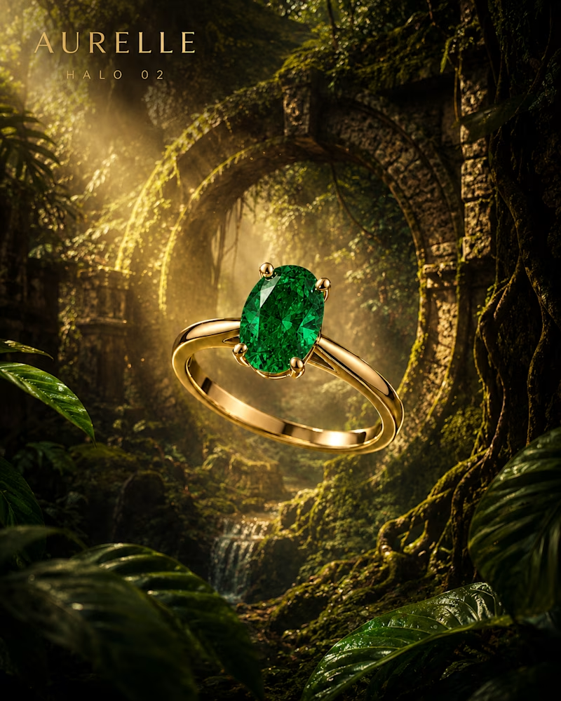
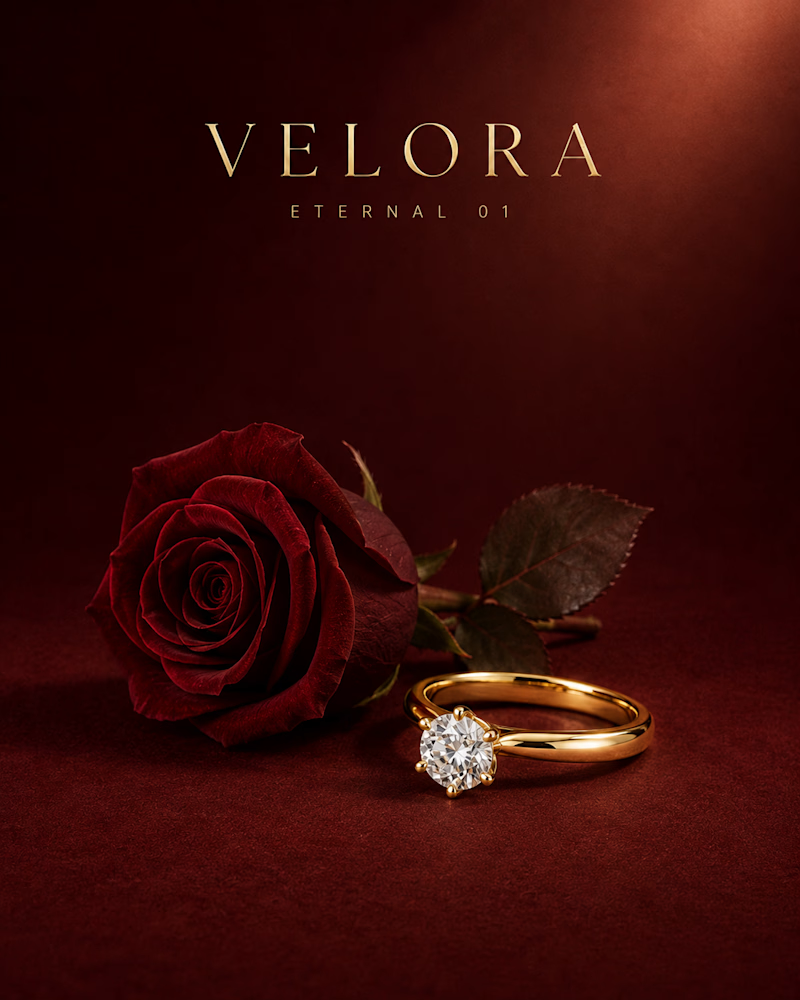
Which one would you put on a jewellery house's front page?
One stays in the studio: deep red velvet, a single rose laid beside the ring, one soft beam from above and a brilliant cut solitaire sitting quietly in yellow gold.
The other goes on location: an oval emerald floating in front of a moss covered arch, light falling through the canopy, wet leaves and a waterfall dissolving behind it.
One trades on restraint. The other trades on wonder. Which one earns the price tag? 👇
#brandconcept #jewelrydesign #artdirection
4 voted
50%
4 voted
50%
8 votes
Closed


I’d go with the first one. The restraint feels more premium and lets the jewellery do the talking.
The network for creativity
Join 1.25M professional creatives like you
Connect with clients, get discovered, and run your business 100% commission-free
Creatives on Contra have earned over $150M and we are just getting started
Trending
retrofuturism
Share your favorite designs from the past exploring the distant future. Or your own take on the aesthetic 🚀
halftone
Dots. Texture. Grain. Let's see your designs using the halftone technique.

Midjourney
Creatives are showing off what they're making with Midjourney.
colorgrade
Video editors sound off: How do you enhance the mood of your video in color grading?
Related posts

Need your eye here!🦩🕶️
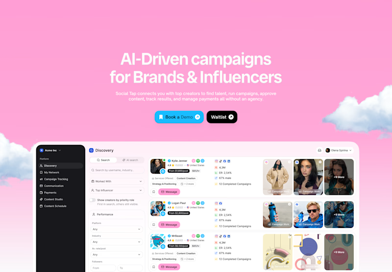
Option A – Soft pink
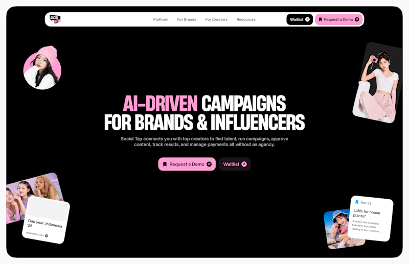
Option B – Bold dark
What's your vote?
15 voted
24%
47 voted
76%
62 votes
Closed

not sure who picked option A 😄


Which one would you put in the campaign?
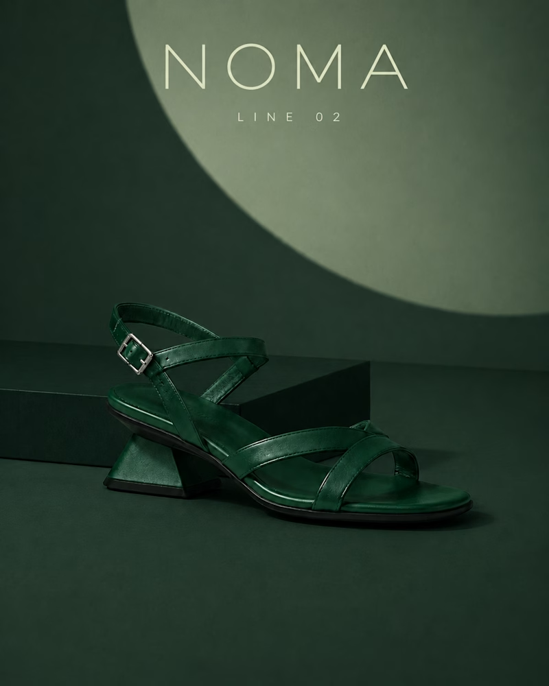
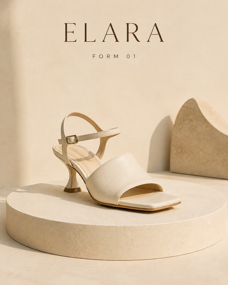
One is built from sand: bone leather on a limestone plinth, a flared heel and one clean strap, soft daylight and scalloped stone shapes holding the background.
The other is built from shade: deep green on green, a sculpted block heel and crossed straps, a single lit circle behind it like a moon and everything else falling into the dark.
One reads warm and quiet. The other reads cold and deliberate. Which one stops your scroll? 👇
#brandconcept #footweardesign #artdirection
5 voted
33%
10 voted
67%
15 votes
Closed


The contrast between texture and shadow is unreal! The soft daylight and limestone plinth feel so effortlessly organic for a campaign
Which one would you lace up?
One runs at sunrise: coral light across still water, an eye holding the reflection, chiffon lifting through the columns and a runner mid stride above the surface, everything white and warm and weightless.
The other runs after dark: violet ring burning in a stone tunnel, the outsole turning slow through the light, tread and air unit glowing like circuitry.
One sells the feeling of flight. The other sells the machinery underneath it.
Which ad would you finish watching? 👇
#brandconcept #sneakerdesign #artdirection
8 voted
73%
3 voted
27%
11 votes
Closed

Amazing work! Do you mind me asking how you create these videos?