The network for creativity
Join 1.25M professional creatives like you
Connect with clients, get discovered, and run your business 100% commission-free
Creatives on Contra have earned over $150M and we are just getting started
Back to feedPost

New project! 🫐
Healthy Pelvis is a pelvic floor physical therapy clinic ready to leave behind the clinical, intimidating aesthetic common in this space. Full rebrand and website redesign built around warmth, clarity and human connection.


Always Amazing 😍

excellence, the website looks fabulous as well!

Nice!!

I really like the pastel color palette, the illustrations, and how everything complements each other. Very nice work!

Rebranding anything in pelvic health without leaning too clinical or too soft-and-pastel is genuinely hard to pull off. How did the clinic's team react the first time they saw the new direction, relief or a little hesitation?


warm > clinical, good call


Amazing

Pelvic health branding is a tough one, that gap between feeling clinical and feeling condescendingly soft is real. Curious what the palette ended up leaning toward for warmth without going saccharine.

Love the colors!


Warmth and clarity feel like the perfect direction for a brand in this space.
The network for creativity
Join 1.25M professional creatives like you
Connect with clients, get discovered, and run your business 100% commission-free
Creatives on Contra have earned over $150M and we are just getting started


Trending
retrofuturism
Share your favorite designs from the past exploring the distant future. Or your own take on the aesthetic 🚀
halftone
Dots. Texture. Grain. Let's see your designs using the halftone technique.

Midjourney
Creatives are showing off what they're making with Midjourney.
colorgrade
Video editors sound off: How do you enhance the mood of your video in color grading?
Related posts

Finally got to put the full ASTRAL case study together.
What started as a Framer template slowly turned into its own little world, identity, art direction, a fictional audio product, packaging, and the digital experience around it.
Had way too much fun obsessing over the tiny details on this one.


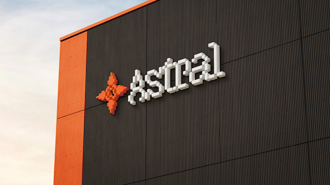
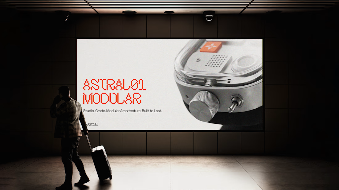
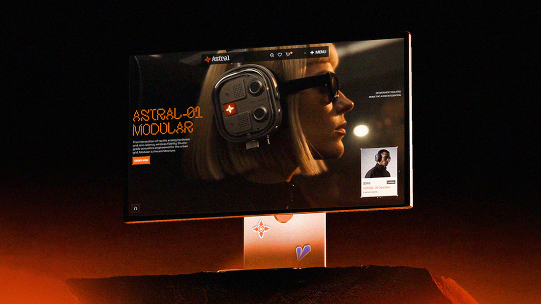

This is such a strong visual direction. Love how ASTRAL feels like a real brand and product, not just a concept piece. The whole world around it is insanely well thought out 👏


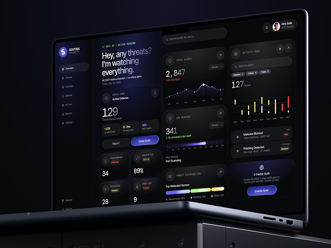
"I'm watching everything" sounds like "I'm watching you" 😊 😂
Great design!

Recently worked with BoomPop on unifying their brand across around 20 pages of their site. Good people and an amazing brand to work on.