The network for creativity
Join 1.25M professional creatives like you
Connect with clients, get discovered, and run your business 100% commission-free
Creatives on Contra have earned over $150M and we are just getting started
Back to feedPost
Taste Test
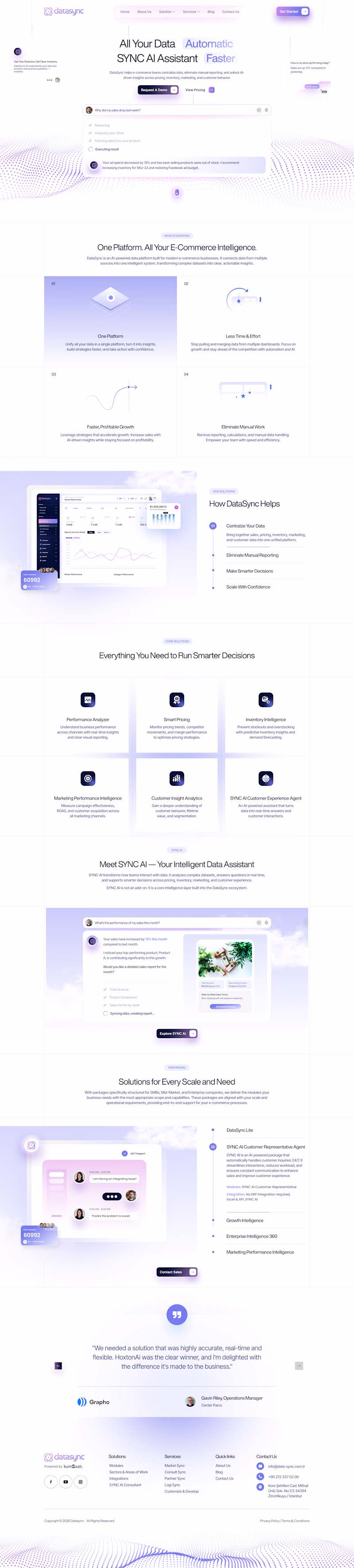
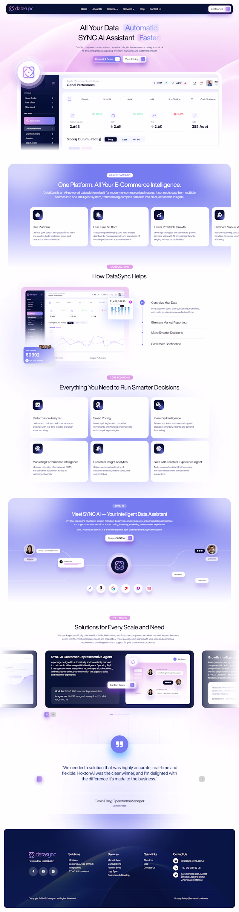
Both are really solid honestly, but B gets my vote. Something about the depth and detail just feels more complete to me.
Thank you soo much for your thoughts Farook 😊
Going for the rich and detailed option
Thanks for sharing your POV 😊
B! i think the richness of the backgrounds & attention to detail you've put in actually helps the viewer dial in more easily!
Thanks for sharing your POV 😊
Voting A. For a SaaS product like DataSync, the cleaner layout keeps the focus on the value prop and reduces cognitive load, which usually helps with conversion. B has great visual energy but it might pull attention in too many directions on a landing page.
Thanks for sharing your thoughts Rafee 😊
The network for creativity
Join 1.25M professional creatives like you
Connect with clients, get discovered, and run your business 100% commission-free
Creatives on Contra have earned over $150M and we are just getting started
Related posts
We spent years getting good at faking apps in Figma prototypes.
Then this took a couple prompts in Claude Code, a real one. Real iOS animations. Tap anything.
Why fake it when you can just build it?
Good work
How to design Figma prototypes with Claude Opus
👉 Can't wait to see your work in Config Makeathon!
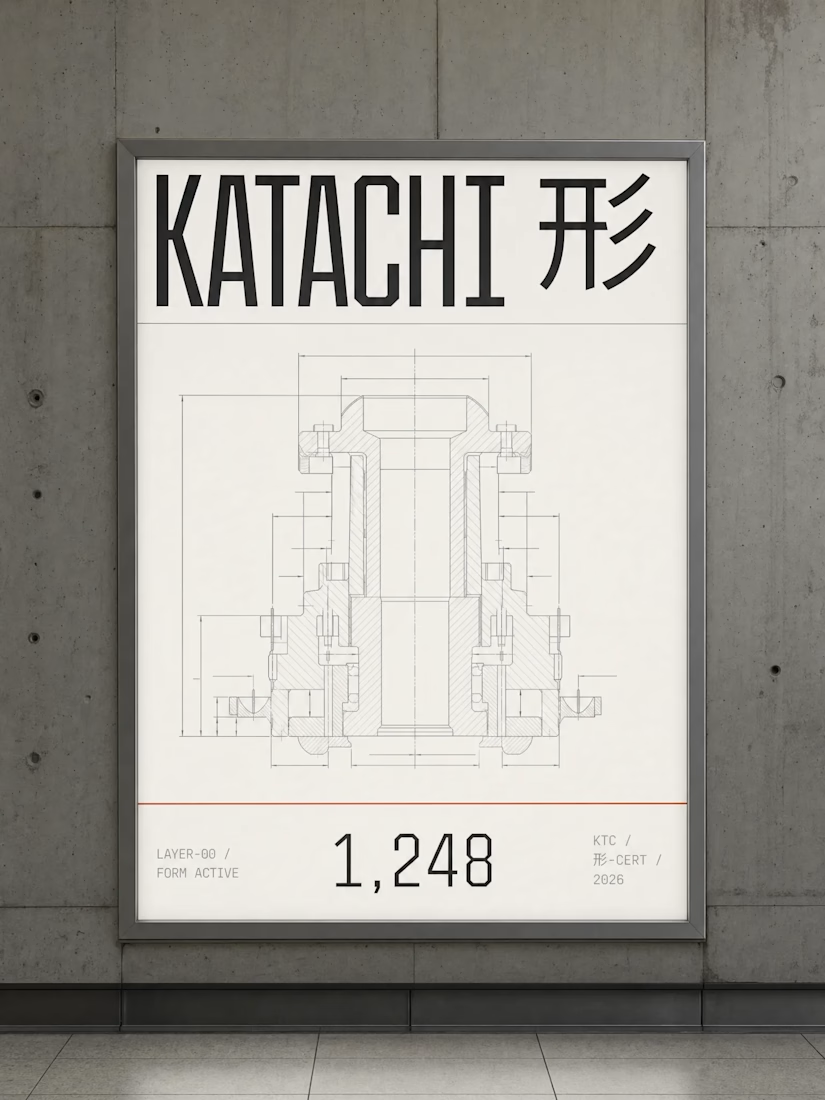
Built a full Web3 brand around one constraint: warning red appears once per composition. Always functional. Never decorative.
30+ outputs. One rule set.
KATACHI 形 — The structure beneath.


Challenges
View allTrending
Claude
Claude has entered the design space. How are you using Claude Design?
Contra University
Learn from expert creatives how to earn more using next-gen AI tools.
MagicPath
The canvas is infinite, and exploration is becoming the workflow. How are you using MagicPath?
creativeaiflow
Creative AI workflows are evolving. What tools do you use, and what are their strengths and weaknesses?
freelancerlife
Freelancer life is wins, pivots, and everything in between. What’s yours right now?