The network for creativity
Join 1.25M professional creatives like you
Connect with clients, get discovered, and run your business 100% commission-free
Creatives on Contra have earned over $150M and we are just getting started
Back to feedPost
Taste Test


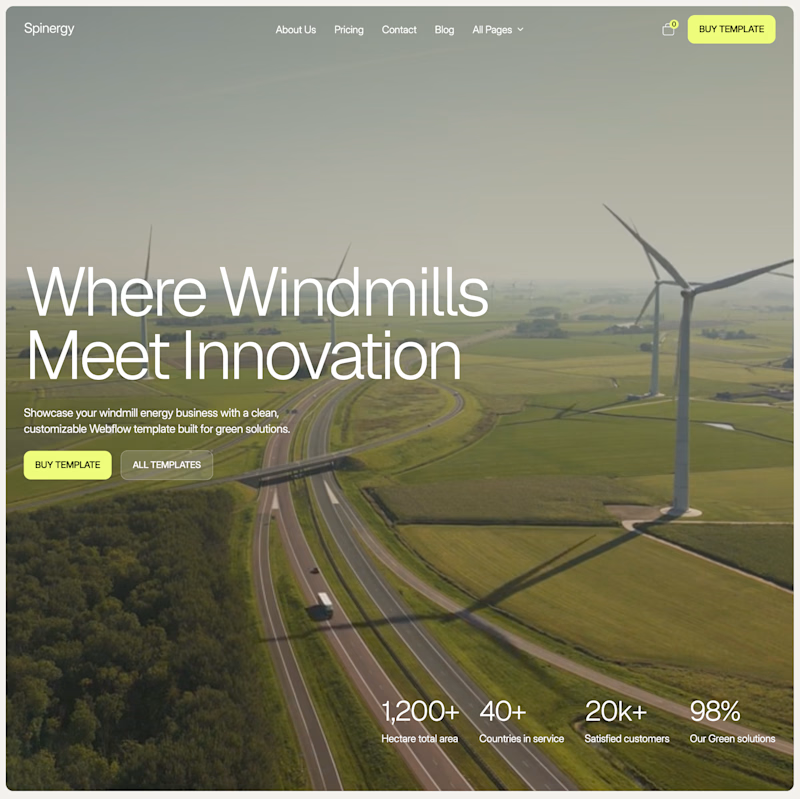
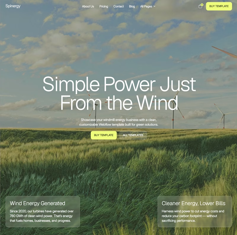
I’ve been staring at these two for too long, so I’ll let you decide.
Both are homepage directions for Spinergy, a Webflow template for wind energy companies.
Which one would you choose?

50 voted
68%
24 voted
32%
74 votes
Closed


I’d go with Editorial. The structure feels cleaner and easier to scan, especially for a B2B energy site.


I like editorial way more


editorial for me

B for me🔥 the aerial image feels more premium and editorial, with stronger hierarchy. The stats add credibility without competing with the headline.

Editorial 🔥

editorial, my guy
It has better hierachy

Going with Editorial 🔥

The first one feels right ✨
Simple and clear to read.

Immersive looks much more elegant! I'd just bring the two bottom cards closer and also keep them in the center 😊

Immersive for me, I just love center layouts, great job either way bro! 🔥


Premium !

The stats bar sitting right in the hero instead of scrolled below is what actually earns the Editorial label - numbers up front read as credibility, while the left version sells a feeling first and asks you to scroll for proof.


immersive for me. the big wind farm photo feels more like energy

immersive version 💖

Editorial looks better

Editorial for me

I love the editorial one because the main message is left aligned and that’s better for user’s eyes and the main numbers that help users trust this website more

Editorial looks way better

Editorial

Editorial absolutely works better

Immersive for me

Editorial look good to me

✌🏻✌🏻✌🏻


i like the editorial!

Right is best one

super clean

Without a doubt, the editorial design with left-aligned content flows smoothly with the background image!
Without a doubt, the editorial design with left-aligned content flows smoothly with the background image!
The network for creativity
Join 1.25M professional creatives like you
Connect with clients, get discovered, and run your business 100% commission-free
Creatives on Contra have earned over $150M and we are just getting started











Related posts

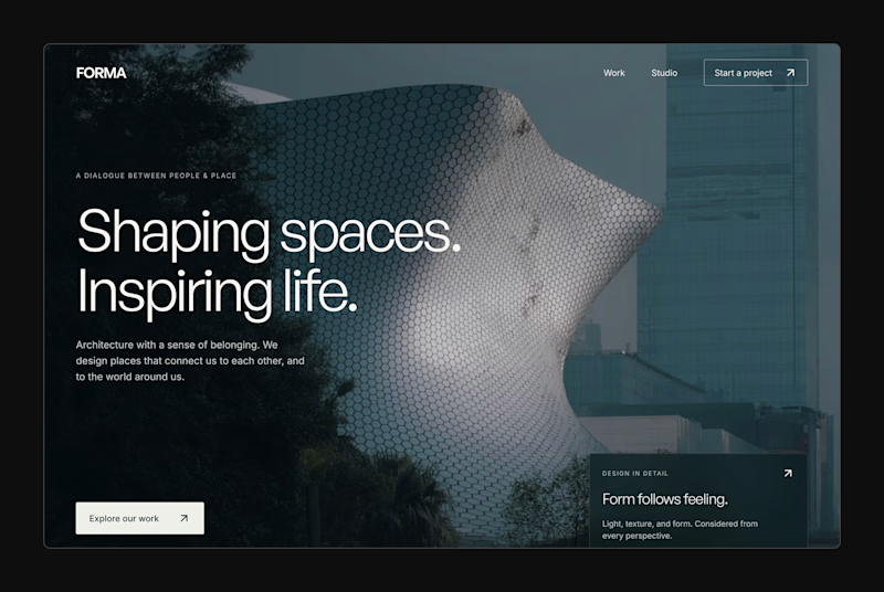
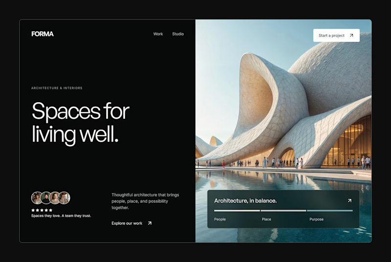
Design Exploration: Hero Section of Architecture Website. Which one do you think much better?


12 voted
43%
16 voted
57%
28 votes
Closed


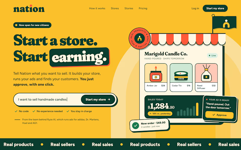
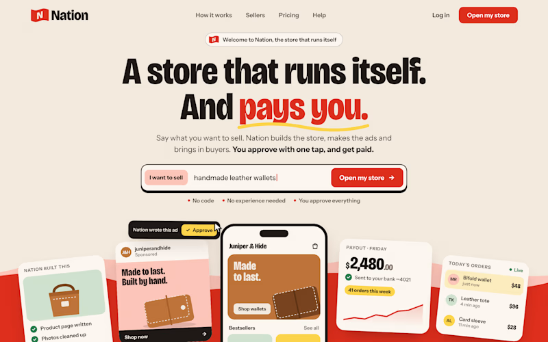
Two visual directions for the same brief. Which do you prefer?
2 voted
29%
5 voted
71%
7 votes
Closed

Direction A is more better to me it feels modern professional cartoony style that's impressive ❤️❤️
Great job Ayoub🔥🔥

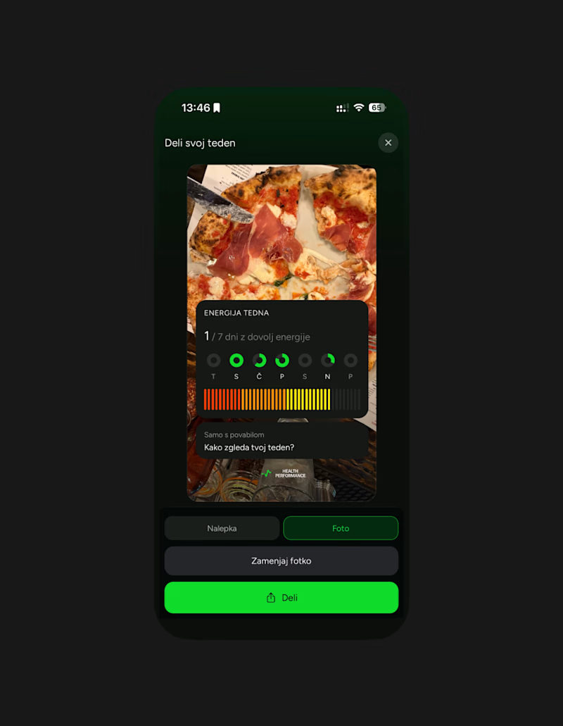
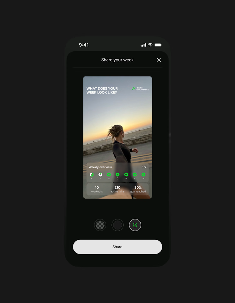
This week client came to me with a new idea for their app's share feature. They were trying something with Claude... But let's simplify this thingy:)
Let's remove all the buttons that confused me already - imagine what they'd do to a user...
Take our predefined bottom sheet and give our users 3 simple choices.
GOALS:
make it as simple as possible for our target persona (35-55 y/olds that aren't necessarily as modern and advanced in tech)
Create an aesthetically pleasing UI frame for stories, that makes people want the app & their lifestyle.
Which one would you go with?
SPOILER ALERT 🚨 we absolutely went with the after result😆
0 voted
0%
5 voted
100%
5 votes
Closed

Afterrrrr😊