The network for creativity
Join 1.25M professional creatives like you
Connect with clients, get discovered, and run your business 100% commission-free
Creatives on Contra have earned over $150M and we are just getting started
Back to feedPost
Taste Test

Two visual directions for the same brief. Which do you prefer?
2 voted
29%
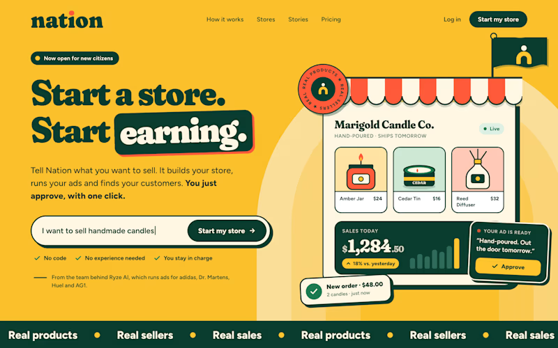
5 voted
71%
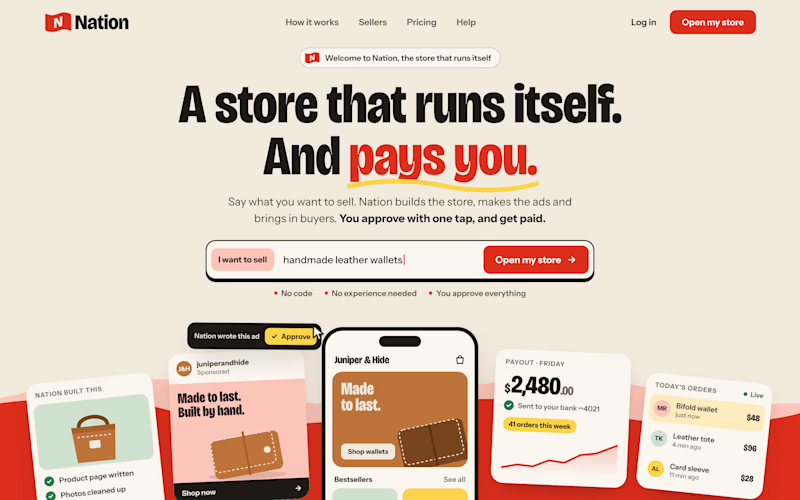
7 votes
Closed

I have a fully animated prototype, I don't know how to share it with you.

Direction A is more better to me it feels modern professional cartoony style that's impressive ❤️❤️
Great job Ayoub🔥🔥
Thank you so much brother for your input.
Pardon Ayoub❤️


direction A

Both directions are strong, Ayoub, but I can see why B won. It has a clear, distinctive character while A reads more classic ecommerce. Great taste test.
The network for creativity
Join 1.25M professional creatives like you
Connect with clients, get discovered, and run your business 100% commission-free
Creatives on Contra have earned over $150M and we are just getting started



Related posts

Which hero would you choose — 1 or 2?
Two directions for Amber House, my real estate website template. The first pairs a closer architectural crop with an asymmetric layout. The second gives the building more breathing room, with a wide view and a centered headline.
Same template, two different first impressions. Which feels stronger to you, and why?
24 voted
59%
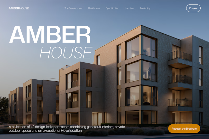
17 voted
41%
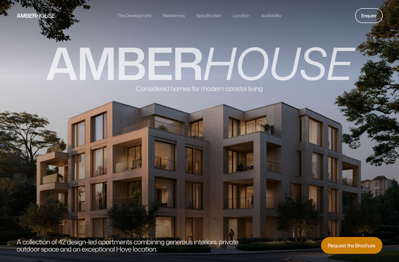
41 votes
Closed

I will go with Bold & Asymmetric!


Which brand showreel preview design would you choose - Silver & Ropes or Purple Stones? ⚡
Lynksen is cooking something fire...
and we need your expert eyes on this one 🔥😎
Vote and tell why! 👇


12 voted
24%
37 voted
76%
49 votes
Closed

Going with Purple Stones. It feels more distinctive and memorable for a showreel, Silver & Ropes is clean but a bit safer.

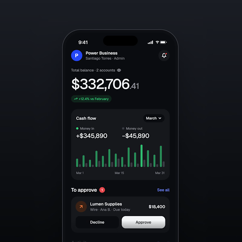
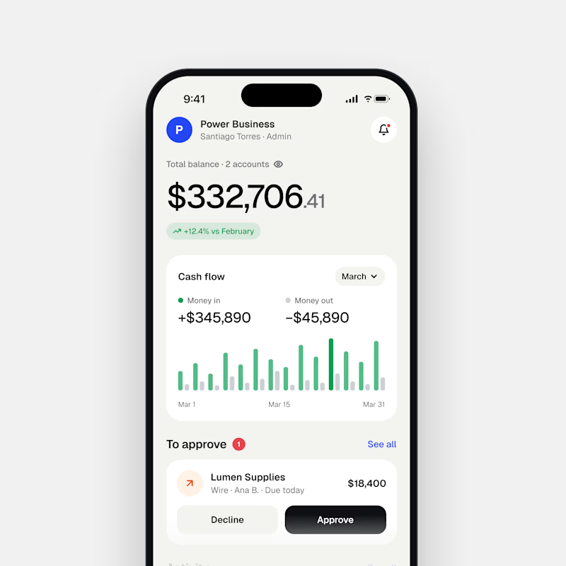
Dark Mode 🖤 or Light Mode 🤍?
Which one matches your vibe? 👀
15 voted
54%
13 voted
46%
28 votes
Closed

Both are nice clean designs...for me,Dark mode!