The network for creativity
Join 1.25M professional creatives like you
Connect with clients, get discovered, and run your business 100% commission-free
Creatives on Contra have earned over $150M and we are just getting started
Back to feedPost
Taste Test
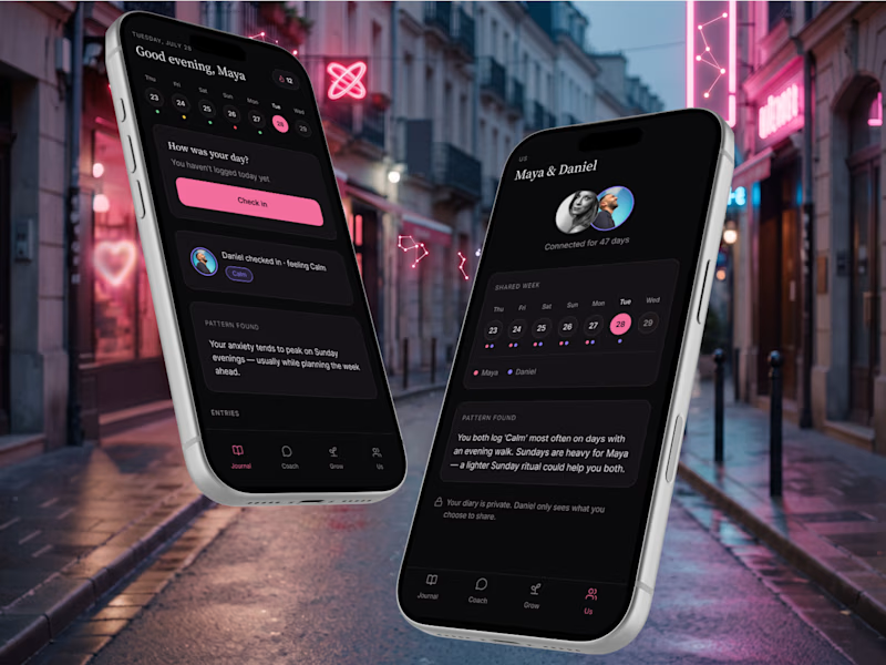
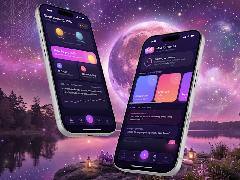
Partnero AI is an app designed for couples.
Age of users: 18+ years old.
Which UI style feels right for Partnero AI?

13 voted
59%
9 voted
41%
22 votes
Closed


I prefer option 1, much more userfliendly

Thank you!

Minimalist Looks Great!
Thank you, Sahil! I'll probably move forward with it!

The colorful version feels more emotional, while the minimalist one feels more focused. What emotion were you hoping users would feel when they first opened Partnero AI?
I'd hope users feel understood and that they will feel safe, so that they can freely explore their emotions and describe their feelings.
Thoughtful Perspective👍
Thanks, Ashish!

My gut says option 2, that cosmic gradient feels more emotionally warm for a couples app, though the minimalist route might convert better for a first download. Which one actually tested better with your target users?
Seems that minimalism is suited better for most people. But my ineer child prefers option 2 as well!

colourful🎨
Thank you for sharing your choice, Sekinat!

Minimalist looks fine
Thanks, Tahir!

I agree that the colorful version feels more emotional.
I think this is better for a couples app.
Thank you! It's so hard to decide 😂 Now people's thoughts are divided 50/50. This poll didn't help much😅


I’d go with 2. It feels more warm and approachable, which fits the idea of a couples app really well.
Thank you for voting Kabir!

Both concepts look beautiful. You chose great colors for a couples app🙌

Would go with minimalist, due to it being an AI app and the colorful varient is giving it even more of an AI slop feel. Minimalist keeps it clean easy to use and good color usage.

Hahah yes! It's such a dilemma! The minimalist version won the Flowstep Challenge - and for me, it also seems timeless - so I will probably continue with it!
Thank you so much for your comment!😊


The colourful version is too good
Thank you, Chidera! Would you guess that it was made with Claude Design from scratch?
Really? Had no idea. You really nailed it
Thank you, Chidera!😊

I choose on minimalist
Thanks, Toluwalase! Minimalist versioin won this poll!!!

Minimalist is the right call for trust in an AI product, and it can still feel understood and safe: warm neutrals instead of pure grey, soft easing on transitions, and human copy carry the emotional register option 2 gave you, without the AI-slop risk.
Love your perspective! Thank you for your feedback!
The network for creativity
Join 1.25M professional creatives like you
Connect with clients, get discovered, and run your business 100% commission-free
Creatives on Contra have earned over $150M and we are just getting started
Trending
retrofuturism
Share your favorite designs from the past exploring the distant future. Or your own take on the aesthetic 🚀
halftone
Dots. Texture. Grain. Let's see your designs using the halftone technique.

Midjourney
Creatives are showing off what they're making with Midjourney.
colorgrade
Video editors sound off: How do you enhance the mood of your video in color grading?





Related posts

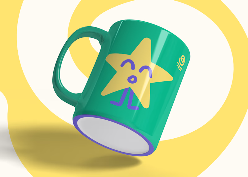
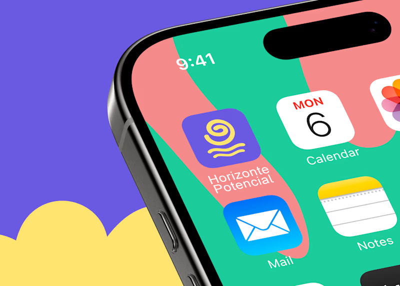
Horizonte Potencial was created at the intersection of child psychoanalysis and technology :)
I created these covers, but I’d like to hear your opinions. Which one grabs your attention the most?
15 voted
58%
11 voted
42%
26 votes
Closed


Combining child psychoanalysis with technology is such a fascinating realm! Cover 1 creates an immediate emotional draw with its soft composition, but Cover 2 has an intriguing depth that really leans into the tech side visual balance done right.

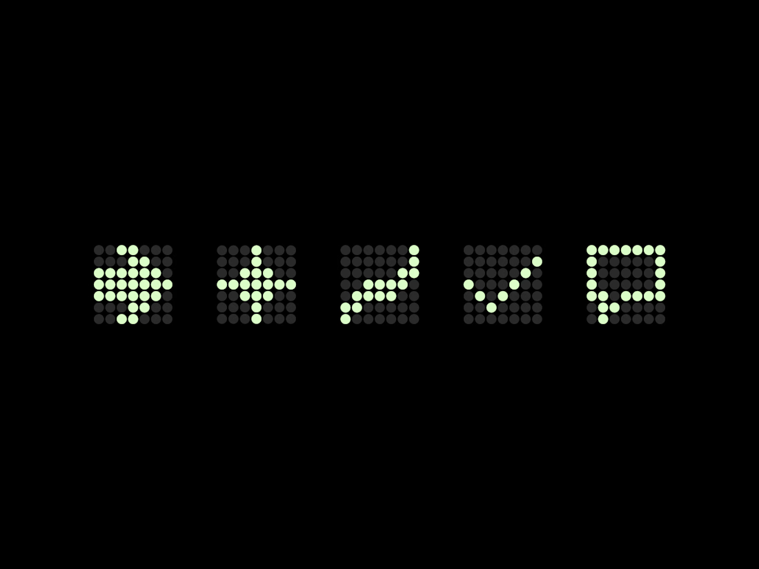
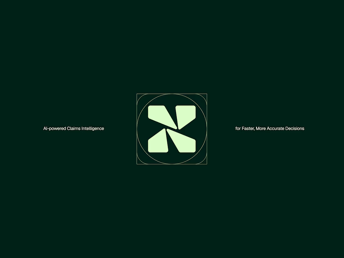
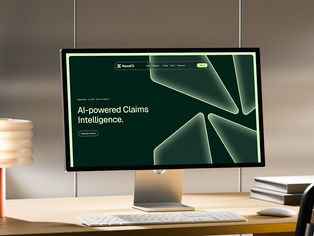
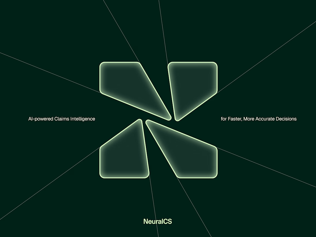
One of the many concepts we presented for NeuralCS, an AI-powered insurance platform.
The N mark created was actually inspired by fractured glass. Each segment represents abstract glass shards while also reflecting the step-by-step claims process, combining the product with the platform’s core functionality.
Logos don't need to explain what a clients does or says in fact usually try avoid this where possible but this was a fun way to bring a little story into the logo and system.

Great work!


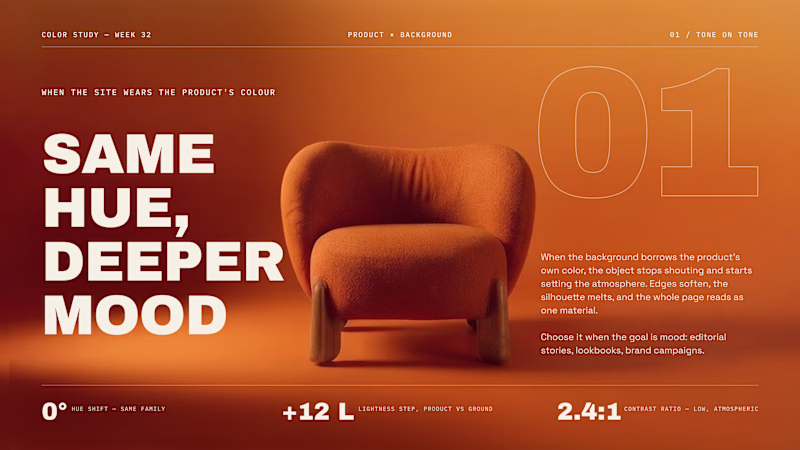
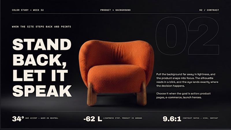
Should the site wear the product's color, or step away from it?
Same chair, two backgrounds. That one decision changes what the page is for.
01 - Tone on tone. The background borrows the product's hue. Edges soften, everything reads as one material. Mood over clarity, perfect for editorial stories and lookbooks.
02 - Contrast. Pull the background far away in lightness and the silhouette snaps into focus. Clarity over mood, built for product pages and launch heroes.
Neither is "better". One sets atmosphere, the other sells the object.
Which side do you reach for first when you start a page?

71 voted
59%
50 voted
41%
121 votes
Closed
