The network for creativity
Join 1.25M professional creatives like you
Connect with clients, get discovered, and run your business 100% commission-free
Creatives on Contra have earned over $150M and we are just getting started
Back to feedPost

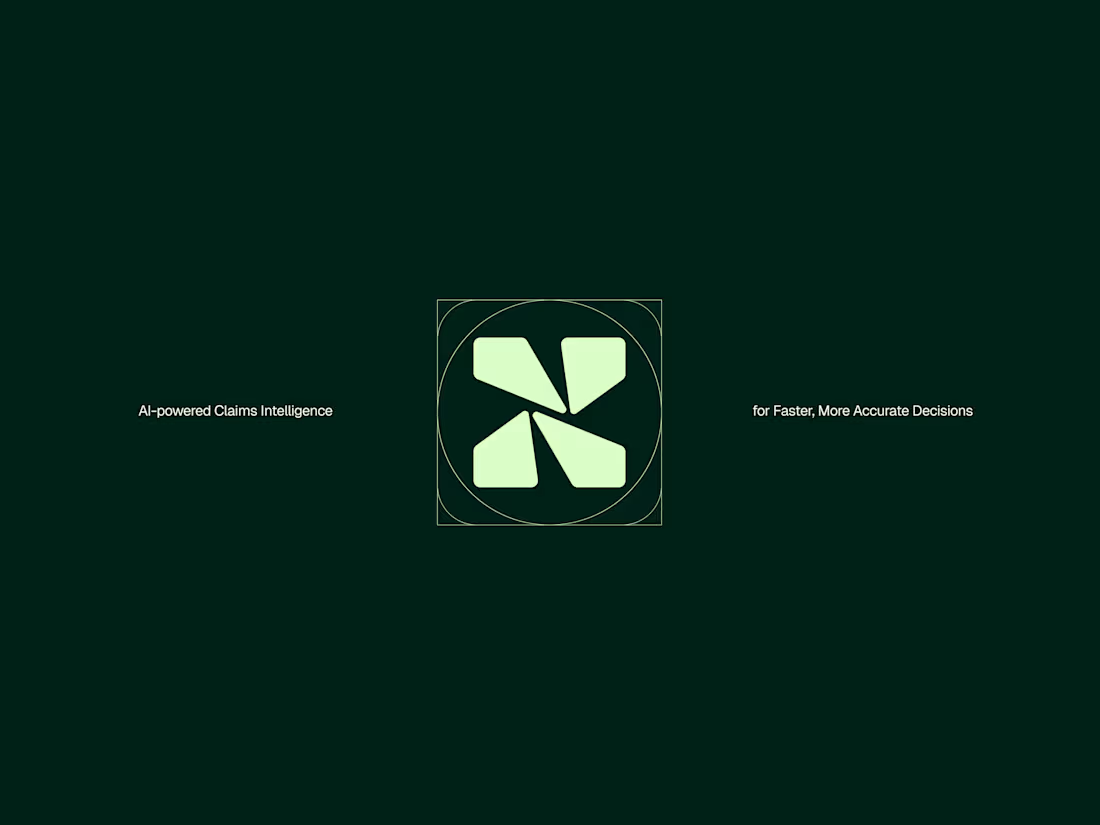
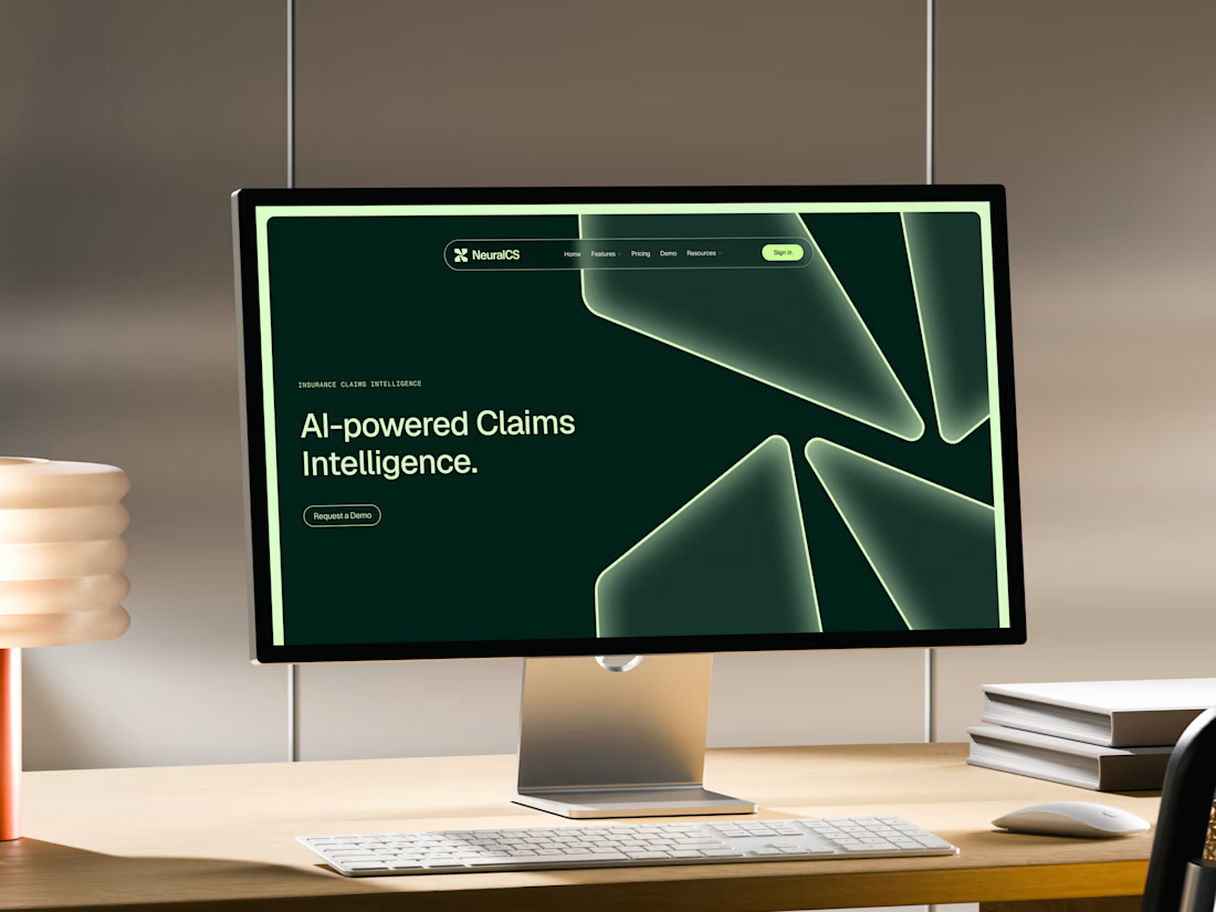
One of the many concepts we presented for NeuralCS, an AI-powered insurance platform.
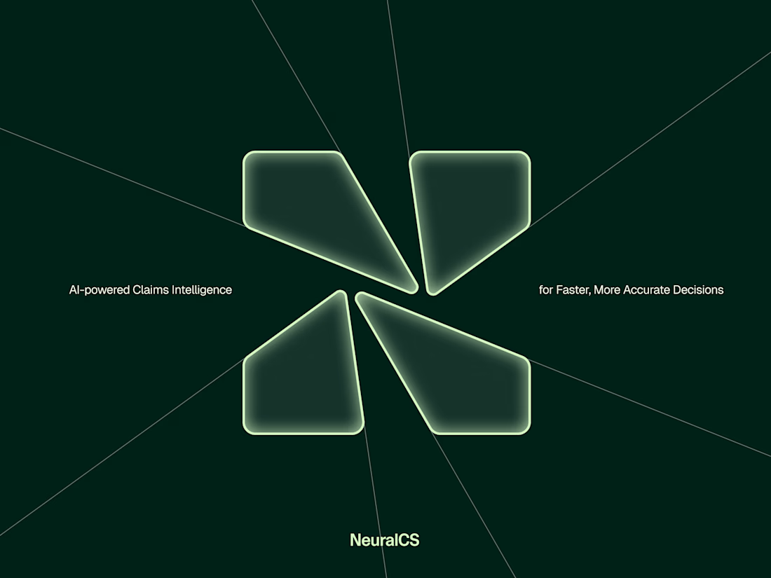
The N mark created was actually inspired by fractured glass. Each segment represents abstract glass shards while also reflecting the step-by-step claims process, combining the product with the platform’s core functionality.
Logos don't need to explain what a clients does or says in fact usually try avoid this where possible but this was a fun way to bring a little story into the logo and system.


Great work!
Thank you


Branding 😍

Looks great Alex!

Beautiful treatment with the inner shadow, it really makes the mark standout.

the fractured glass inspiration is something i never would've guessed, but it enhances the logomark doubly in my opinion.

Great!


Supreme work 🧡

Agreed that most logos shouldn't try to explain the business, but the fractured glass tying back into the claims process is subtle enough it doesn't read as a literal explainer. Did the client catch that connection right away, or did you have to walk them through it?
I always walk the client through my ideas. They did get it but it was to creative for them in the end. We went with something more AI related.
Sometimes those shifts happen but I really love the work great job!

Nice color and concept

The ideation of using the fractured glass to create the N is really mind blowing and creative. Very good one

Did the fractured glass idea come out of deliberately looking for a metaphor that mapped to the claims process, or was it more that you landed on the shards first and the meaning clicked afterward?
I was map out my ideas before I design them. So I note down what I could include after learning about the clients business, process etc.. and see where I can create something unique around it. Good place to start as it can rule out bad ideas quickly.
Makes sense, ruling out the bad ideas early probably saves a lot of wasted design time. Do you usually know pretty quickly which direction is the strong one, or does it take sitting with a few options before one clicks?


Great work🔥👏👏

Great work🔥


Lovely work!

The glass-shard segments doing double duty as both the mark's texture and a metaphor for sequential claims steps is a nice trick - most abstract logo stories don't map that literally onto the actual product flow.

One of the best designs I’ve seen today. Really solid work 👏 Translating abstract fractured glass into a step-by-step mark looks incredible on a canvas.
Thank you :)

Looks great

This is actually Great stuff


That branding is so addictive, bro.
Thanks man. Yeah I do love this solution

Looks great! Love the creativity behind it.

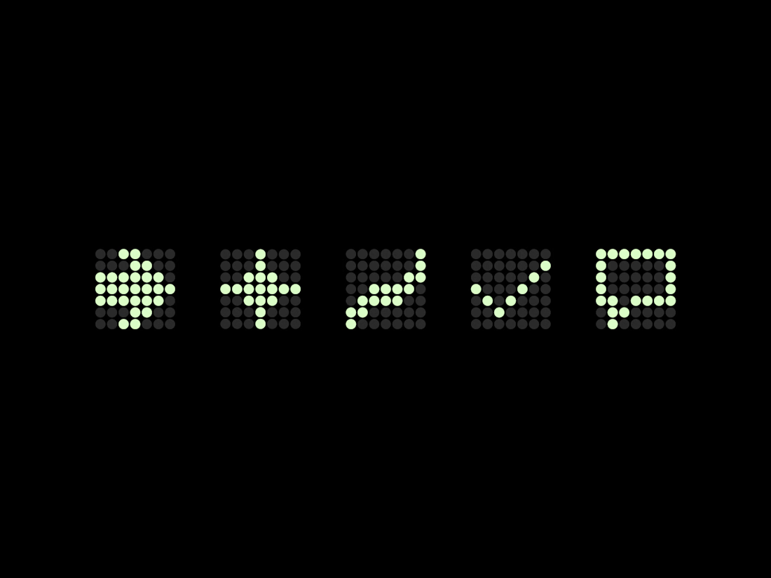
love the icons, they remind me of the traffic lights


Really like the idea behind the N mark. The fractured glass reference gives it a story without making the logo feel too literal.

nice work 🔥


Really like the idea behind the N mark. The glass pieces make the logo feel simple but still have a story.

Out of the crowd work, stunning.

great brand style

Creative design
The network for creativity
Join 1.25M professional creatives like you
Connect with clients, get discovered, and run your business 100% commission-free
Creatives on Contra have earned over $150M and we are just getting started





Related posts

A few things we’ve been working on this month.
Different industries, different problems, but the same goal: making complex products feel simple, clear, and trustworthy.
Fintech → Investment Banking → Geospatial AI
More projects are still in progress.
Full case studies coming soon.






This is the kind of work I enjoy seeing — simple, focused, and actually thought through.

Next intelligence. A brand you can feel.
Ice blue, deep black and refracted glass bring texture, depth and a sense of touch to an invisible technology. An identity designed to be recognised. And felt.
Brand identity and visual direction for Niwos, a platform that brings AI agents together as a digital workforce.
Five modules. One W. A simple idea at the heart of the identity: working as one.
I’ve really enjoyed working on this project with Muhammed. His trust in my design judgement and openness to new ideas gave me the creative freedom to explore fully.
Here’s hoping this is just the first chapter of an exciting journey with him and his team.


👍 nicely done


Does an AI brand still need to look like an AI brand?
Lupr helps small and growing businesses adopt AI without the complexity, so the identity needed to do the same.
We built a clean, approachable system around movement, connection and continuous improvement, without leaning on the usual futuristic tech clichés.
The idea was simple: make AI feel like useful business infrastructure, not something you need to be an expert to understand.
As AI becomes part of everyday business, do you think brands still need to visibly signal “AI”?
Full case study below 👇


Great design it feels alive 🎉🎉❤️❤️


