The network for creativity
Join 1.25M professional creatives like you
Connect with clients, get discovered, and run your business 100% commission-free
Creatives on Contra have earned over $150M and we are just getting started
Back to feedPost
Taste Test
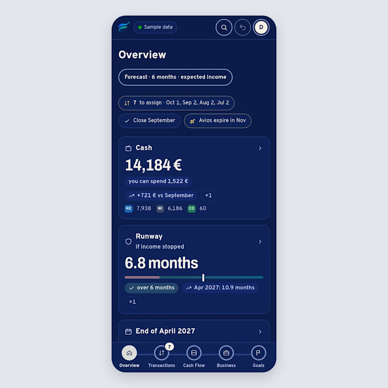
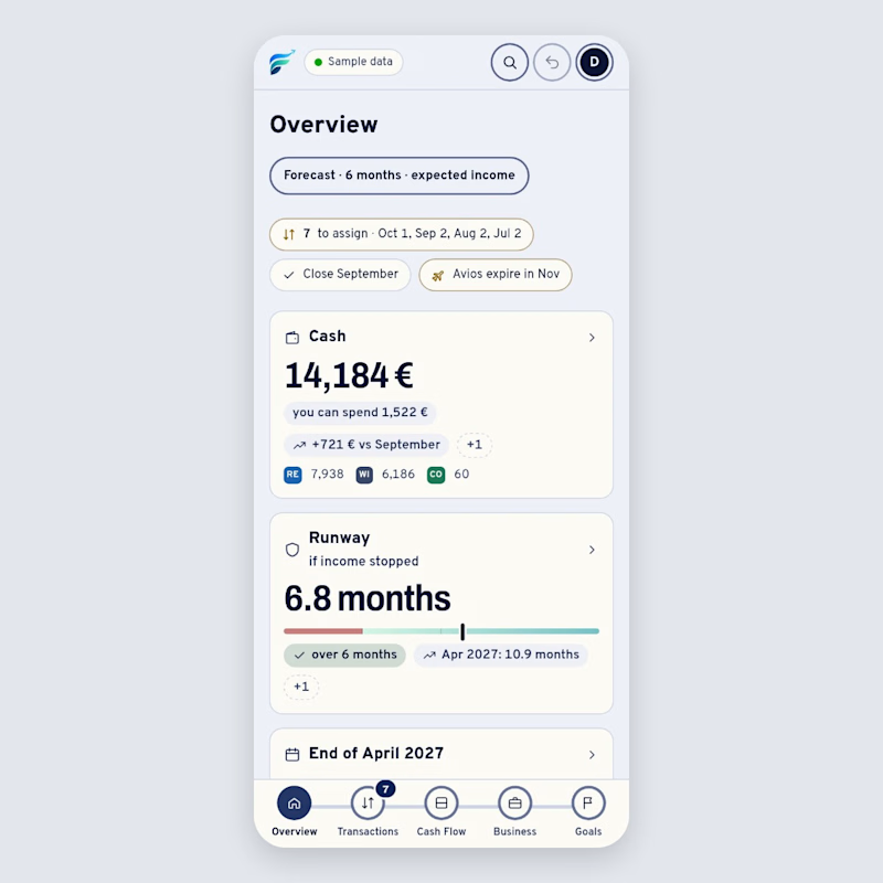
Same screen, two themes: the overview of Flusso, a money dashboard I'm building. People open it every day, so I want the default to feel calm. Which theme would you open every morning, and why? 👇
1 vote
Ends in 1d

Great visual hierarchy.

thanks 😃
The network for creativity
Join 1.25M professional creatives like you
Connect with clients, get discovered, and run your business 100% commission-free
Creatives on Contra have earned over $150M and we are just getting started





Related posts

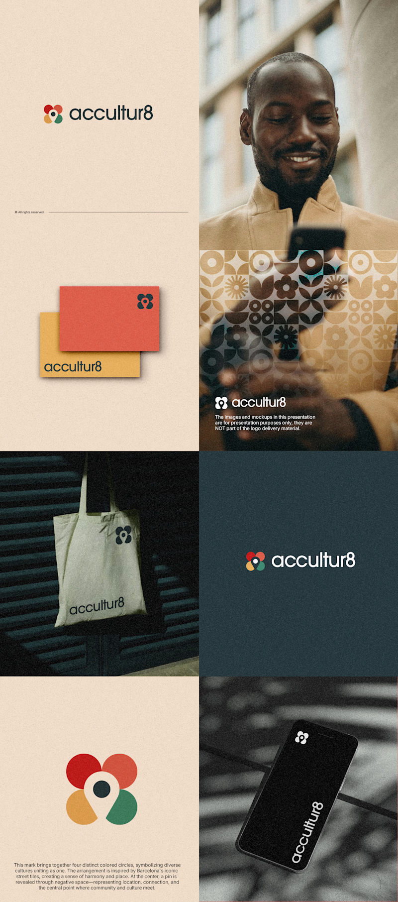
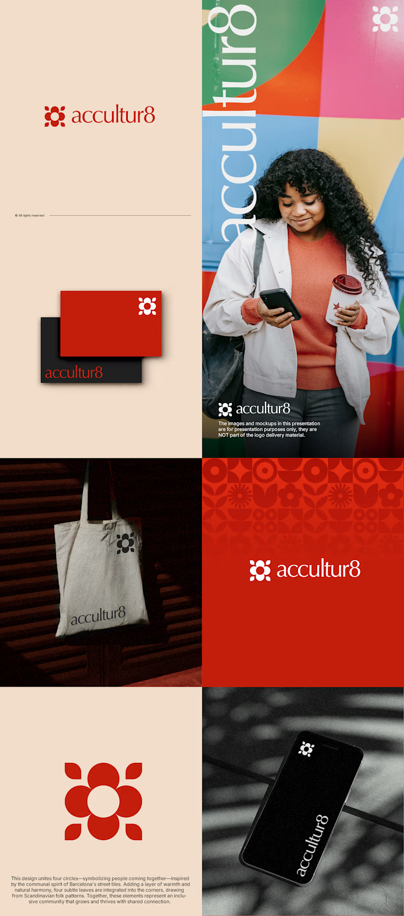
The client really liked Barcelona typical floor tiles, so I presented these logo options. Which one you liked the most?
4 voted
13%
26 voted
87%
30 votes
Closed

Love option 2, which one do you like most ?

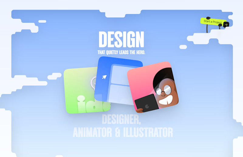
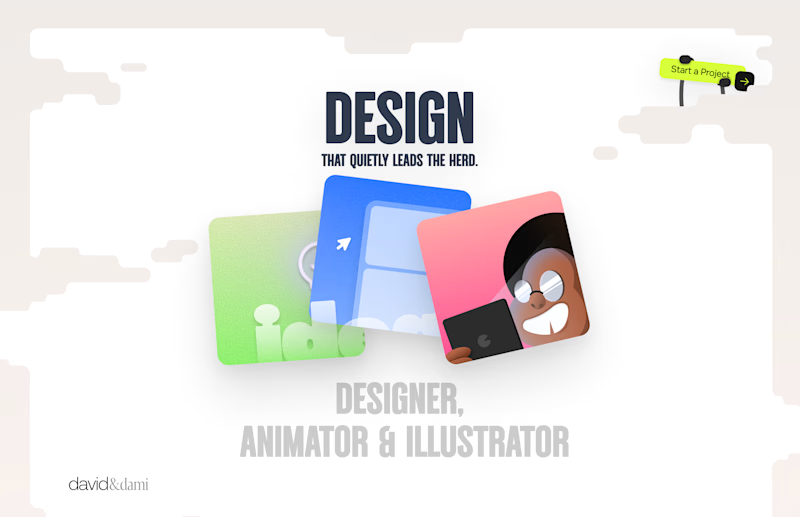
Should I go for left or right? Focusing on updating and finishing up my portfolio... and then I came across this crossroads. Another alternative is to make them switchable themes through a toggle, but I still need to decide which should be the default.

27 voted
75%
9 voted
25%
36 votes
Closed

Left is better because the text is readable, the overall blue background is not flashing to the eyes as compared to the right one.
For the top right button " Start a project ", you can add some animation so that it stands out and encourage users to click on it.

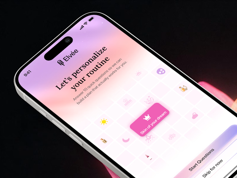
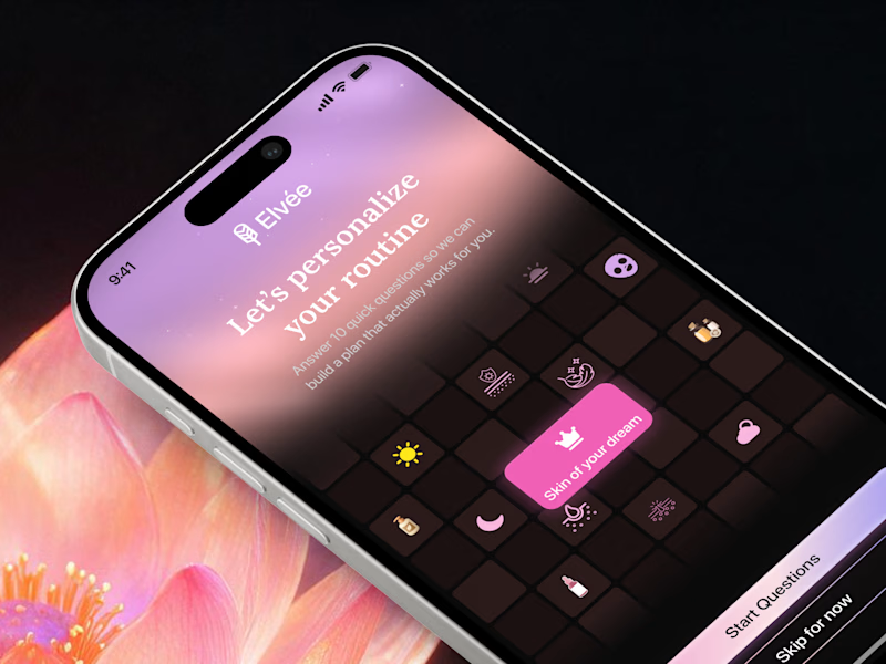
First impressions matter in onboarding 🌸 Which theme sets the right mood for a personalized wellness app? Drop your favorite light gradient or moody dark mode in the comments! 💬
7 voted
47%
8 voted
53%
15 votes
Closed