The network for creativity
Join 1.25M professional creatives like you
Connect with clients, get discovered, and run your business 100% commission-free
Creatives on Contra have earned over $150M and we are just getting started
Back to feedPost
Taste Test
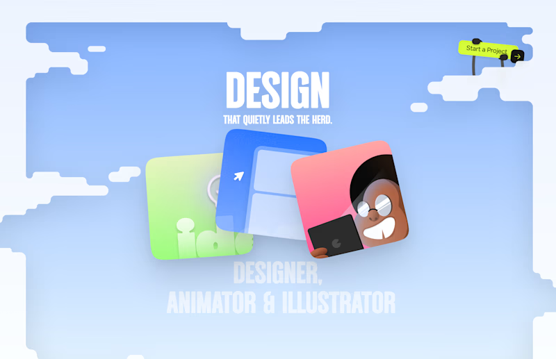
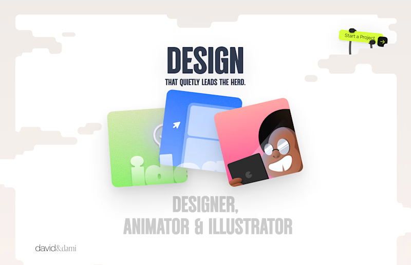
Should I go for left or right? Focusing on updating and finishing up my portfolio... and then I came across this crossroads. Another alternative is to make them switchable themes through a toggle, but I still need to decide which should be the default.

27 voted
75%
9 voted
25%
36 votes
Closed

Left is saturated with emotion and energy I love it🎉🎉🔥🔥

Thank you
Pardon ❤️

Left. It’s a theme. The “sky” theme gives it more character.👌🏽👌🏽
Thank you

right
Thank you


the sky blue one. feels way more like a portfolio only you could make
Oh wow... Thank you so much 😊

I like the left one; which one you personally like?
Thank you, I also like the one on the left. It looks more vibrant

left one
Thank you

The illustration blends nice with the blue background.

I’d choose Left. The blue gives it a stronger visual identity.
Alright thanks man

Left is better because the text is readable, the overall blue background is not flashing to the eyes as compared to the right one.
For the top right button " Start a project ", you can add some animation so that it stands out and encourage users to click on it.
Mistakenly voted for the right lol
Yeah, thanks, a really interesting perspective. I was planning to add animation there as well. You were spot on with your take.

I totally agree with what you said. Priorities should be put on readability and engagement

Very true...


Looks great !
Thanks

Colour play on the right looks cool
Thanks

I like the left one best.
Looks more vibrant and the readability is better
The network for creativity
Join 1.25M professional creatives like you
Connect with clients, get discovered, and run your business 100% commission-free
Creatives on Contra have earned over $150M and we are just getting started



Related posts

One pixel grid. A whole brand.
For Appy, a London product studio for impact-driven startups, the wordmark, icons, 3D smile and Appy Pixel, its custom typeface, all come from the same grid.
Appy Pixel won Typography at the Online Design Awards.
Type first or symbol first: where do you start a rebrand?

thats so nice, i loveee

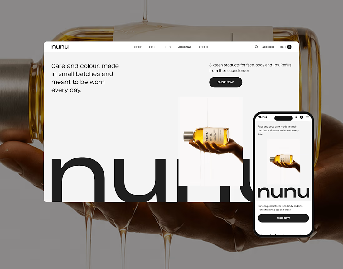
nunu is a self-initiated skincare and body care brand built from zero: naming, brand identity, art direction, product imagery and a responsive e-commerce websit

Nice work!

working on a case study for my latest project - brand identity for Coral Pay.
need your help choosing the best cover video for it:
35 voted
23%
118 voted
77%
153 votes
Closed

Lilac looks amazing with the 3D shining.