The network for creativity
Join 1.25M professional creatives like you
Connect with clients, get discovered, and run your business 100% commission-free
Creatives on Contra have earned over $150M and we are just getting started
Back to feedPost
A logo is not a brand identity.
It’s the signature at the bottom of the letter.
Most founders start by asking for a logo.
What they need is a system that still looks like them on day 100.
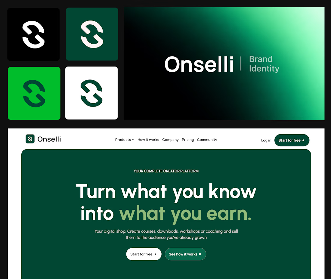
Here’s what sits behind the Onselli mark 👇
- A mark that holds on any background
- A style guide, with a color system where every color has a job and type with a point of view
- The brand principles, with the logo use cases on socials, mockups, or any surfaces.
- Components that match: buttons, cards, hero, forms, etc...
- Social creatives and copy that sells the product: “Turn what you know into what you earn.”
- A live website that carries all of it
Skip one and the whole thing starts to look like a template.
A logo gets you noticed.
A system gets you trusted.
Which of the 6 is your brand missing?
Drop the number below, and I’ll tell you how I’d fix it.
Know a founder who thinks branding is a logo?
Repost ♻️ and save them an expensive redo.
I’m Daniel, a Design Engineer. I craft premium web, motion, product design, and brand identities for startups.
Follow for more breakdowns like this, or DM me “identity” if you’re building something.


Outstanding

Agree with the signature line. The one I would add to the six is the words: a brand that looks consistent but sounds different on every page still reads like a template. Turn what you know into what you earn is a good sign Onselli has that part.

Great job Daniel 🎉🎉

Thank youuu
Pardon Daniel❤️

Nice work
The network for creativity
Join 1.25M professional creatives like you
Connect with clients, get discovered, and run your business 100% commission-free
Creatives on Contra have earned over $150M and we are just getting started







Related posts

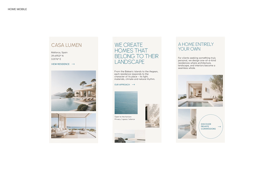

A luxury property deserves a presentation that does it justice.
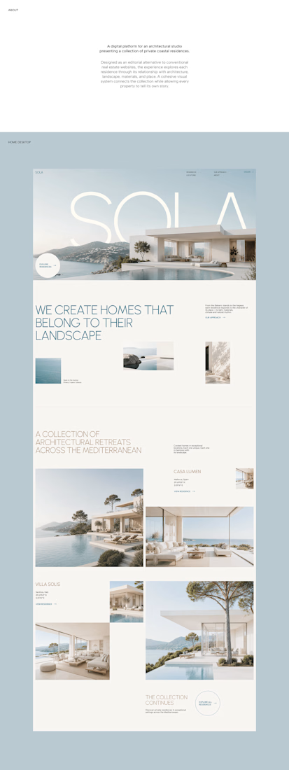
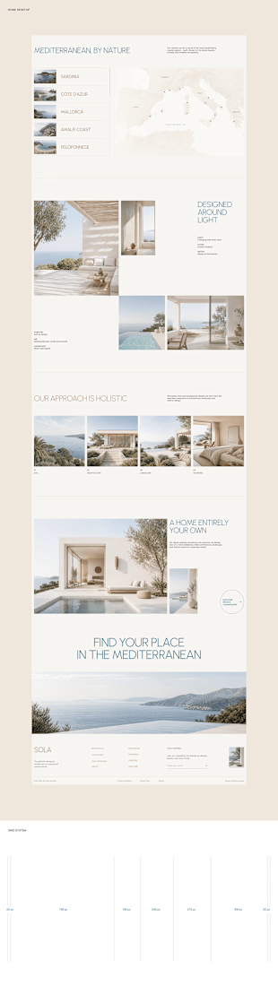
With SOLA – Architecture Studio & Luxury Real Estate, I wanted to bring the beauty of modern coastal architecture into the website itself.
From the large property images and soft blue tones to the clean layout across desktop and mobile, every part of the design helps create a calm, premium feel while making the homes the centre of attention.
I like how the website brings architecture and digital design together, giving visitors a chance to explore the properties before making an enquiry.
If you were looking for a luxury home, would a website like this make you more interested in the property?
#WebDesign #Architecture #LuxuryRealEstate

Incredible work, you transformed SOLA into a premium property brand.


Every element feels perfectly placed! 👏


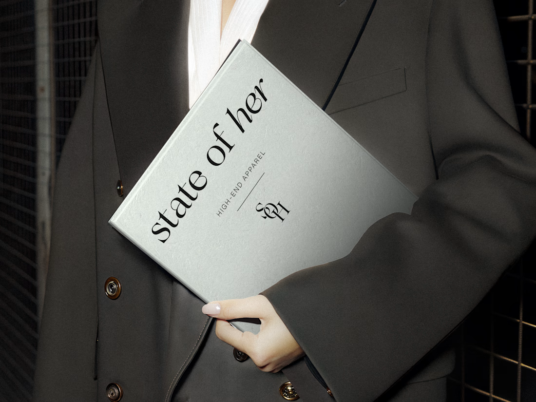
Introducing State of Her, a womenswear brand made for every state of her life.
Custom typography, sculptural monograms, and a softly grounded palette come together in an identity that balances confidence with ease.