The network for creativity
Join 1.25M professional creatives like you
Connect with clients, get discovered, and run your business 100% commission-free
Creatives on Contra have earned over $150M and we are just getting started
Back to feedPost

Designed a salad ordering experience around one simple idea:
Build Your Bowl. 🥗
The goal was to make healthy food ordering feel more personal by letting users create their own salad, choose their ingredients and customize their bowl.
I worked on both the branding and product design, taking the visual identity into a complete web and mobile experience.
From the brand language to the ordering flow and Build Your Bowl experience, the focus was on keeping everything simple, intuitive and enjoyable to use.
A little look at the work.
Logo Design • Product Design • UI/UX • Web • Mobile

The network for creativity
Join 1.25M professional creatives like you
Connect with clients, get discovered, and run your business 100% commission-free
Creatives on Contra have earned over $150M and we are just getting started











Related posts

sentences
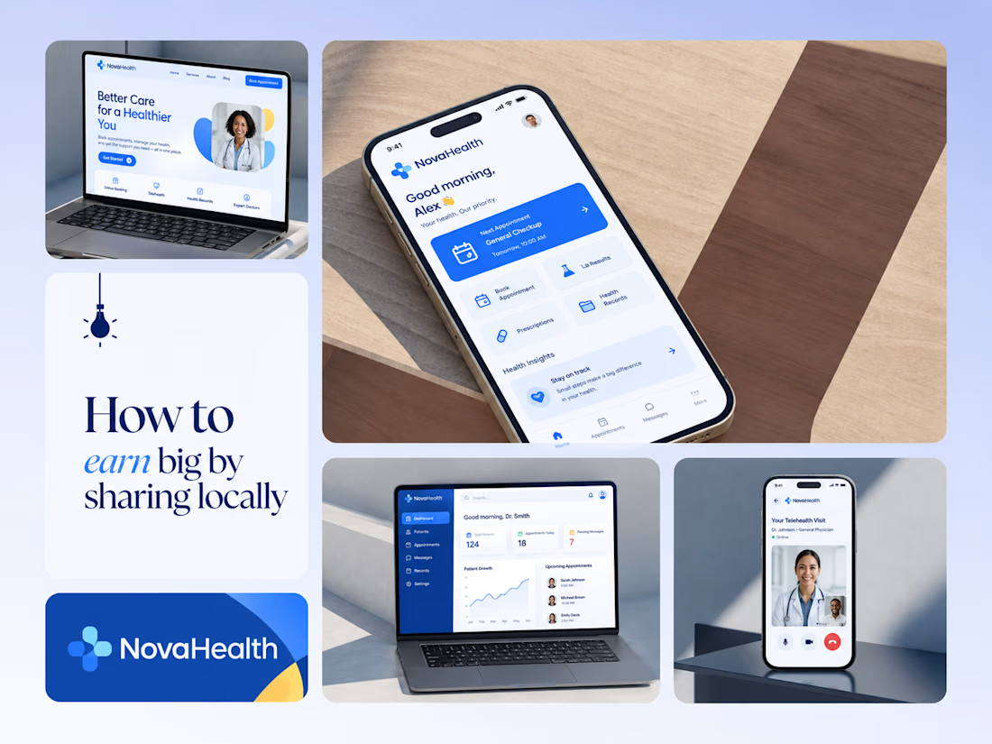
One brand, three screens: patient, doctor, and the video call between them.
NovaHealth is a healthcare brand and product system I designed from logo to apps. Healthcare software tends to feel either cold and clinical or too cluttered to open. I wanted something calm for a worried patient and quick for a doctor between appointments.
The logo breaks the classic medical cross into soft, rounded blocks in two blues, so it reads as “health” without feeling sterile.
The patient app opens with one thing: a solid blue card showing your next appointment. It’s the only fully saturated block on the screen, so nothing competes with it.
The doctor dashboard is built for a glance. Total patients, today’s appointments, and pending messages come first, in the same blue and rounded style as the patient app.
The telehealth screen has almost no UI. The doctor’s face fills the screen, with just three controls: mic, camera, and a red end-call button, the only red in the whole system.
One rule ties it together: blue means action, white space means calm, and yellow is a small spark of warmth.
Which screen should I break down next? 👇


Great medical brand design specially the phone app UI and top left laptop dashboard 🔥🔥🔥
great job Joshua ❤️🎉

Same design. Which palette? 👀
You picked your favorite preview last time. This time, I’m putting the colors to the vote.
One body-care packaging concept, with the same typography and composition:
A · Rose Cream, Strawberry Sorbet + Plum Jelly
B · Lime Mousse, Coconut Cream + Plum Jelly
Which would you choose and what does it make you feel about the brand?
Both palettes use colors and matching ingredient textures from DCS 654, my library of 654 dessert-inspired colors.
Take a closer look: dcs.mariya.design
7 voted
44%
9 voted
56%
16 votes
Closed
B is absolutely stunning 🎉🎉🎉🎉
Great job Mariya❤️

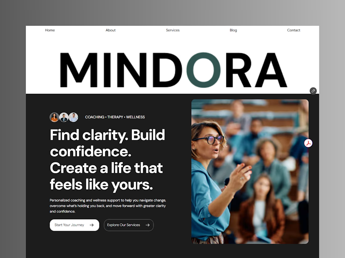
Introducing Mindora — a Life Coaching & Wellness Framer Template.
I designed Mindora for life coaches, wellness professionals, and personal growth brands looking for a calm, modern, and welcoming online presence.
Inspired by clarity, confidence, and meaningful growth, Mindora features a thoughtful layout, dedicated service sections, a blog for sharing valuable insights, and a clean visual style designed to help brands connect with their audience.
Built with Framer, it's a customizable starting point for creating a professional coaching or wellness website.
Explore Mindora and bring your next website idea to life.
Kindly check it out the template: https://www.framer.com/marketplace/templates/mindora-life-coach/



Great work