The network for creativity
Join 1.25M professional creatives like you
Connect with clients, get discovered, and run your business 100% commission-free
Creatives on Contra have earned over $150M and we are just getting started
Back to feedPost

Navigation Designed for Instant Decisions, Not Extra Thinking.
Navigation is one of those products people interact with while their attention is somewhere else. That means every visual decision has to reduce cognitive load instead of adding to it.
For this concept, I focused on three principles:
One dominant action. Orange is reserved only for information that requires immediate attention, such as the active route, progress, and navigation action. Everything else remains monochrome, creating a clear visual hierarchy.
Readable at a glance. Large typography, high contrast, generous spacing, and simplified cards make the most important information understandable in less than a second, even during movement.
Hardware and software as one product. The hexagonal form, premium materials, and restrained UI language are designed to feel like a single industrial product rather than a screen placed inside a device.
The result is an interface where every colour, icon, and layout decision has a purpose. Instead of decorating the UI, the design helps users focus on the road while receiving only the information that matters.


The network for creativity
Join 1.25M professional creatives like you
Connect with clients, get discovered, and run your business 100% commission-free
Creatives on Contra have earned over $150M and we are just getting started
Trending

Claude
Claude has entered the design space. How are you using it?

Contra University
Learn from expert creatives how to earn more using next-gen AI tools.
Brand Design
The best brand designers are on Contra. Scroll to see what's trending in brand design. What are you building?
creativeaiflow
Creative AI workflows are evolving. What tools do you use, and what are their strengths and weaknesses?
freelancerlife
Freelancer life is wins, pivots, and everything in between. What’s yours right now?



Related posts

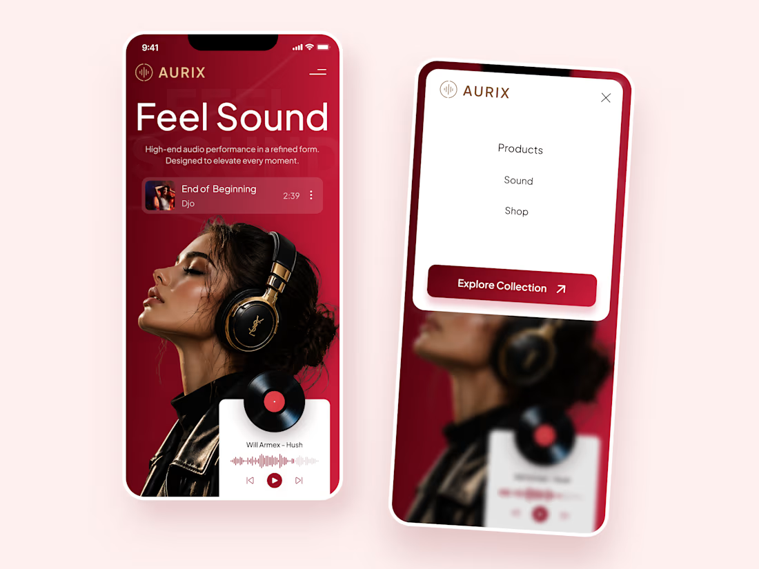
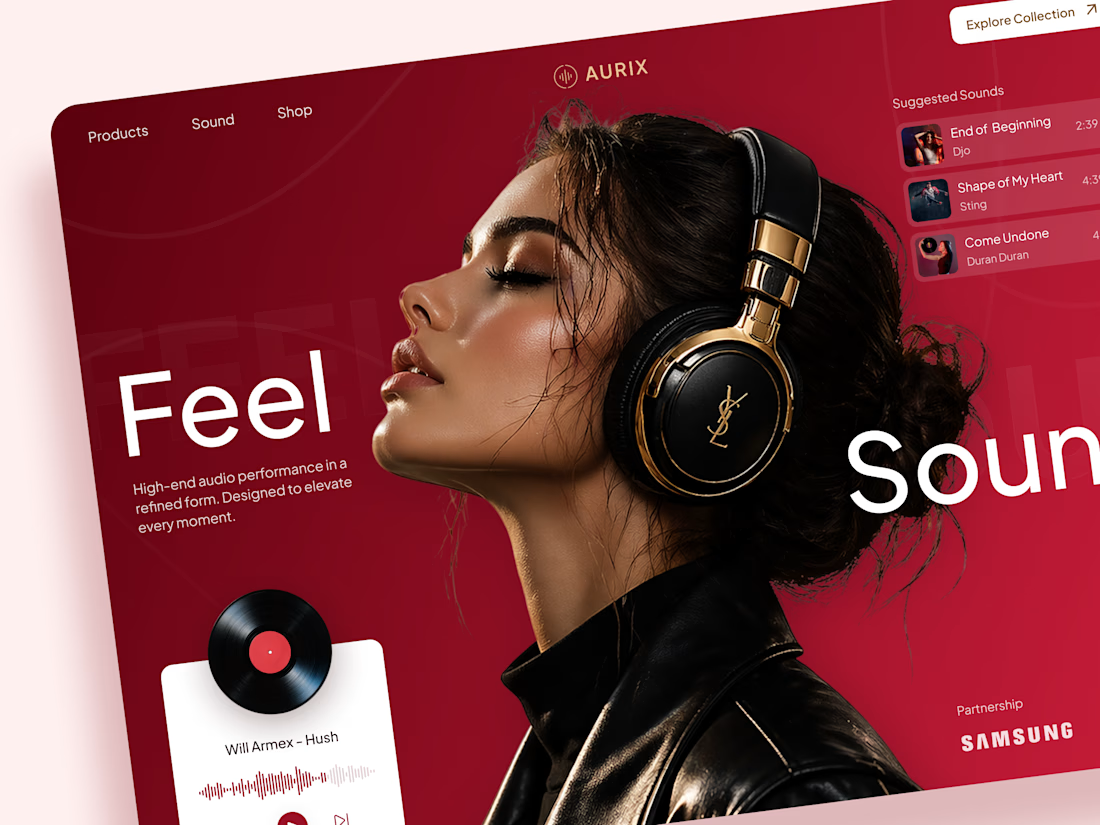
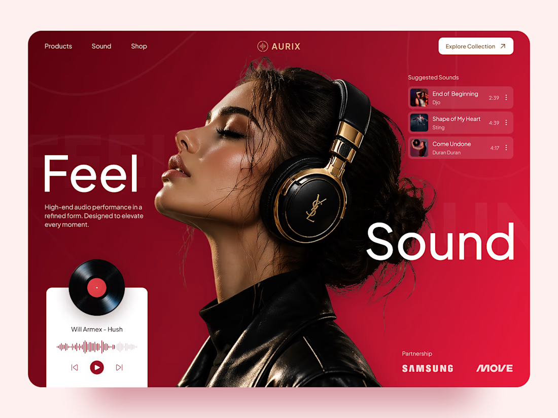
AURIX — Premium Audio Product Landing Page 🎧✨
AURIX is a bold landing page concept created for a premium audio brand focused on high-end sound, refined design, and an immersive listening experience.
The goal was to make the product feel aspirational from the first screen while keeping the interface clear, modern, and easy to explore. The visual direction combines rich red tones, editorial typography, premium lifestyle imagery, and interactive music elements to create a digital experience that feels both luxurious and emotionally engaging.
Special attention was given to:
• a cinematic hero section that places the headphones and listening experience at the center;
• premium product positioning supported by elegant typography and a refined color system;
• responsive desktop and mobile layouts designed for smooth product discovery 📱;
• music player components that add interaction and reinforce the audio-focused concept;
• suggested tracks and collection navigation that make the experience feel more dynamic;
• strong calls to action guiding users toward exploring the product collection;
• a scalable visual system suitable for product launches, campaigns, and future e-commerce pages.
The result is a memorable digital experience that helps AURIX feel premium, modern, and emotionally connected to music — combining product storytelling with a clear path toward discovery and purchase 🎶
Looking to create a bold landing page for your audio, lifestyle, technology, or consumer product brand? Let’s build something people can feel ⚡


so cool! 🔥


We're exploring two interaction patterns for a services section.
Option 1 - Direct Navigation. Users preview a service on hover and navigate directly on click.
Option 2 - Progressive Disclosure. Users expand the card first, explore additional details, and then decide whether to continue.
Both approaches aim to reduce uncertainty before navigation. The trade-off is simple: speed vs. exploration.
Which pattern would you choose, and in what situations would you use the other one?


53 voted
65%
29 voted
35%
82 votes
Closed

Option 2 is not actually bad, but it may be difficult for users to navigate. From what I’m seeing, users would need to place their cursor over the section before they realize that a feature is hidden there.

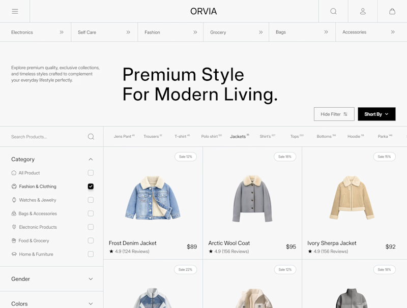
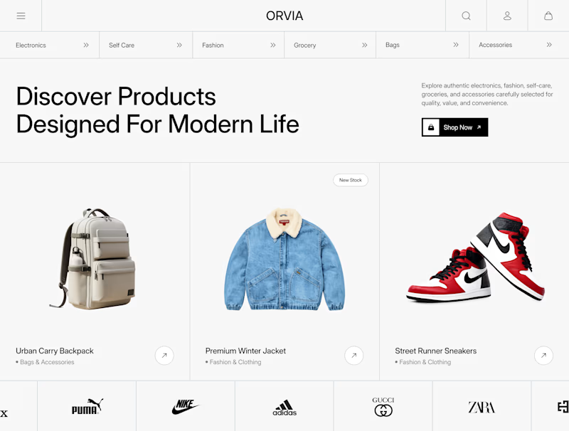
Which homepage would make you explore the store first?
Not every eCommerce store needs more colors.
Sometimes better hierarchy, spacing, and product-first layouts do the heavy lifting.
Here's a small preview of a concept we've been crafting.
Left Label: Product Listing
Right Label: Homepage
6 voted
35%
11 voted
65%
17 votes
Closed

I’d explore the homepage first; the strong hierarchy and curated product highlights make the store feel instantly engaging.