The network for creativity
Join 1.25M professional creatives like you
Connect with clients, get discovered, and run your business 100% commission-free
Creatives on Contra have earned over $150M and we are just getting started
Back to feedPost


Branding for a cause I won't forget.
When ACE Resource Network came to me, they were a national nonprofit with a massive mission and no visual identity. Their work is breaking the cycle of childhood trauma through real systems change. Legislation, hospital protocols, clinician training. The kind of brief that makes you sit up a little straighter.
The challenge was finding the balance. The work is about Adverse Childhood Experiences in kids, but the brand isn't for kids. It speaks to clinicians, legislators, and state partners across red states and blue states alike. Too playful and you lose credibility. Too clinical and you lose the warmth that makes people lean in.
So I built the full brand identity. Strategy, positioning, logo, visual system, and guidelines. Something functional, welcoming, and human. A brand strong enough to anchor a movement, humble enough to let everyone else shine.
This is the kind of work I want more of!
See the full brand identity!
ACE Resource Network → Website
The network for creativity
Join 1.25M professional creatives like you
Connect with clients, get discovered, and run your business 100% commission-free
Creatives on Contra have earned over $150M and we are just getting started











Related posts

Not every client comes to me for a brand identity and not all my clients are skincare or cosmetic brands.
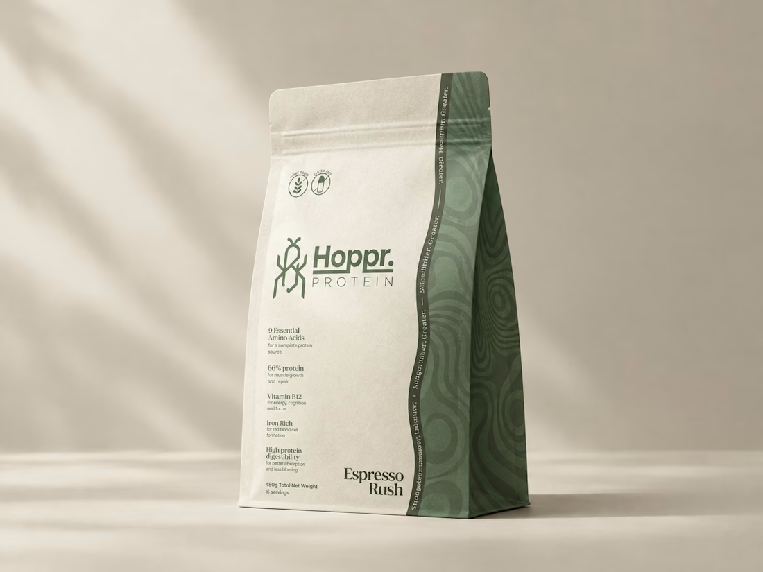
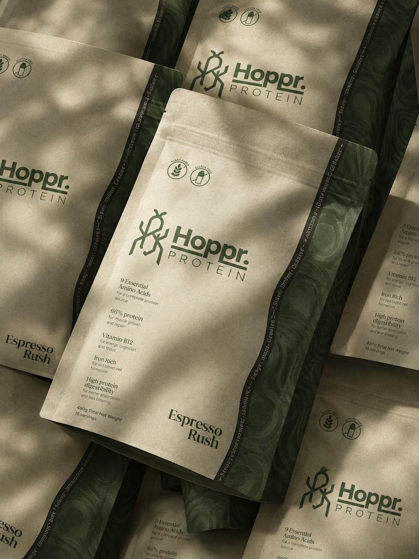
That was the case with Hoppr, a protein powder brand made from crickets. 🦗 YES, CRICKETS!
Sometimes the logo, colors, and visual system are already there and my job is to bring them to life on packaging and see how far I can push them.
I love projects like this because I get to play with typography, layout, and materials while working within an existing identity.
How much freedom do you think a designer should have when working with an established brand?


Great packaging work, nice job

HuroPay Branding for Fintech
We built its identity to feel the same way: fast, clear and human.
Need a branding? DM Now...
#branding #brandidentity #logo


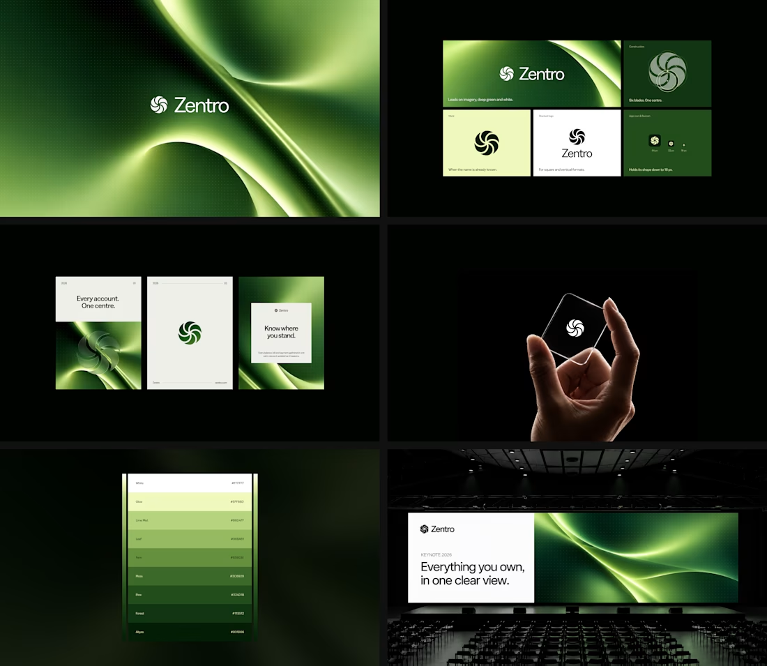

Clean and confident work! The green gradient with the mark feels very modern for fintech - trustworthy but not boring. The app screens look really polished. Curious how you landed on this mark, does it represent growth / movement?