The network for creativity
Join 1.25M professional creatives like you
Connect with clients, get discovered, and run your business 100% commission-free
Creatives on Contra have earned over $150M and we are just getting started
Back to feedPost
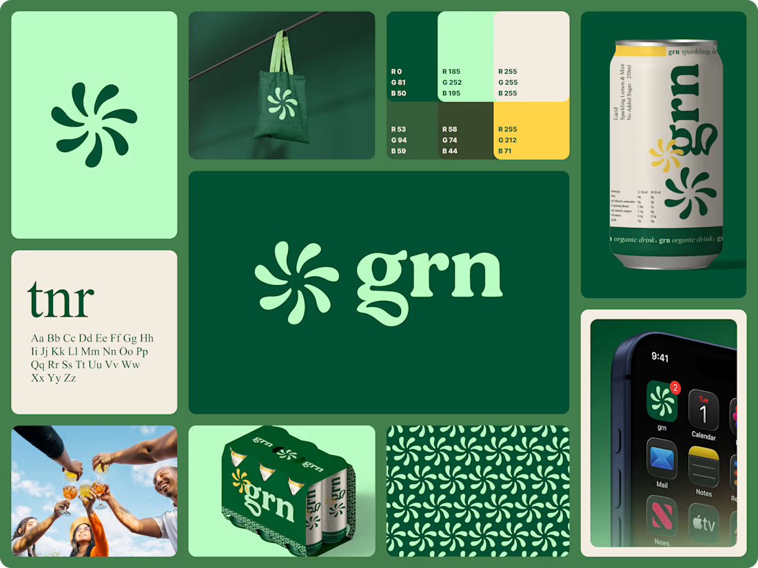
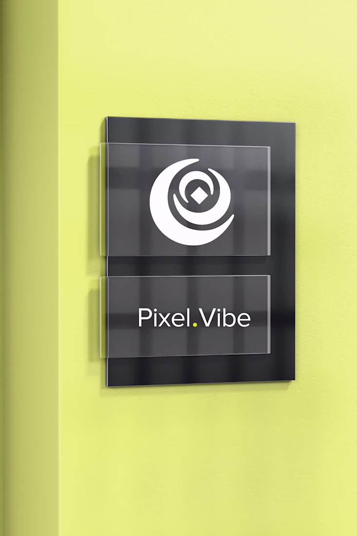
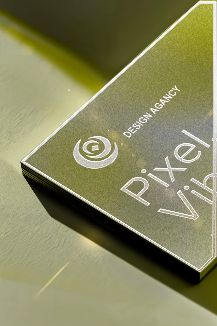
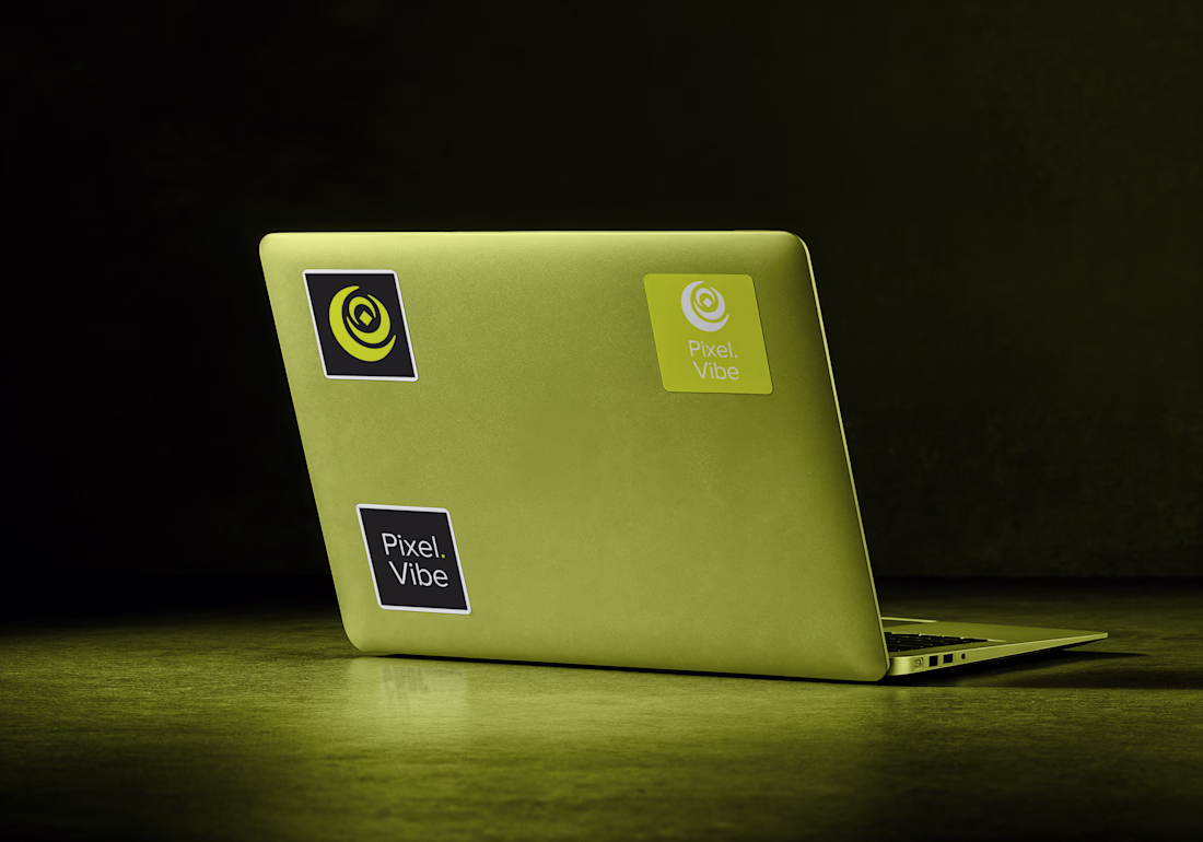
Built a complete brand identity for grn, a certified organic sparkling drink brand built around community and health.
The work covered everything from the ground up: logo, mark development, colour system, typography, packaging, can label, 6-pack carton, collateral, pattern design, and digital touchpoints.
The spinning petal mark is the heart of the brand: nine organic teardrops in a radial formation capturing movement, nature, and community in a single symbol. Paired with a rounded serif wordmark, the identity balances the classical with the organic, confident without being corporate.
The color system: forest green, mint, cream, and gold, works across every surface, from packaging to digital to print. Every color has a role. Nothing is decorative.
Brand DesignLogo DesignAdobe IllustratorAdobe PhotoshopFigmapackagingbrandingpackagingdesignexpertsbrandingPackaging Design
The network for creativity
Join 1.25M professional creatives like you
Connect with clients, get discovered, and run your business 100% commission-free
Creatives on Contra have earned over $150M and we are just getting started
Related posts
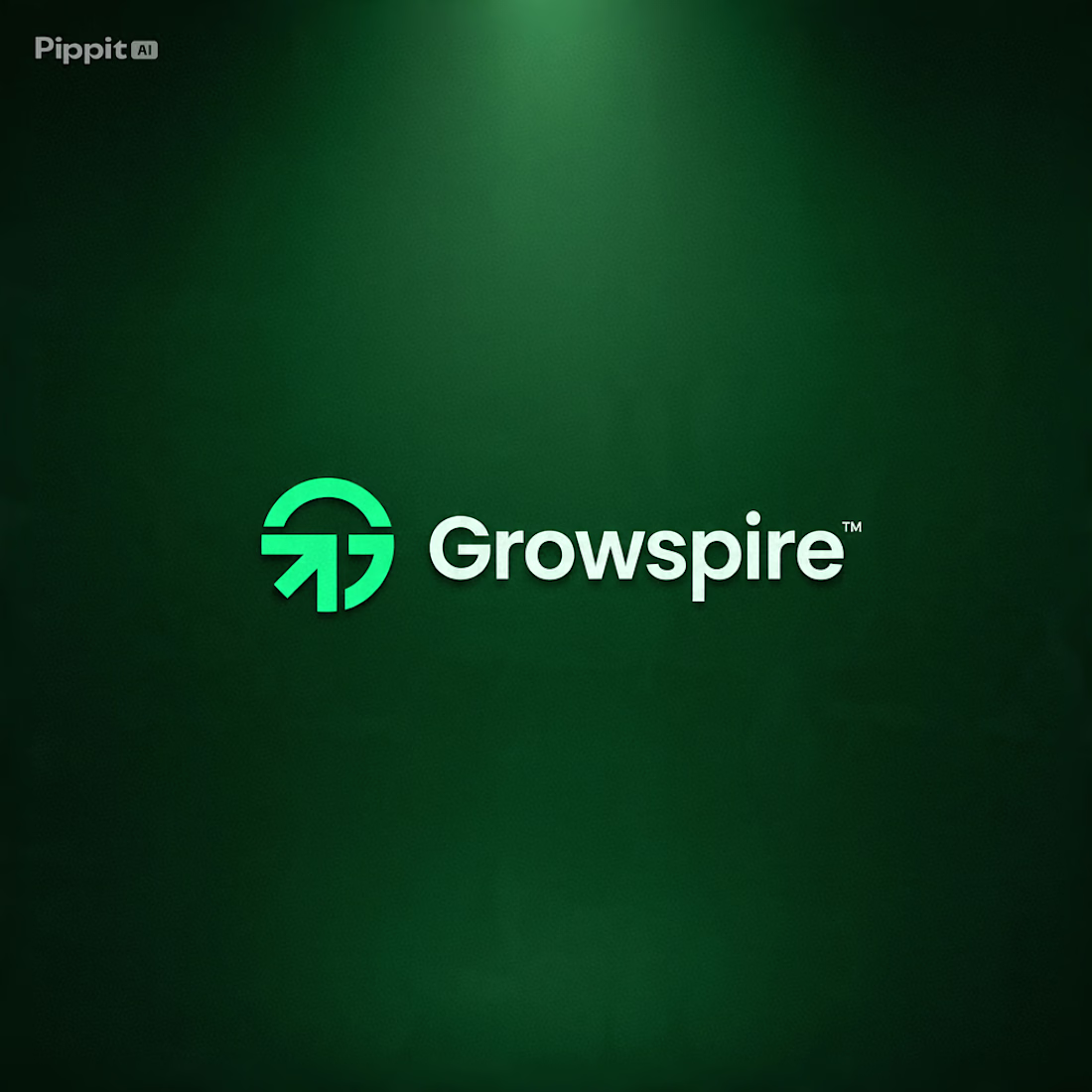
How do you design a brand that represents growth… without relying on the usual leaf or tree icon? 🌱🤔
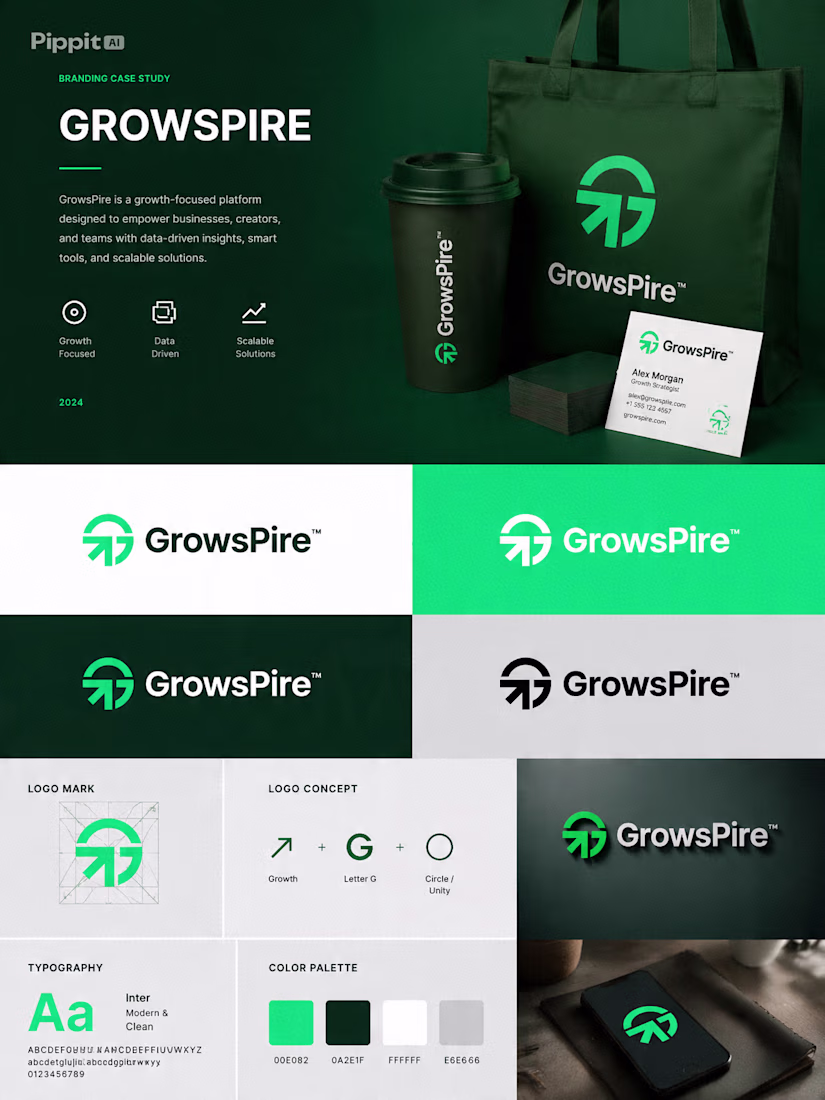
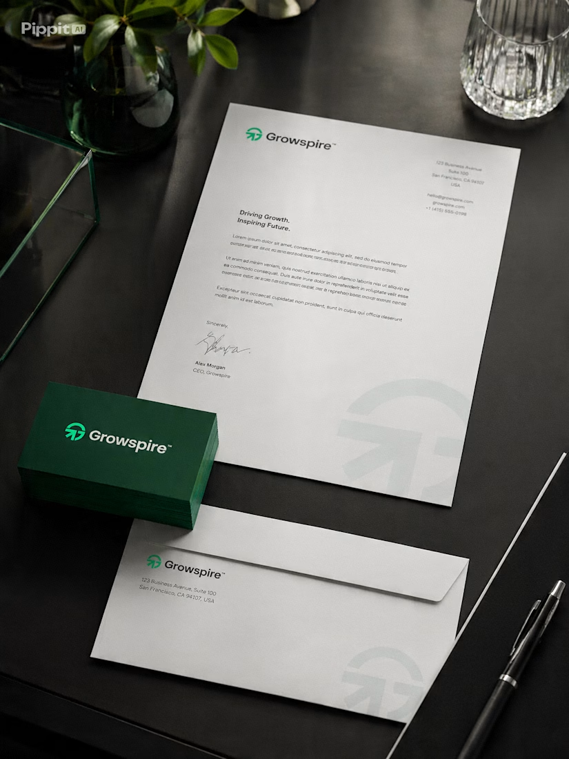
That's the creative challenge I explored with Growspire.
Growth is often visualized through plants, but I wanted this identity to feel more strategic, modern, and future-focused rather than predictable. Instead of following common symbols, I focused on upward movement, clean geometry, balanced proportions, and a minimal mark that communicates ambition, progress, and momentum.
Every curve and angle was carefully refined to create a logo that feels timeless, scalable, and instantly recognizable across digital and print applications.
This is more than just a logo—it's the foundation of a brand built to inspire confidence, innovation, and long-term growth.
I'd love to hear your thoughts... If you had to communicate growth without using a leaf, what symbol or concept would you start with? 💬🌿
Great work
Portugal's FA shipped a new logo mid world cup.
by the end of the week: it will never appear on the shirt. institutional use only. players keep the old crest.
an identity is proven by the surfaces it's allowed on. exempt the highest-stakes one and you've admitted the brand can't carry you.
b2b runs the same retreat quietly. new site ships, sales keeps the old deck "until the quarter closes," product waits for the redesign. two brands in market, and the old one owns every surface where money changes hands.
That line about the sales team quietly keeping the old deck 'until the quarter closes' is such a brilliant, overlooked observation. It’s so true—we often talk about branding at a high level, but the real test is always in those small, practical corners where revenue actually...
Good logo🙌
Trending
Claude
Claude has entered the design space. How are you using Claude Design?
Contra University
Learn from expert creatives how to earn more using next-gen AI tools.
fifaworldcup2026
The World Cup is here and the whole world's watching. How are you designing for the world stage?
creativeaiflow
Creative AI workflows are evolving. What tools do you use, and what are their strengths and weaknesses?
freelancerlife
Freelancer life is wins, pivots, and everything in between. What’s yours right now?