The network for creativity
Join 1.25M professional creatives like you
Connect with clients, get discovered, and run your business 100% commission-free
Creatives on Contra have earned over $150M and we are just getting started
Back to feedPost
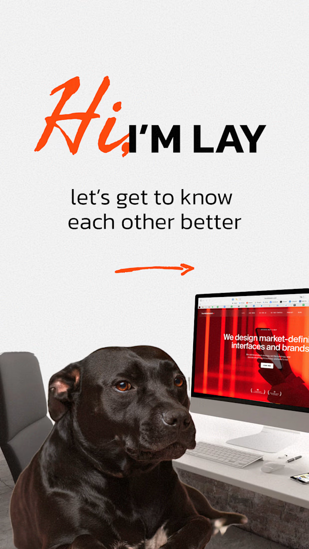
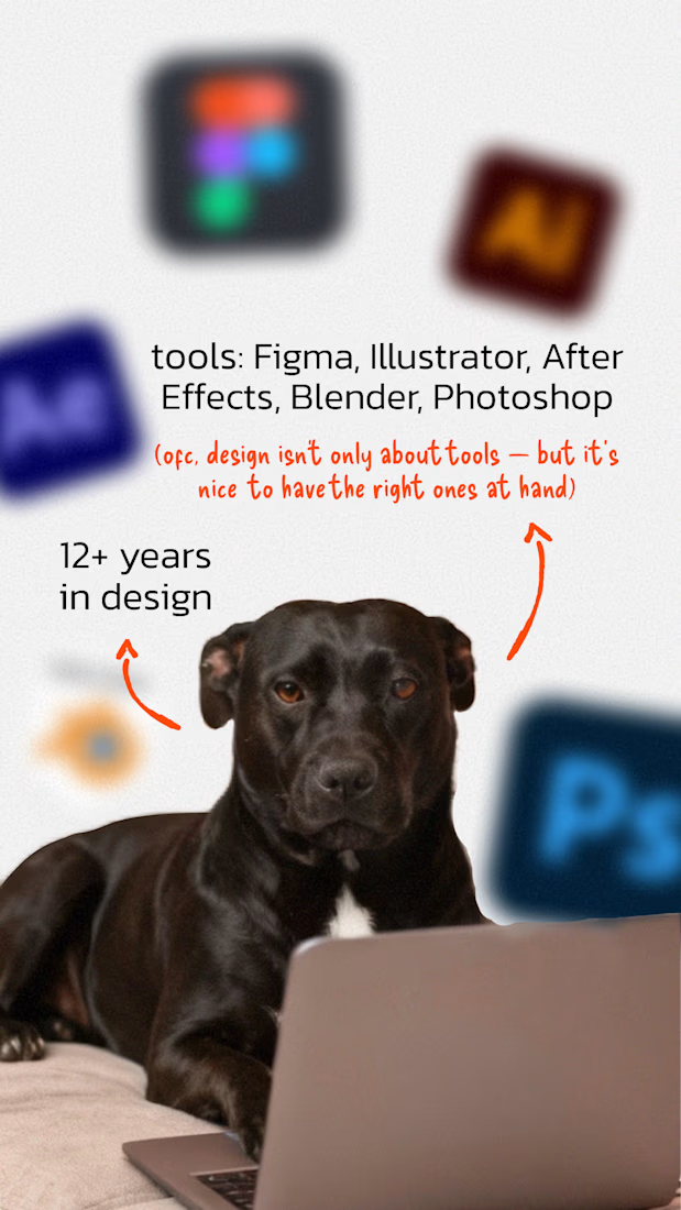
Hi there! I'm Lay, I’ve been designing interfaces for 12+ years and still get excited every time a screen finally clicks.
I work full time as a UX/UI designer Humbleteam and love to take new challenges on my own!
I love turning messy ideas into clear flows, confusing screens into calm experiences, and “something feels off” into “ah, now it works.”
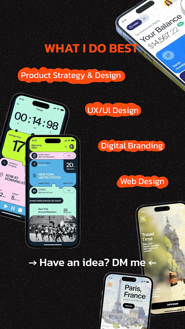
What I do best:
– UX that doesn’t need explanations
– Interfaces that feel light but are built with logic
– Design that supports growth, not just Dribbble likes
– Branding that clicks with your audience
*Everyone asks what's up with the dog photos – I'm not ready to show my face on social media, so check out my dog :)

Love this intro, Lay. UX that doesn’t need explanations” is such a strong way to put it—and honestly the best compliment a product can get. Turning “something feels off” into “ah, now it works” is real senior-level craft.
Also, the dog-as-avatar move is iconic 🐶✨ privacy and...

thank you so much!

Love this, excited to see more of your work this year! Also your photos remind me of the show Dog with a Blog, too cute 🤭
Maybe in the future I'll film my own show too :)

good work
thanks!
The network for creativity
Join 1.25M professional creatives like you
Connect with clients, get discovered, and run your business 100% commission-free
Creatives on Contra have earned over $150M and we are just getting started







Related posts

What if your watch collection had a dashboard this luxurious?
Meet Chronova. Built for collectors who care about every detail.
Would you use this?


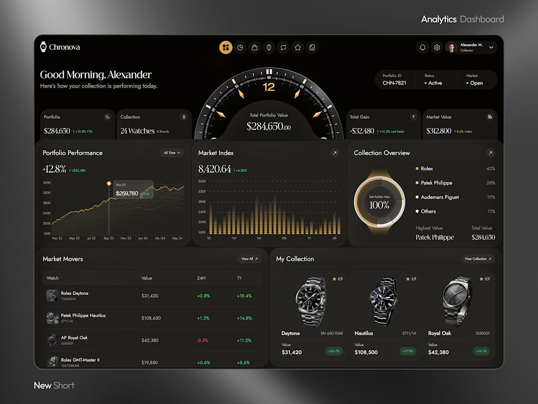
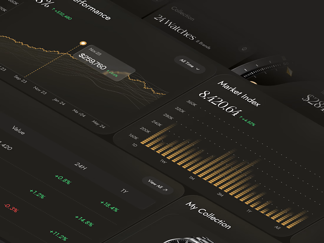
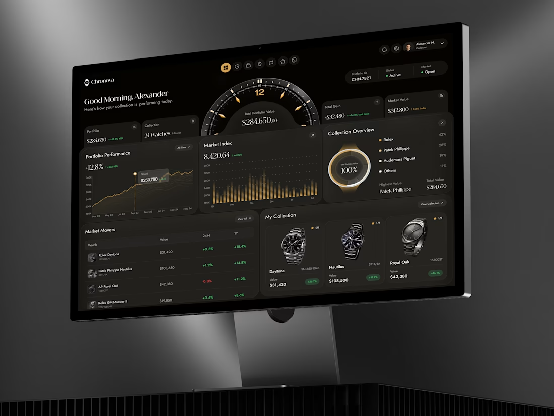

a dark dashboard makes sense here, the watches get to be the brightest thing on screen. how do you show a collection's value changing without it feeling like a trading app?

Same collection. Two different experiences.
Would you choose the bold, playful catalogue or the calm, architectural gallery?
Both complete websites are free to download — source code, assets and animations included.
Grab the kit: https://contra.com/products/FNrYmtZe-stillform-two-animated-landing-pages
10 voted
53%
9 voted
47%
19 votes
Closed


MAGMA: A Liquid Light Instrument
A single HTML physics-driven lava lamp. Every blob carries heat it soaks it up at the floor plate, rises on buoyancy, sheds it at the cap, stalls, and sinks-the canonical lava-lamp circulation, with nothing keyframed.
Blobs merge by transferring mass through sustained contact; overheated giants pinch off children. Total volume is conserved, so the lamp never empties. The surface is a metaball scalar field shaded through a palette LUT, with marching-squares iso-contours stroked on top as a glass rim and a fresnel crown. Run it hot and champagne micro-bubbles boil off the plate - flip gravity mid-rise and they hang weightless.


Anyone who wants to check this build live can visit my JSFiddle here: https://jsfiddle.net/Saminsami/1rvay2bx/1
jsfiddle.net
MAGMA - SAMIN
SAMIN - a HTML example you can edit and run in your browser on JSFiddle.