Lay UX/UI and branding
Product & brand designer with 12+ years of experience
Profile in progress
Lay is building their profile!
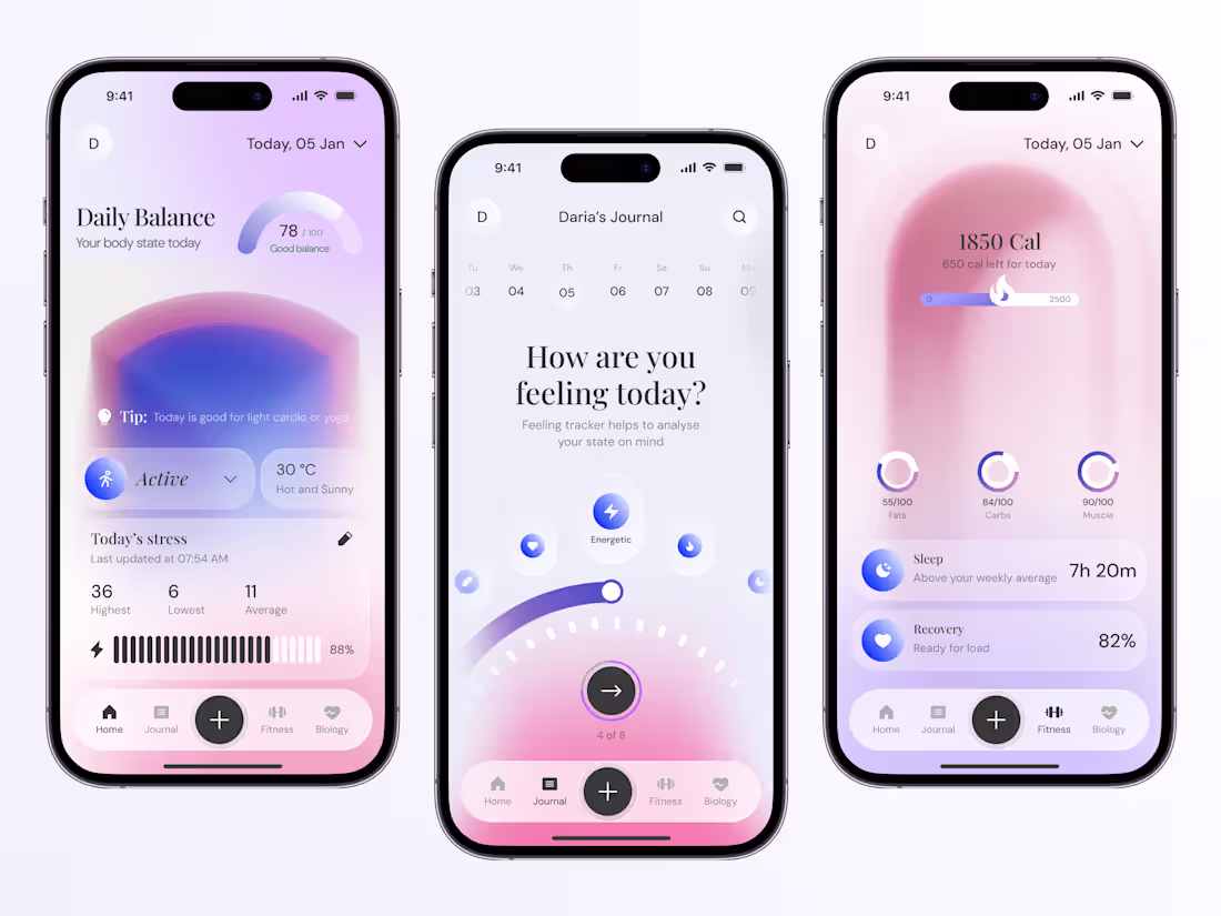
Soft Pulse is a mobile interface concept exploring rhythm, softness and emotional feedback 🏙️
The design uses translucent layers, blurred gradients and subtle motion to express change without explicit instruction.
The interface acts as an ambient surface – calm, minimal and intentionally abstract – inviting observation rather than control.
Have an idea in mind? Designs don’t make themselves – contact me via email setbukonen@gmail.com
(mailto:setbukonen@gmail.com)❤️ if you love it and share your thoughts on this one!
14
111
Meet Revive – the new playful app concept
In this one, I wanted to show a world where creativity has no age limit. Where bold colors, oversized typography, and quirky characters make the whole experience feel vibrant and alive.
I tried to make the sports & lifestyle niche look more expressive, more energetic and a lot less predictable.
❤️ if you love it and share your thoughts on this one
And if you want something this bold for your product → DM me or email sethbukonen@gmail.com (mailto:sethbukonen@gmail.com)
16
34
369
Meet the new concept that turns classic art into a modern, immersive digital gallery 🎨🖼
Soft gradients, serif typography, and minimal UI let the paintings take center stage – so every screen feels like stepping into a curated exhibition.
From Renaissance portraits to modern masterpieces, the interface blends storytelling with clean navigation, helping users explore artists, museums, and collections with ease.
❤️ if you love it and share your thoughts on this one
Have an idea in mind? Designs don’t make themselves – contact us: setbukonen@gmail.com (mailto:setbukonen@gmail.com)
1
19
173
Where fashion meets art – and design ties it all together
This concept reimagines an event app for the creative scene – bold typography, dynamic grids, and layered motion give every screen the energy of a live exhibition.
It’s not just an app – it’s a digital stage for creativity.
❤️ if you love it and share your thoughts on this one
→ DM me or email sethbukonen@gmail.com (mailto:sethbukonen@gmail.com) - let’s design something that moves people
6
13
132
Meet the new app concept where taste meets power 🧋
A vibrant concept blending fitness aesthetics with bubble tea culture. Rich purples and soft yellows create a bold yet refreshing contrast – inspired by energy, flavor, and flow.
Clean grids, curved elements, and floating visuals bring a sense of motion and lightness, turning every product card into a mini flavor experience.
💜 Like if you’d use it
→ Our inbox is open – drop us a line and let’s create sethbukonen@gmail.com (mailto:sethbukonen@gmail.com)
3
128
Meet DogHub – the ultimate space where every wag matters :)
From grooming and playdates to boutique shopping and treats, DogHub brings all things dog into one joyful experience.
The design combines retro-inspired typography, pastel contrasts, and playful characters to build a warm, welcoming tone – as friendly as the tails it serves.
Soft blues and creamy corals create familiarity, while bold accents keep it lively and modern. Every screen feels like a cheerful poster – because this app is more than just a service hub.
❤️ Like if you’d spend your afternoon here
→ DM me or email sethbukonen@gmail.com (mailto:sethbukonen@gmail.com) to bring your next concept to life
2
2
126
Meet Brew Bliss – a coffee app concept that turns every order into a little ritual ☕
Hand-drawn illustrations meet a clean layout to create a warm, personal feel – from your first tap to your last sip.
Think of it as your digital café corner: simple, cozy, and full of flavor.
❤️ if you love it and share your thoughts below!
Contact us to start your project → sethbukonen@gmail.com (mailto:sethbukonen@gmail.com)
8
11
135
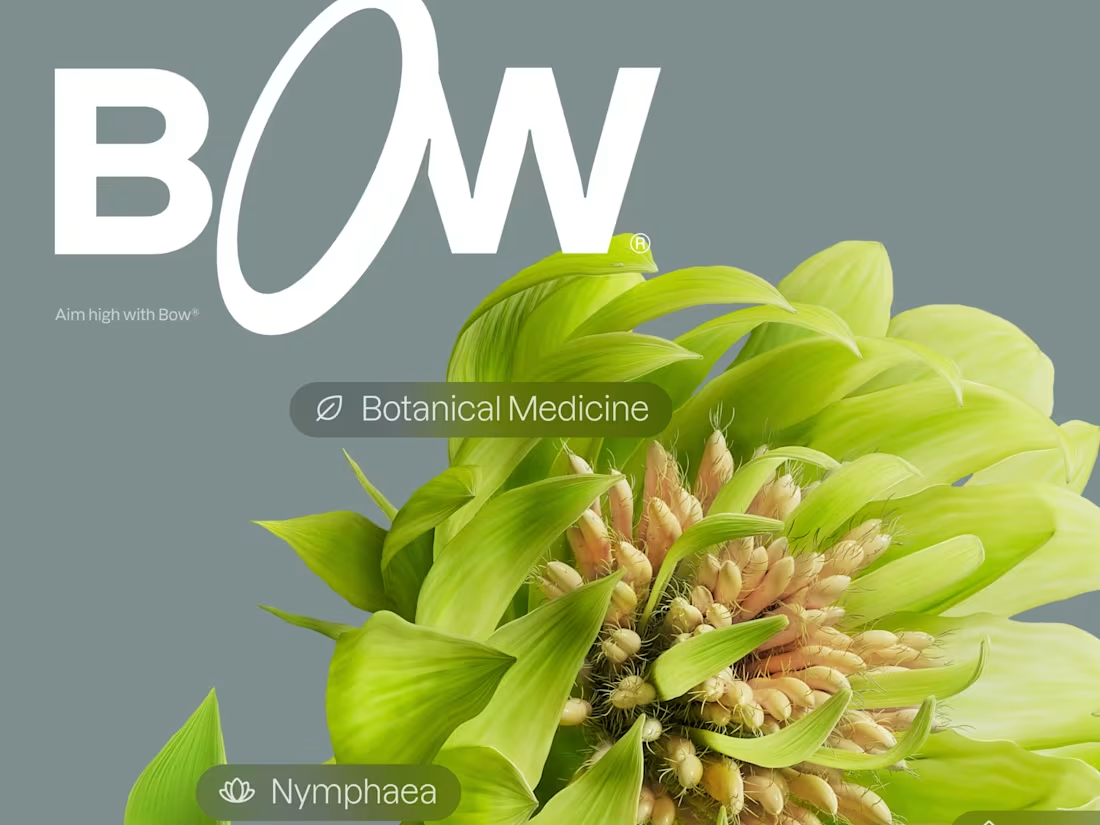
Brand identity and UI/UX for a healthtech startup Bow®
1
3
Designed the WRC iOS app concept from scratch in just 2 weeks 🚀
Built a bold UX/UI focused on gamification and seamless streaming.
The result: a dynamic hub where fans can pick teams, earn rewards, and watch live rally action - all in one place.
❤️ if you love it and share your thoughts on this one!
Ready to take your product to the next level? Let’s talk: setbukonen@gmail.com (mailto:setbukonen@gmail.com) 📩
16
178
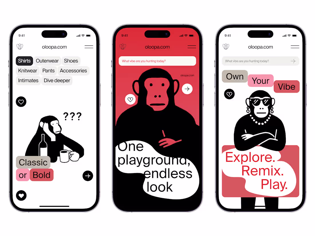
Oloopa - Fashion Playground 🔥
This is a concept for a style-powered platform - a playful yet modern space where users can explore, mix, and own their vibe.
With bold characters, witty visuals, and simple navigation, it invites people to experiment with looks, unlock fresh combinations, and connect with a community that celebrates expression and individuality.
Every screen is crafted to make fashion feel approachable, reduce the fear of “getting it wrong,” and highlight the fun of remixing everyday pieces into something completely yours.
❤️ if you love it and share your thoughts on this one!
Ready to take your product to the next level? Let’s talk: setbukonen@gmail.com (mailto:setbukonen@gmail.com) 🚀
21
232
Meet our new app concept where generative typography meets brutalist visuals.
Symbols, grids, and data fragments evolve into dynamic patterns - turning raw system language into bold design statements.
❤️ if you love it and share your thoughts on this one!
Our inbox is open - drop us a line and let’s create setbukonen@gmail.com (mailto:setbukonen@gmail.com)
2
14
182
Exited to submit my work for my very first #ShareYourWork challenge! This mobile app concept brings the spirit of tattoo culture into digital form 📲
A retro-inspired color palette of beige and black sets the stage, while sharp orange accents lead the eye to key actions like booking and browsing designs.
Artist spotlights, portfolios, and booking flows are all designed to feel intuitive yet full of character. From discovering new artists in your city to flipping through flash designs, every screen captures the rebellious, creative edge of the tattoo community.
❤️ if you love it and share your thoughts on this one!
21
228
The new mobile app concept reimagines a fitness app experience ⚽️
Bold, dynamic and built to keep users engaged. Bright color blocks highlight progress, heart rate and key statistics at a glance, making data simple and motivating rather than overwhelming.
From exercise breakdowns to step-by-step activity graphs, every screen is crafted for clarity and usability. A dark interface provides contrast for vibrant stats, while the modular card layout ensures intuitive navigation and a smooth flow between goals, rewards and performance tracking.
It’s a design that turns progress into motivation and helps users stay on track, one step at a time.
❤️ if you love it and share your thoughts on this one!
22
204
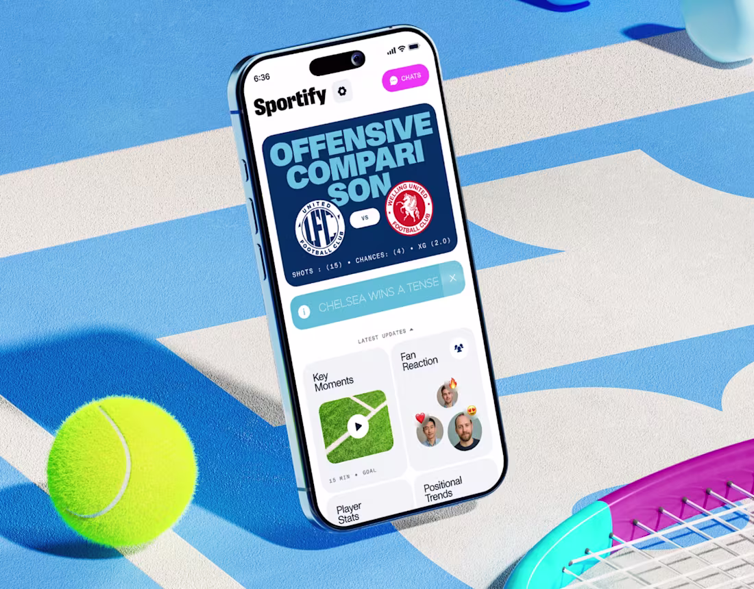
AI Sports Assistant: Design & Identity for Sportify
0
0