The network for creativity
Join 1.25M professional creatives like you
Connect with clients, get discovered, and run your business 100% commission-free
Creatives on Contra have earned over $150M and we are just getting started
Back to feedPost

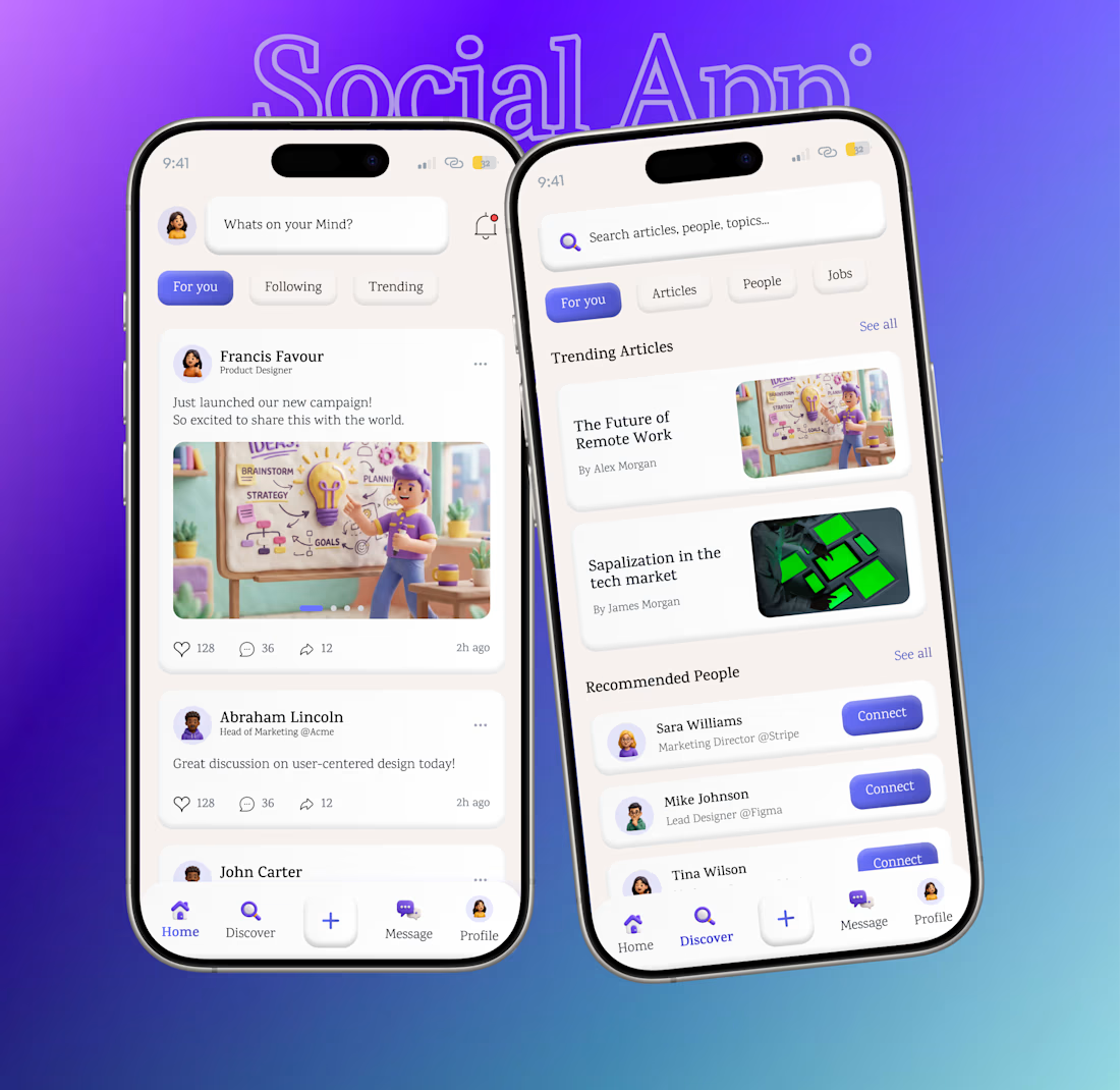
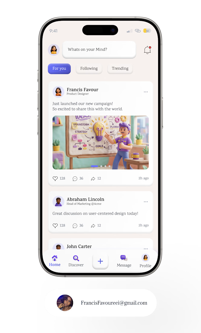
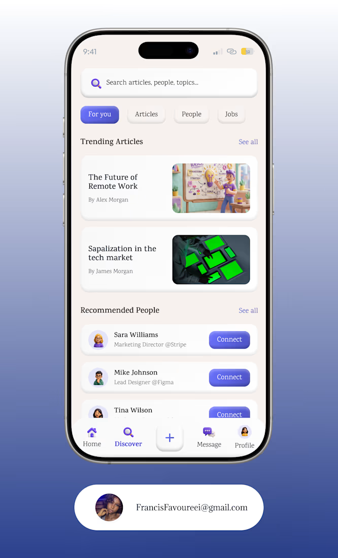
I’ve been exploring different visual styles lately, and this time I went with Claymorphism.
Started with the idea of making a “soft” UI.
Then came the shadows.
Then came adjusting the shadows.
Then adjusting them again. 😂
That was basically my Claymorphism experiment.
I wanted the interface to have depth and personality, but still feel clean enough that the content remained the main character.
It’s interesting how much you can change the feeling of a screen without changing the actual layout, sometimes it’s just light, shadow, spacing and restraint.


Good Work!!!!

You captured the Claymorphism trade-off really well: the depth adds personality, but the restraint keeps the content legible. The repeated shadow adjustments are exactly where this style is won or lost.
The network for creativity
Join 1.25M professional creatives like you
Connect with clients, get discovered, and run your business 100% commission-free
Creatives on Contra have earned over $150M and we are just getting started

Challenges
View all


Related posts


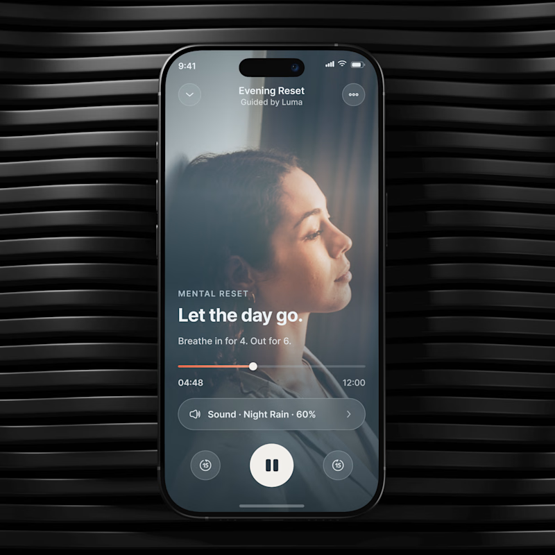
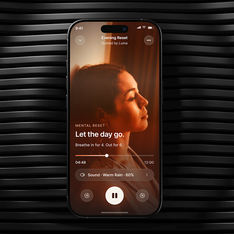
🧪 TASTY TEST 04/30
Which mood would make you more likely to start?
🔥 A Grounded Warm, intimate, cocoon like.
🌫️ B Weightless Cool, airy, spacious.
Same UX. Different emotional temperature.
💡 Growth Insight: visual mood can change how easy the same action feels.
Which one would you choose? A or B?
04/30. 26 experiments left. Follow for the next one.
👉 BOOK A MOBILE APP STRATEGY SESSION
https://calendly.com/asol_design/book-diagnostic-call-linkedin-clone
#MobileAppDesign #MobileUX #GrowthDesign #WellnessApp #AsolDesign

26 voted
26%
75 voted
74%
101 votes
Closed

Really cool direction!

Hero section I designed for Orbital 🫴
Crazy to think this redesign helped them land 10+ enterprise clients in NYC and hit record sales within just a few weeks.
Never underestimate the difference great design can make!


the dark hero looks sharp. 10+ clients is huge!


clean