The network for creativity
Join 1.25M professional creatives like you
Connect with clients, get discovered, and run your business 100% commission-free
Creatives on Contra have earned over $150M and we are just getting started
Back to feedPost

I don’t just use AI.
I create with it. 🎨
I’ve been exploring how AI can turn a simple idea into a complete visual concept — from the first prompt to the final creative.
I create AI-powered visuals for:
→ Brand campaigns
→ Social media
→ Product promotions
→ Ad creatives
→ Marketing campaigns
→ Creative concepts
What excites me most is that AI has changed the creative process.
You no longer need to start with a blank canvas.
You can start with an idea — and build from there.
Still experimenting. Still learning. Still creating.
What would you create if there were no creative limitations?
#AICreatives #GenerativeAI #AIArt #CreativeDesign #Branding #Marketing #VisualDesign #Contra
The network for creativity
Join 1.25M professional creatives like you
Connect with clients, get discovered, and run your business 100% commission-free
Creatives on Contra have earned over $150M and we are just getting started

Challenges
View all


Related posts


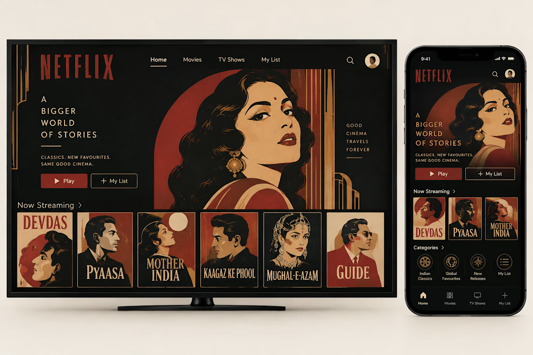
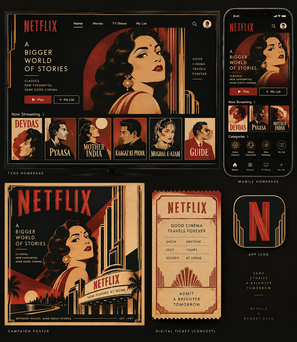
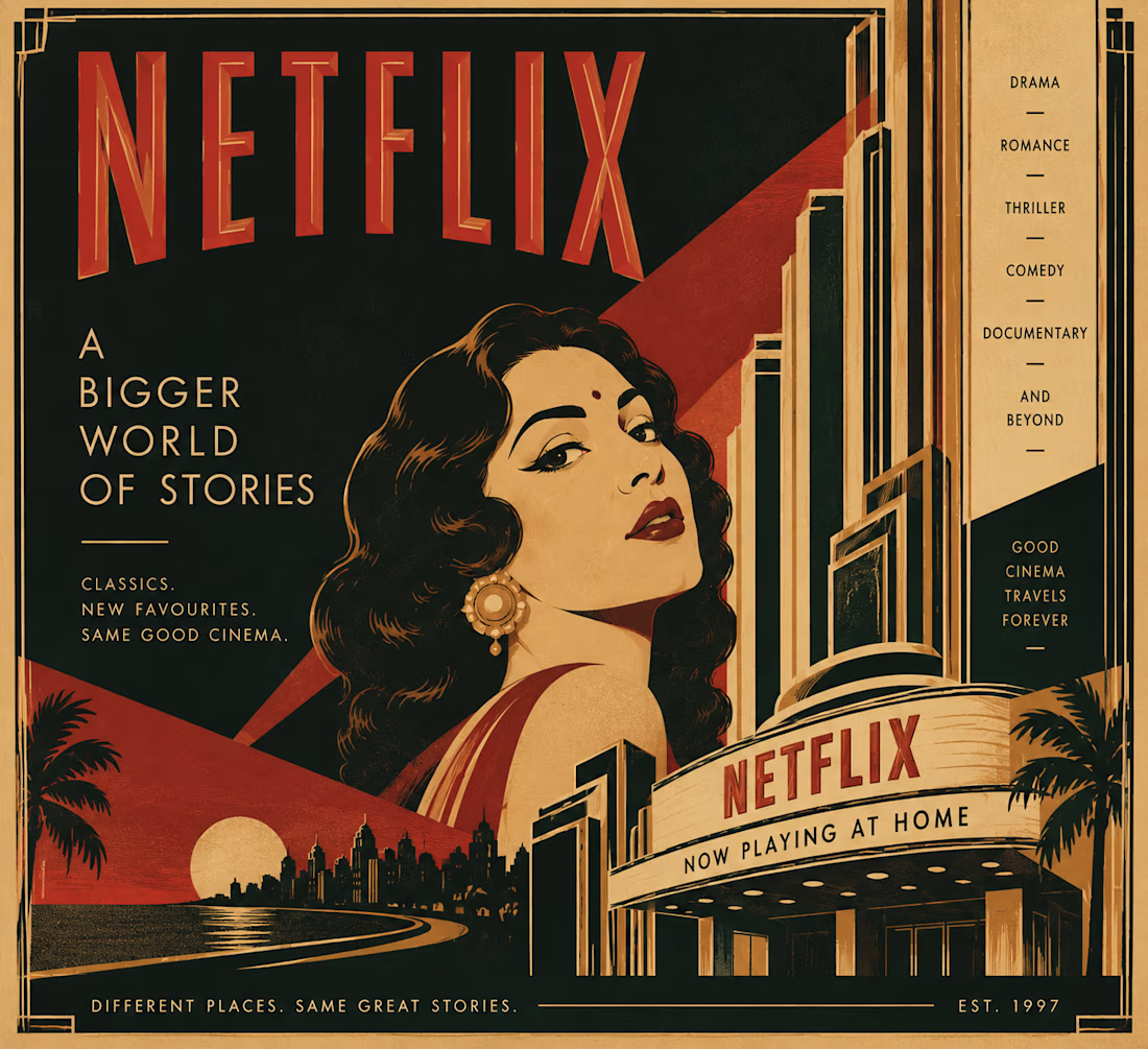
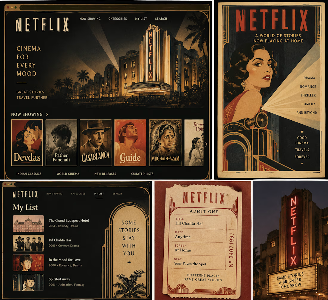
What if Netflix had grown out of Bombay’s golden age of cinema?
I’ve always loved the idea that design can tell you where something comes from, so I wanted to imagine a version of Netflix that didn’t come from Silicon Valley, but from Bombay’s Art Deco cinema culture of the 1930s and 40s.
That meant looking beyond the obvious visual treatment and asking what the experience itself might have been.
The homepage becomes a cinema program.
The mobile app becomes a pocket guide.
Film recommendations become show listings.
And suddenly, even a “My List” feels a little more like something you’d keep in your ticket stub collection.
I kept the visual language rooted in Bombay Deco: geometric typography, symmetry, strong verticals, stepped forms, warm reds and creams, and the kind of theatrical graphic language you’d find around the city’s cinema halls.
The fun part was imagining how a product built for infinite scrolling might feel if it had inherited the sense of occasion that came with going to the cinema.
What modern product would you love to reimagine through the visual language of its own place and time?

looking soo esthetic... great work!!

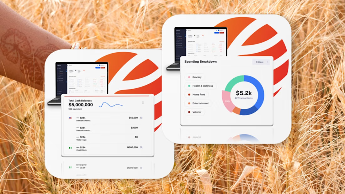
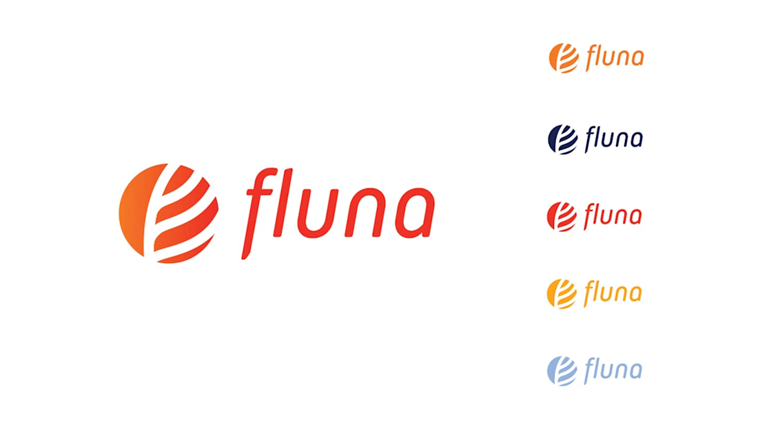
Fintech for agriculture doesn’t have to look earthy, heavy or industrial.
With Fluna, the goal was to create something more premium, distinctive and forward-looking, while still feeling relevant to the market it serves.
What I value most about this project is its longevity. I created this identity four years ago, and the client is still using the logo and visual system today.
For me, good taste in branding is not about following a visual trend. It’s about making choices that still feel right years later, and building a system strong enough to evolve with the company.
#BrandIdentity #BrandDesign #CreativeDirection #FintechBranding





Great work 👍

Working on motion for YONU.
The visual identity is starting to take shape, so I wanted to see how the logo could behave once it moves.
I explored two directions.
Option 1 is sharper and more engineered. Angular fragments build the mark, a controlled energy pulse moves across the frame, and the wordmark reveals with a more technical, performance-led feel.
Option 2 is quieter. Smaller movements, cleaner reveals, fewer elements, and a much more minimal sense of precision.
Same identity, two very different personalities.
I’m leaning toward one already, but curious which direction feels more YONU to you.
Option 1 or Option 2?


3 voted
60%
2 voted
40%
5 votes
Closed

Exploring how the YONU mark behaves in motion while the identity is still developing makes sense. Are these intended for a short logo sting or a longer brand sequence?