The network for creativity
Join 1.25M professional creatives like you
Connect with clients, get discovered, and run your business 100% commission-free
Creatives on Contra have earned over $150M and we are just getting started
Back to feedPost
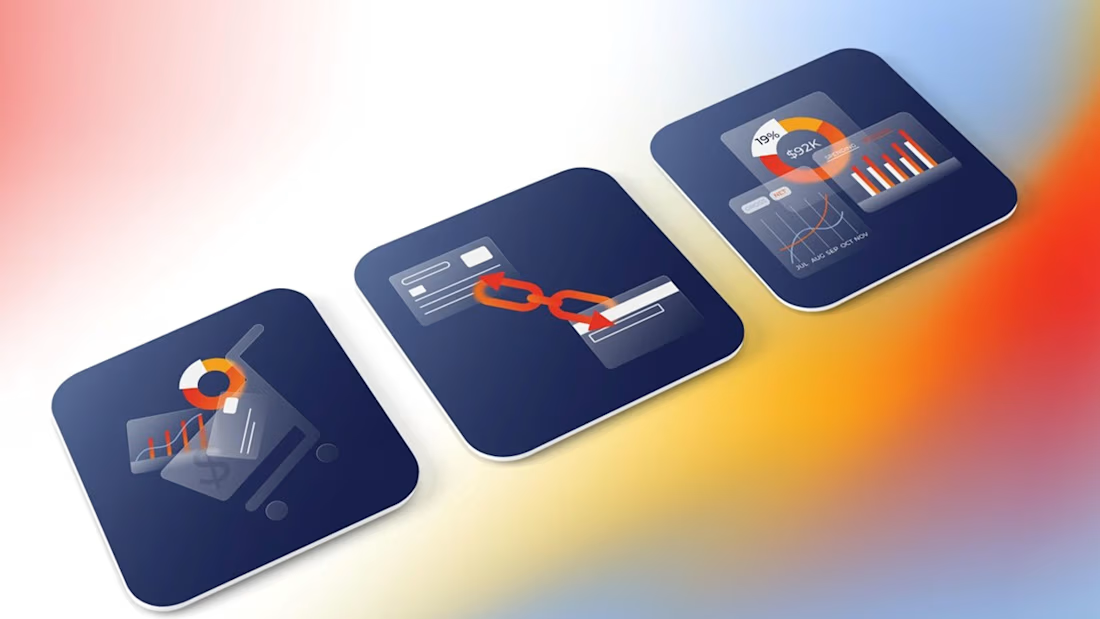
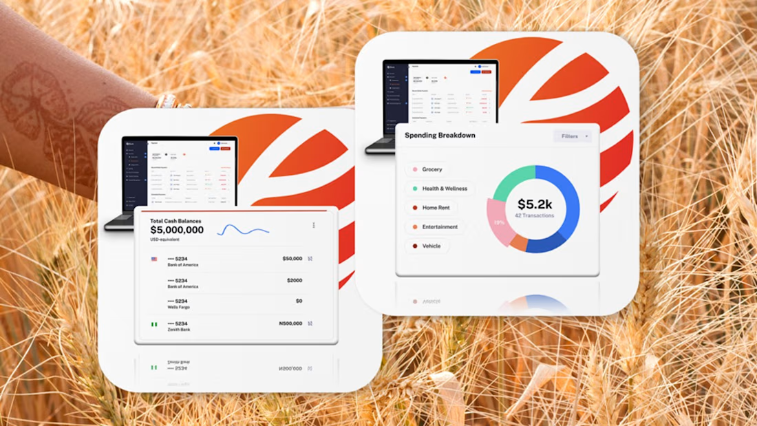
Fintech for agriculture doesn’t have to look earthy, heavy or industrial.
With Fluna, the goal was to create something more premium, distinctive and forward-looking, while still feeling relevant to the market it serves.
What I value most about this project is its longevity. I created this identity four years ago, and the client is still using the logo and visual system today.
For me, good taste in branding is not about following a visual trend. It’s about making choices that still feel right years later, and building a system strong enough to evolve with the company.
#BrandIdentity #BrandDesign #CreativeDirection #FintechBranding




Great work 👍

Thank you, Umar! 🙌

I love how forward-looking this entire system feels. The data-driven dashboard looks incredibly sharp and just begs for some smooth, high-end UI motion.

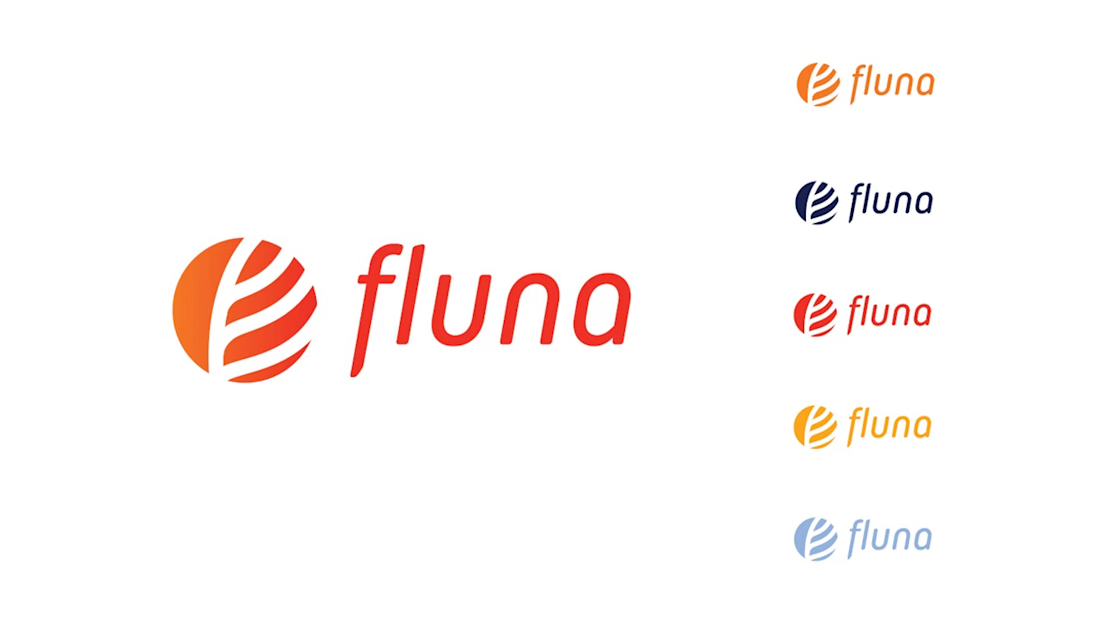
The restraint here is what makes the identity feel durable—the bright orange mark gets energy from the deep navy system without falling into predictable “agritech” earth tones.
Thank you @Rohan Ahmed , that’s exactly the balance I was aiming for 🔥 The orange needed enough energy to feel distinctive, while the deep navy grounds the identity and gives it more weight and credibility. I also really wanted to avoid the predictable earthy agritech visual language.

Four years and still going strong is the real test of good branding. That sphere logo has personality without being gimmicky, and the choice to go premium over earthy is exactly right for fintech.

Four years without a refresh is the real proof of concept for an identity system, trend-driven branding rarely survives that long without starting to look dated. Did you build room into the system to flex, a secondary palette or pattern language, or has it genuinely held as this exact system the whole time?
Thank you for your comment! Yes, that was definitely part of the thinking. The core identity stayed very consistent, but the wider colour range, imagery and supporting visual language gave the system enough room to flex across product, web and campaigns.
I think that’s why it has...

good work.
Thank you @Tvaron Technologies®

Agri fintech usually defaults to wheat fields and burlap textures, so seeing Fluna go premium and forward looking is refreshing. That citrus as a globe mark quietly says global without shouting it.
The network for creativity
Join 1.25M professional creatives like you
Connect with clients, get discovered, and run your business 100% commission-free
Creatives on Contra have earned over $150M and we are just getting started





Related posts


Well done !

Nike × Champions League Ball Concept
An independent concept exploring what a Champions League ball could look like through Nike’s visual language.
The idea starts with a star containing a Swoosh in the negative space, then extends into a complete ball system using Nike’s existing panel construction.
Designed and animated with Spline, After Effects, and a custom 3D ball tool built for the project.
Unofficial concept. Not affiliated with Nike or UEFA.


This is very well thought of and creative

I’ve always liked products that solve a very specific problem instead of trying to do everything.
So for the Lovable Challenge, I picked a simple question that event-tent rental businesses hear all the time:
“Can I book a tent for my wedding?”
The problem is… a tent can’t really be booked until you know if the whole event will work.
How many guests?
How much usable space?
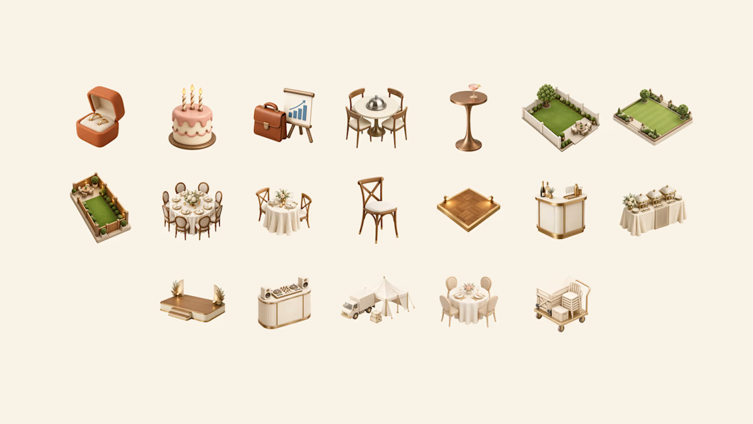
Tables? Dance floor? Bar? Stage?
Will the layout actually fit?
Can the crew set it up and pick it up on time?
Usually, the owner has to figure all of that out manually through messages, calls and calendar checking.
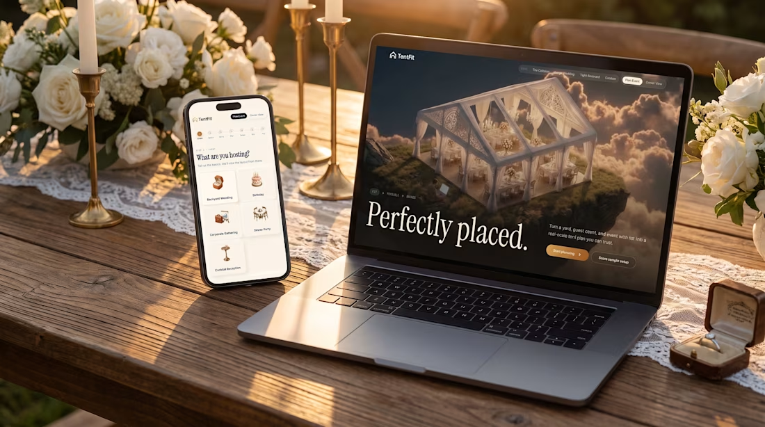
So I built TentFit — a spatial booking experience for event tent rentals.
The customer starts by planning the event, then maps out the space and everything they want inside it. TentFit checks the layout and highlights conflicts.
And instead of just saying “doesn’t fit,” it helps solve the problem:
Switch the tent. Move the layout. Remove an element.
Once everything works, TentFit checks the logistics and turns the final setup into a booking.
The goal was simple:
Make the customer’s decision easier, and make the owner’s job easier.
The flow is basically:
FIT → FEASIBLE → BOOKED
I had a lot of fun building the spatial planning part of this one.
X/Twitter post: https://x.com/brjanov/status/2105630218492731501?s=20
Built with @Lovable
#LovableChallenge #ProductDesign #UXDesign #NoCode #SaaS #WebDesign



Nice stuff!