The network for creativity
Join 1.25M professional creatives like you
Connect with clients, get discovered, and run your business 100% commission-free
Creatives on Contra have earned over $150M and we are just getting started
Back to feedPost


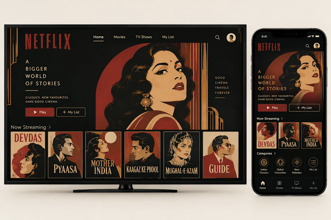
What if Netflix had grown out of Bombay’s golden age of cinema?
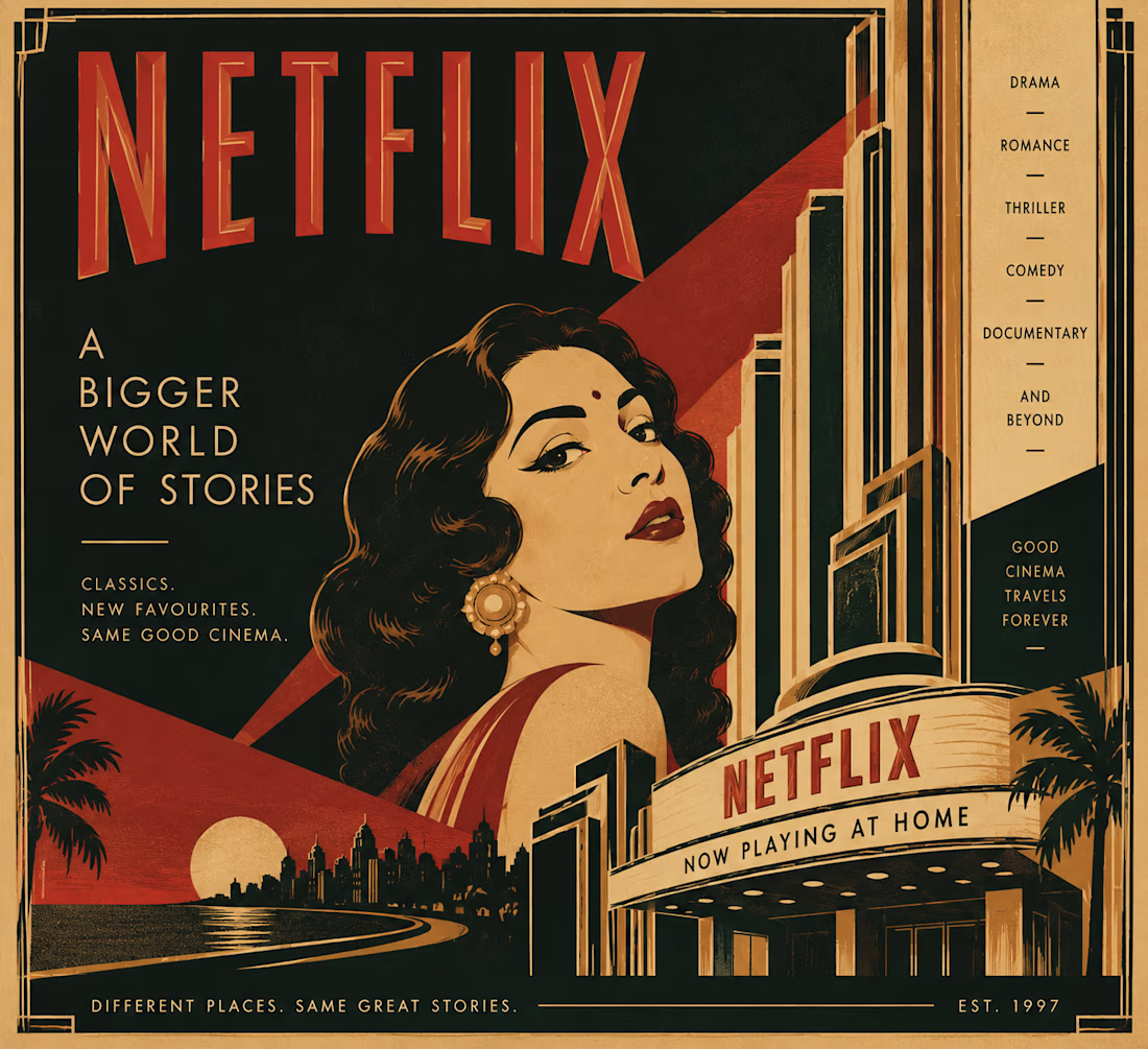
I’ve always loved the idea that design can tell you where something comes from, so I wanted to imagine a version of Netflix that didn’t come from Silicon Valley, but from Bombay’s Art Deco cinema culture of the 1930s and 40s.
That meant looking beyond the obvious visual treatment and asking what the experience itself might have been.
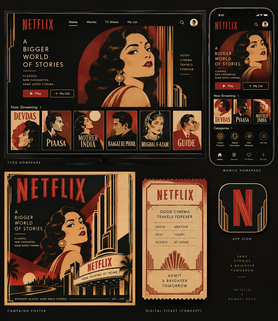
The homepage becomes a cinema program.
The mobile app becomes a pocket guide.
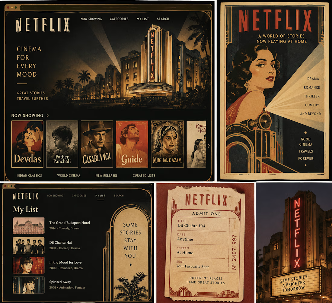
Film recommendations become show listings.
And suddenly, even a “My List” feels a little more like something you’d keep in your ticket stub collection.
I kept the visual language rooted in Bombay Deco: geometric typography, symmetry, strong verticals, stepped forms, warm reds and creams, and the kind of theatrical graphic language you’d find around the city’s cinema halls.
The fun part was imagining how a product built for infinite scrolling might feel if it had inherited the sense of occasion that came with going to the cinema.
What modern product would you love to reimagine through the visual language of its own place and time?

looking soo esthetic... great work!!

This is actually a super cool idea that @Netflix can pick:0

This is a thoughtful way to turn visual identity into product world-building—the cinema-program homepage and ticket-stub My List make the concept feel genuinely native to Bombay’s film culture.

The 1930s Bombay Deco angle is such a sharp concept. Turning 'My List' into a ticket stub collection and film recommendations into show listings shows how deeply the metaphor was thought through.


bombay art deco netflix, what a premise

Very nice!

This is the rare what if concept that actually earns the redesign. Art Deco Netflix makes Silicon Valley minimalism look a little lazy by comparison. I would happily lose a weekend inside this version.

Amazing!

Very impressive.

The concept of placement of Netflix with Bombay Deco feels like the actual brand placement they should look up to for at least Indian region for personalised touch.
ok this premise is so good
The network for creativity
Join 1.25M professional creatives like you
Connect with clients, get discovered, and run your business 100% commission-free
Creatives on Contra have earned over $150M and we are just getting started

Challenges
View all


Related posts

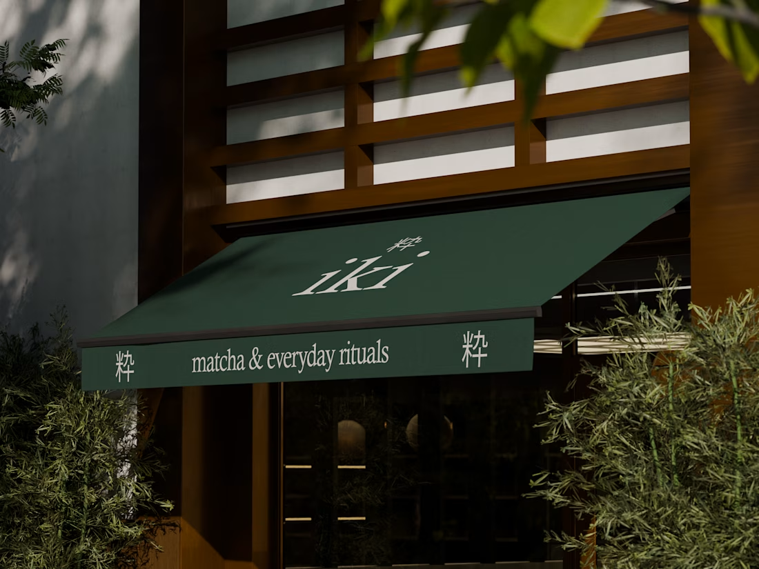
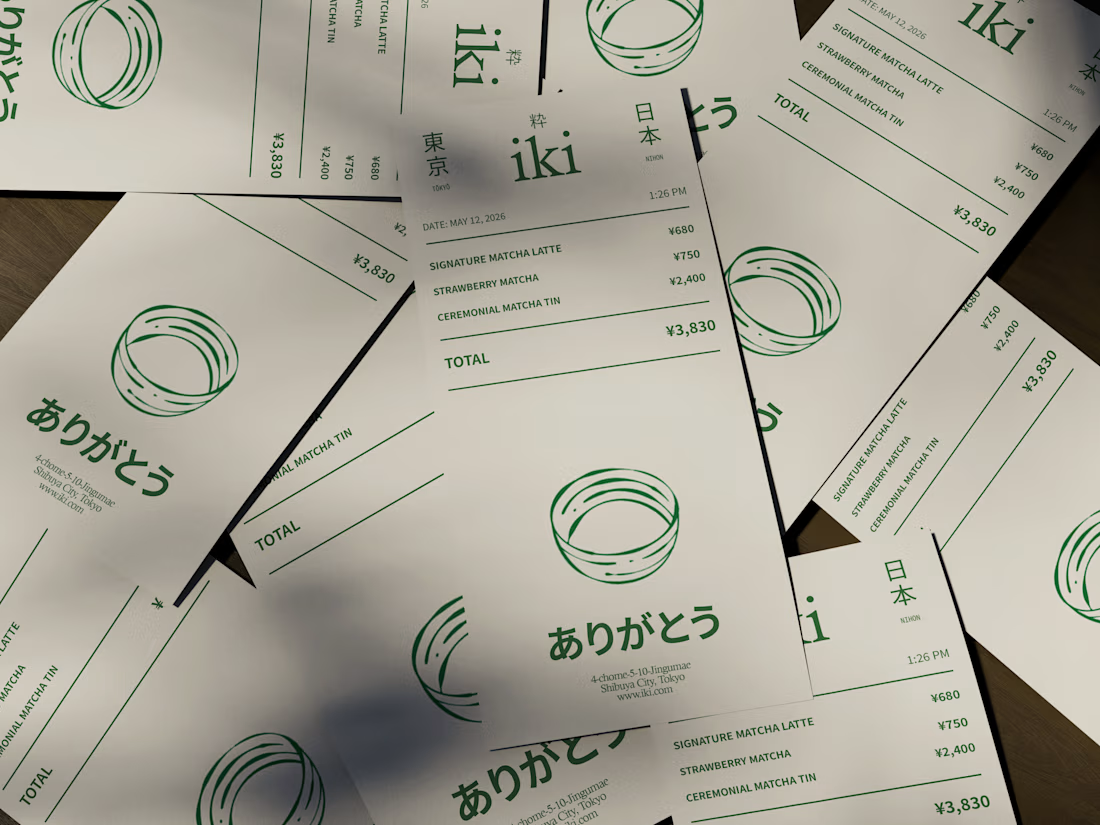
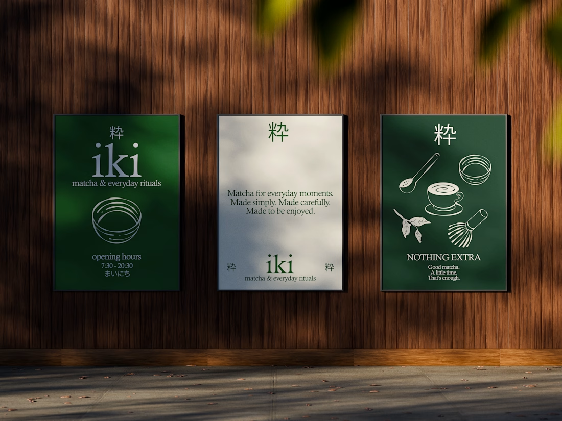
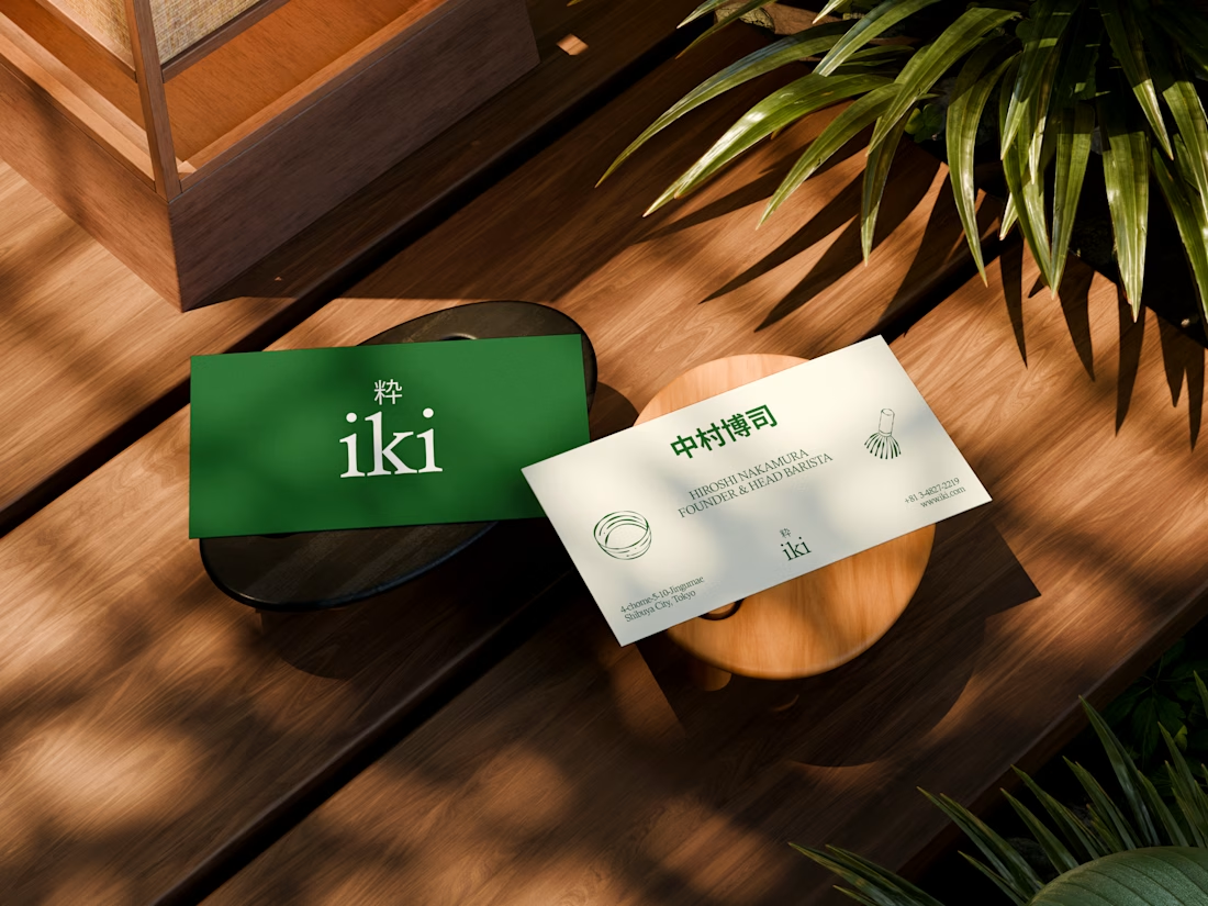
some visuals from iki, a matcha shop i’m currently working on 🍵
one of the most interesting parts of this project has been figuring out how to turn an abstract concept into something people can actually see and feel.
from the typography to the illustrations and overall visual language, every element is an opportunity to give the brand more personality and make it feel like its own world.
still exploring, but i’m really enjoying where this is going.


the illustration direction feels like it could take over the whole shop interior, not just the cups. thats usually where these projects fall apart

slightly exhausting personality trait: I need every new project to be the best thing I've ever designed.
14 years of doing this and somehow the obsession is only getting worse.
constantly learning, getting better, changing my mind, finding new things I want to try.
god I love design.

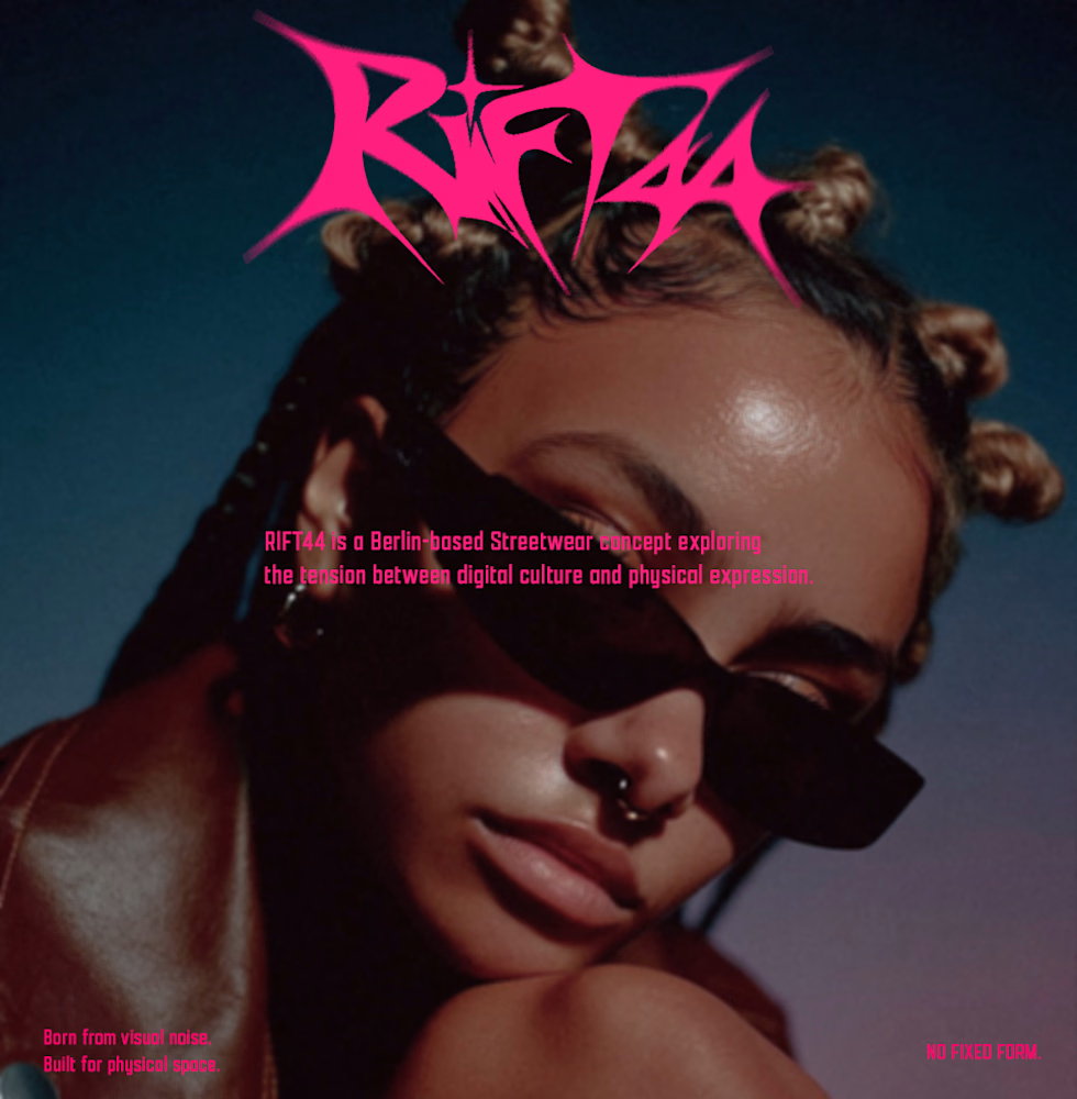
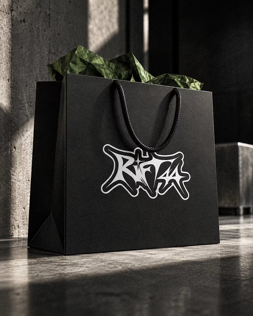
RIFT44 — Streetwear Visual Identity
A self-initiated identity exploring custom lettering, underground fashion culture and bold physical applications.
Visual Identity · Art Direction · Campaign Design




Beautifully done! 🌟🌟