The network for creativity
Join 1.25M professional creatives like you
Connect with clients, get discovered, and run your business 100% commission-free
Creatives on Contra have earned over $150M and we are just getting started
Back to feedPost
Taste Test
Working on motion for YONU.
The visual identity is starting to take shape, so I wanted to see how the logo could behave once it moves.
I explored two directions.
Option 1 is sharper and more engineered. Angular fragments build the mark, a controlled energy pulse moves across the frame, and the wordmark reveals with a more technical, performance-led feel.
Option 2 is quieter. Smaller movements, cleaner reveals, fewer elements, and a much more minimal sense of precision.
Same identity, two very different personalities.
I’m leaning toward one already, but curious which direction feels more YONU to you.
Option 1 or Option 2?


3 voted
60%
2 voted
40%
5 votes
Closed

option 1 for me, the fragments snapping into the mark got me. what does yonu actually do?

Glad you liked it! YONU is a consumer audio brand focused on earbuds, headphones, and personal audio products. I’m currently shaping the identity and how that performance-led feel carries across everything.


the angular fragments move so well. which option won?
Engineered Energy is taking the lead so far. The angular motion just feels more native to the mark, so I’m leaning that way too.

Voted Engineered Energy. The mark itself already reads fast and angular, so the sharper option feels like it is animating what the logo is actually saying rather than working against it.
Exactly what I was trying to test. The sharper direction feels like it is extending the logic already inside the mark rather than adding motion on top of it.

Exploring how the YONU mark behaves in motion while the identity is still developing makes sense. Are these intended for a short logo sting or a longer brand sequence?
They’re intended as a short logo sting for now, around 5–6 seconds. The goal is to establish how the mark should move before carrying that motion language into longer brand moments later.
The network for creativity
Join 1.25M professional creatives like you
Connect with clients, get discovered, and run your business 100% commission-free
Creatives on Contra have earned over $150M and we are just getting started











Related posts

I’ve been working on a bold, modern-retro logotype and can’t decide between these two options.
🆘 Which one feels more aesthetically pleasing to you?

11 voted
26%
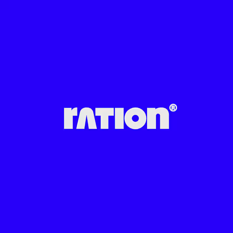
31 voted
74%
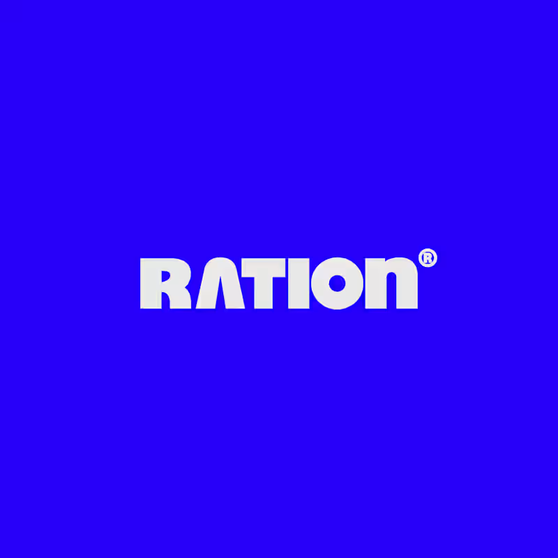
42 votes
Closed

CAPITAL is great but SMALL is unique great job Nawras 🔥🔥


Working on a new brand project: Pace Theory. ✦
Exploring two different directions for the visual identity and brand presentation.
Which variation do you prefer — Left or Right? 👀
I’d love to hear your thoughts on the layout, composition, and overall brand feel.
Drop your pick in the comments 👇
5 voted
33%
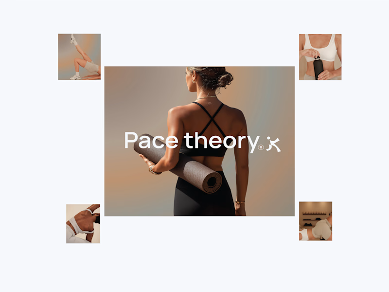
10 voted
67%
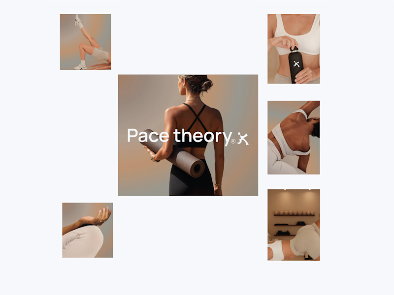
15 votes
Closed
Left variation is more practical ❤️
great job Shivan🔥🔥


Your Hero Section Has One Job: Be Clear.
You don’t need huge headlines or long explanations. You need the right image + short headline + clear offer.
For the first version, we worked on the branding, the image and the copy together, so at first glance it’s clear: this is a makeup course, and here’s what you’ll get.
The second version is still beautiful and still feels like beauty. But what are you actually getting? A makeup course? Products? A store? That’s the problem with a Hero that looks good but isn’t thought through.
Your first screen doesn’t need to say everything. It just needs to say the right thing.

22 voted
61%

14 voted
39%

36 votes
Closed
