The network for creativity
Join 1.25M professional creatives like you
Connect with clients, get discovered, and run your business 100% commission-free
Creatives on Contra have earned over $150M and we are just getting started
Back to feedPost
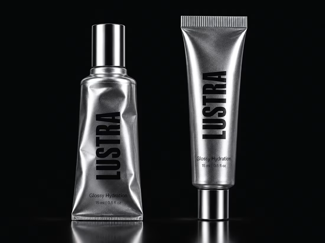
If your skincare formula is premium but the packaging still looks like everyone else, you are making the customer work too hard to see the difference.
That is the problem LUSTRA was designed to solve.
The goal was not to create another “clean beauty” pack.
It was to build something that could signal premium positioning, stronger shelf presence, and a more distinctive brand perception before the customer even reads the product details.
So the system was built around:
⚪ Metallic silver to create a sharper, more elevated presence
⚫ Black typography for confidence and contrast
🔤 Vertical branding for faster recognition
✨ Reflective materials that make the pack feel tactile and premium
🧴 A minimal hierarchy that keeps the product looking intentional, not empty
The result is a packaging direction that feels closer to fashion and product design than conventional skincare.
And that matters.
Because when customers are comparing five similar products, the brand that looks more considered often gets perceived as more valuable.
Packaging is not decoration.
It is part of the buying decision.
LUSTRA
Glossy Hydration.
What would make you notice this first on a shelf?
A. The metallic finish
B. The vertical wordmark
C. The black + silver contrast
D. The overall premium direction
Drop A, B, C or D below.
If you are building a skincare, beauty, cosmetic, or wellness brand with a strong product but weak visual positioning, send me a message.
I help product founders turn good formulas into brands that look ready to charge more, compete harder, and be remembered.
#PackagingDesign #SkincareBranding #BeautyBranding #CosmeticPackaging #BrandIdentity #LuxuryPackaging #VisualIdentity #CreativeDirection



The vertical wordmark paired with metallic silver and black is a smart way to make skincare feel closer to fashion than to the usual clean-beauty look. I also like how you framed packaging as part of the buying decision rather than decoration. For me it would be the black and silver contrast first.

Appreciate that, Anna. The black and silver contrast was definitely key to pushing it away from the usual clean-beauty look.
Thank you, Ismail, the contrast really does make it feel so refined. Did you test other metallic finishes before settling on silver?
Yes, I explored a few warmer metallic directions, but silver felt cleaner and more fashion-forward for LUSTRA. It gave the contrast I wanted without making the pack feel too traditional or overly luxurious.
The network for creativity
Join 1.25M professional creatives like you
Connect with clients, get discovered, and run your business 100% commission-free
Creatives on Contra have earned over $150M and we are just getting started


Related posts

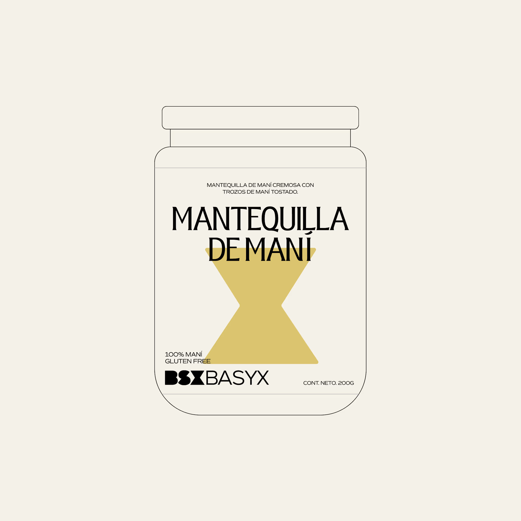
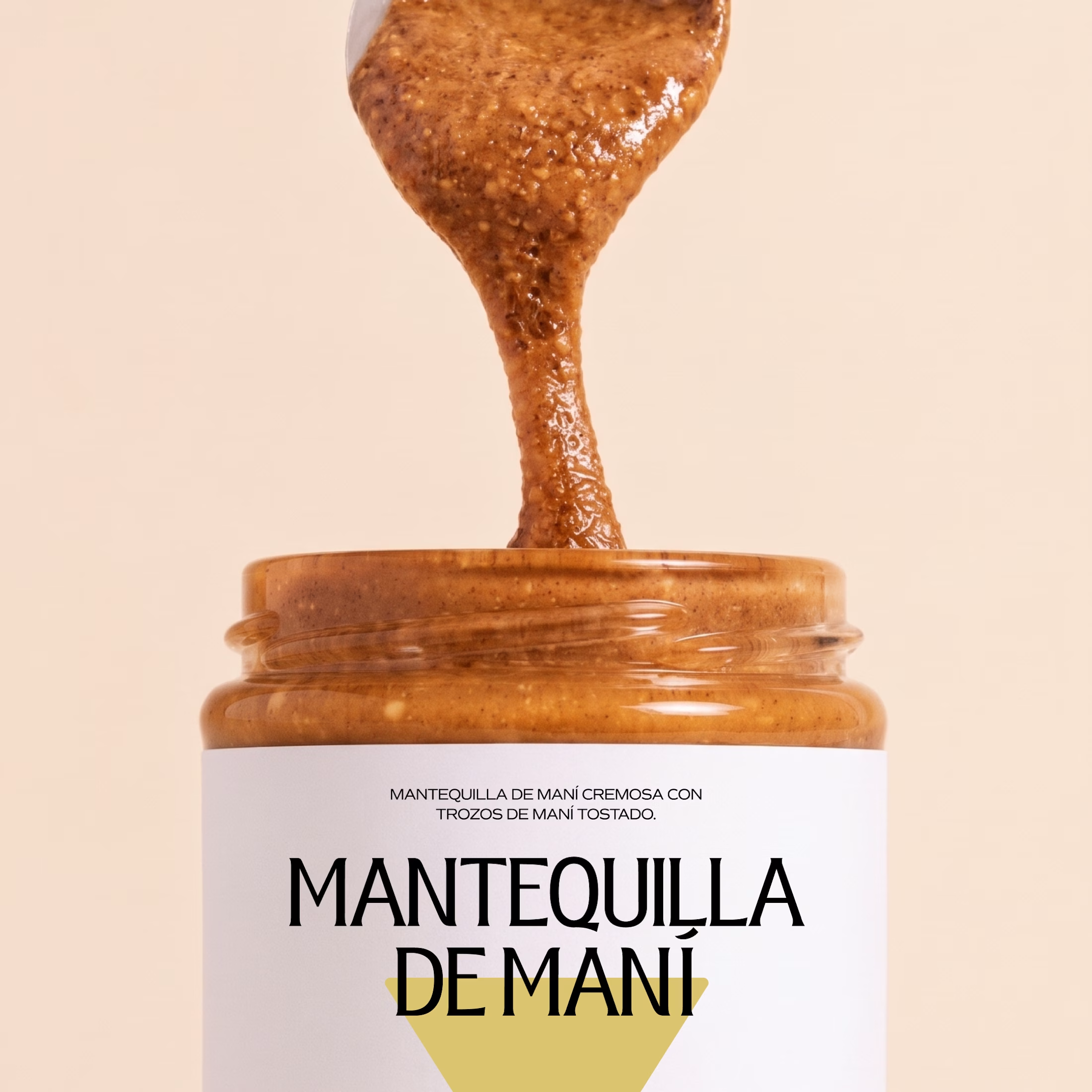
Minimal packaging is not less work. It’s MORE decisions 🤍
On a recent project, I spent a whole day on one thing: the spacing between two phrases in a label. Nobody will ever notice it. But everyone will feel it.
When there is nothing else on the label, every small adjustment has to carry the brand.
Do you also lose hours on details no client will ever mention? 😅

So true. A whole day on the spacing between two phrases sounds about right, and it's exactly why good packaging just feels right.

This morning: a design exploration.
Tonight: a whole brand.
Calling. Numbered, glitched, answered.
Case study dropping soon.
Pick up.

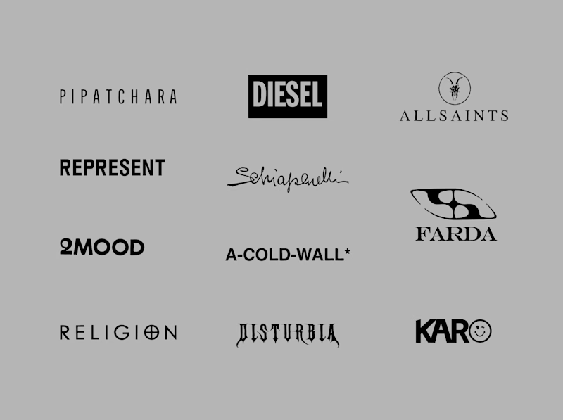
Another category comparison, and this one's going to make you look twice.
The fashion category needed a fresh point of view. Most established players relied on functional wordmarks and relatively restrained visual identities.
With Ru’asā, we took a different route. We challenged those conventions and built an identity designed to stand apart, be remembered and give the brand a world of its own.
Distinctive by design. Unconventional by nature.
Which would you choose?
Familiar category conventions
A fresh point of view
1 voted
11%
8 voted
89%

9 votes
Closed


Motion wins