The network for creativity
Join 1.25M professional creatives like you
Connect with clients, get discovered, and run your business 100% commission-free
Creatives on Contra have earned over $150M and we are just getting started
Back to feedPost
Taste Test
I’m currently refining the logo for Shootify Production and I’m torn between these two versions. The overall design stays the same, but the film-strip icon uses different colors, giving each logo a slightly different personality.
Which one do you think represents a production brand better?
Your feedback would really help me make the final decision.


2 voted
40%
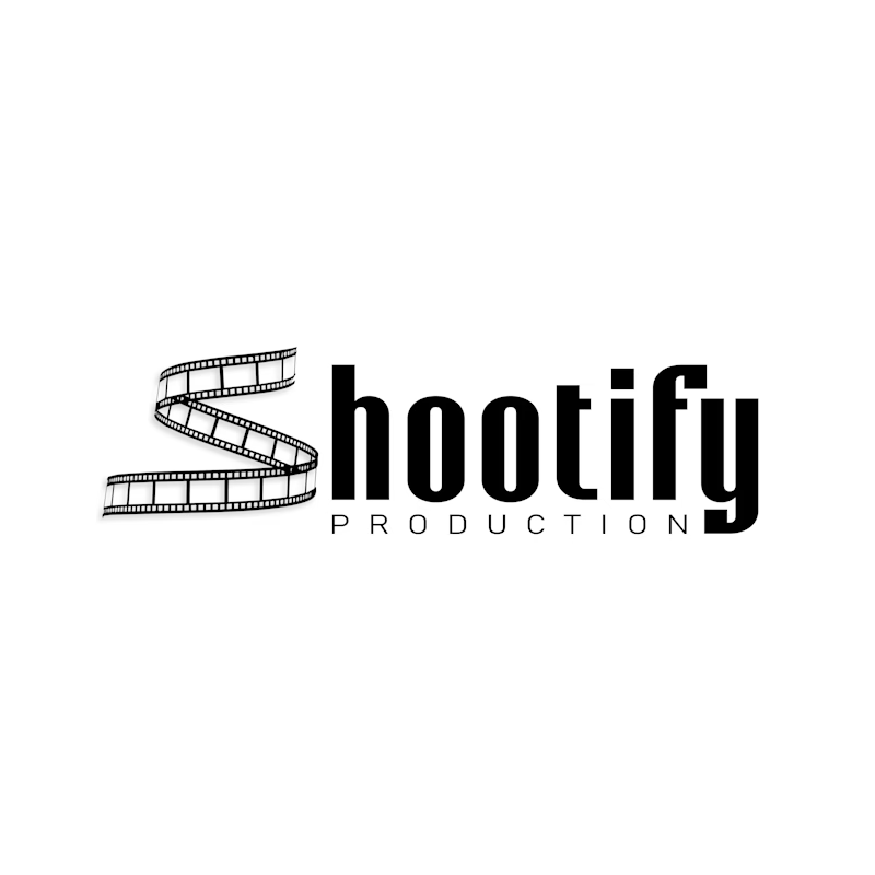
3 voted
60%
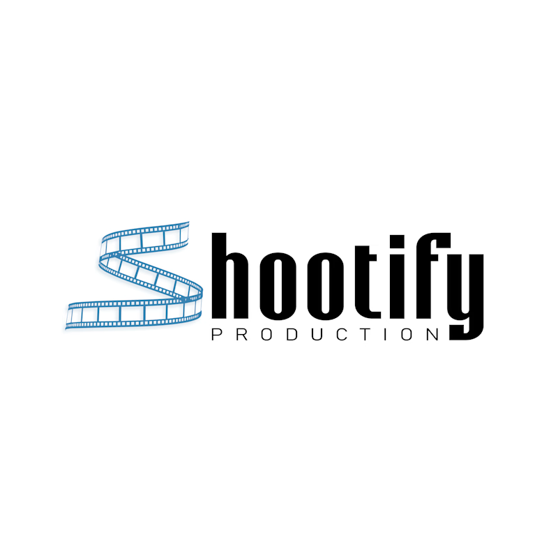
5 votes
Closed

Both are great, but the Blue Accent has my vote! The blue color gives a very pleasant, cooling effect and enhances the overall personality of the logo.

Thank you!
The network for creativity
Join 1.25M professional creatives like you
Connect with clients, get discovered, and run your business 100% commission-free
Creatives on Contra have earned over $150M and we are just getting started





Related posts

Working on a logo for The 100 Club. Two very different directions.
Concept A: Badge style, blue and gold, hands holding a star.
Concept B: Shield crest, red and blue, bold and sporty.
Which one fits a club identity better? A or B? 👇
4 voted
25%
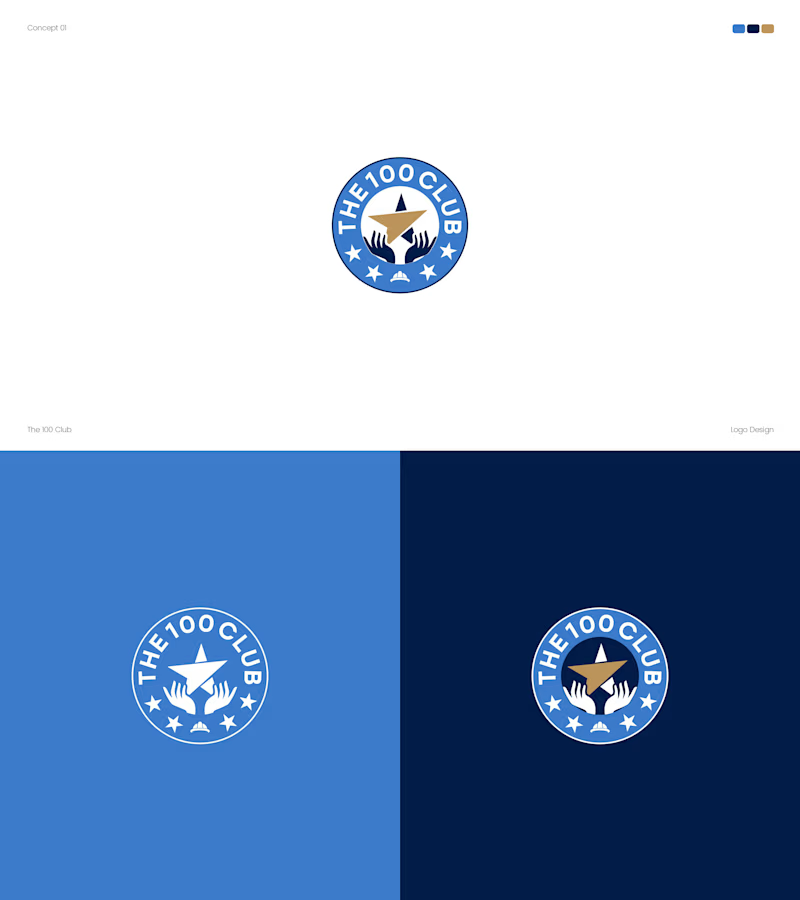
12 voted
75%
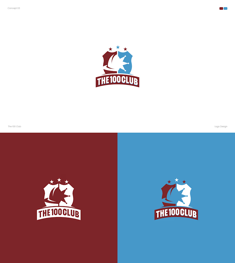
16 votes
Closed


Both options turned out amazing

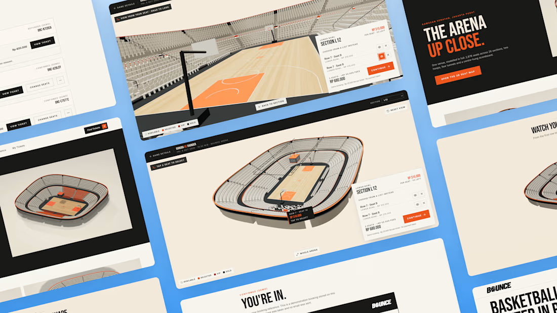
What if you could explore a basketball arena in 3D before booking your seat?
You found the game. But before you pay, how do you know which seat is worth it? A flat seating chart gives you a section and a number, but it can be hard to picture your position relative to the court.
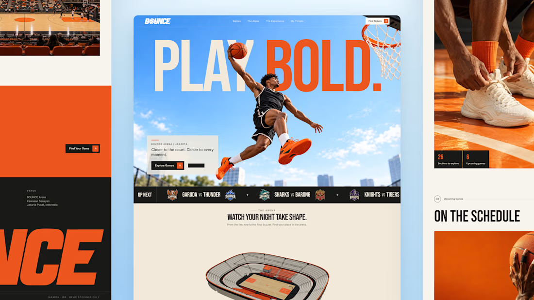
So I built BOUNCE with Lovable, a basketball ticketing concept centered around interactive 3D seat selection.
Rotate the stadium, zoom into the stands, explore different sections, and compare prices before choosing your seats directly inside the 3D arena. The goal is simple: help fans feel more confident about where they’re sitting before they book.
From there, complete checkout and get a ticket you can view, save, or print. My Tickets brings bookings together, with a one-time seat change for the same game and refund requests for eligible bookings.
Bold orange, oversized typography, and scroll driven motion bring the energy of basketball into the experience.
Try the demo: https://bouncebasketball.lovable.app/
Fictional teams. Simulated payments. No real charges.
Less guesswork. More game. BOUNCE. Your game. Your view.



The 3D elements, especially seat pov idea is very interesting🔥

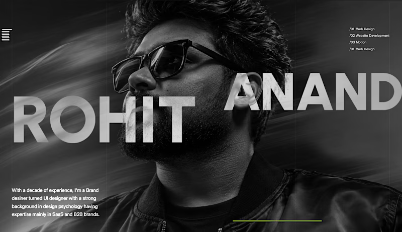
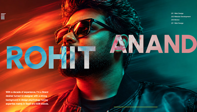
Which one is better? Grey or color?

2 voted
18%
9 voted
82%
11 votes
Closed

The Grey one looks better to me, as for the coloured version if the Text colours are tweaked a bit , it would look even better.