The network for creativity
Join 1.25M professional creatives like you
Connect with clients, get discovered, and run your business 100% commission-free
Creatives on Contra have earned over $150M and we are just getting started
Back to feedPost
Taste Test

We had a debate in the studio on this one.
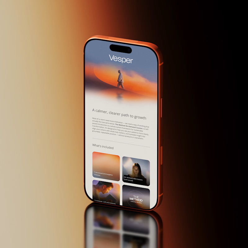
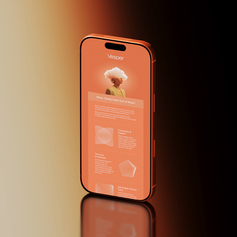
Do you lead with contrast and let the brand breathe, or do you go full brand saturation and make it unmistakable?
These are two email directions we designed for Vesper, our Kajabi demo build.
Tell us which approach you'd open, click, and remember.
See the project here!
101 voted
89%
12 voted
11%
113 votes
Closed

Option A. The contrast creates a cleaner hierarchy and makes the brand accents feel more intentional. B is visually striking, but A is the one I'd actually read and click.


was shocked to see i'm the sole voter so far on option B, but i DO love both options you've got available! i went for B because it screamed creativity & true understanding of self. it's rare i see something that feels so fully authentic & unapologetic, & i think the design...


option A is sick! 💯

Both versions are immaculate, I especially love the color composition on this too clean and crisp👍🏼

A all day

Option A looks cool

A is too good. B is great too, but A feels like the right direction.

hmmmmm Go for A

I’d definitely open Option A, it feels cleaner, more readable, and lets the content shine

I feel like A is the clear winner here. I like the contrast between the blue and orange tones and the gray/white bg. The overall impression feels more light and the readability is also a lot better. ✌️

Option A, because white space is the main ingredient of any design.

A ftw

Option A

Option A has better usability


This is brilliant


Option A is nice

would go with Option A for it's calm design

A of course

that A feels natural and calm, more premuim

Both look cool, but I'd definitely pick Option A over B. Dark text on white background I feel like makes it easier read. The use of imagery looks cooler too.

Its a tough choice i get the debate

For B, there is a UX accessbility issue (color)

A looks more sleek

Option A

Really hard choice but Option A gives more breathing space compared to the monotonous feel of OptionB


Option A

Creative work

Option A looks more natural and user friendly
The network for creativity
Join 1.25M professional creatives like you
Connect with clients, get discovered, and run your business 100% commission-free
Creatives on Contra have earned over $150M and we are just getting started
Trending

Claude
Claude has entered the design space. How are you using it?

Contra University
Learn from expert creatives how to earn more using next-gen AI tools.
Brand Design
The best brand designers are on Contra. Scroll to see what's trending in brand design. What are you building?
creativeaiflow
Creative AI workflows are evolving. What tools do you use, and what are their strengths and weaknesses?
freelancerlife
Freelancer life is wins, pivots, and everything in between. What’s yours right now?



Related posts


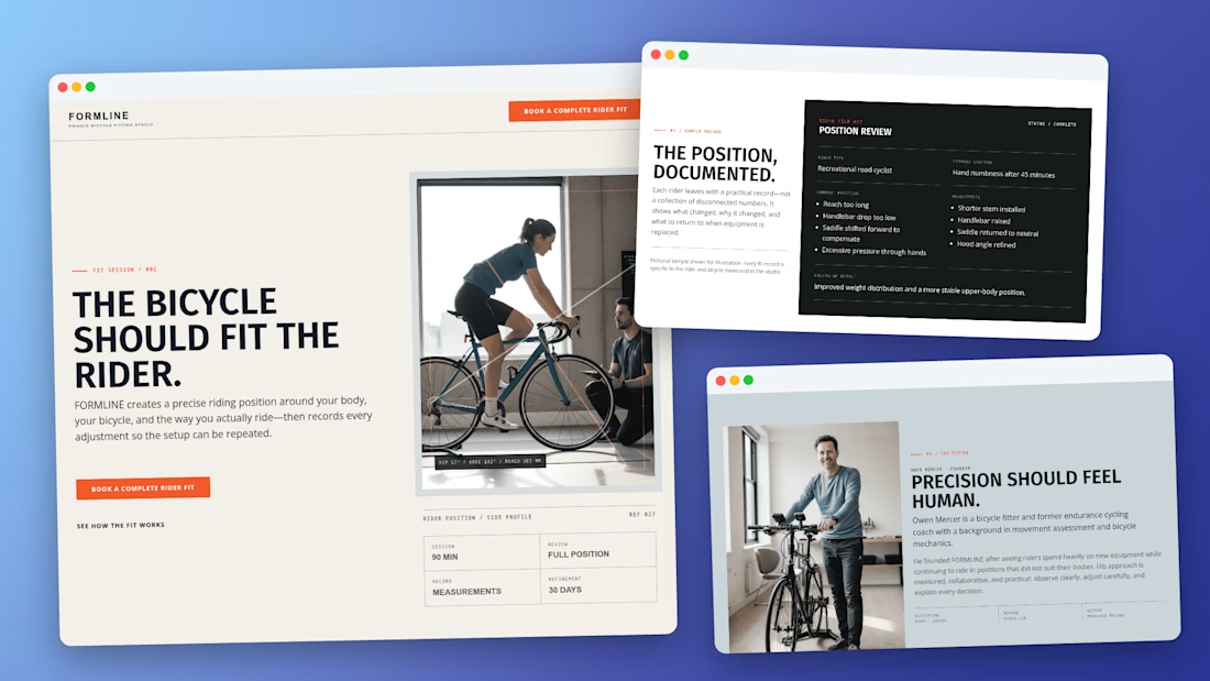
One prompt. One attempt. One complete Kajabi-compatible landing page.
Built with Pro Studio.
I gave ChatGPT a written brief for a fictional bicycle-fitting studio. Using Pro Studio, it turned that brief into the complete landing page template you see here.
This was the first build.
ChatGPT interpreted the brief and directed the build. Pro Studio provided the independent design platform, template system, and creation tools needed to produce the finished result.
When it was done, I didn’t have instructions or a mockup.
I had a complete, exportable template built specifically for Kajabi.
And after one attempt, it was already something I’d be proud to show a client.
If you create websites or landing pages for Kajabi, try Pro Studio:



The "no instructions, no mockup" part is the real flex here, most AI landing page tools still need heavy babysitting. My hunch is the brief quality did a lot of the heavy lifting too, not just Pro Studio itself. Fair, or was the tool actually filling in gaps a vague brief left open?

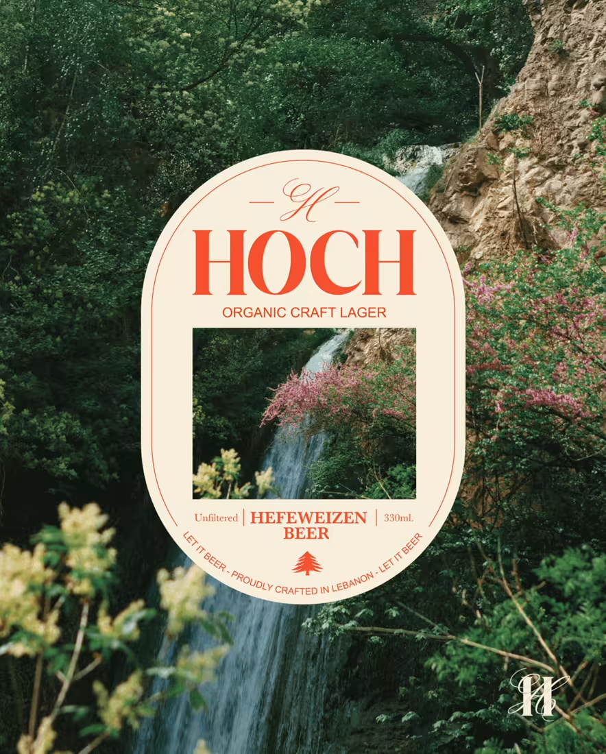
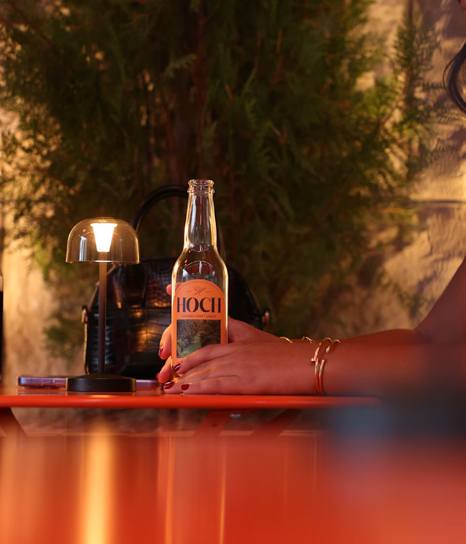
A beer label turned into a restaurant : and honestly, I still find that pretty wild.
At the beginning, the project was simple: build a strong identity for the beer and design a label people would remember. Then the beer launched.
People loved the taste, but they also really connected with the branding, the label, the colors, the tone, the whole personality of Hoch.
That response pushed the owner to think bigger:
What if Hoch became more than a beer?
That’s how the idea of opening a restaurant around the brand started.
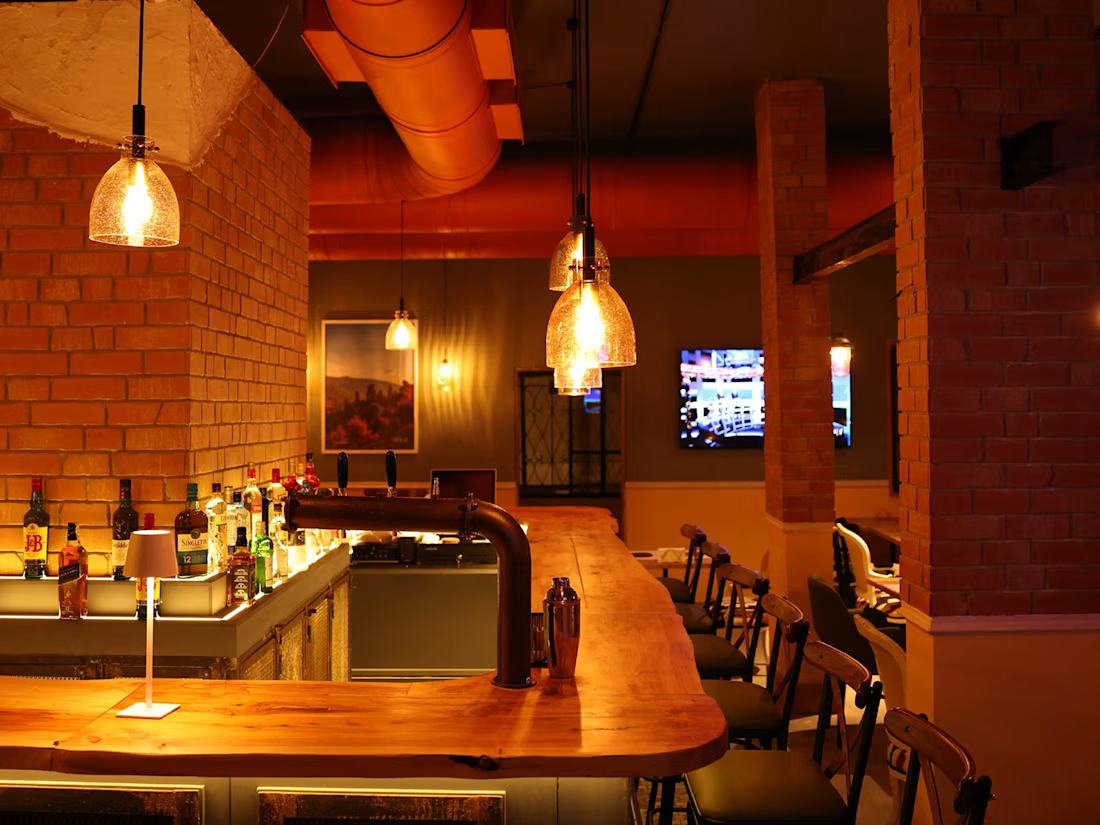
And suddenly, the identity had to leave the bottle and enter a real space.
I worked on translating the original visual world into:
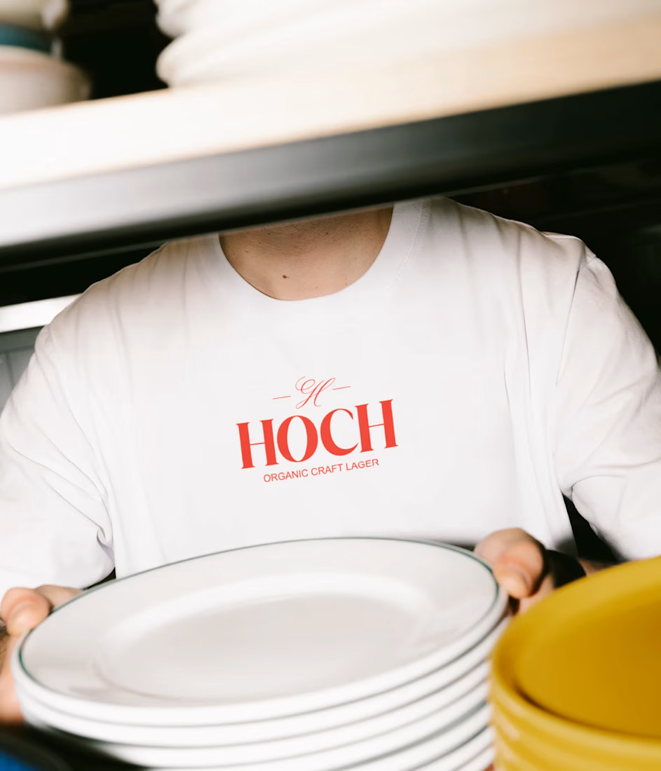
→ Signage
→ Menus and printed materials
→ Social media content
→ Branded details throughout the space
→ A complete restaurant experience
The most exciting part was making sure it still felt like the same Hoch people had discovered on the label, just bigger, more immersive and alive.
This project reminded me why I love branding so much.
Sometimes, you design a label.
And sometimes, that label becomes the starting point for an entire world people can walk into.
Here’s a look at how Hoch evolved from a bottle into a restaurant.

Beautiful work, Anna!

Hey! We're GOAT Studios 🐐
Every creative studio needs a first introduction—this is ours.
For our first post on Contra, we wanted to keep things simple: a clean photography studio, a goat walking into frame, one confident "mee," and a subtle reveal of the GOAT Studios logo.
This short film reflects how we approach creative work: simple ideas, strong execution, and meticulous attention to detail.
At GOAT Studios, we combine creative direction with cutting-edge AI technologies to create cinematic visuals, branded content, and digital experiences that help businesses stand out.
This piece was produced entirely through an AI-powered creative pipeline, including concept development, prompt engineering, image generation, animation, sound design, editing, and final compositing.
We're excited to be part of the Contra community and look forward to collaborating with brands, agencies, and fellow creatives.


Feel at home! Contra is the PLACE to be for designers.