The network for creativity
Join 1.25M professional creatives like you
Connect with clients, get discovered, and run your business 100% commission-free
Creatives on Contra have earned over $150M and we are just getting started
Back to feedPost
Taste Test
We had a debate in the studio on this one.
Do you lead with contrast and let the brand breathe, or do you go full brand saturation and make it unmistakable?
These are two email directions we designed for Vesper, our Kajabi demo build.
Tell us which approach you'd open, click, and remember.
See the project here!
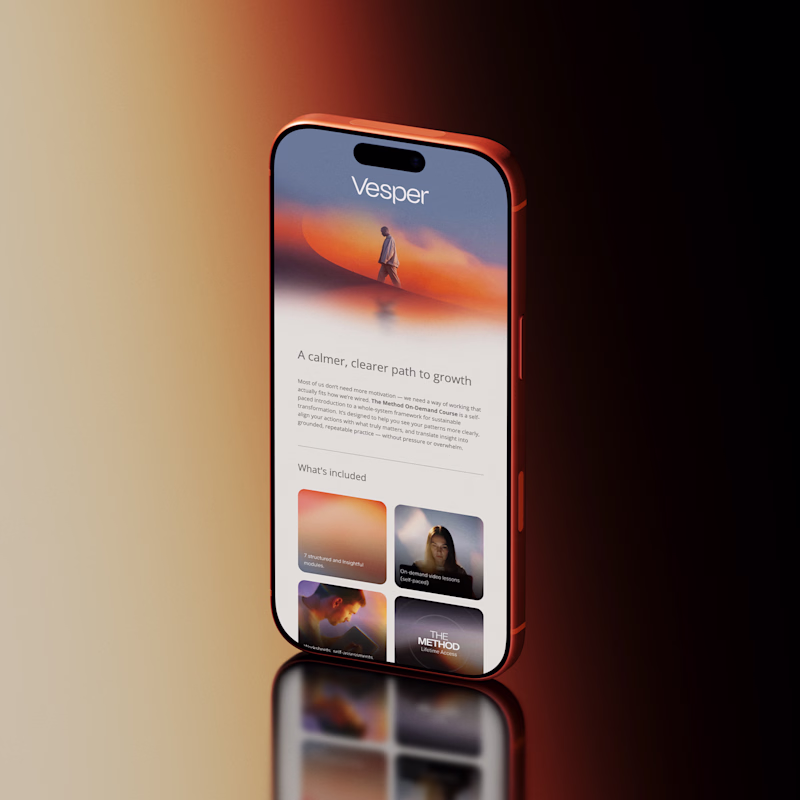
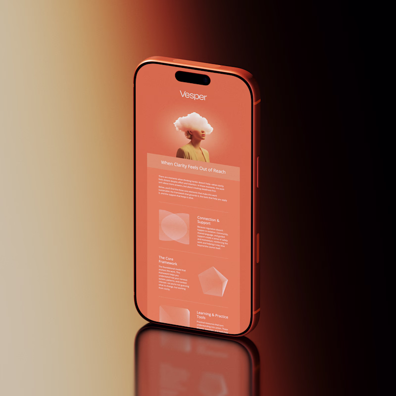
23 votes
Ends in 1d
was shocked to see i'm the sole voter so far on option B, but i DO love both options you've got available! i went for B because it screamed creativity & true understanding of self. it's rare i see something that feels so fully authentic & unapologetic, & i think the design...
option A is sick! 💯
Both versions are immaculate, I especially love the color composition on this too clean and crisp👍🏼
A all day
Option A looks cool
The network for creativity
Join 1.25M professional creatives like you
Connect with clients, get discovered, and run your business 100% commission-free
Creatives on Contra have earned over $150M and we are just getting started
Related posts
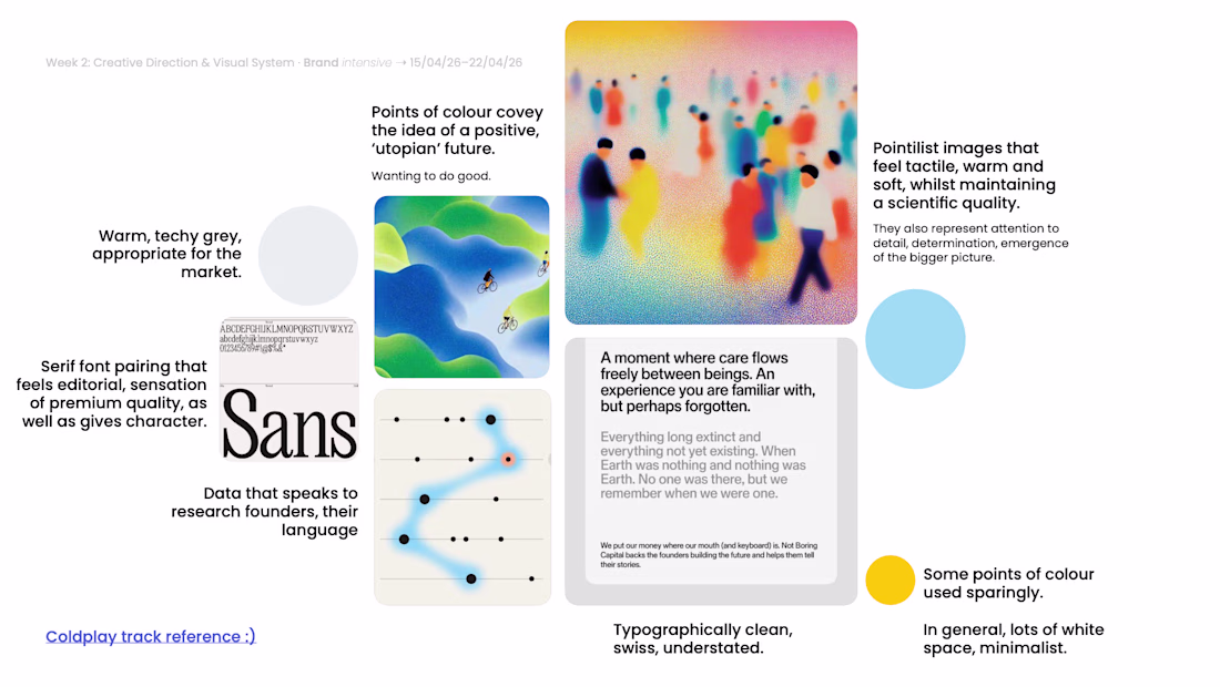
In these two visual styles for brand identities, which direction would be your style?
1 voted
33%

2 voted
67%
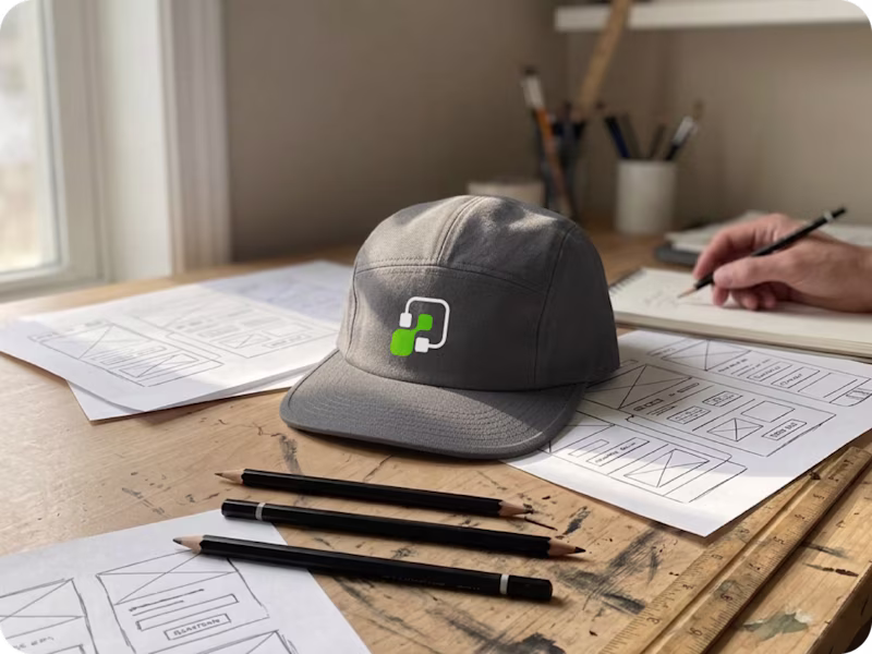
3 votes
Closed
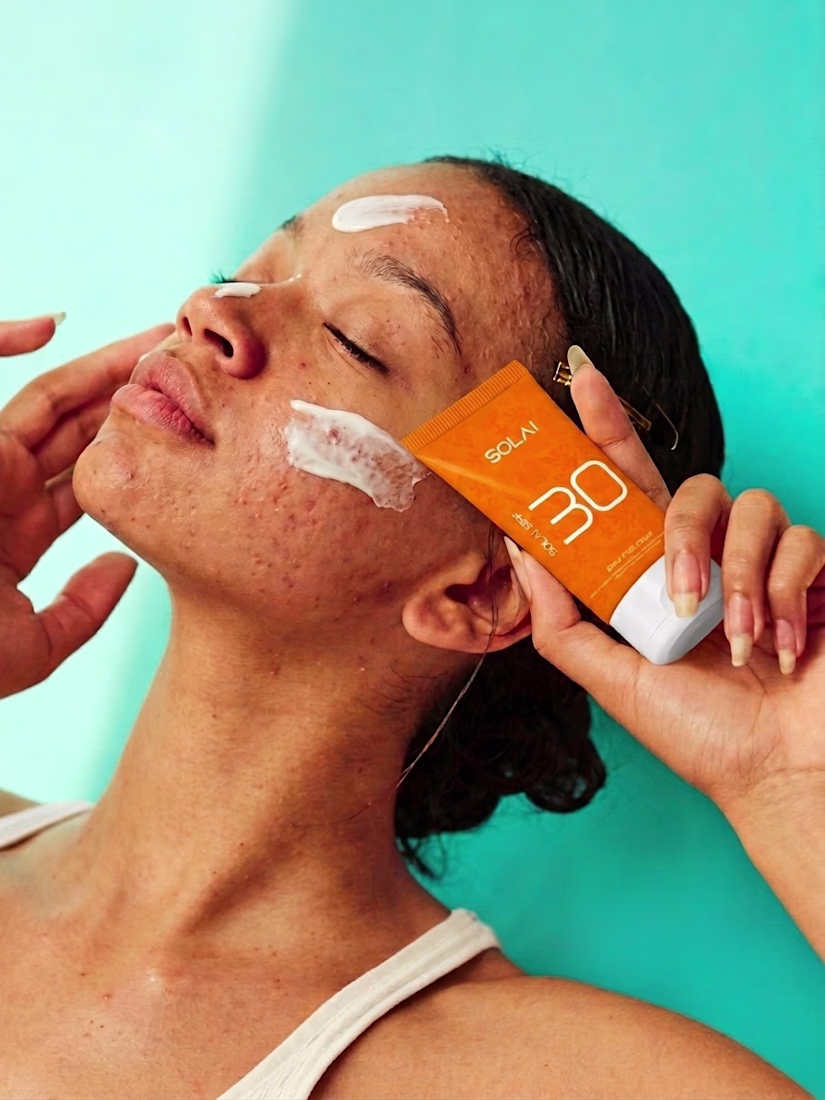
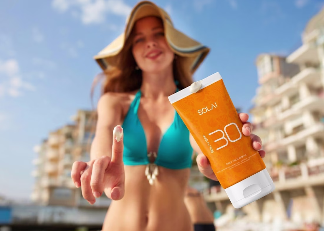
Lifestyle is fire 🔥
Most sunscreen looks like medicine.
SOLAI doesn't. 🧴🌞
Brand identity + packaging + 3D renders — all built around one color that says everything before you even read the name.
Full case study on Behance 🔗 link in bio

Lovely concept
Why not add a song to your moodboards?
Totally helps the client get the vibe if they're not so visual.
Trying to have more fun with the process 😃
Trending
Claude
Claude has entered the design space. How are you using Claude Design?
Contra University
Learn from expert creatives how to earn more using next-gen AI tools.
MagicPath
The canvas is infinite, and exploration is becoming the workflow. How are you using MagicPath?
creativeaiflow
Creative AI workflows are evolving. What tools do you use, and what are their strengths and weaknesses?
freelancerlife
Freelancer life is wins, pivots, and everything in between. What’s yours right now?