The network for creativity
Join 1.25M professional creatives like you
Connect with clients, get discovered, and run your business 100% commission-free
Creatives on Contra have earned over $150M and we are just getting started
Back to feedPost
NICE HUMANS
Making automation feel human.
Context
Nice Humans is a growing automation studio that helps teams streamline how they work. As they scaled, their brand no longer reflected the expertise or the people behind it.
The challenge
The automation market speaks in efficiency, systems and scale, and it often sounds interchangeable. Nice Humans needed to claim leadership in that space while standing for something competitors overlook: automation is ultimately about people.
The approach
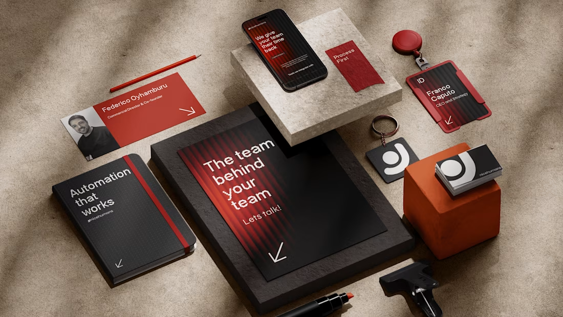
Rather than starting with a logo, we started with a positioning: a team that builds for other teams. From there we developed a complete brand strategy, including archetype, tone of voice, verbal identity and a visual language. Each one was designed to balance technical authority with human warmth.
The outcome
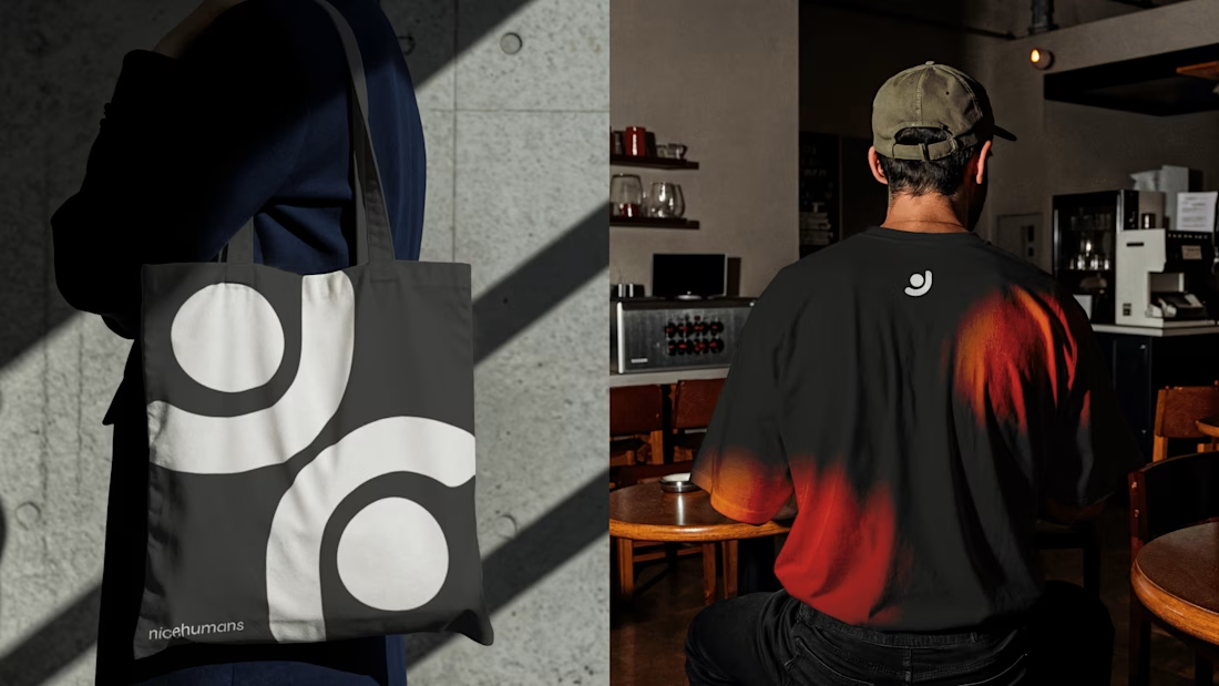
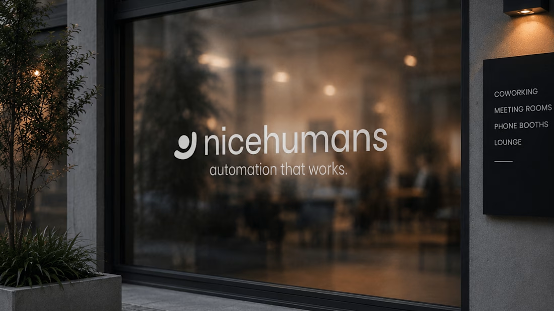
A cohesive brand system that sets Nice Humans apart in a crowded category and gives them a clear, consistent voice to grow with.


Great strategy and sleek execution! The visual hierarchy across web and print is spot on. 👏

Thank u so much 🙌

Strong and memorable.


great work!

Thanks, Alaa! Glad that balance came through, it was exactly the goal.

I love that logo on T-shirt, presentation of T-shirt too good. I really would love to wear it😊

Good branding

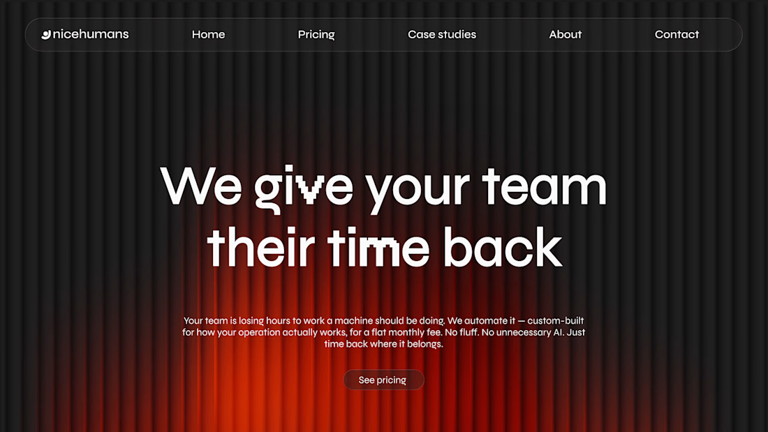
Starting from a positioning before the logo shows in the work. The "time back" headline on the site is a good line.
Appreciate it! The “time back” line took a few rounds to land, glad it works for you. Is copy something you pay close attention to in your own work?

Positioning before the mark really shows — anchoring “automation is about people” keeps the system from defaulting to cute illustration. The restraint in the NICE HUMANS wordmark + applied UI mockups carry most of the warmth; curious how you pressure-tested tone-of-voice on dry SOP/docs copy.
Appreciate the close read! One thing I found: on functional copy, warmth comes from who the sentence is about and what it says to do next. “The invoice must be submitted prior to approval” is cold, “Send us the invoice first, then we’ll approve it” is the same step, but human....
The network for creativity
Join 1.25M professional creatives like you
Connect with clients, get discovered, and run your business 100% commission-free
Creatives on Contra have earned over $150M and we are just getting started











Related posts

A little peek at the brand work we did for Elio Mortgage.
A warm, approachable identity full of warm vibrant colors paired with soft sun rising inspired gradients, inner glows and custom illustrations & more. Loved this direction!
Full case study coming soon, from process to final identity.
Plenty of logo explorations to share too!


That color palette takes the whole identity to a different level!! I loove it.

Brand Expressions -- Olivir


Thats so crazy!!!!!! Seeing this I feel we humans are still far better than AI

Figma Football
An unofficial football concept inspired by Figma and its visual language.
The ball was created using a custom 3D generator I built in ChatGPT, with animated interface icons and graphics developed with Claude.
Part design experiment, part exploration of how custom AI-powered tools can become part of the creative process.

The interface icons translate surprisingly well into a football identity.