The network for creativity
Join 1.25M professional creatives like you
Connect with clients, get discovered, and run your business 100% commission-free
Creatives on Contra have earned over $150M and we are just getting started
Back to feedPost

I developed the branding for DICEO — a German company built around the concept of transforming data into meaningful, actionable information.
DICEO stands for Data and Information Cycle for Elevator Optimization, and the entire brand was designed to reflect this core idea: collecting, organizing, and cross-referencing data from elevators to generate smarter, more efficient solutions.
The visual identity is rooted in this logic. The logo is constructed from two integrated data blocks, creating an intersection that forms the letter “D” — a direct representation of data connection and information flow. This geometric approach reinforces the idea of structure, precision, and intelligence behind the system.
brandinggraphicsdesignerlogoArt DirectionBrand DesignGraphic DesignAdobe IllustratorAdobe InDesignAdobe Photoshop


The network for creativity
Join 1.25M professional creatives like you
Connect with clients, get discovered, and run your business 100% commission-free
Creatives on Contra have earned over $150M and we are just getting started











Related posts

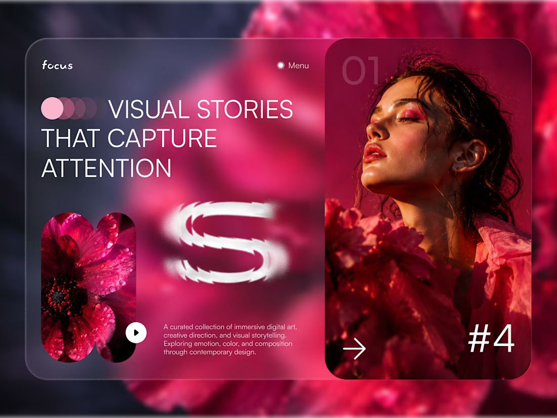
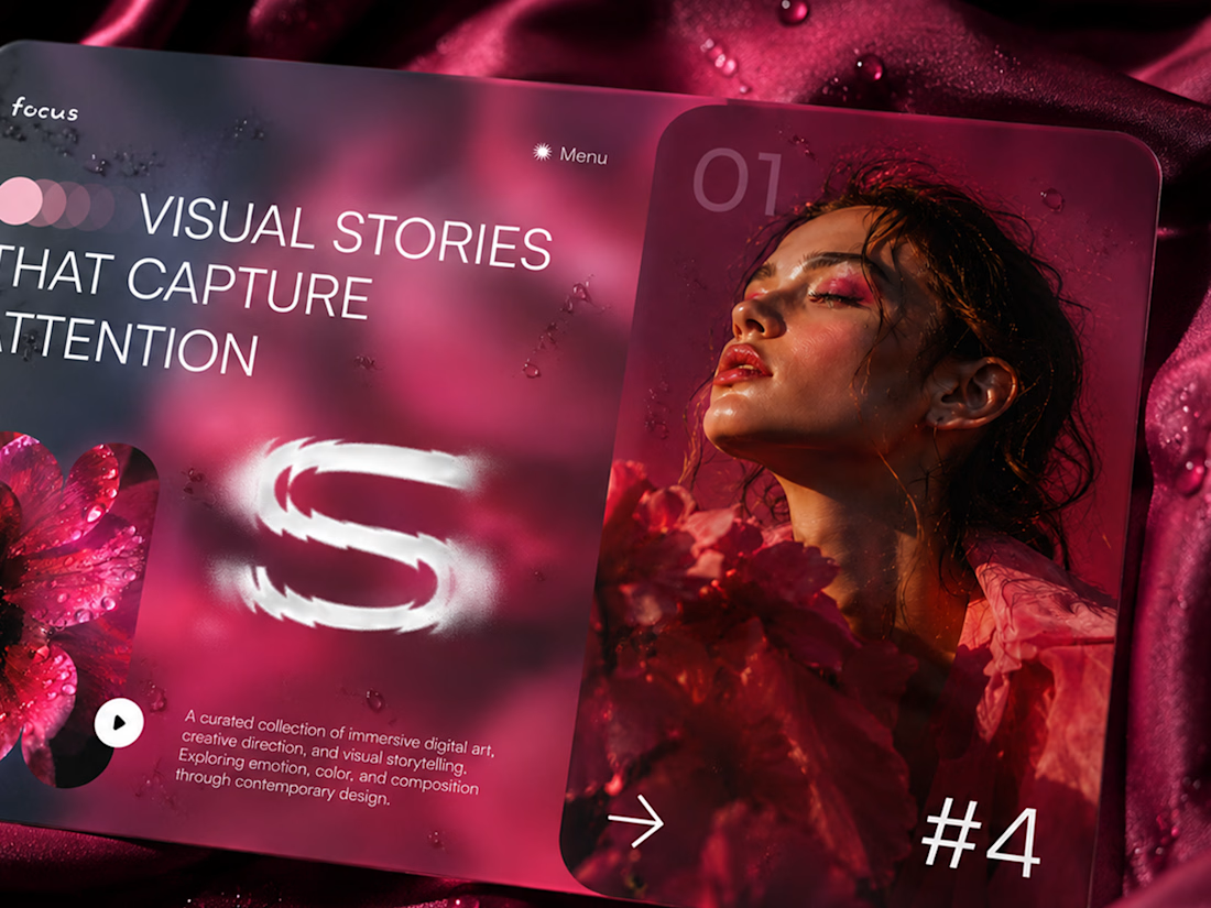
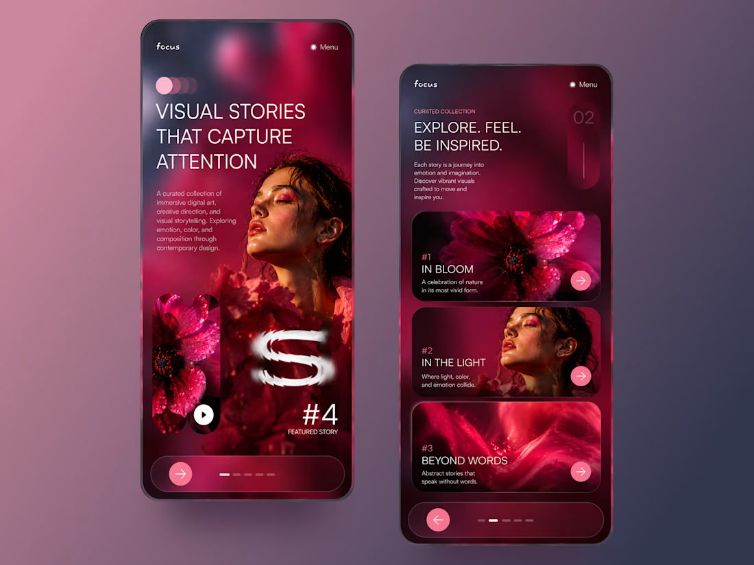
FOCUS — Creative Portfolio & Digital Art Website 🌸✨
A visually expressive website concept for a creative portfolio, built around digital art, bold imagery, and visual storytelling
The design combines vibrant pink tones, soft gradients, experimental typography, and immersive photography to create a distinctive editorial experience
Special attention was given to:
• Bold editorial hero composition
• Vibrant pink and dark color palette
• Experimental typography and visual details
• Immersive photography and digital artwork
• Creative project gallery and navigation
• Responsive mobile experience
• Clean layouts with a strong visual identity
The result is an expressive digital experience that puts creativity, emotion, and visual storytelling at the center of every screen 💗
Looking to create a standout portfolio or website for a creative brand? Let’s connect 🚀


The vibrant pink against the dark palette gives this such a bold editorial feel. The experimental typography is the star here.

Figma Football
An unofficial football concept inspired by Figma and its visual language.
The ball was created using a custom 3D generator I built in ChatGPT, with animated interface icons and graphics developed with Claude.
Part design experiment, part exploration of how custom AI-powered tools can become part of the creative process.


The interface icons translate surprisingly well into a football identity.

The presentation on top. The process below. ⚡
A behind-the-scenes look at my Tesla Cybertruck presentation, with the finished animation playing alongside a sped-up view of how I built it in PowerPoint.
From arranging each slide to fine-tuning the Morph transitions, here’s the work behind the final result.

