Gabriel de Castro
Art director and graphic designer. +10y XP.
Ready for work
Gabriel is ready for their next project!
Submission for #levelupwithbubble
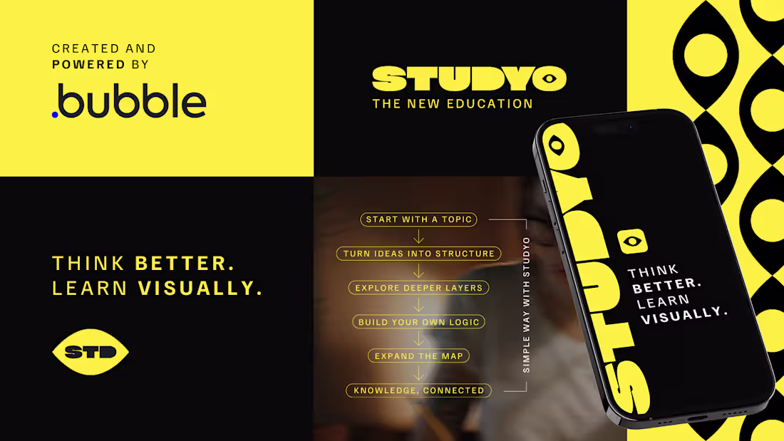
App Name: STUDYO
Category: Education & Learning
Live Link: https://gabrielcastrodias.bubbleapps.io/version-test
The STUDYO prototype starts with a simple idea:
what if learning worked more like thinking?
Instead of linear formats, STUDYO organizes knowledge through connections. From a single topic, AI generates a structured mind map, revealing key concepts and their relationships.
Each node opens layered content — from summaries to deeper explanations, supported by images, videos, and curated references.
STUDYO also introduces a collaborative layer.
Existing maps can be reused, expanded, and reorganized, allowing knowledge to grow over time through contributions.
Flexibility is central.
Users can reshape structures, move ideas, and define their own way of learning.
1
7
383
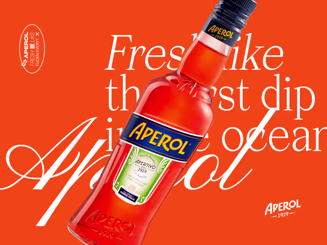
A personal art direction study inspired by Aperol.
Concept: “Fresh dip like a…🔥”
This project explores the refreshing sensation of summer — that instant feeling when you dive into a pool or take the first cold sip of a drink under the sun. The idea was to translate that moment visually through a mix of photography and bold graphic shapes.
By blending cut-out photography with fluid and geometric forms, the compositions create a sense of movement and immersion, as if the images themselves were dipping into color and freshness.
The goal was to create a playful and contemporary aesthetic that captures the light, social, and refreshing spirit associated with Aperol.
This is a personal creative exploration of how graphic forms and photography can merge to express the feeling of a refreshing summer “dip”.
10
27
565
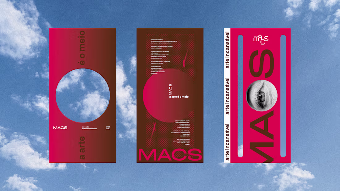
A personal rebranding study inspired by the Museu de Arte Contemporânea de Sorocaba (MACS).
This project explores a conceptual rebranding for MACS, rethinking how a contemporary art museum can visually communicate experimentation, openness, and cultural dialogue.
The idea was to create a flexible identity system that reflects the dynamic nature of contemporary art. The acronym MACS becomes the central graphic element, working as both a logo and a modular structure that adapts across exhibitions, artists, and visual applications.
Minimalist compositions and bold typography create a clean framework where art remains the protagonist.
This is a personal creative exploration on how branding can evolve with contemporary culture.
1
153
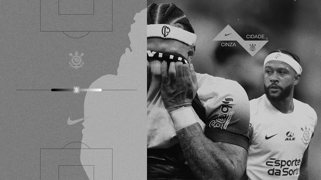
A personal art direction and graphic design study inspired by the football club Corinthians.
Concept: “Cidade Cinza”
The idea explores the symbolism behind black and white — the club’s iconic colors — blending into grey as a metaphor for unity. Just like a city where different stories, cultures, and people coexist, the project connects the team’s visual identity with the diversity of its supporters.
Through bold typography, compositions, and the fusion of black and white elements, the visual language creates a “grey city” where differences merge into collective strength.
This is a personal creative exploration of how graphic design and art direction can translate identity, city culture, and unity through the symbolism of color.
1
1
150
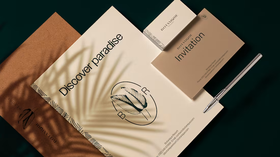
A personal branding study for a luxury resort concept called Botanique.
This project explores a visual identity designed to express refinement, calm, and deep connection with nature. The concept positions Botanique as a destination where time slows down and relaxation becomes the central experience.
The branding is built around elegant typography, organic shapes, and a restrained visual language, creating a sense of sophistication and serenity. Soft compositions and natural-inspired elements reinforce the idea of a place designed for rest, balance, and quiet luxury.
The goal was to craft an identity that communicates Botanique not just as a resort, but as a sanctuary for relaxation and wellbeing.
This is a personal creative exploration of how branding can translate tranquility and refined hospitality into a visual system.
1
6
208