The network for creativity
Join 1.25M professional creatives like you
Connect with clients, get discovered, and run your business 100% commission-free
Creatives on Contra have earned over $150M and we are just getting started
Back to feedPost

First hero for my Nation concept (not affiliated), an AI store builder: a shipping box. In the mockups it read as a company that makes boxes
A nation is somewhere you travel to, so the hero became a boarding pass, JOB → OWN.
The network for creativity
Join 1.25M professional creatives like you
Connect with clients, get discovered, and run your business 100% commission-free
Creatives on Contra have earned over $150M and we are just getting started





Related posts

AI Creator | Hyperrealistic Visuals & Cinematic Videos
From bold ideas to cinematic reality. Creative concepts, hyperrealistic visuals, storytelling, and professional editing
Have an idea? Let's bring it to life together
Feel free to message me about your project

This is really creative and real. Nice job!

Redesign proposal for a chess-for-money platform: a new logo with the $ built into the knight, plus home, log in and sign up with cinematic AI video.✨♟️
The challenge
Every screen had its own style and logo, and the home was just an image with two buttons. Not enough to trust a site with your money.
What I did
A new logo: no shield, the $ lives in the knight’s curve.
A home that explains it: “Play chess. Win money.”, how it works and fair play.
Shorter log in and sign up, with chess.com rating checks.
AI video panels and mobile versions.

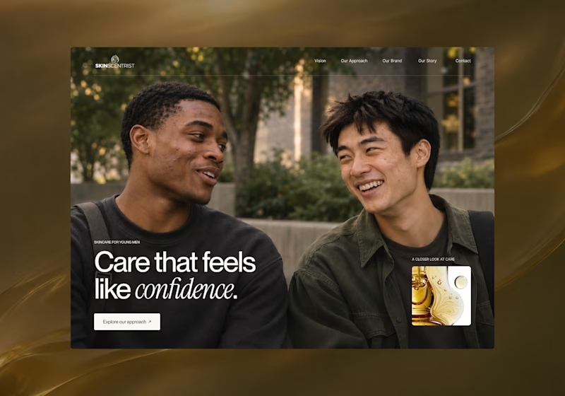
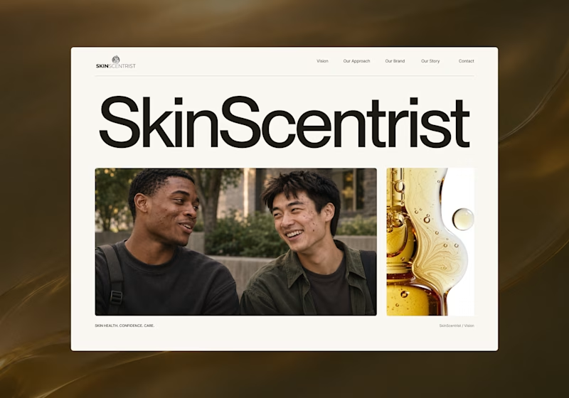
I’m exploring two homepage hero directions for SkinScentrist, a skincare brand focused on helping young men feel more confident in their skin.
Both concepts use the same imagery but take very different approaches to storytelling and visual hierarchy.
Direction 1 feels more emotional, immersive, and lifestyle-driven. The full-screen photography and bold messaging create a stronger connection to confidence and self-care.
Direction 2 feels more minimal, editorial, and brand-focused. The oversized typography, clean layout, and product imagery give it a more refined, contemporary skincare feel.
Direction 1: immersive, personal, emotional
Direction 2: minimal, editorial, premium
Which direction feels stronger for a modern skincare brand?

12 votes
Ends in 1d