The network for creativity
Join 1.25M professional creatives like you
Connect with clients, get discovered, and run your business 100% commission-free
Creatives on Contra have earned over $150M and we are just getting started
Back to feedPost

This is my first original song — Island Hustle.
I wrote, edited, and composed it myself. Lyrics, arrangement, mix — first time end-to-end. I had fun, and I went into a space I had been afraid to touch.
There are rough edges. I shipped it anyway.
I made it for the creative community I work with in my country: a small push to keep going.
Full song:
The network for creativity
Join 1.25M professional creatives like you
Connect with clients, get discovered, and run your business 100% commission-free
Creatives on Contra have earned over $150M and we are just getting started








Related posts


So excited to see Creative Intelligence 2026 by @Contra Labs out in the world!
At @Heed Collective , we had the pleasure of designing both the website and the report. We’re incredibly grateful for this collaboration!
Our creative exploration started with a question:
What does Creative Intelligence mean today?
We believe it lives at the intersection of creativity and analysis, imagination and insight.
We translated this into a visual story that begins in space — vast, dreamy, full of possibility — and gradually moves closer to Earth, grounding imagination in something tangible and human.
Huge congrats to the whole team, @Erin Horner, @Ben Huffman, @Mark Vassilevskiy, @Alex Karpodinis, @Stacy · Heed Collective, @Heed Collective , and the entire @Contra Labs team 👏


Incredible work, congrats!

Sharing some other projects we worked on for @casamigos, in collaboration with @itsplaydate.
Being part of a project connected to the FIFA World Cup 2026™ made this one especially exciting for us. We shaped the sound around the energy of the stadium, combining crowd atmosphere, movement, impacts and detailed accents to bring the film to life.
We’re really excited to have been part of this project and to work alongside the @itsplaydate team.
Sound design: @penrose_audio
#SoundDesign #Casamigos #FIFAWorldCu


World Cup 2026 x Casamigos - huge! Love the stadium energy concept for the sound design. That pitch art is 🔥

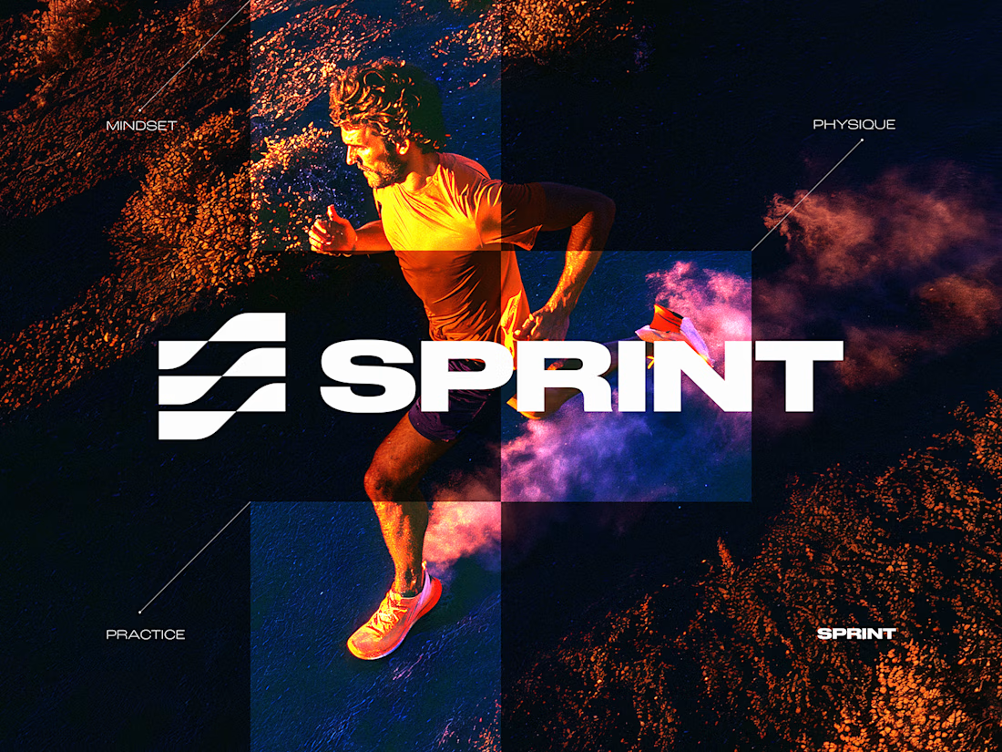
SPRINT — Experimental Brand Visual
A visual experiment built around an unused logo concept from a recent branding project.
The design was created manually, while exploring how AI-driven aesthetics are increasingly influencing contemporary visual language, even when AI itself isn’t part of the design process.
Logo design, art direction and visual exploration.


Good work


