The network for creativity
Join 1.25M professional creatives like you
Connect with clients, get discovered, and run your business 100% commission-free
Creatives on Contra have earned over $150M and we are just getting started
Back to feedPost

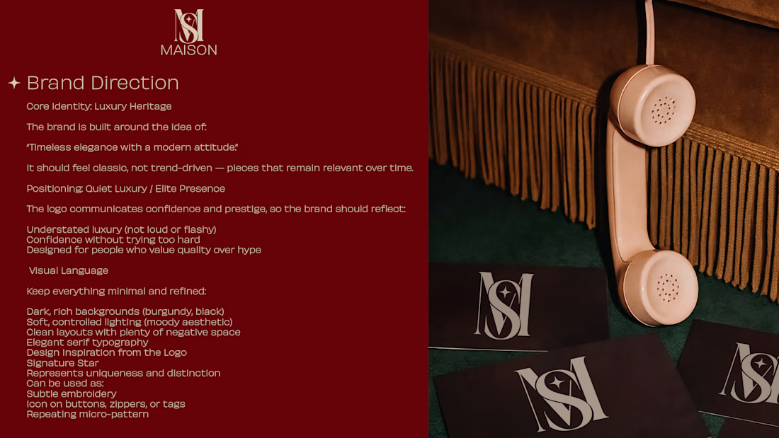
MAISON — Timeless Fashion Branding
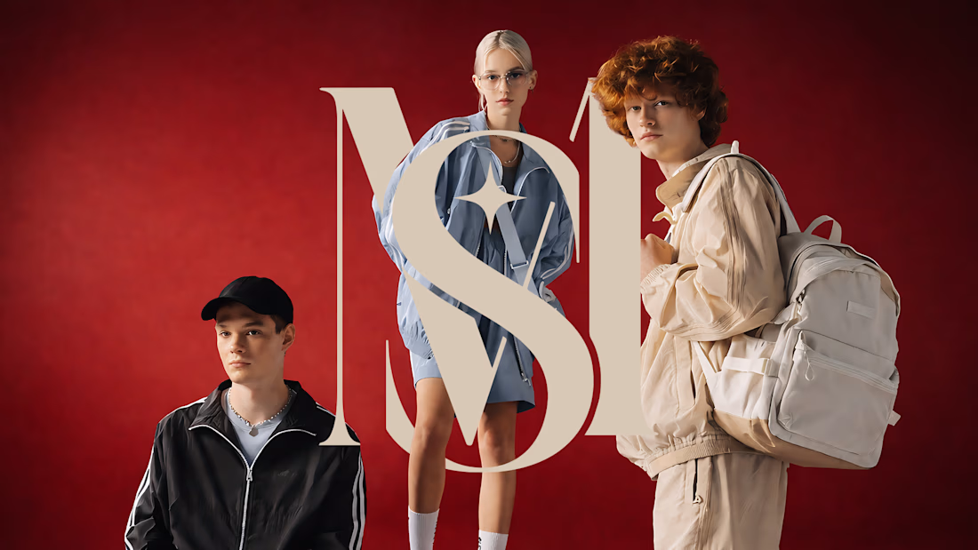
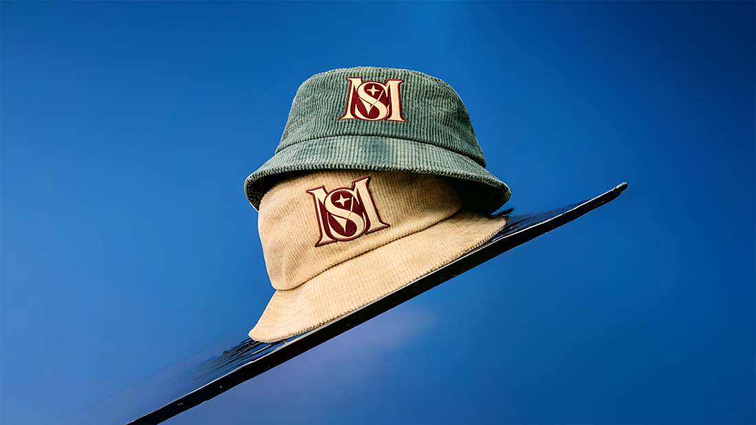
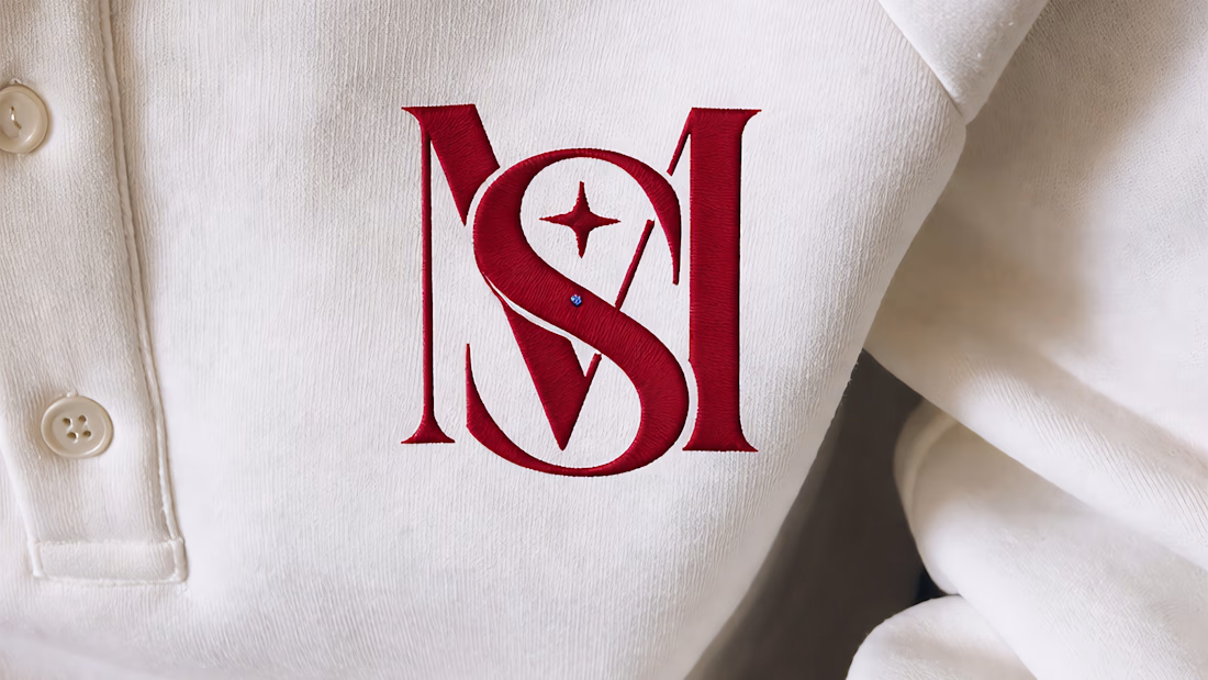
The MAISON logo is a modern and eye-catching design that creatively integrates letters into a strong visual identity, embodying the brand's contemporary style. It boasts a striking and memorable logo with impressive features.
Features:
Minimalist and modern style.
A solid, sophisticated design that stands between average and exceptional.
Available across various digital and print platforms.
Strong colors that enhance brand presence and command attention.
Various sizing enhances clarity.
Services Offered:
Gold logo design.
High-quality file delivery (PNG, JPG, PDF, AI/SVG upon request).
Transparent background version.
Color and size customization options, including customization to reflect the client's identity.
Design Objective:
To create a distinctive visual brand identity that resonates professionally and modernly with the target audience, inspiring children to leave school with confidence.


The network for creativity
Join 1.25M professional creatives like you
Connect with clients, get discovered, and run your business 100% commission-free
Creatives on Contra have earned over $150M and we are just getting started





Related posts




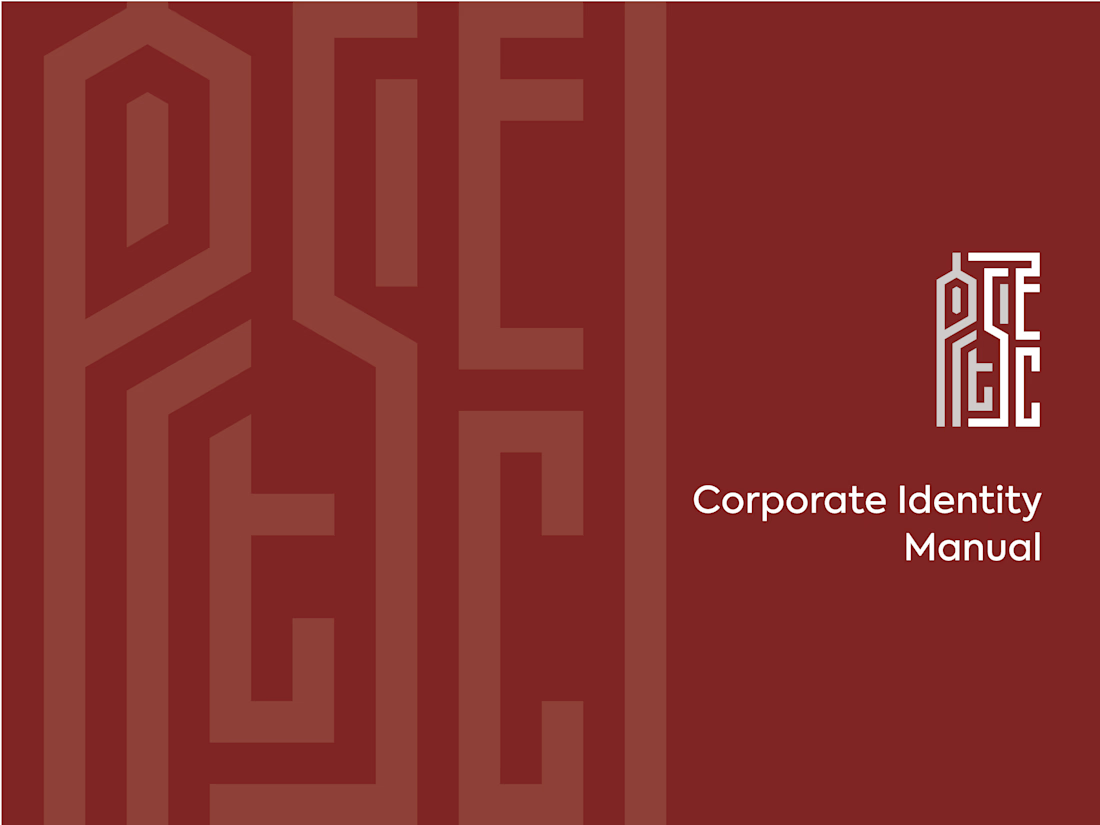
ARTSEC is an art investment platform focused on making African contemporary and indigenous art more accessible to collectors and investors.
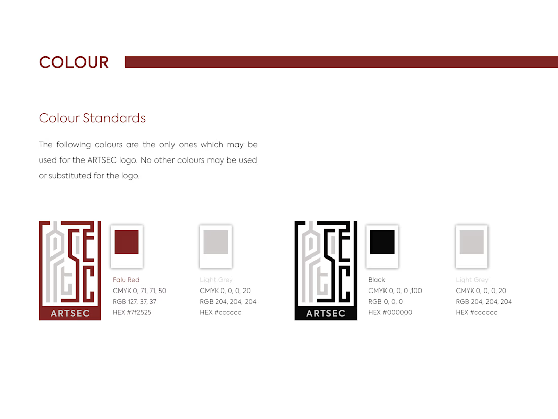
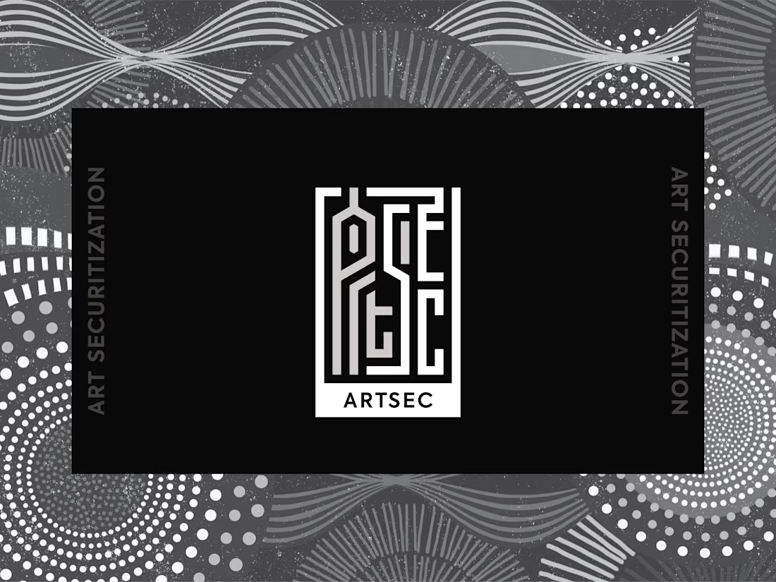
I developed a complete visual identity system for the brand, including the logo, colour palette, typography and usage guidelines.
The identity was designed to give ARTSEC a distinctive, consistent visual presence while reflecting its connection to African art and culture across print and digital applications.

Can't stop looking at this! 😍

Which hero visual feels right for this brand?
While working on the homepage for Halfspace, a website design and SEO agency, I explored two different hero visuals for the same headline and layout. Same message, same structure, just a different visual metaphor and mood.
Option 1 - Rocket Launch. Bold, literal, and energetic, visually reinforcing the "launch your business" message with motion and fire.
Option 2 - Glass Cube. Abstract, sleek, and premium, giving a more refined, tech-forward feel without relying on a literal metaphor.
Would love your honest UX/UI take, which direction feels more impactful, memorable, and aligned with a web design/SEO brand, and why?
11 voted
41%
16 voted
59%
27 votes
Closed

Both design are great; it's hard to choose one