The network for creativity
Join 1.25M professional creatives like you
Connect with clients, get discovered, and run your business 100% commission-free
Creatives on Contra have earned over $150M and we are just getting started
Back to feedPost

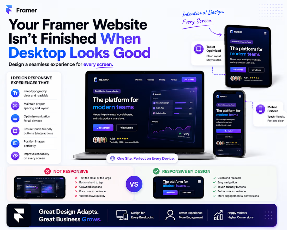
Your Framer Website Isn't Finished When Desktop Looks Good
One mistake I see often:
A website looks amazing on a laptop…
Then you open it on your phone and everything feels different.
Text is too large.
Buttons are awkward.
Sections feel crowded.
Images don't sit properly.
That's why I don't treat mobile as an afterthought when building in Framer.
I think about responsive behavior from the beginning:
Desktop → Tablet → Mobile
For each breakpoint, I check:
✅ Typography and hierarchy
✅ Spacing and section height
✅ Navigation and menus
✅ Button sizes
✅ Image positioning
✅ Content readability
✅ Touch-friendly interactions
The goal isn't to make the desktop design "shrink."
It's to make the experience feel intentional on every screen.
That's one of the things I like about Framer—the visual workflow makes it easy to see how design decisions translate across breakpoints and refine them quickly.
Have you ever visited a website that looked great on desktop but terrible on mobile?


The network for creativity
Join 1.25M professional creatives like you
Connect with clients, get discovered, and run your business 100% commission-free
Creatives on Contra have earned over $150M and we are just getting started
Trending
retrofuturism
Share your favorite designs from the past exploring the distant future. Or your own take on the aesthetic 🚀
halftone
Dots. Texture. Grain. Let's see your designs using the halftone technique.

Midjourney
Creatives are showing off what they're making with Midjourney.
colorgrade
Video editors sound off: How do you enhance the mood of your video in color grading?
Related posts


Clean layout on the Nelta site, did you build the interactions natively in Framer or lean on custom code for the more complex ones?


Clients often ask what style I have. I always answer that I'm super versatile. I get bored easily, so I like to explore many different approaches when working.

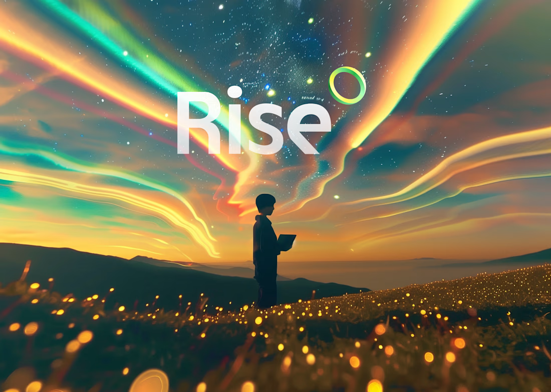

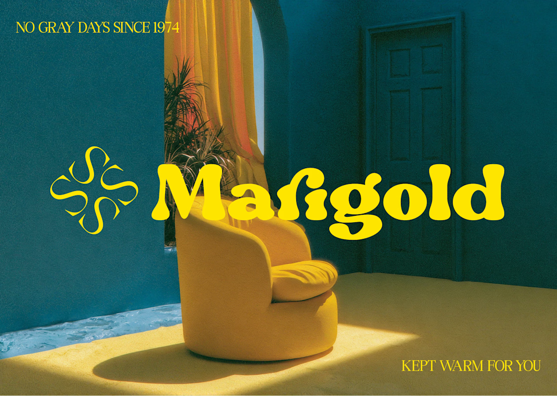

props to you, these are all so well executed! flexibility is a creative superpower.

I've been building Studio Kowa from the inside out with a new mark, a refined color and type system, and a studio direction that actually reflects where I want this project to go.
I've been building this idea on the side for a while now, while freelancing for different clients over the years. The focus is on helping founders and cultural clients put their first step forward through clean, energetic design and brand systems. I'm directing AI with a strict point of view and using it to move faster while also flagging poor results.
I will be sharing more on the studio this week as well as a new website built in Framer!


Directing AI with a strict point of view instead of just prompting and accepting whatever comes back is the actual skill gap right now. most people either avoid AI in brand work entirely or let it flatten their taste. doing both, moving faster and still catching poor output, is a harder discipline than either extreme