The network for creativity
Join 1.25M professional creatives like you
Connect with clients, get discovered, and run your business 100% commission-free
Creatives on Contra have earned over $150M and we are just getting started
Back to feedPost


Clean design and layout, satisfying to scroll through.

Clean layout on the Nelta site, did you build the interactions natively in Framer or lean on custom code for the more complex ones?


All interactions are natively done


Amazing!

Cool


Amazing work👏🔥🔥


COOL STUFF MAN

The muted industrial fog imagery paired with that headline gives Nelta a weight that a lot of B2B IT consulting sites miss, it feels more substantial than the usual stock office photos. Good pick going bilingual with DE/EN right in the nav too.


Great design

Very nice hover effects. The only thing I wondered was whether the context of the cards gets lost if the main explanatory text is only visible on hover. Perhaps the interaction might not be obvious to some users?


looks great, german b2b sites are usually so stiff

great job!
The network for creativity
Join 1.25M professional creatives like you
Connect with clients, get discovered, and run your business 100% commission-free
Creatives on Contra have earned over $150M and we are just getting started







Related posts

Contact page done with claude from my phone
What a time to be a designer

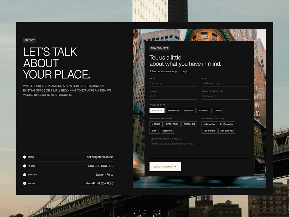

That is amazing and the contact page design looks great.


Proud to be an Official Framer Expert Agency for 2026!
Explore our work:
https://artonest.design/
https://www.framer.com/@artonest-design-studio/