The network for creativity
Join 1.25M professional creatives like you
Connect with clients, get discovered, and run your business 100% commission-free
Creatives on Contra have earned over $150M and we are just getting started
Back to feedPost
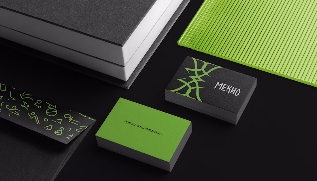
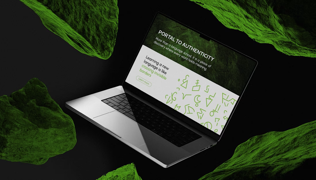
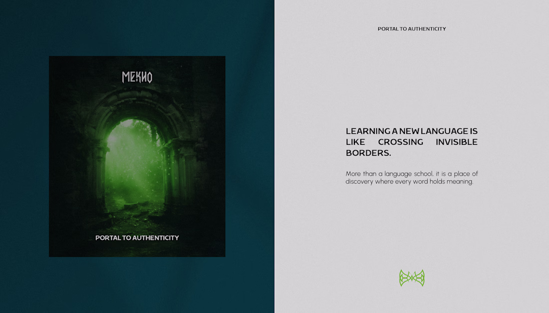
Language can be a portal, where each word opens a passage to new worlds. Yet in the language school market, many brands still communicate in similar ways.
With MEKHO, the goal was to move away from traditional academic imagery without losing credibility or structure. The challenge was to translate depth and authenticity into a consistent visual system for digital environments.
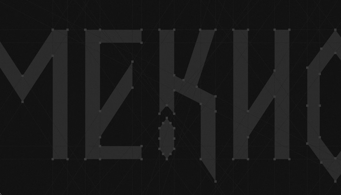
The logotype features angular strokes to convey precision. The symbol combines stylized bat wings, representing guidance, with a form that suggests a coded sign, reinforcing language as a system to be deciphered. The palette builds authority through dark tones, while green acts as a calculated contrast, signaling sophistication and direction.
The result is an identity that positions MEKHO as an immersive brand focused on real communication.
Really like the direction here — feels modern without falling into the typical “edtech clichés.”
The credibility still comes through.
Curious — how do you usually balance distinctiveness vs familiarity when designing for education brands?
Thank you so much! It was really important for me not to fall into clichés. When it comes to the brands I work with, I like to focus on symbols, the meaning they carry, and how they connect to each client’s story.
“Love that perspective — avoiding clichés while preserving familiarity is a really delicate balance.
I’ve noticed the strongest education brands often anchor distinctiveness in concept rather than visuals alone. The symbolism carries originality, while the execution maintains...
The bat wings logotype with that dark green on black system is so distinctive, it reads as premium and academic at the same time.
Thank you so much! That’s exactly what I wanted to convey, knowledge as something precious, something we should explore.
The network for creativity
Join 1.25M professional creatives like you
Connect with clients, get discovered, and run your business 100% commission-free
Creatives on Contra have earned over $150M and we are just getting started
Related posts
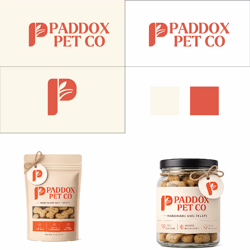
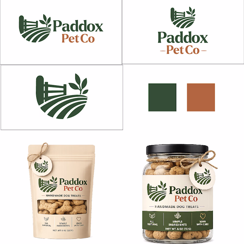
Just wrapped up a couple of logo directions for a recent pet food branding project.
Right now I'm leaning toward the first concept with the orange splash, but I'm curious what you think.
Which direction would you choose?
14 voted
47%
16 voted
53%
30 votes
Closed
The one with orange sits better
I couldn't just stand aside and not join in on the fun of this character challenge. So let me share this mesh animation I did a while back for the Stompers app. These guys have an incredible creative direction and really fun app design. I had a blast animating these characters and hope you'll enjoy watching it.
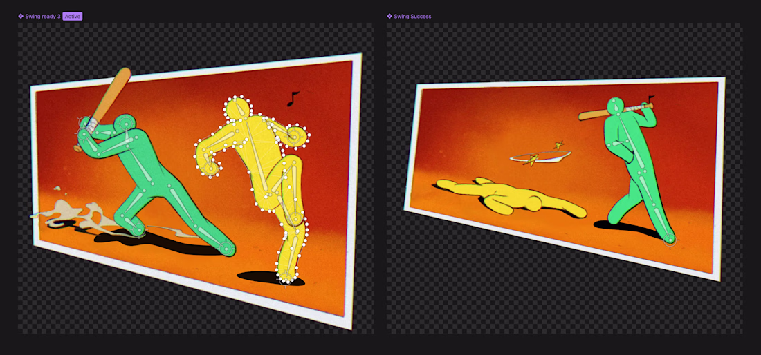
Looks great! Curious about the choice to go with mesh. I tend to avoid it, had some bad experiences with crashes and performance, so I usually stick to vectors 😂
Hey peeps!
Recently animated Inspire's logo - which style you prefer?
59 voted
72%
23 voted
28%
82 votes
Closed
Goung for a Logo Animation
Trending
Claude
Claude has entered the design space. How are you using Claude Design?
Contra University
Learn from expert creatives how to earn more using next-gen AI tools.
fifaworldcup2026
The World Cup is here and the whole world's watching. How are you designing for the world stage?
creativeaiflow
Creative AI workflows are evolving. What tools do you use, and what are their strengths and weaknesses?
freelancerlife
Freelancer life is wins, pivots, and everything in between. What’s yours right now?