
Chibueze Umechukwu
Product Designer | Mobile • Web • Dashboard Design
Ready for work
Chibueze is ready for their next project!
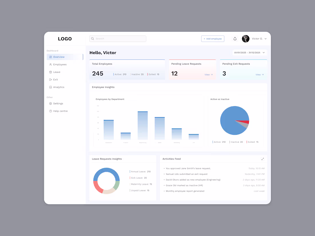
Just wrapped up this HR dashboard design, and the goal was simple: make the data feel alive without overwhelming the people actually using it every day.
I focused on giving HR managers a clear snapshot of what’s happening across the company. Employee counts, leave requests, exits, department insights, and activity feeds — all in one calm, easy-to-breathe space.
Designing dashboards is always a balancing act between clarity and personality, and colour plays a big role in that.
Do you think too much colour on dashboards can distract from the data displayed? What are your thoughts?
2
3
36
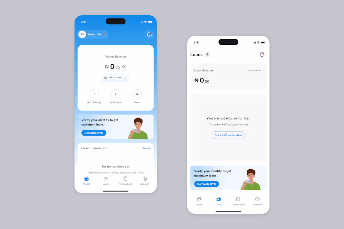
Every fintech journey starts with that “Complete KYC” button staring you down 😭🔥
New user mode activated 🪪
Just finished designing this onboarding flow for a fintech app, and honestly, this stage is always fun to work on because it’s the real “first impression” moment. A fresh user, zero balance, no history yet — just vibes and potential.
Here’s what I focused on:
- Clarity over chaos
- Warm, friendly tone
- Simple actions upfront
- State transparency
- A smooth path to trust
Designing onboarding states like this is where product design really feels like storytelling — guiding someone from “new here” to “fully in.”
2
3
48
Facity: A Student-Centric Fintech Solution
1
18
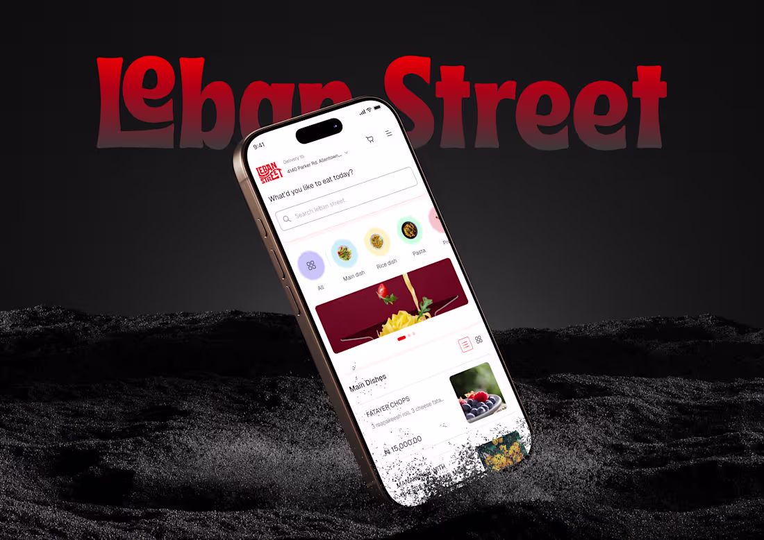
Leban Street | Restaurant Mobile Web App Design
0
15
Innovation Hub | Responsive Web App Design
0
5
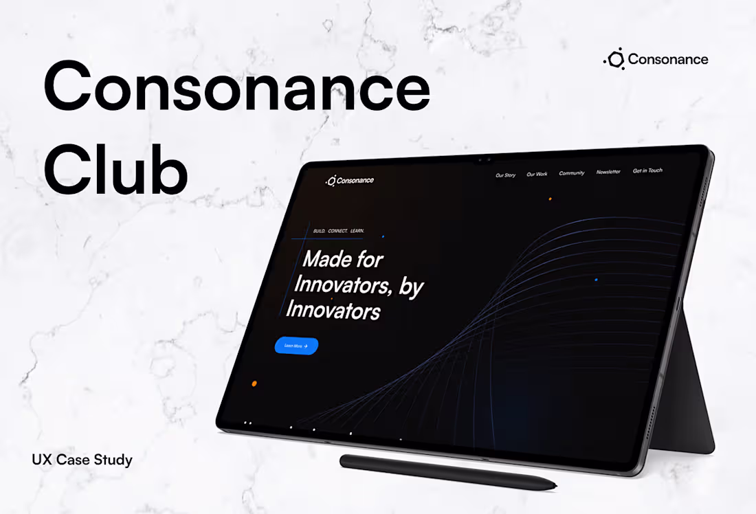
Consonance Club Website Redesign & Development
0
2
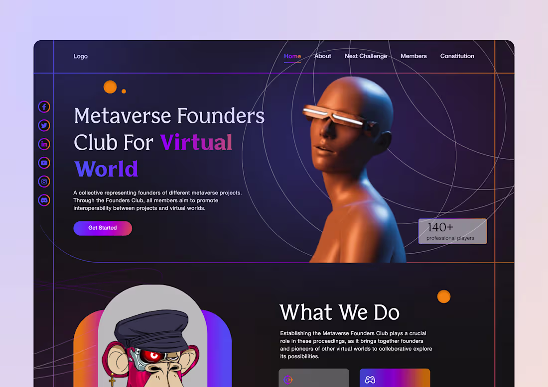
Meterverse Landing Page
0
4