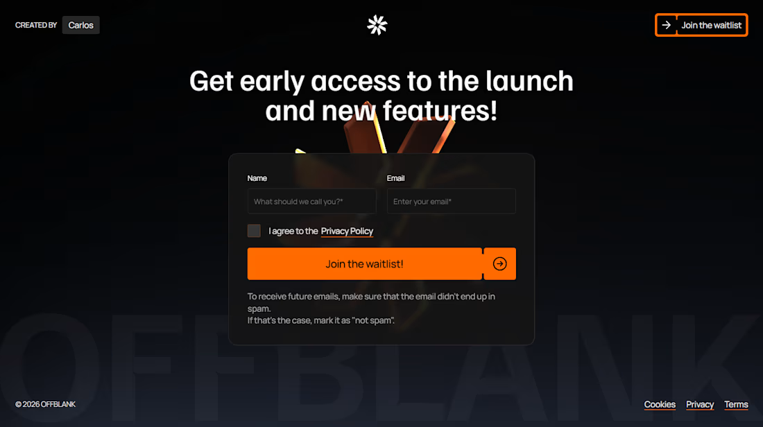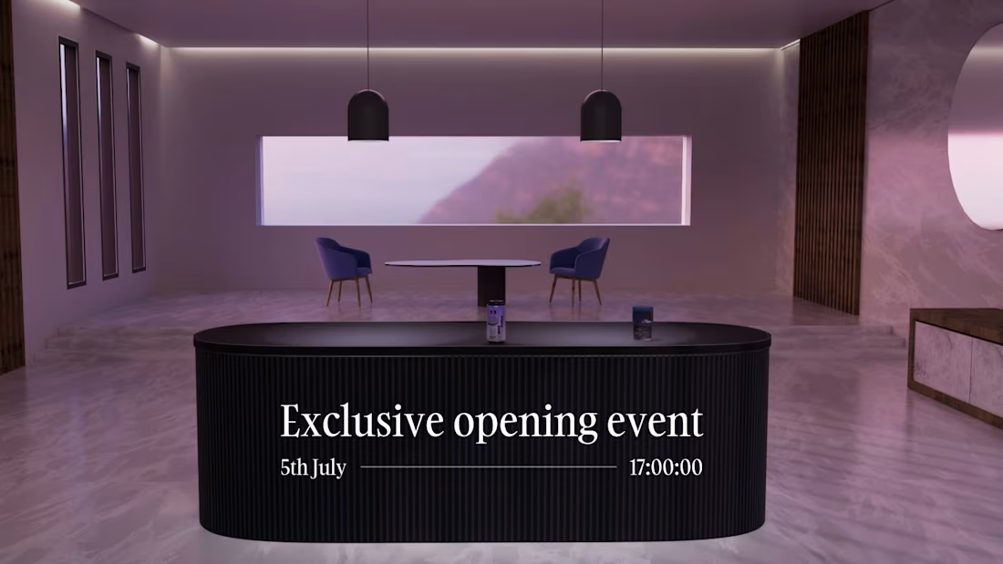
Landing page for FolderV12 → folderv12.com (https://folderv12.com/)
🚀 We launched FolderV12 two days ago and it's already getting some traction.
📂 FolderV12 is an e-commerce brand of premium organizational products built for Creative & Ambitious minds. Our mission is to help this niche to get more mental clarity with their projects and help them focus on what matters.
Nowadays, every organizational product/system is ugly, boring and useless, because they try to solve a generic problem, when in reality, each proffesional has specific needs, and therefore, need specific solutions.
That's why we are focusing only on helping Creative and Ambitious minds.
If you are interested, fill out the form from the website and enter our newsletter to discover more. We also have a Free gift for you in case you fill out the large Form.
Really cool products and things about to come.
FolderV12 will be the coolest brand in the industry.
3
2
55
It's been a lot of time since I posted something here, but I come with a masterpiece. I have been working in a lot of projects that hopefully They will see the light soon. I willl be sharing them here.
Here are some AI generated images that I've done for GAA Design Studio to use them as brand assets for client projects.
There are just 23 great images out of the last +4500 images that I have generated.
I made them by using Midjourney + Flora.
I think I have already mastered my AI workflow.
What do you think?
17
28
797
✱ Update 4 - Building my own digital brand
Last time I shared something about this project was 1 month ago.
I had the idea of creating this brand/product since July, 2025 and the launch is getting closer.
So much to build yet but is just time what I need.
So I wanted to share with you the roadmap that I have for now. I hope everything goes as plan and I don't have to delay anything.
ROADMAP:
✱ January - May: Keep building and improving the product.
✱ February: Launch the landing page + Waitlist
✱ May: Launch the entire website + Product (Founders round with limited spots that will have all-time acces)
Early access for the people on the waitlist.
✱ May - September: Keep improving the product based on the feedback from the people who bought in the founders round.
The founders round will be seen as a bargain in 1 year.
6
13
124
✱ Day 3 building my own digital brand - Documenting my journey as a designer in my 20s.
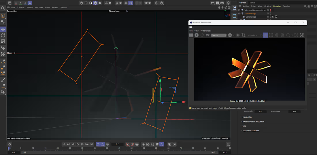
Logo done and also a 3D version on C4D in order to stand out visually in the market, specially in the niche that will be this brand.
✅Research of the market and competitors done.
✅Naming defined.
✅Mission, vision & values of the brand defined.
✅Art direction of the project defined.
✅Logo done
✦ Currently building the website in Framer. A website that really stand out in the market, that builds authority, trust and maintains the brand consistency which helps a lot to increase brand awareness over time.
I'm building a high-quality type of MVP that maybe it will evolve during the next years. That's why I'm building just the basics of branding and not an entire brand guidelines yet.
This is a really high-quality and premium digital brand.
21
235
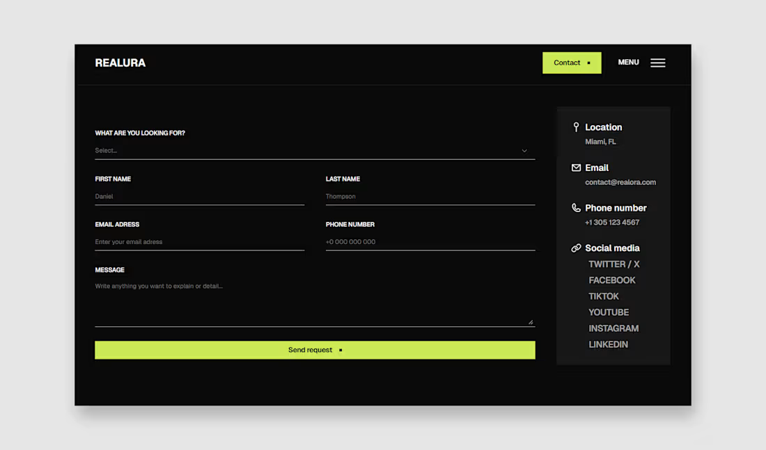
Realura > contact page
2
114
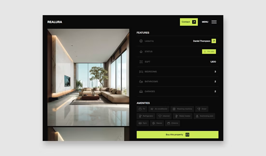
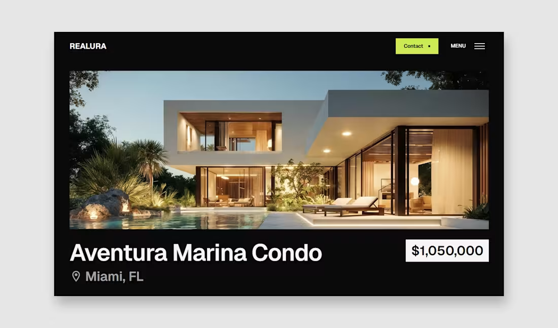
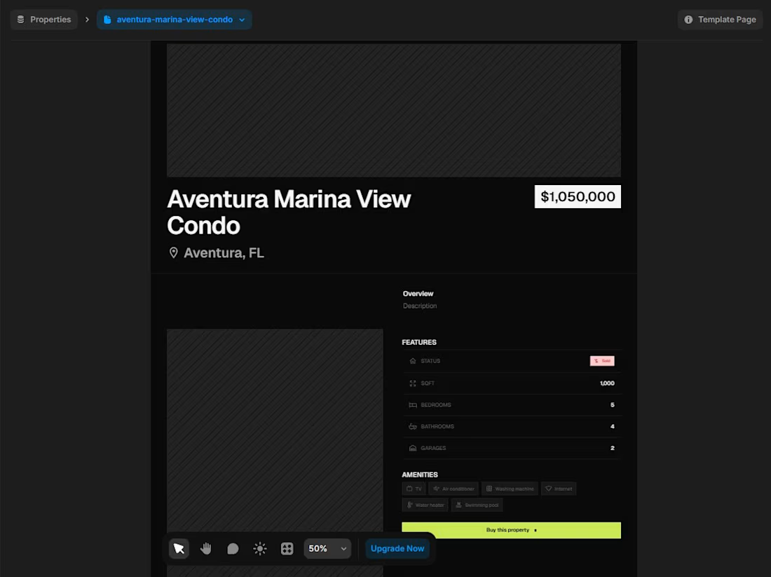
Property detail page - Realura
2
127
Property detail page - Realura
Not gonna lie, the price is a little bit off for that image 😂
But what do you think about the layout?
1
5
117
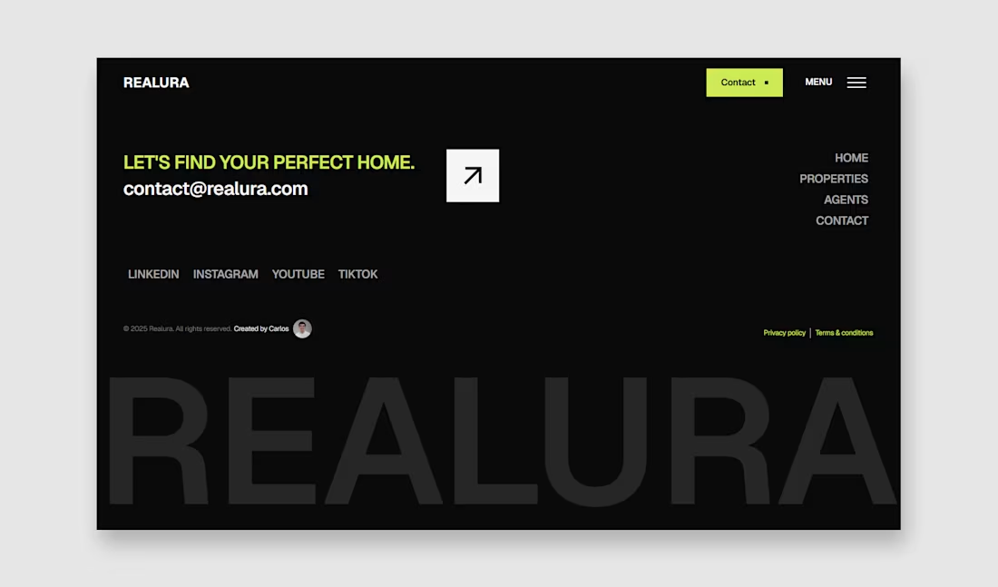
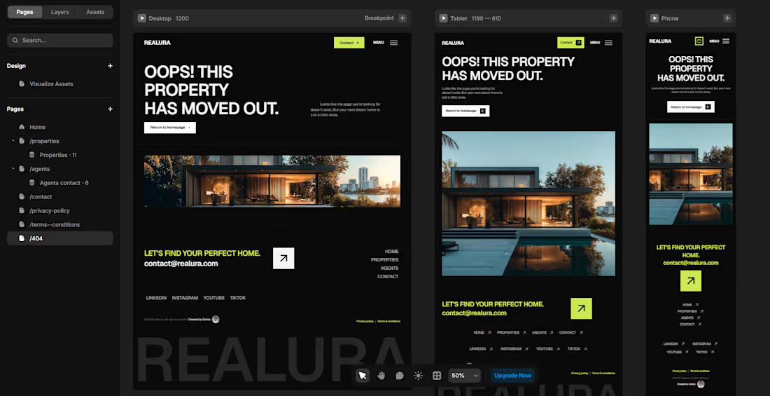
Footer design for Realura.
Love the big typography footers.
I really wanted to make it simple in order to make the CTA stand out.
What do you think?
1
112
Today, I'm starting a series that consists on sharing my journey as a designer building a Framer template business, from creating the brand & campaigns to designing all the products.
My vision is to eventually transform this brand into a premium design assets brand for designers, so this is a really long-term project for me.
Should I also share into the series the journey of getting clients as a freelancer and eventually starting my own agency? Or it's too much for a series?
Here it starts.
Day 1 sharing my journey building a brand as a designer.
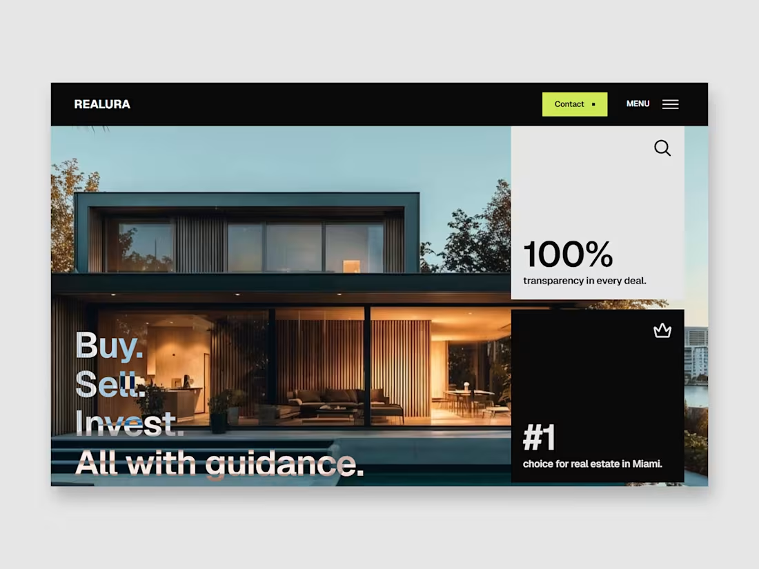
Realura > homepage section
Do you think it's a great layout to showcase info in a minimal and clear way?
0
98
Realura is looking great so far!
It's a really complete real estate framer template.
Let's add little animations and the template is fully finished and ready to submit to the Framer marketplace.
I will be sharing more about this project really soon.
2
6
92
WIP - Realora
I'm creating and setting up the CMS collection of the properties for this real estate framer template.
And I want to ask you, what do you think about the layout so far?
Do you think is something missing?
Trying to improve it as much as I can in order to help future buyers of the template to customize it easily.
22
221
WIP - Footer design for my upcoming real estate Framer template.
2
145
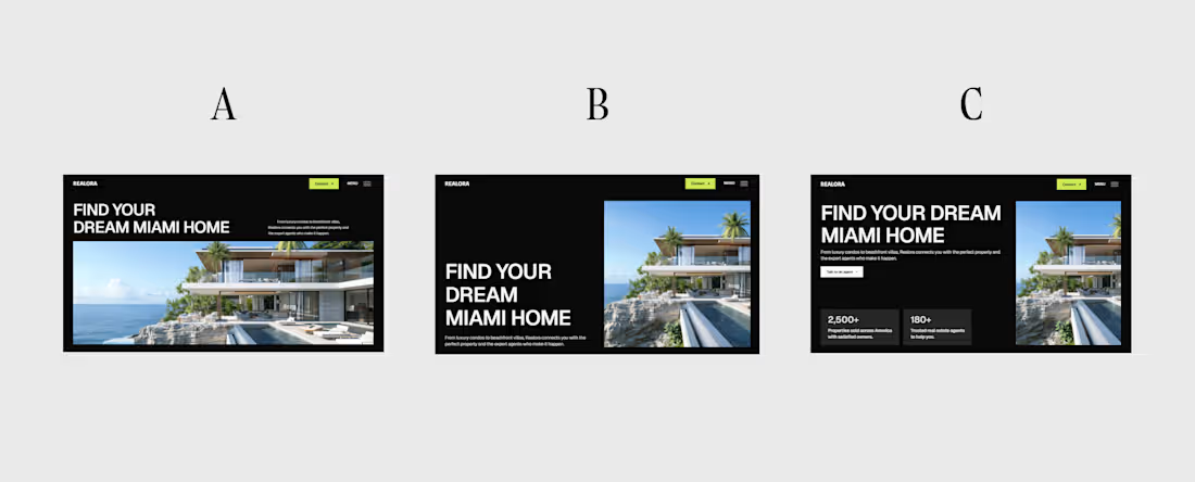
Exploring some hero sections for my new real estate Framer template - REALORA.
Which one do you think is better?
Should I keep exploring?
Btw, I already explored like 10 different hero sections but these 3 are the best from my point of view.
12
26
235
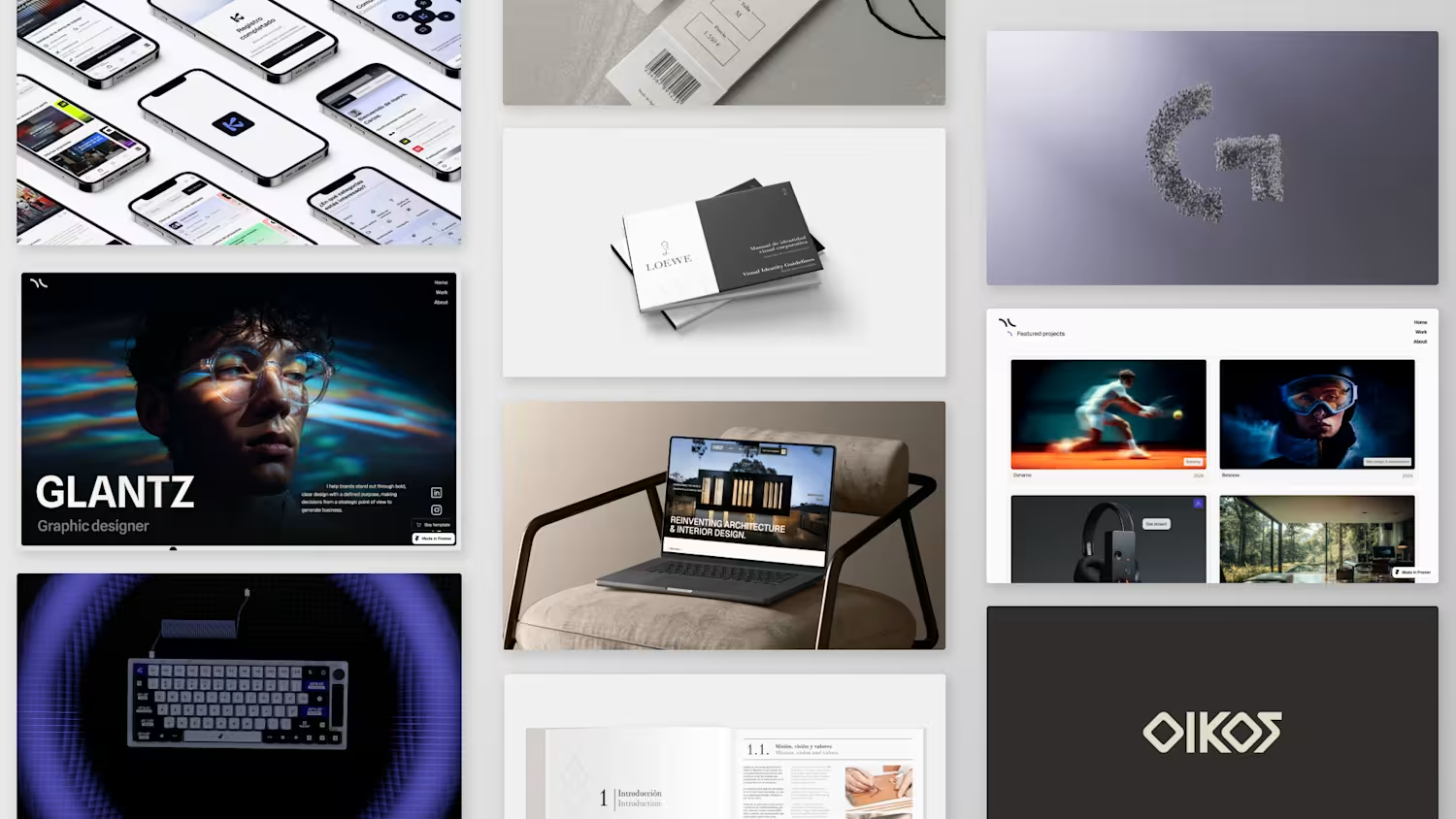
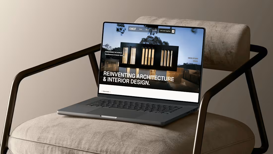
OIKOS Studio - Strategic Website & Brand redesign.
3
5
🎉 Happy to announce that I finally have my own portfolio website and my own space on the internet!!
Of course I had to make it with Framer.
I wanted to make my portfolio unique with cool interactions but making it clear in order to convert better.
Also I designed it in a scalable way, managing the CMS and making components that could be duplicated easily and fast so in the future it would be faster to modify content.
There are some new ideas of sections that I want to add in the portfolio in order to make it even more cool. Once I develop this new ideas, I will be glad to show you again.
Planning to submit it to Awwwards. What are your thoughts?
In case you want to visit the portfolio, here is the link:
https://carloshuertas.com/
2
26
243
Kinoud - App Design, Branding & 360 campaign.
2
4
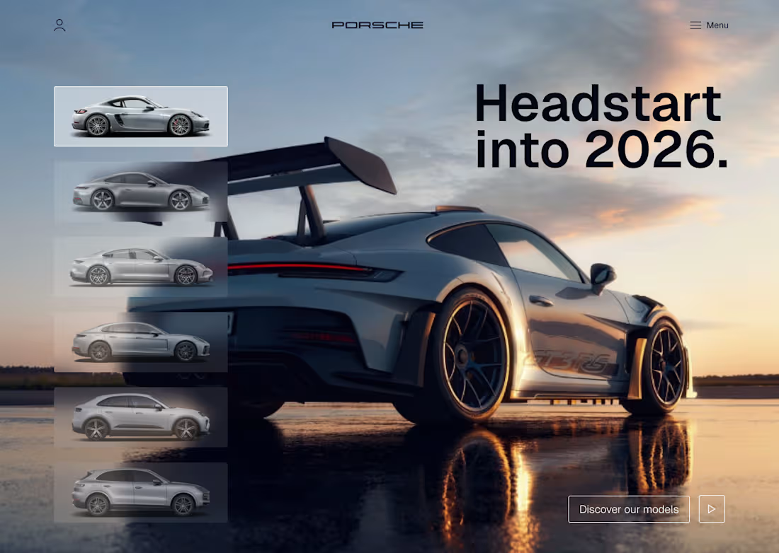
I redesigned the hero section of porsche's website in figma.
Less friction for the user to see the models.
Easier to scan visually.
3
25
194
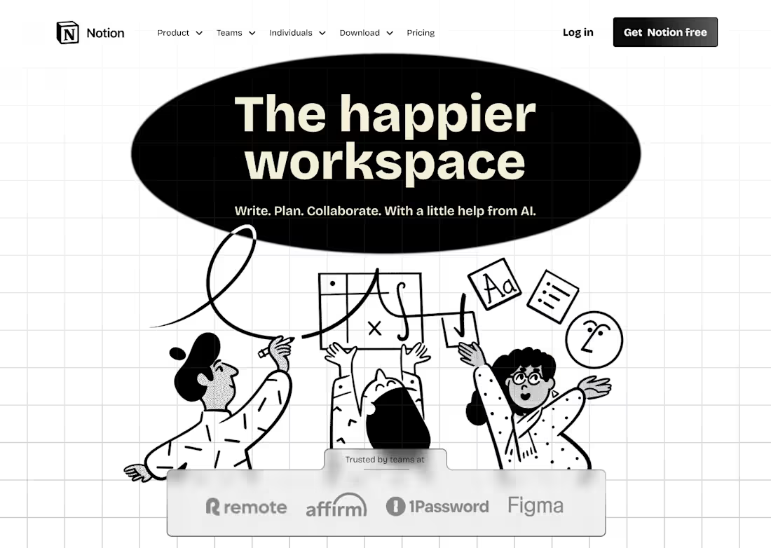
For the last few weeks I have been using Notion a lot to create systems & organizing projects.
Honestly, it's a really great tool that I use every day, so I decided to redesign the hero section for their landing page.
28
204
Hello Contra community! I hope all is going well.
Here is a 3D passion project. Entirely done from scratch and alone. It took 3,5 months from brainstorming & find the idea to developing it & achieving these results.
What do you think?
I always appreciate a lot the feedback.
It allows me to keep improving.
3
23
252
Maybe it's not very common to see projects about the luxury industry here but I wanted to share this branding project that I did. Hope you like it!
Rebranding for Loewe + brand guidelines.
Loewe is a Spanish luxury brand that focuses primarily on craftsmanship and sustainability. This rebranding was carried out with the aim of highlighting and emphasizing these brand values that set it apart in a sector as consumerist as luxury fashion.
The goal was to approach this rebranding from a transparent perspective, directly connected to nature but taking into account the luxury, exclusivity, and elegance of the brand. Create a visual identity manual with brand guidelines in order to maintain a clear and consistent visual identity over time.
2
23
263
I recreated the rabbit r1 physical product in Figma.
Just for practice. Honestly, it was so fun to do it.
It seems to me like the product shadow is a little bit off.
What do you think?
1
14
113
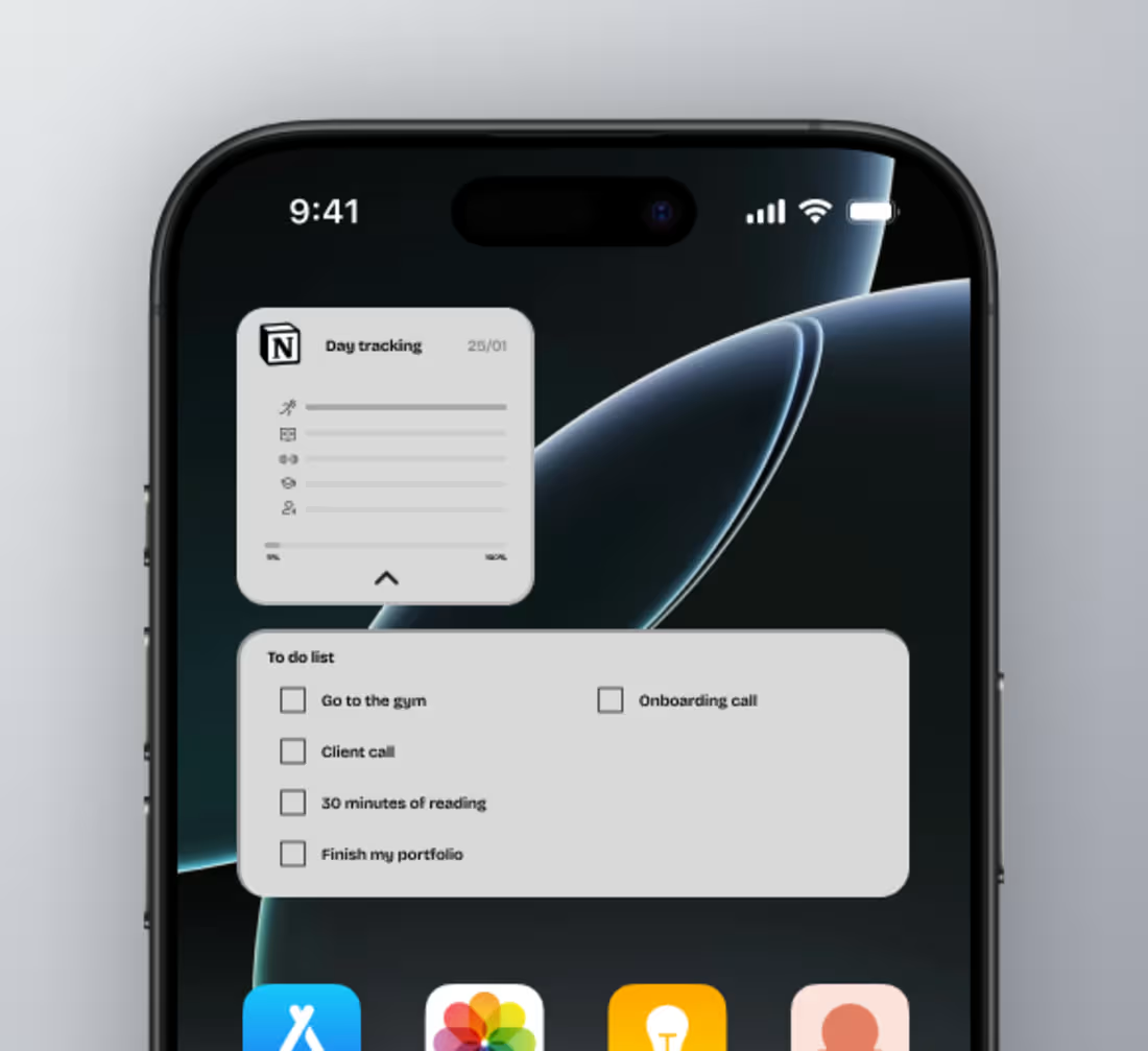
I designed a mobile widget for Notion to track daily habits and see the progress.
What do you think? Would you use a widget like this?
1
9
83
3D project made in Cinema4D + redshift.
The goal of this project was to create a sleek & premium social space.
So happy with the results of the glass. Love to play around with translucent materials and distorsions.
2
15
137
Branding + Landing page for my own newsletter.
2
0
103
Full screen menu + big typography always looks great.
Today I started building a real estate website on Framer.
Looking to achieve a really proffesional look that generates authority and trust.
REALORA is under construction.
1
48
Exploring some visuals in order to add depth to the design.
1
65
Footer design for a digital bank's website.
Big typo in the footer always looks nice.
1
76
