
pro
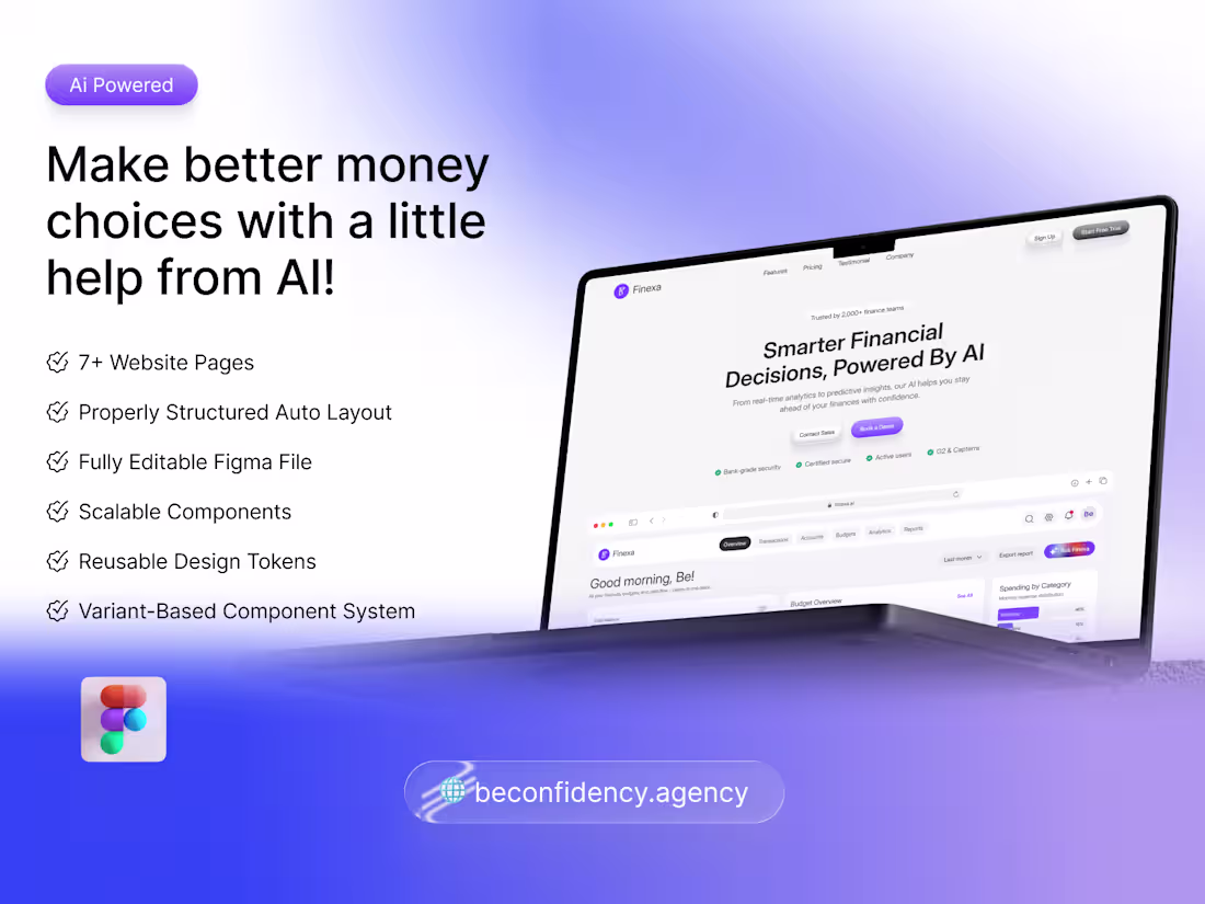
𝐄𝐱𝐜𝐢𝐭𝐞𝐝 𝐭𝐨 𝐬𝐡𝐚𝐫𝐞 𝐦𝐲 𝐥𝐚𝐭𝐞𝐬𝐭 𝐒𝐚𝐚𝐒 𝐰𝐞𝐛𝐬𝐢𝐭𝐞 𝐭𝐞𝐦𝐩𝐥𝐚𝐭𝐞 — 𝐅𝐢𝐧𝐞𝐱𝐚 🎉 𝐋𝐢𝐯𝐞 𝐨𝐧
A modern finance & budget management website design built for fintech startups and AI-driven finance platforms.
Includes:
✔ 𝐻𝑖𝑔ℎ-𝑐𝑜𝑛𝑣𝑒𝑟𝑡𝑖𝑛𝑔 𝑙𝑎𝑛𝑑𝑖𝑛𝑔 𝑝𝑎𝑔𝑒
✔ 𝐷𝑎𝑠ℎ𝑏𝑜𝑎𝑟𝑑 𝑝𝑟𝑒𝑣𝑖𝑒𝑤 𝑠𝑒𝑐𝑡𝑖𝑜𝑛𝑠
✔ 𝑃𝑟𝑖𝑐𝑖𝑛𝑔 & 𝑏𝑙𝑜𝑔 𝑝𝑎𝑔𝑒𝑠
✔ 𝐴𝑢𝑡ℎ 𝑠𝑐𝑟𝑒𝑒𝑛𝑠
✔ 𝐹𝑢𝑙𝑙𝑦 𝑜𝑟𝑔𝑎𝑛𝑖𝑧𝑒𝑑 𝐹𝑖𝑔𝑚𝑎 𝑓𝑖𝑙𝑒
Perfect if you're launching a finance SaaS and want a professional, investor-ready website design.
Download now: https://contra.com/products/27Cbznkb-finexa-finance-and-budget-management-website-or-saa-s-templates
#SaaSDesign (https://www.instagram.com/explore/tags/saasdesign/) #FintechUI (https://www.instagram.com/explore/tags/fintechui/)
1
99
Fitness Mobile App UI/UX Design
#fitnessapp (https://www.linkedin.com/search/results/all/?keywords=%23fitnessapp&origin=HASH_TAG_FROM_FEED) #mobileui (https://www.linkedin.com/search/results/all/?keywords=%23mobileui&origin=HASH_TAG_FROM_FEED)
4
4
194
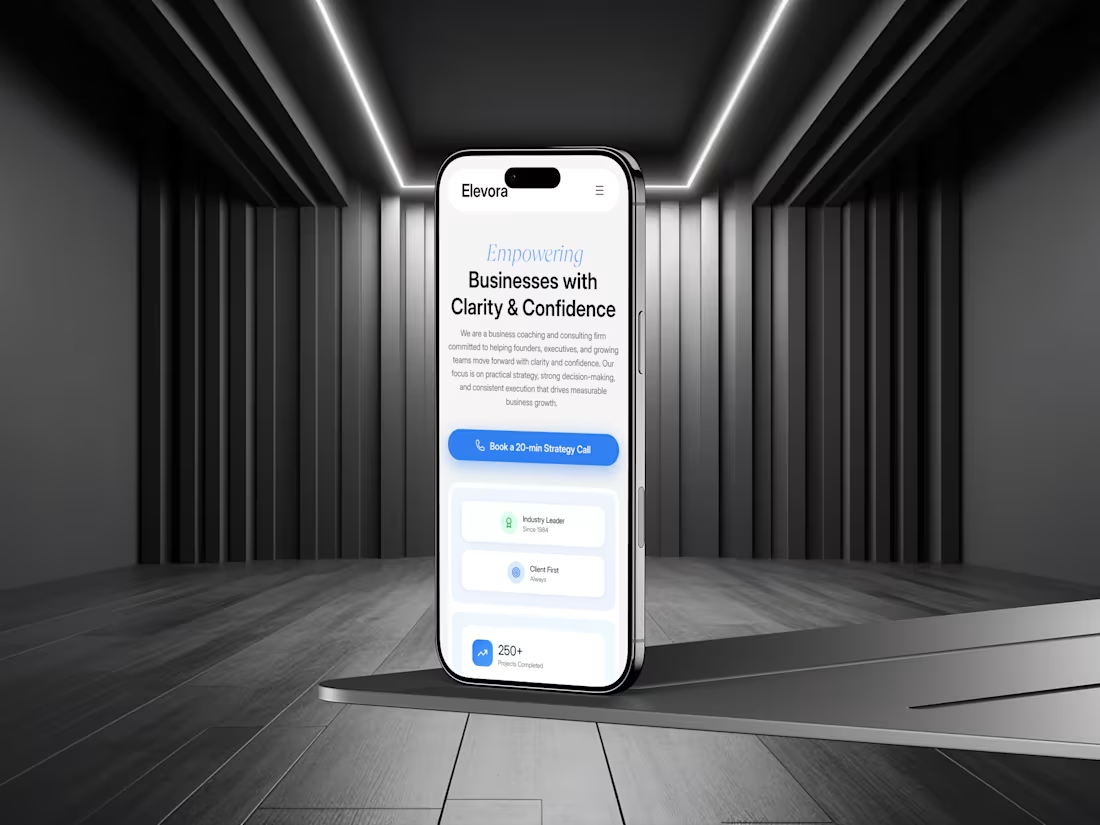
Responsive Consulting Website Design | UIUX | About us
4
159
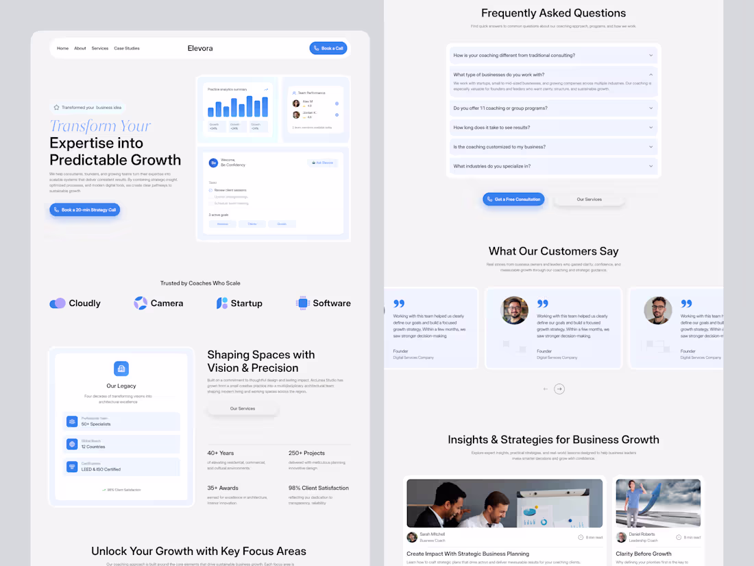
Responsive Consulting Website Design | UIUX | Clean Design
#saasdesign (https://x.com/i/communities/1493871333243068418/hashtag/saasdesign) #consultingwebsite (https://x.com/i/communities/1493871333243068418/hashtag/consultingwebsite) #websitedesign (https://x.com/i/communities/1493871333243068418/hashtag/websitedesign) #uidesign (https://x.com/i/communities/1493871333243068418/hashtag/uidesign) #uxdesign (https://x.com/i/communities/1493871333243068418/hashtag/uxdesign)
1
3
172
Designed a modern landing page for a platform that helps creators and professionals build their own personal digital space.
Clean visuals, intuitive structure, and a flexible layout designed to showcase identity in a more meaningful way.
What do you think of this design?
#webdesign (https://x.com/i/communities/1453877367030484992/hashtag/webdesign) #saasdesign (https://x.com/i/communities/1453877367030484992/hashtag/saasdesign) #uidesign (https://x.com/i/communities/1453877367030484992/hashtag/uidesign) #portfoliowebsite (https://x.com/i/communities/1453877367030484992/hashtag/portfoliowebsite) #figmadesign (https://x.com/i/communities/1453877367030484992/hashtag/figmadesign)
1
134
Just designed a clean and motivating fitness analytics experience with daily goals, recent activity, weekly progress, and achievement tracking all in one flow.
Ideal for fitness brands, trainers, and gyms seeking to provide users with a data-driven workout experience.
Would you like to see this turned into a full case study?
#fitnessapp (https://x.com/i/communities/1471242627551043590/hashtag/fitnessapp) #activitytracking (https://x.com/i/communities/1471242627551043590/hashtag/activitytracking) #workoutanalytics (https://x.com/i/communities/1471242627551043590/hashtag/workoutanalytics) #uidesign (https://x.com/i/communities/1471242627551043590/hashtag/uidesign) #figmadesign (https://x.com/i/communities/1471242627551043590/hashtag/figmadesign)
6
153
Just wrapped a clean and energetic fitness app design built for trainers, gyms, and wellness brands.
Clear workouts, visual progress tracking, and powerful analytics help users stay motivated and consistent with their goals.
Would you like to see the full case study for this app?
#fitnessapp #mobileui #uidesign #wellnessapp #figmadesign
1
2
125
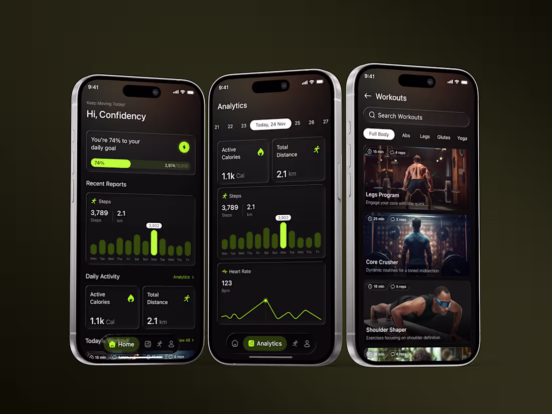
Fitness Mobile App UI/UX — Designed for Real Progress
This Fitness App concept was designed with one core idea in mind: help users build sustainable habits through clarity, motivation, and structure. Instead of overwhelming users with data, the interface focuses on what truly matters each day — movement, consistency, and measurable progress. That’s why the dashboard highlights daily goals, recent activity, and key health stats in a clean, easy-to-understand dark-mode UI.
We wanted to create an experience where every screen supports user momentum. The Analytics view transforms raw numbers into meaningful insights, showing calories burned, total distance, step trends, and heart-rate patterns with intuitive visual charts. This helps users recognize progress and understand their training rhythm without digging through menus.
8
5
158
Just designed a clean, data-driven B2B SaaS Lead Generation Dashboard UI/UX
↳ Real-time lead stats (Total Leads, Verified Emails, Exported Leads)
↳ Trend analytics for smarter decision-making
↳ Quick Actions to speed up workflow
↳ Modern, minimal & conversion-focused layout
This dashboard is crafted for SaaS teams that depend on accuracy, speed, and clarity.
How do you like the visual hierarchy & data presentation?
3
138
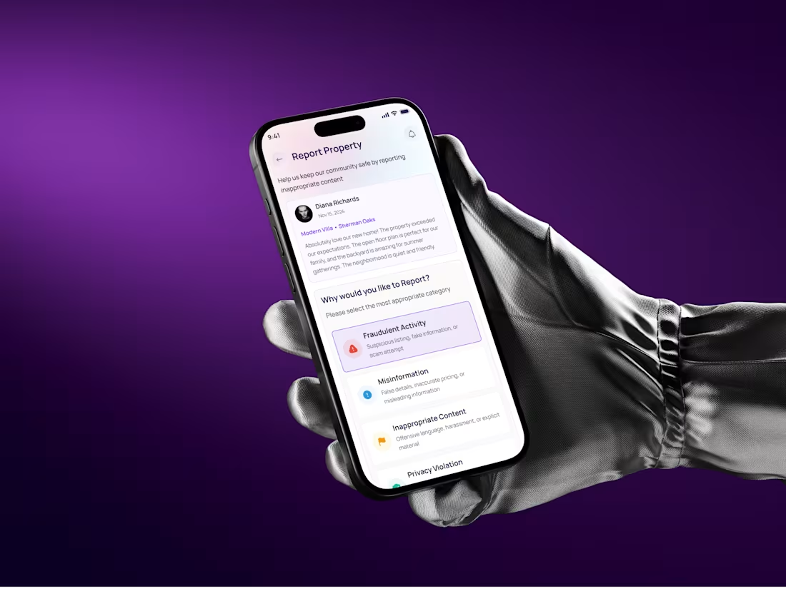
Real Estate Mobile App UI/UX | Modern, Clean & High-Conversion
Lately, UI/UX is moving towards cleaner layouts, softer shadows, meaningful spacing, and micro-interactions that actually guide the user, and honestly, I’m loving this direction.
So here’s something fresh I designed recently:
A Real Estate Mobile App | Report Flow that keeps everything simple, fast, and human-friendly. From selecting the issue → adding details, → submitting the report, the whole experience stays smooth and confident.
(If you check the screens, you’ll notice neat spacing, rounded cards, calm typography, soft color feedback, and that modern “Apple-feel” we all love.)
2
3
127
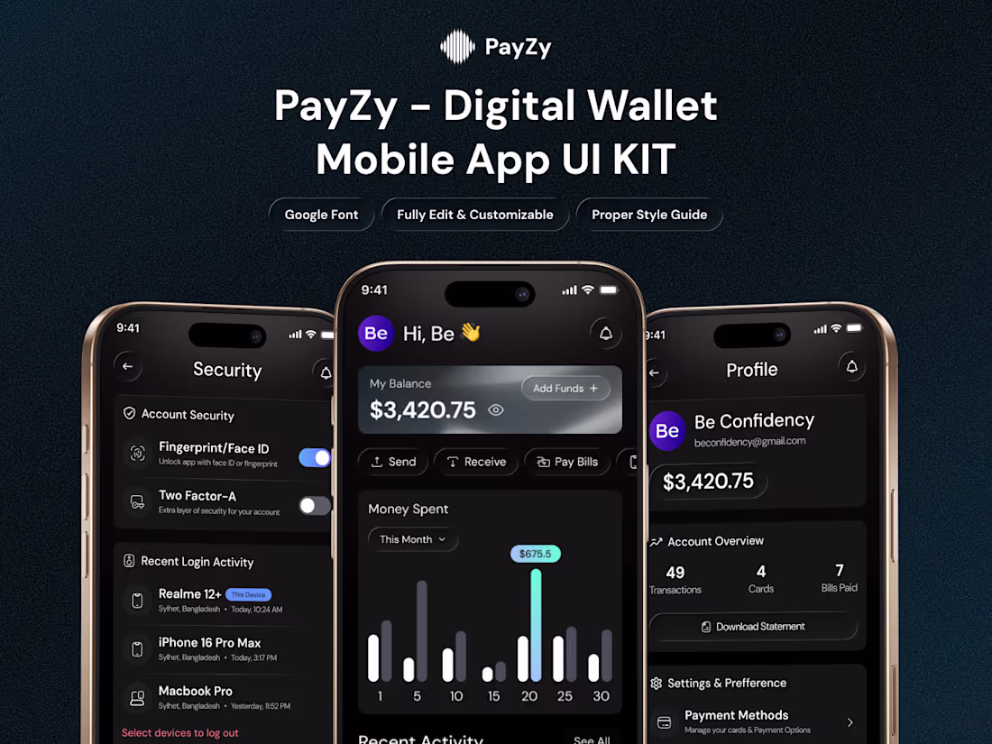
We’re excited to share our latest project: Digital Wallet App UI/UX Design!
This case study highlights a clean, modern digital wallet experience, featuring dark-mode dashboards, smart analytics, and seamless wallet interactions crafted with a scalable design system.
Check out the full case study on Behance 👇
🔗 https://www.behance.net/gallery/239022357/Digital-Wallet-App-UIUX-Design-Case-Study
Show some love if it inspires you! 🙌
#UIDesign #UXDesign #Fintech #MobileApp #DigitalWallet
2
128
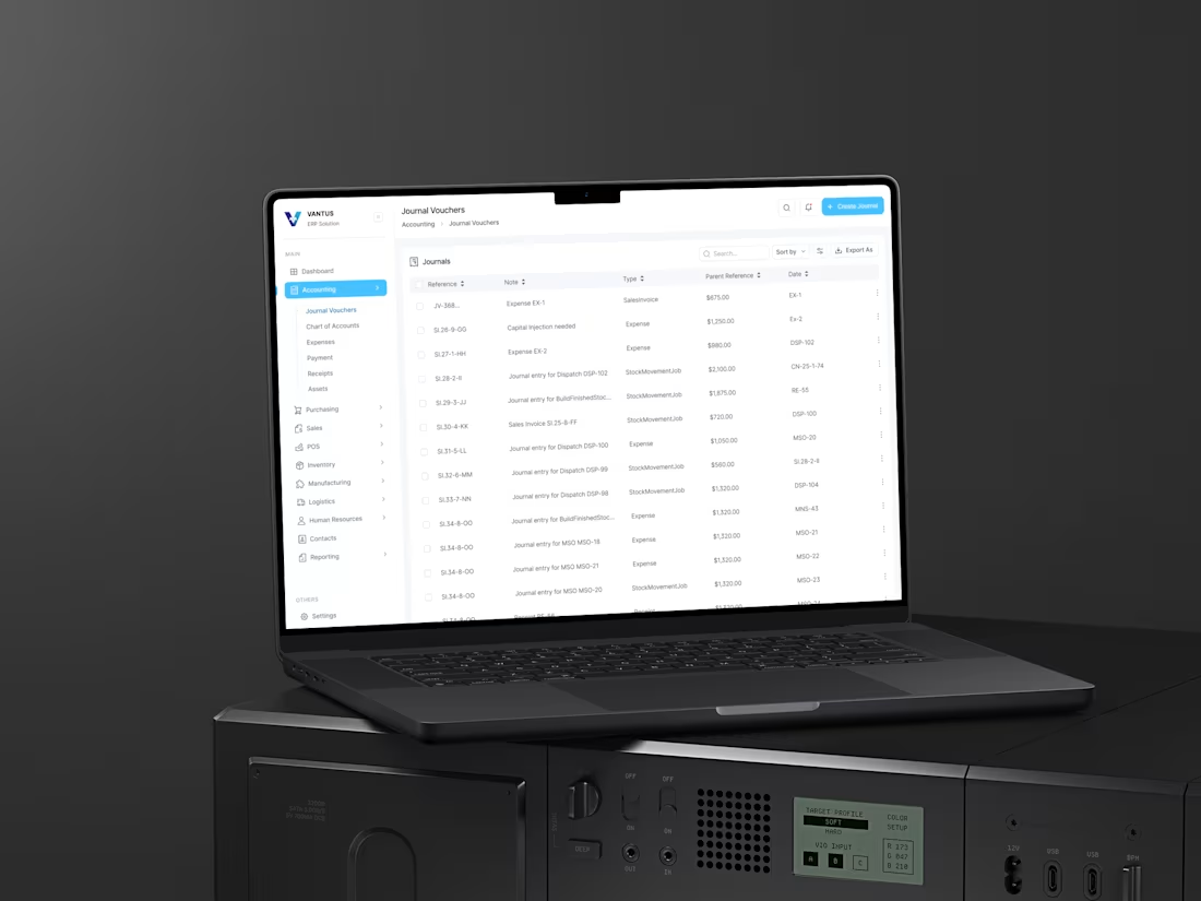
ERP Dashboard Redesign- Modern Accounting Dashboard UI
This Accounting Dashboard UI is designed with a strong focus on clarity, scalability, and real-world usability — perfect for SaaS, fintech platforms, ERP systems, and enterprise-level financial tools. Featuring key modules like Journal Vouchers, Chart of Accounts, Expenses, and Payments, the layout ensures smooth navigation, intuitive data visibility, and effortless workflow management. Every screen follows a clean grid structure, subtle visual hierarchy, and modern spacing to enhance readability and reduce cognitive load — a style that aligns with trending Dribbble UI inspiration, fintech dashboard design, and enterprise SaaS UX searches on Google.
3
121
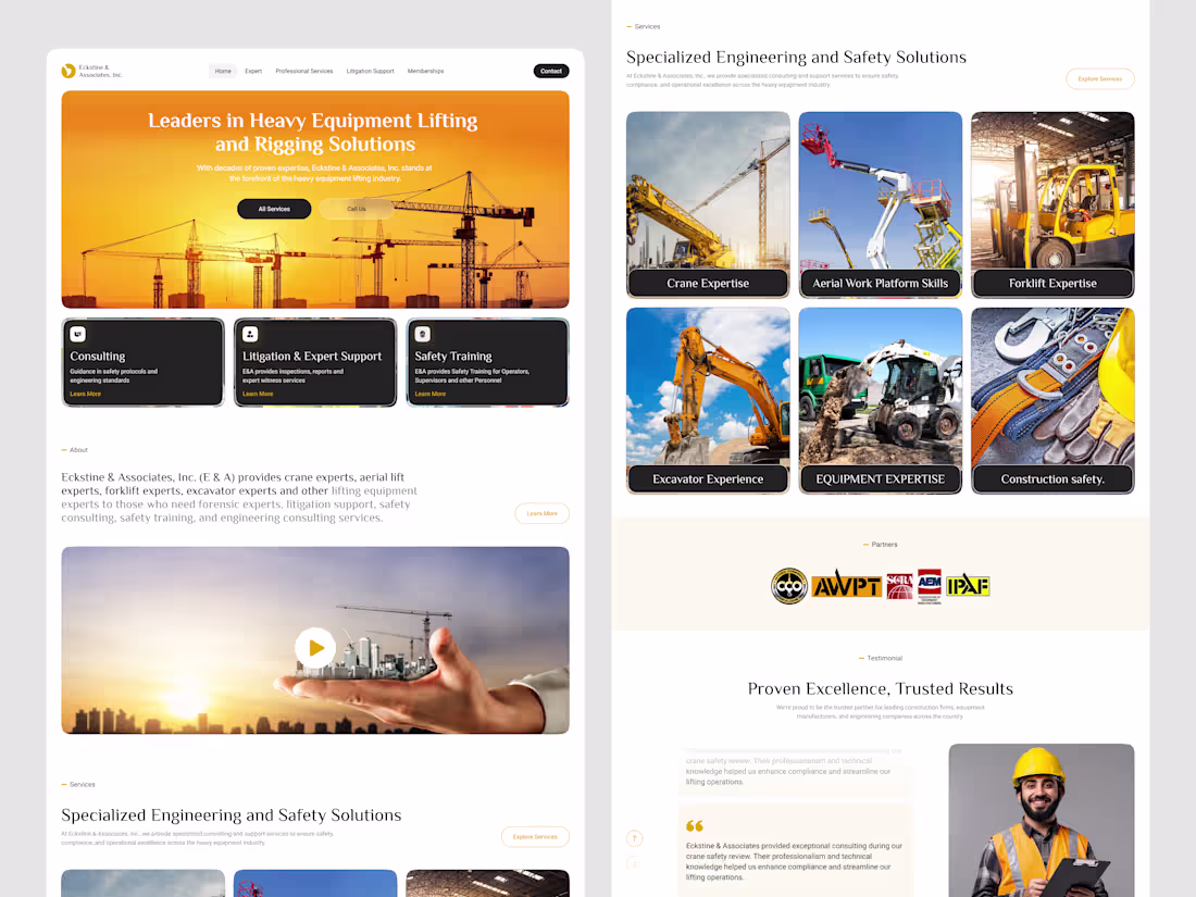
Eckstine & Associates Website Redesign — Heavy Equipment, Safety
We redesigned the Eckstine & Associates website with a modern, high-impact visual direction that reflects their authority in heavy equipment lifting, rigging solutions, safety training, and engineering consulting. The goal was to create a digital presence that feels bold, trustworthy, and aligned with industries where precision and safety matter most.
2
114
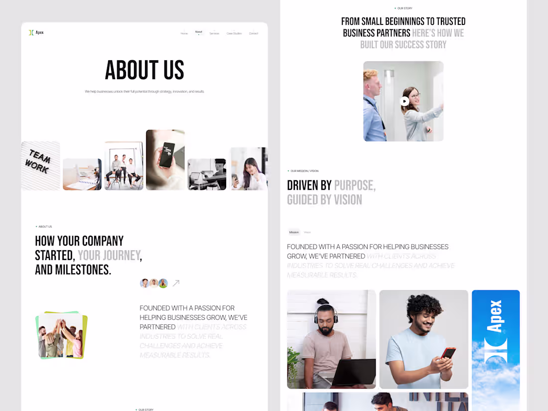
Apex Consulting – About Us Page Design
About Us page design for Apex Consulting was crafted to communicate trust, expertise, and human connection from the very first scroll. Our goal was to build a modern, story-driven page that introduces the company with clarity, personality, and professionalism, giving visitors an immediate sense of who Apex is and what they stand for.
3
118
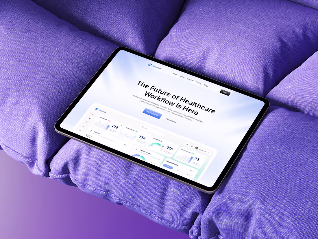
CarePlus — Healthcare SaaS Website Design
The CarePlus Healthcare SaaS Website is designed to redefine how medical teams manage operations, automate workflows, and improve patient satisfaction through a seamless digital experience. We built this website to feel trustworthy, human, and intelligently modern — blending healthcare clarity with SaaS innovation.
1
5
102
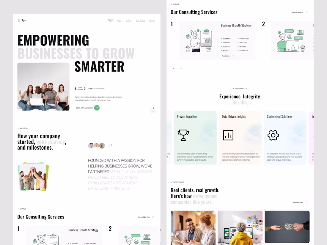
Business Consulting Website Design
The Apex Business Consulting Website is a clean, strategic, and conversion-driven design built to reflect professionalism, trust, and modern growth-oriented thinking. We designed this layout to help consulting agencies present their expertise, showcase real success stories, and attract high-value clients through design that feels confident and data-driven.
4
5
108
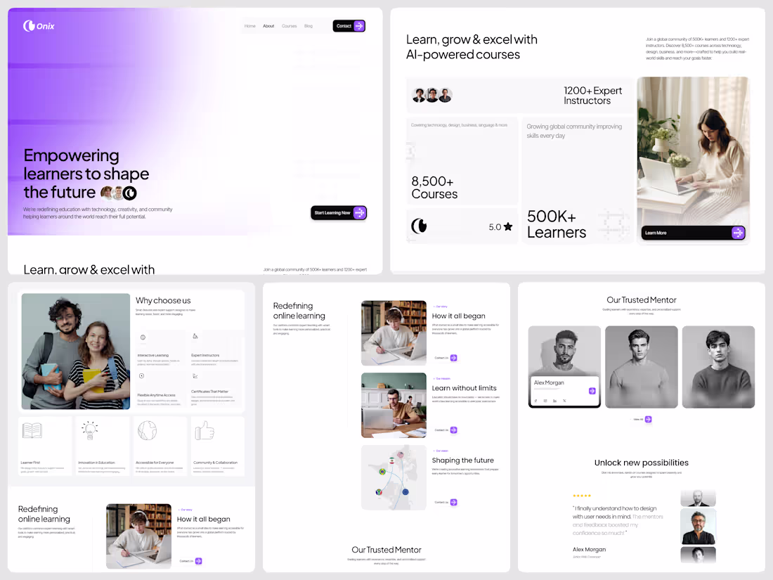
Onix – AI-Powered Learning Platform Website Design- About us
The Onix About Page embodies the vision of a modern learning platform that fuses AI-powered education, clean aesthetics, and seamless usability. Designed for the next generation of global learners, this page tells a story of innovation, connection, and personal growth through thoughtful UX and purposeful visual storytelling.
4
88
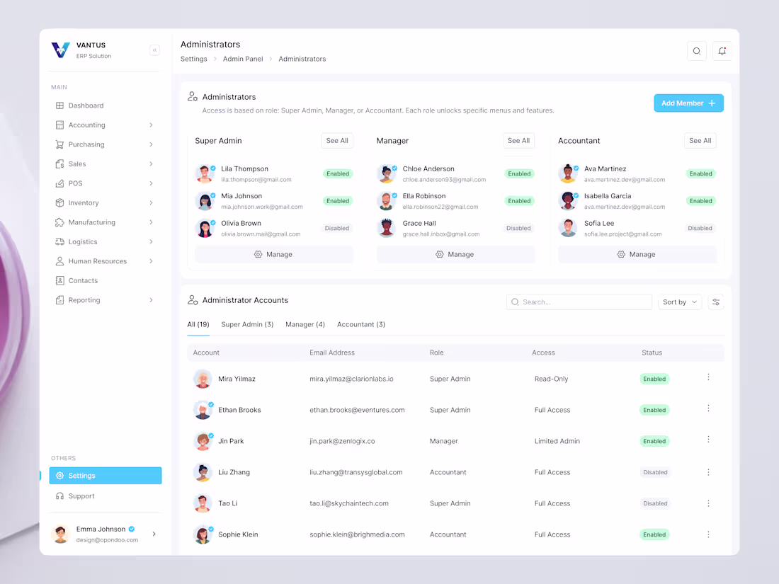
ERP Dashboard Redesign-Admin Management Dashboard UI
Visit: https://dribbble.com/shots/26733975-ERP-Dashboard-Redesign-Admin-Management-Dashboard-UI
The Admin Management Dashboard is a modern and intuitive interface built for seamless user role and permission management within the Vantus ERP System. Designed to simplify complex administrative tasks, this dashboard allows teams to efficiently assign, monitor, and manage roles like Super Admin, Manager, and Accountant — ensuring secure and organized access control across departments.
3
114
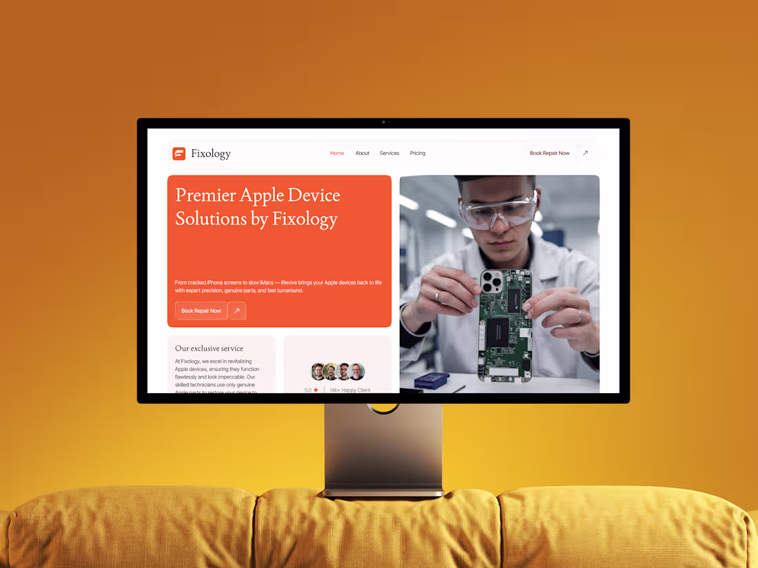
Fixology – Premier Apple Device Repair Website Design
Visit: https://dribbble.com/shots/26734244-Fixology-Premier-Apple-Device-Repair-Website-Design
The Fixology Website Design is a clean and modern landing page created for an Apple device repair service brand that focuses on trust, quality, and user convenience. Designed with a refined aesthetic and seamless layout, this page positions Fixology as a premium repair partner for iPhones, iPads, iMacs, and MacBooks, combining precision visuals with conversion-focused UX flow.
3
89
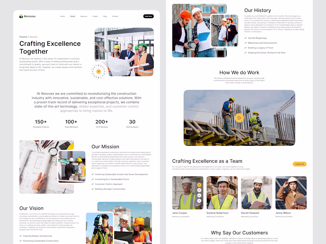
Construction Company Website – About Us Page Design
The Construction Company – About Us Page is designed to build trust and showcase the brand’s expertise, values, and team culture in the most professional and visually engaging way possible. This page highlights the company’s dedication to innovation, sustainability, and precision engineering, with a clean, user-focused design that reflects reliability and modern craftsmanship.
3
99
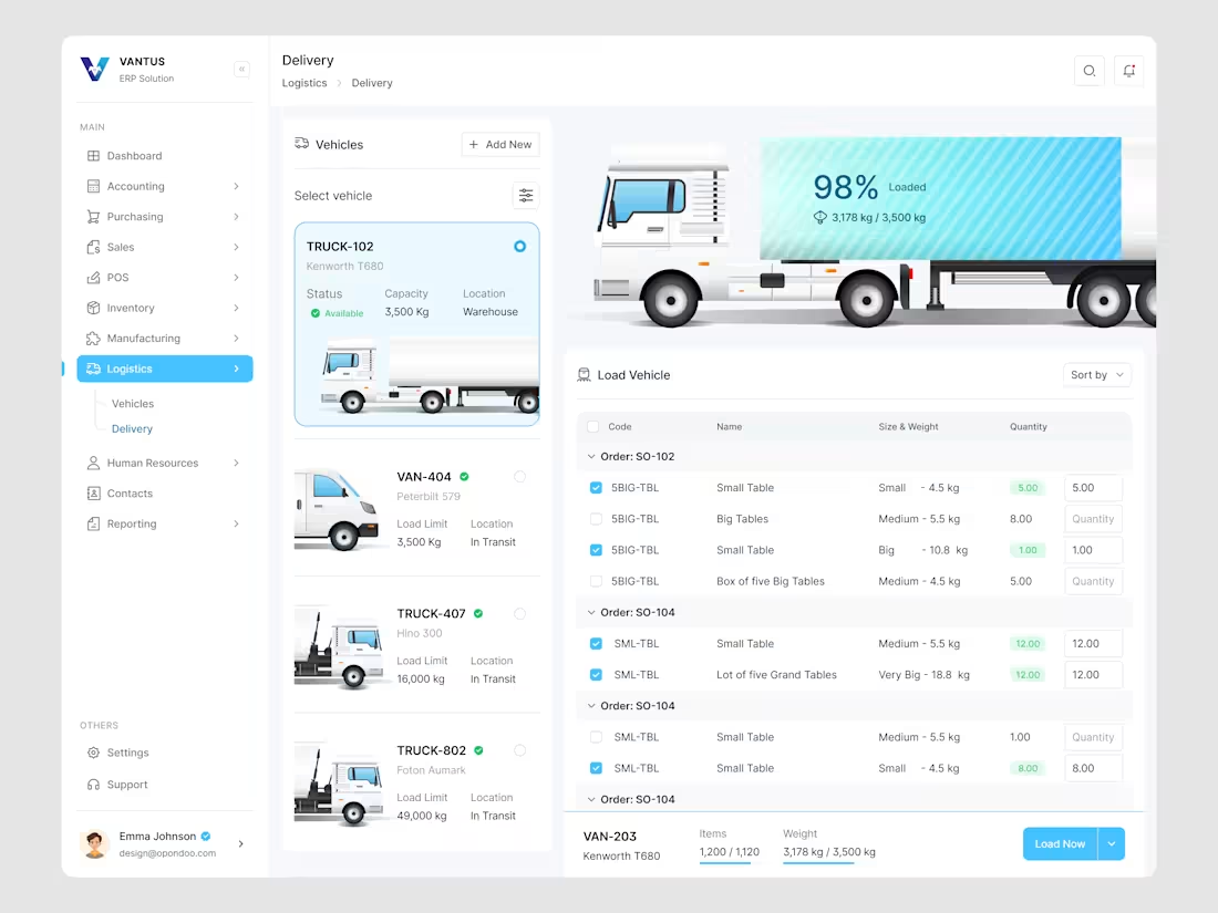
ERP Dashboard Redesign-VANTUS- Logistics Delivery
Check in detail: https://dribbble.com/shots/26727888-ERP-Dashboard-Redesign-VANTUS-Logistics-Delivery
The Logistics Delivery Dashboard is a modern ERP interface for efficient fleet management and delivery operations within the Vantus ERP System. It provides a real-time view of vehicle location, capacity, and load distribution, enabling the optimization of delivery efficiency.
4
105
ERP Dashboard Redesign-VANTUS
Preview Link: https://dribbble.com/shots/26719764-ERP-Dashboard-Redesign-VANTUS
Redesigned an ERP Dashboard to convert a cluttered interface into a clean, modern, and insightful experience. The aim was to simplify complex business data, making it intuitive and enjoyable to explore.
The new design features a clear visual hierarchy, effective white space usage, and engaging data visualizations. We replaced static tables with interactive charts, enhanced contrast for readability, and chose a calming color palette in line with modern SaaS design.
Sidebar navigation was restructured for scalability, and each module now flows seamlessly within a unified design system. Subtle shadows, balanced typography, and meaningful icons direct users’ attention to their insights.
2
4
116
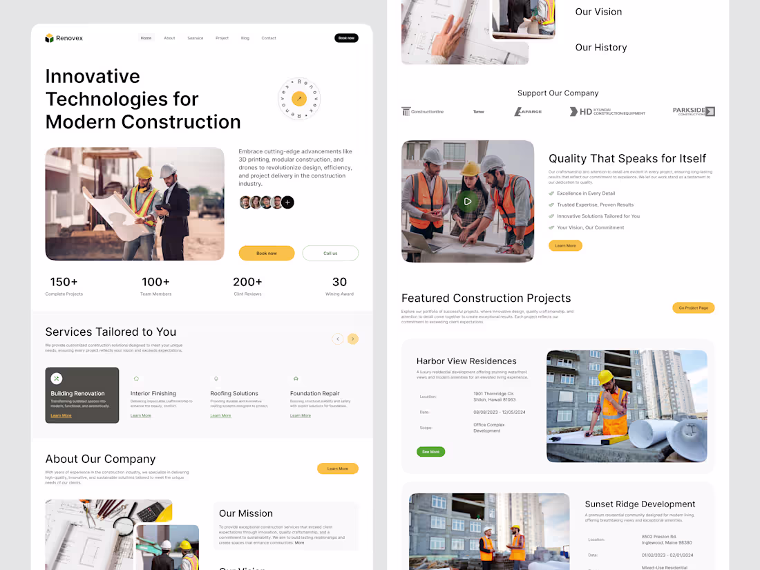
Construction Company Website – Modern, Clean & Impactful Design
The Construction Company Website offers a modern, professional online presence that highlights innovation, reliability, and visual storytelling. The homepage features a hero section showcasing the brand’s vision with real imagery and team visuals to build trust.
Key metrics and service cards provide clarity and quick navigation, while sections on the company’s mission and vision create a compelling narrative. Featured projects and client testimonials add credibility and showcase the company’s achievements.
The design uses a warm neutral palette with yellow accents and modern typography, ensuring readability and a strong visual identity. The responsive layout supports seamless user engagement and SEO across all devices.
3
5
99
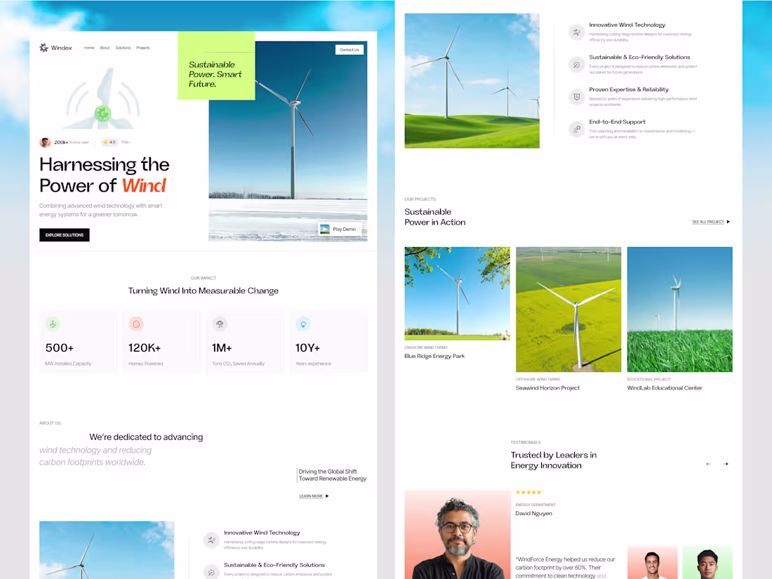
Wind Power Company Website, Clean Energy & Sustainable Future UI
Visit us: https://dribbble.com/shots/26655507-Wind-Power-Company-Website-Clean-Energy-Sustainable-Future-UI
We've just launched a clean and modern website design for a renewable energy company specializing in wind power and sustainability.
This design seamlessly blends purpose and aesthetics, highlighting data transparency, environmental impact, and the mission to build a greener future.
Every section is built to inspire trust, show measurable change, and drive engagement toward a more sustainable tomorrow. 🌱
Let’s design for impact, not just impressions.
#UIDesign #WebDesign #RenewableEnergy #SustainableDesign #CleanEnergy #UXDesign #ProductDesign #WindPower #FigmaDesign #GreenEnergy #Dribbble #DesignCommunity #EcoDesign #BeConfidency
1
106
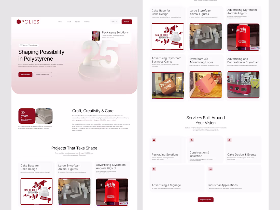
POLIÉS Website Redesign
0
3
IBTE Website Redesign – UI/UX Focused on Impact
1
1
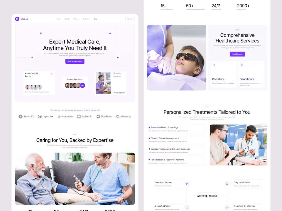
Healthcare Platform Website UI Design
1
6
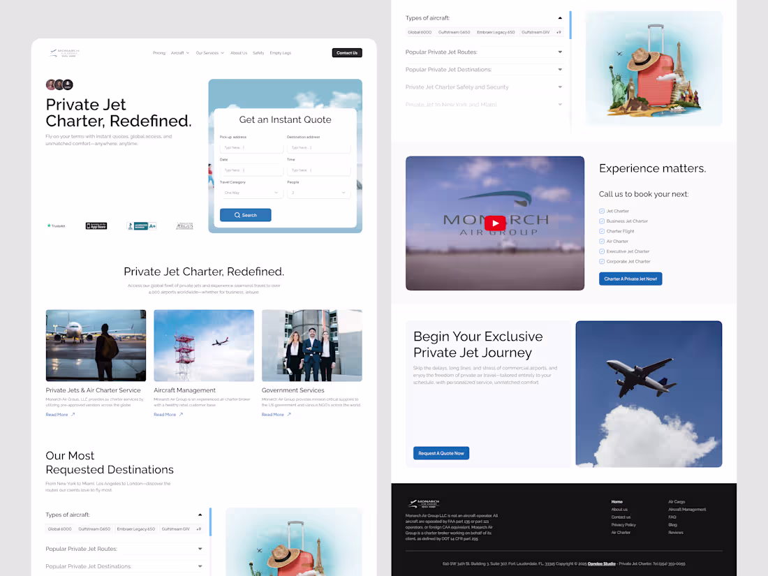
Monarch Air Group Website Redesign
1
5
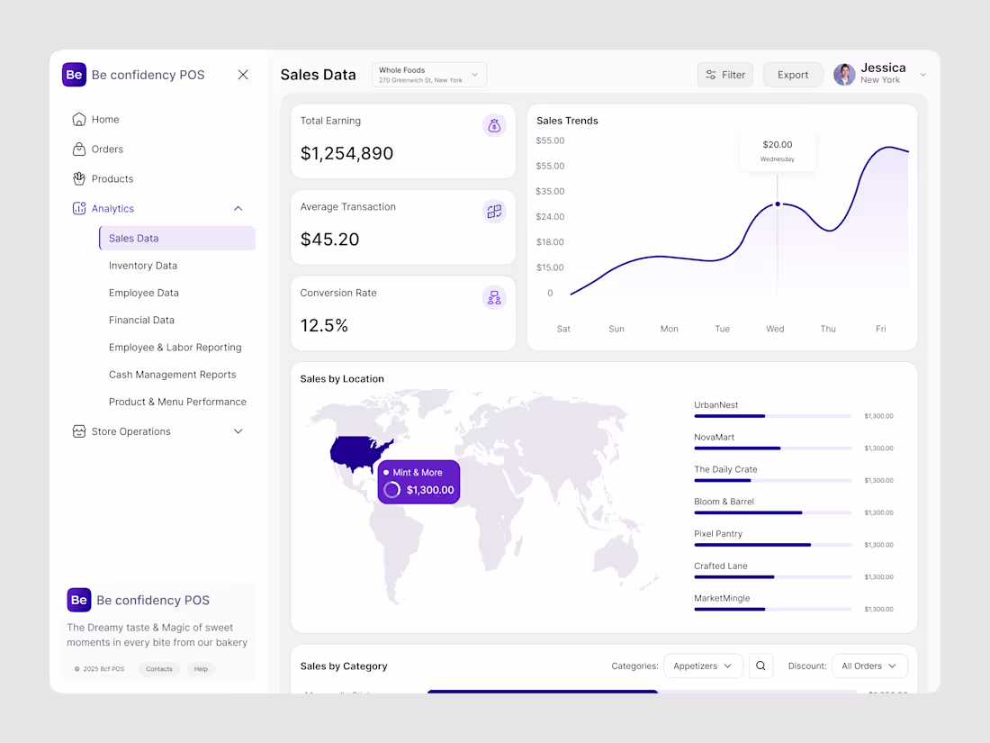
Be Confidency POS – Sales Analytics Dashboard UI Design
1
4
SwiftHub – Seamless Logistics Website UI Design | Animation
1
47
Trendex HR Management Dashboard Design
0
5
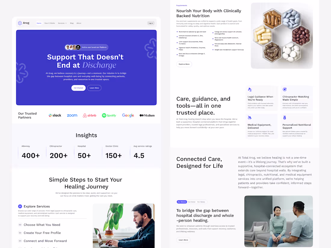
Arog – Post-Hospital Care Platform Website Design | Responsive
1
3
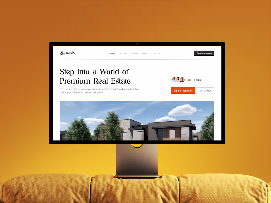
Luxury Real Estate Website — Modern & Responsive
1
2
Website Redesign (89 Transfers) | UIUX | Responsive | Animation
1
3
Neurix – Ethical AI SaaS Landing Page Design | Responsive | UIUX
1
2