Bakhrudin Jafar
Branding Identity Designer
- 12
- Followers


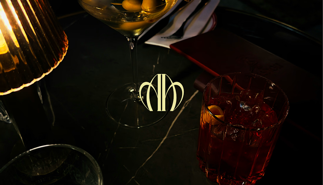
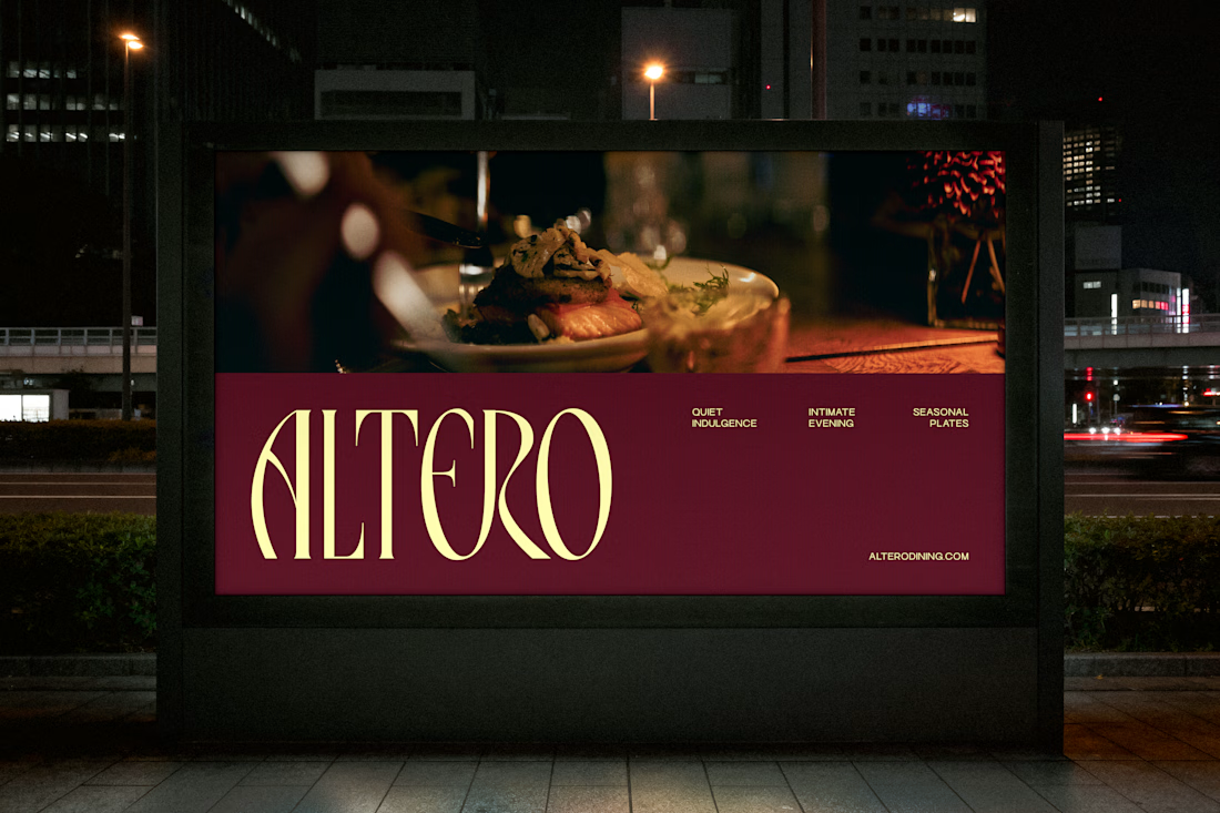
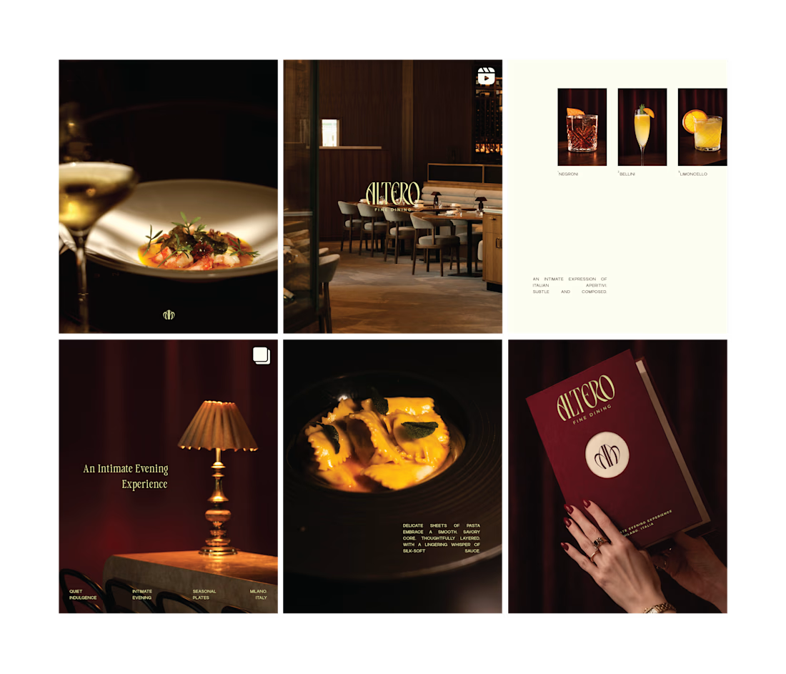
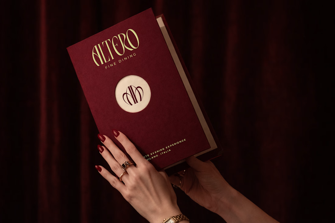
Altero | Where Dining Becomes a Quiet Luxury.
A different perspective on dining, where luxury lives in the details rather than the spectacle.
Built around a sense of calm, balance, and craftsmanship, Altero brings together a refined visual identity that reflects the beauty of...
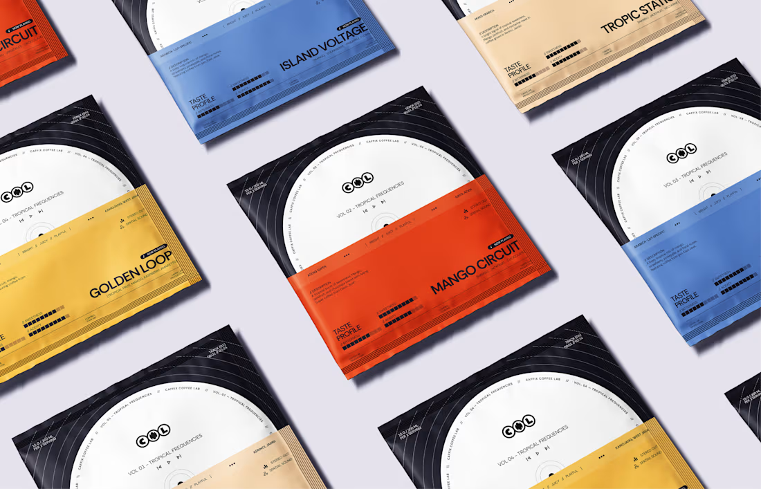
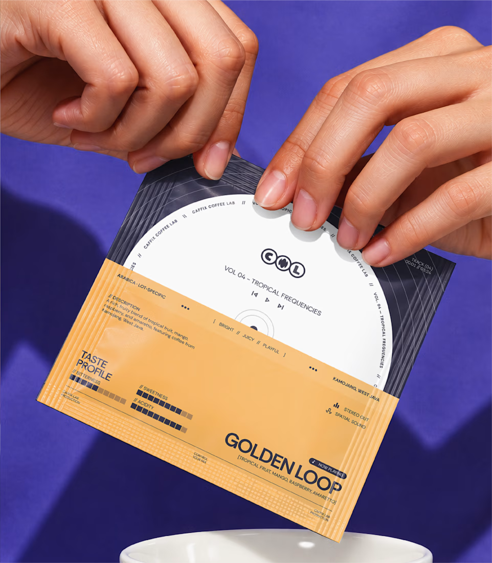
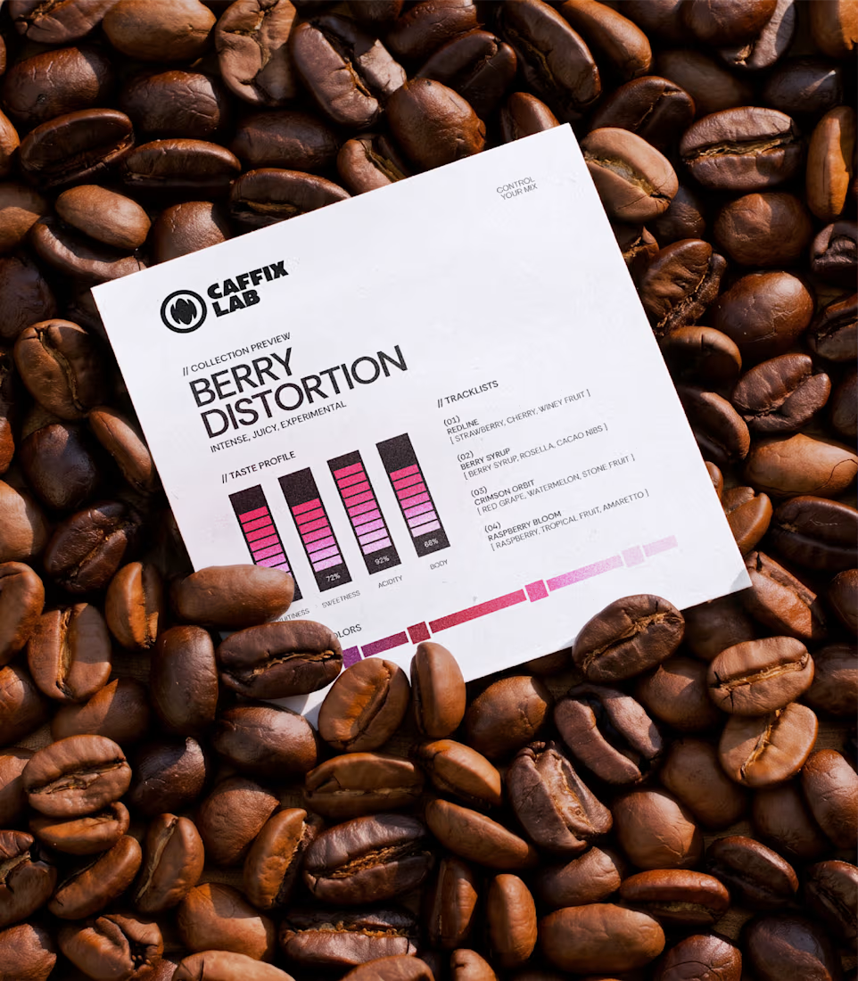
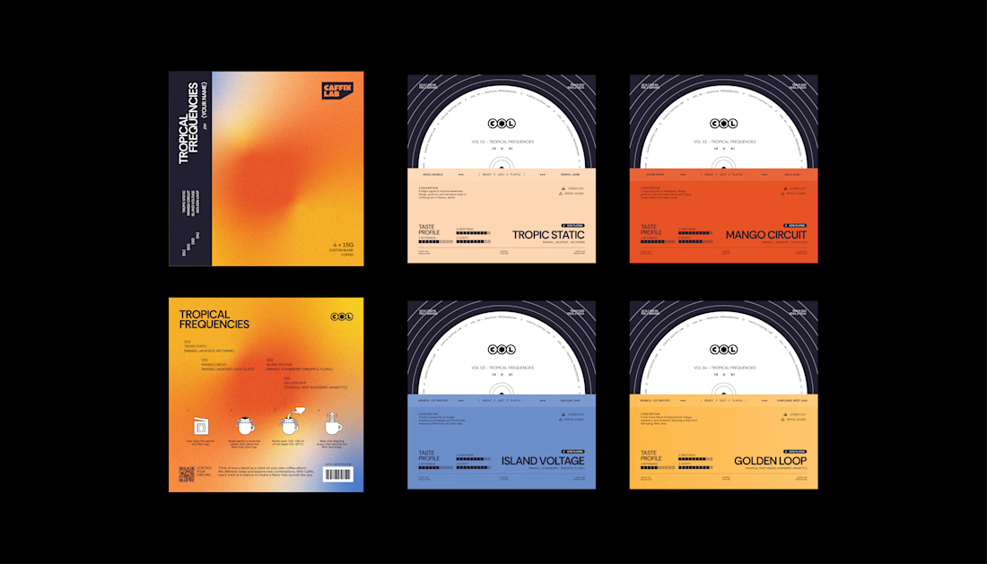
CAFFIX | Every Blend Has Its Own Frequency.
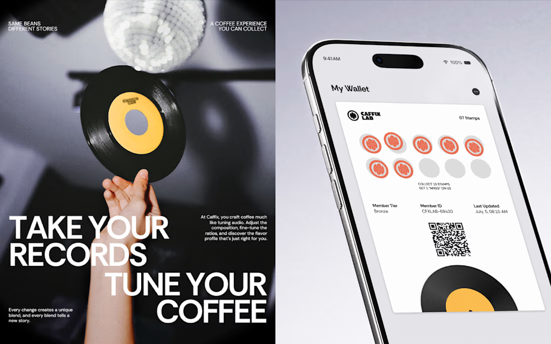
Coffee, remixed to your taste.
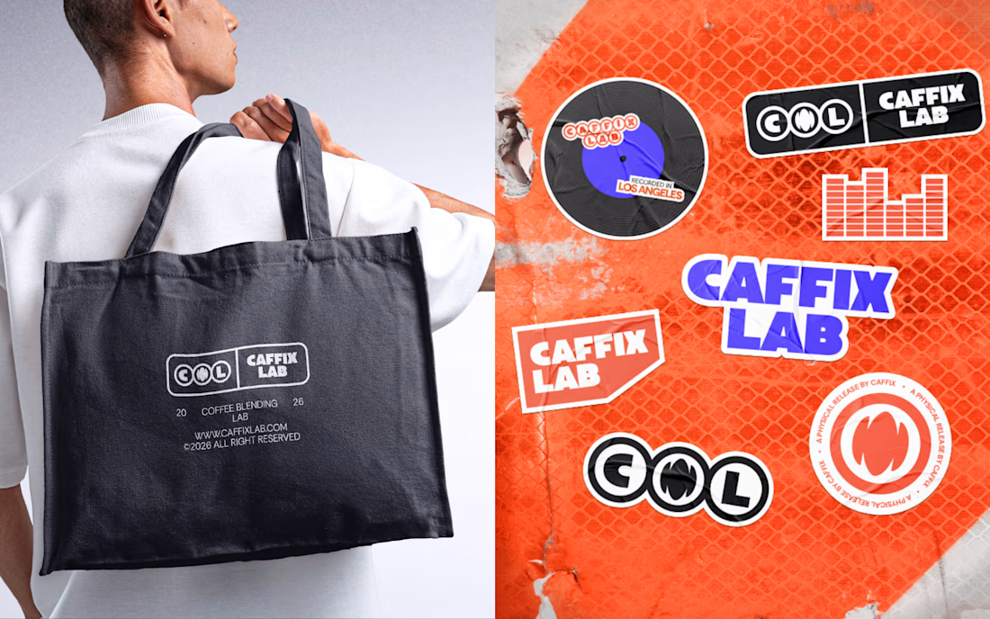
Taking inspiration from audio equalizers and sound mixing, CAFFIX packaging turns coffee blending into a more personal and expressive experience. Each blend becomes its own remix, distinguished through...
CAFFIX | Tuning the Taste of Coffee.
What if coffee had its own sound?
Inspired by the precision of audio engineering, CAFFIX brings the art of sound tuning into the world of coffee. The logotype translates this concept into a distinctive visual identity, balancing technical...


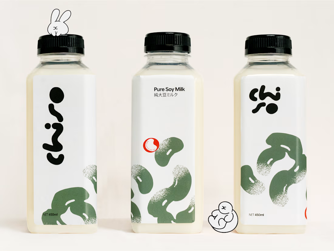
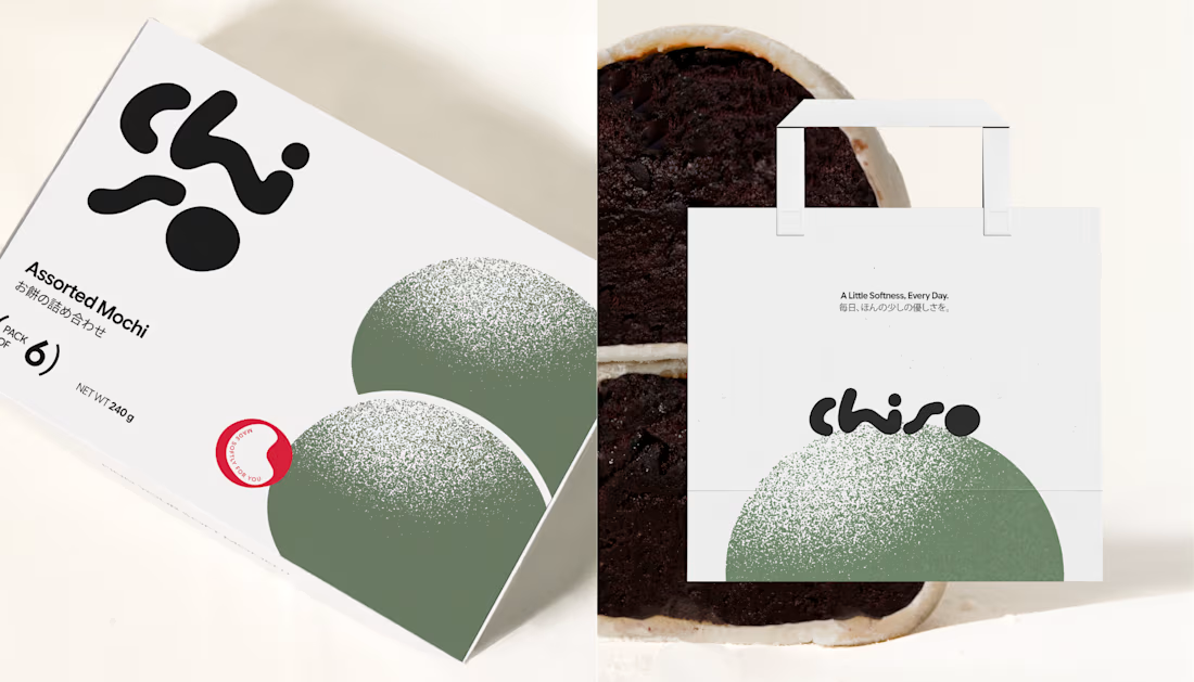
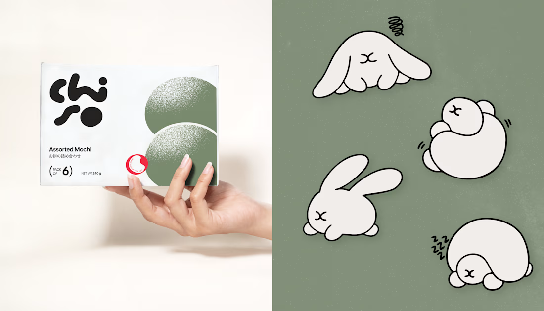
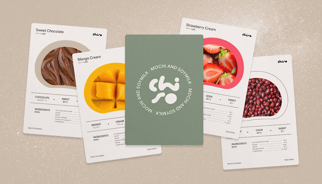
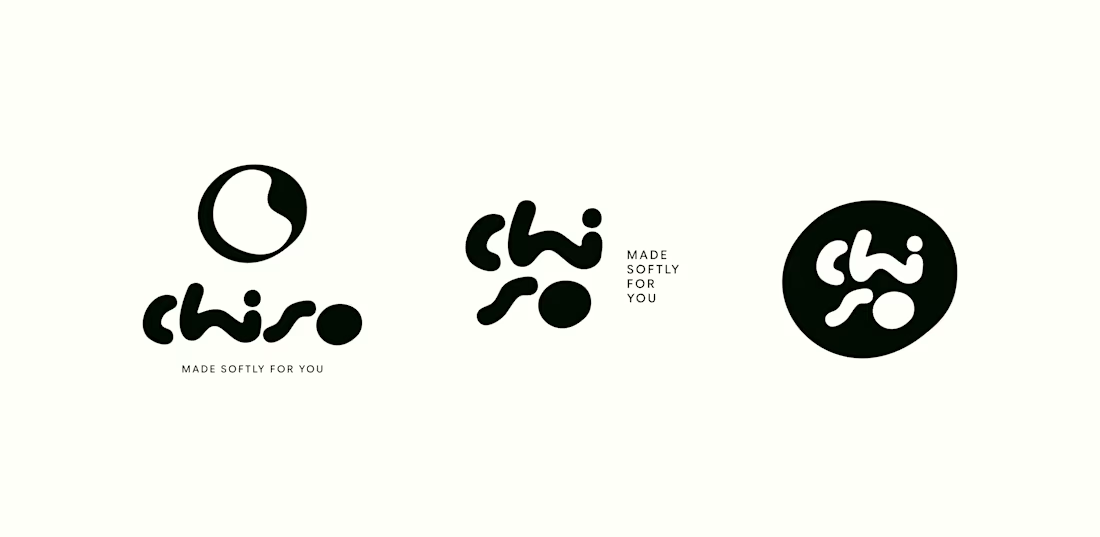
Chiso a Little Softness, Everyday.
Some things don't need to be loud to leave an impression.
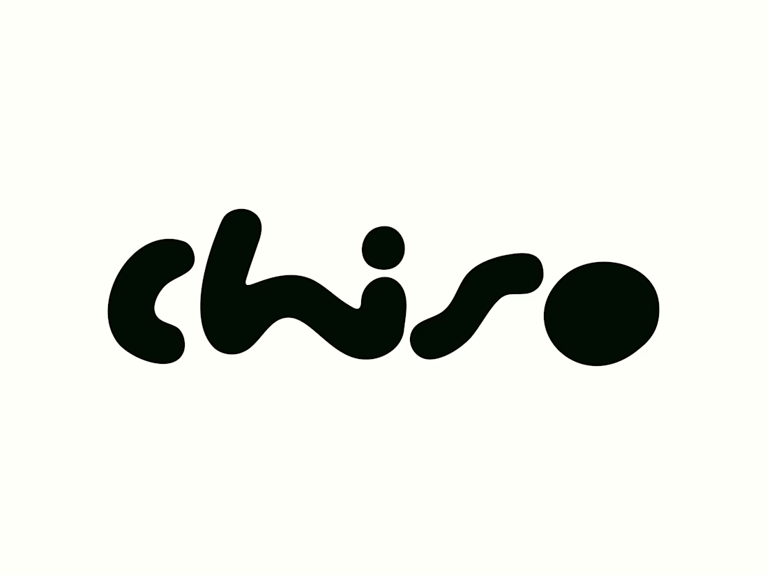
For Chiso, we created a logotype that captures the gentle charm of everyday moments. Inspired by Japanese simplicity, its soft curves and clean letterforms bring a sense of warmth,...
Chiso A Little Softness, Everyday.
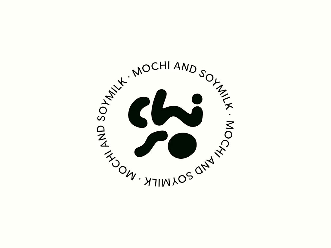
Chiso brings a gentler touch to everyday moments through Japanese-inspired packaging for mochi and soy milk. Rooted in simplicity, warmth, and quiet craftsmanship, the visual identity pairs a soft, muted palette with clean typography to create...