The network for creativity
Join 1.25M professional creatives like you
Connect with clients, get discovered, and run your business 100% commission-free
Creatives on Contra have earned over $150M and we are just getting started
Back to feedPost

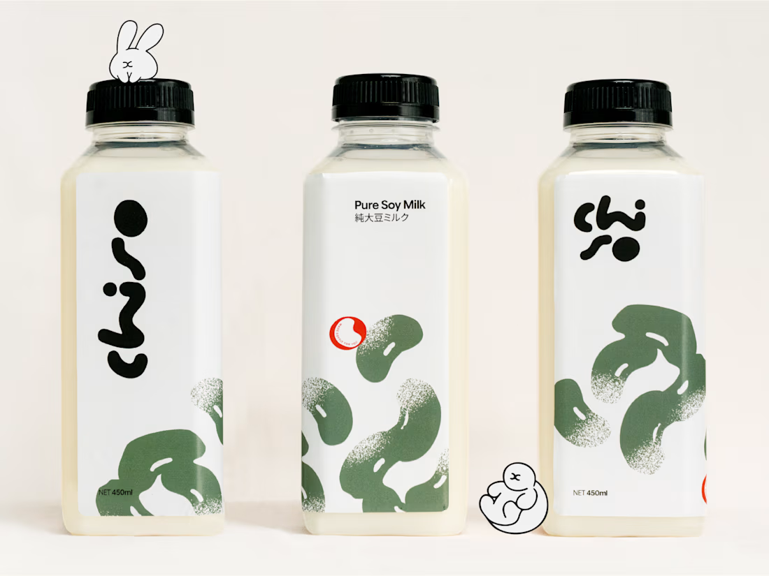
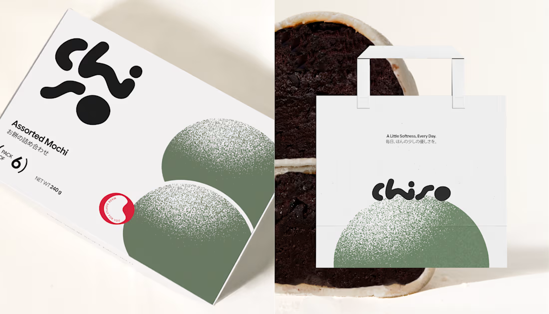
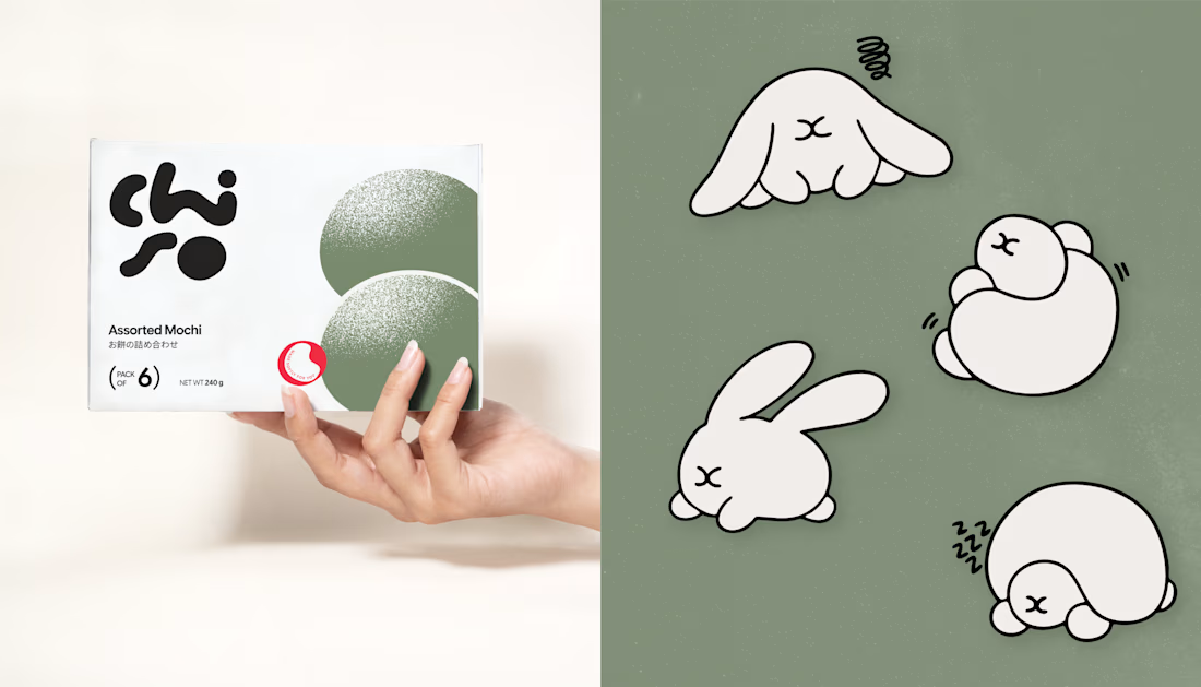
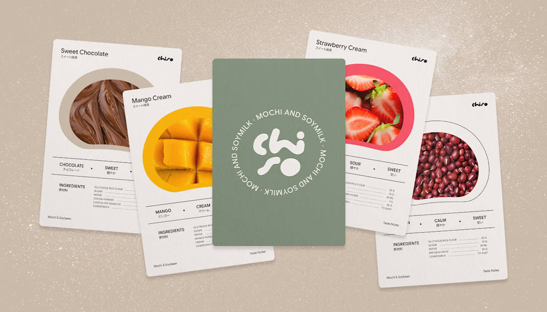
Chiso A Little Softness, Everyday.
Chiso brings a gentler touch to everyday moments through Japanese-inspired packaging for mochi and soy milk. Rooted in simplicity, warmth, and quiet craftsmanship, the visual identity pairs a soft, muted palette with clean typography to create a sense of calm in the middle of a fast-paced day.
From the mochi box to the soy milk packaging, every detail is designed to feel approachable, considered, and quietly distinctive—turning everyday treats into small moments worth slowing down for.
A reminder that sometimes, the simplest things bring the most comfort.


The network for creativity
Join 1.25M professional creatives like you
Connect with clients, get discovered, and run your business 100% commission-free
Creatives on Contra have earned over $150M and we are just getting started


Related posts

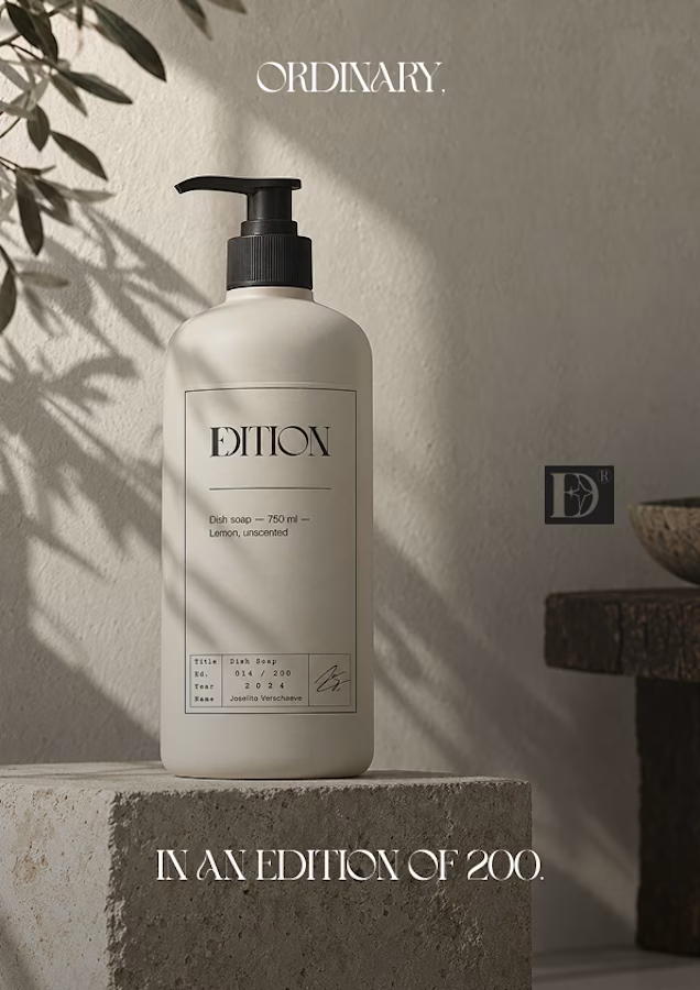
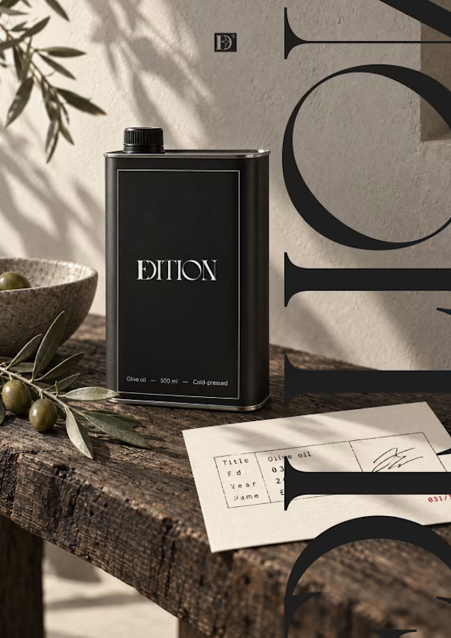
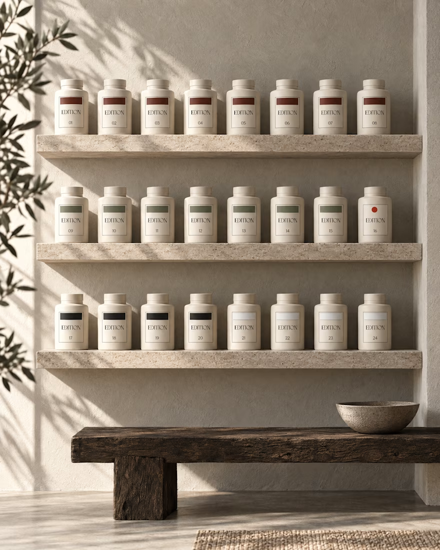
Ever signed for a pack of pasta? Soon you will.
EDITION is a brand where nothing is decorative and everything is numbered.
Case study landing very soon.

A minimal and elegant visual style with soft blush pink, cocoa brown, refined serif typography, and clean layouts to create a calm, premium wellness aesthetic.

3 voted
75%

1 voted
25%

4 votes
Closed

Label Design · Wine Branding · Malbec Gran Reserva · Mendoza


looks great