
Bailey White
Senior Product Designer | Design Systems Specialist
Ready for work
Bailey is ready for their next project!
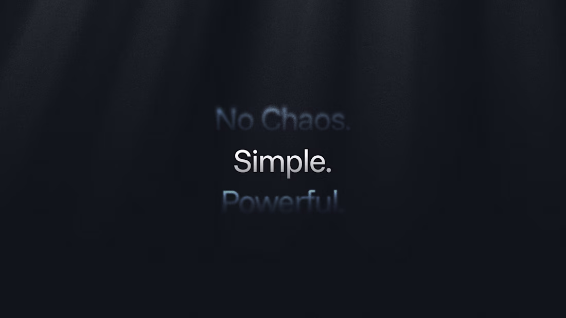
Rebrands hit different when you’re a product designer.
Half of your brain’s in Figma variables, the other half’s thinking, “how does this feel when someone actually uses it?”
It’s been cool bridging that gap, making sure the system still tells the brand’s story.
1
21
146
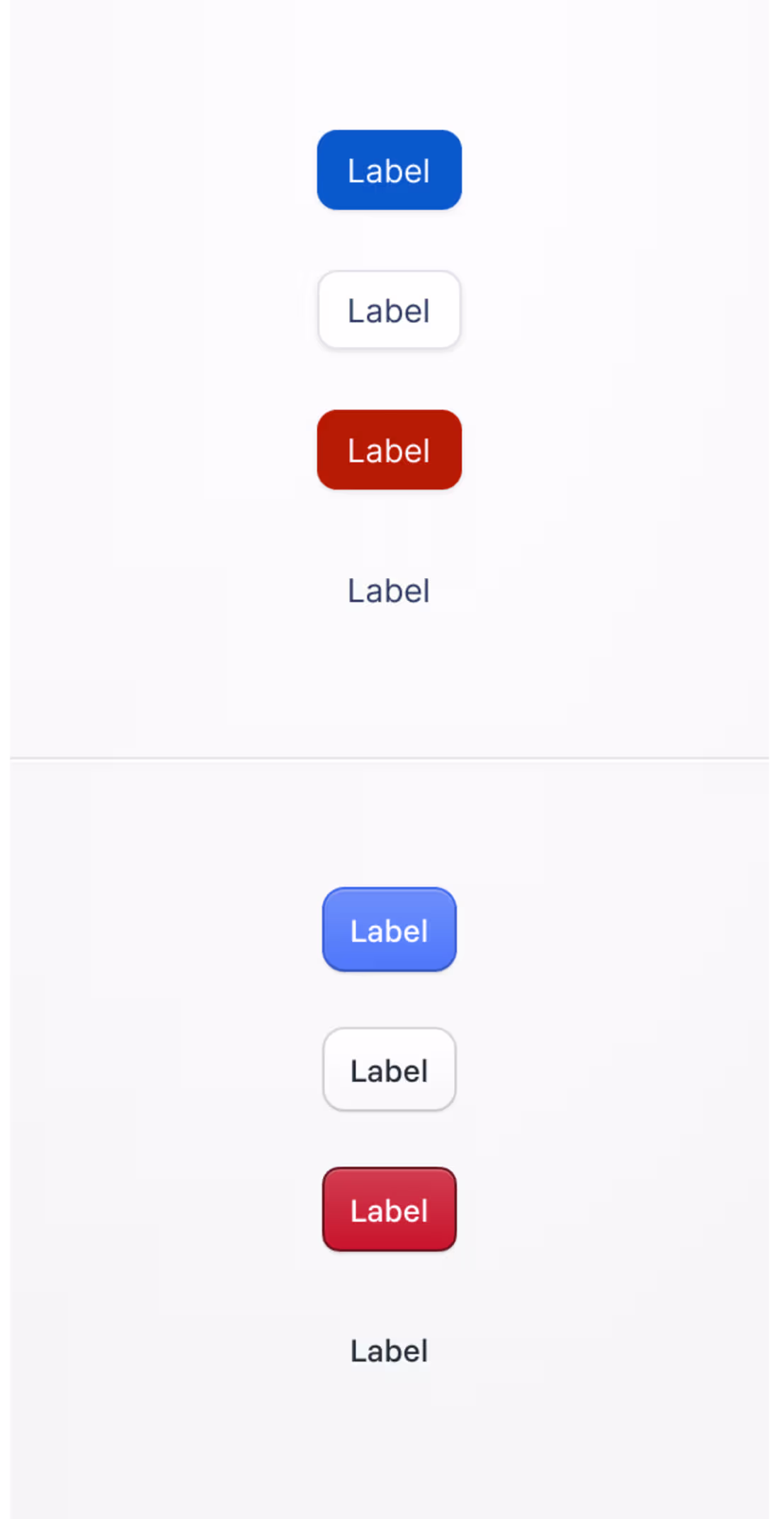
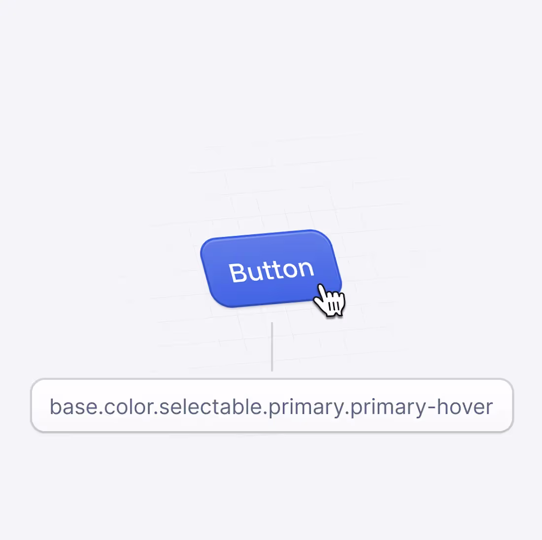
Just wrapped up a refresh of our button components for an upcoming rebrand.
The goal was simple: make them feel lighter, sharper, and more in tune with the brand’s tone.
Cleaner spacing, tighter type, and a system that feels more consistent across every touchpoint.
Before → After
Small changes, but they completely shift how the interface feels.
Always satisfying when design system work starts to show a bit of personality again.
21
145
A quick look at some early rebrand work I’ve been exploring, refining the visual language, tightening the type, and bringing more personality into the brand.
Still in mock stage, but already feeling sharper and more intentional.
1
54
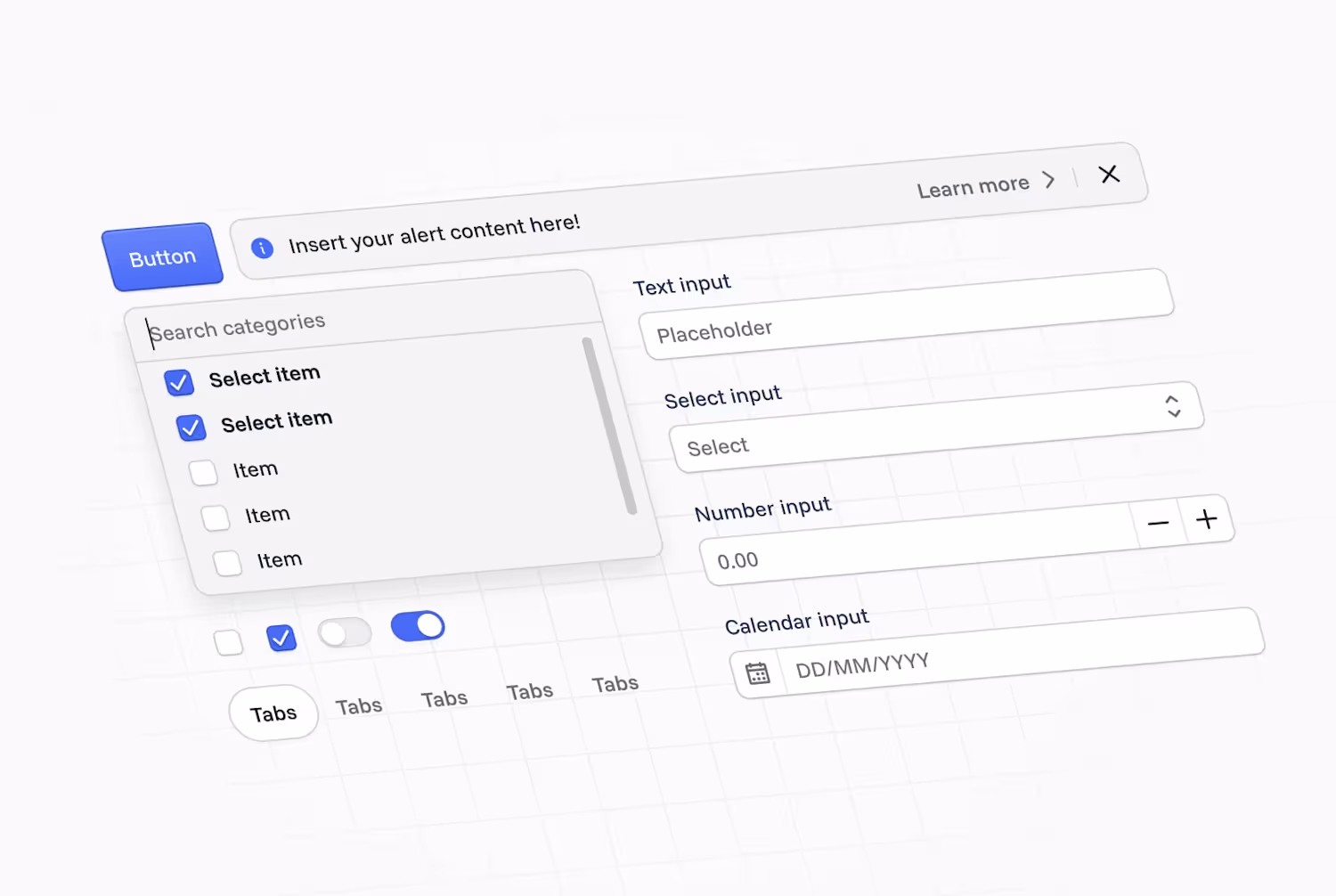
Figma-First Design System Documentation for Visibuild
0
6
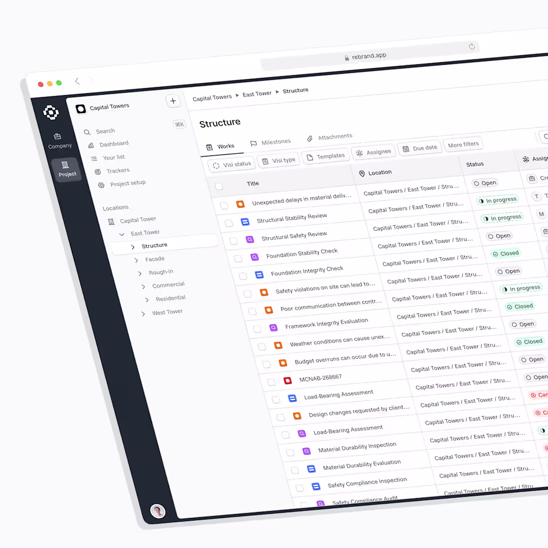
Revamping Interactive State Management at Visibuild
0
6
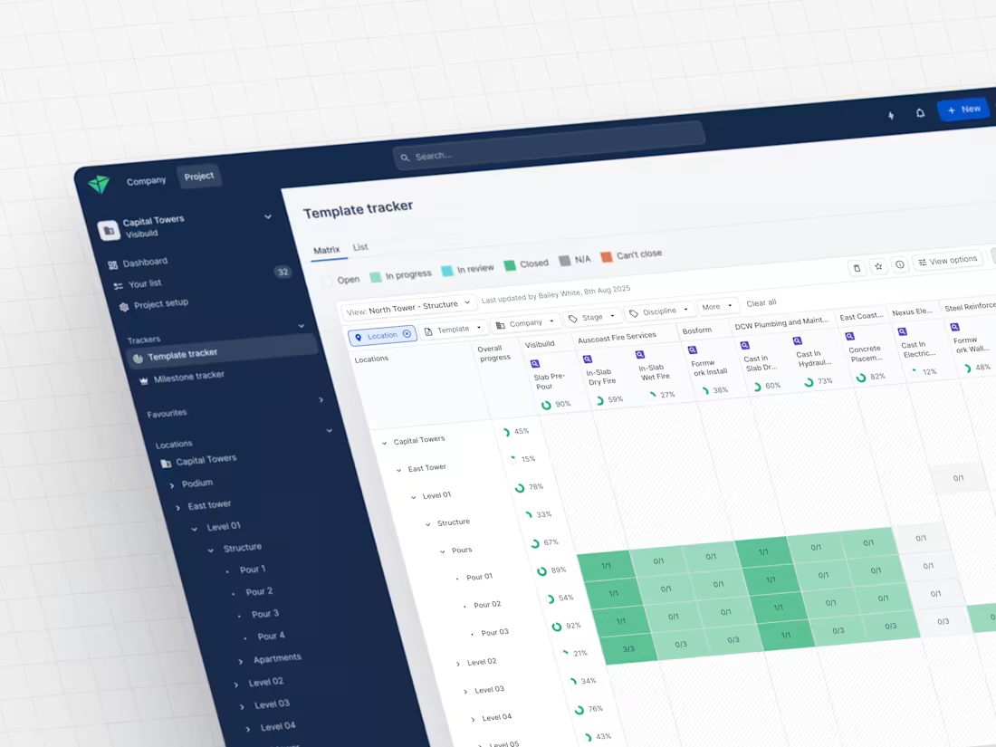
Inspection Matrix: Enhancing Construction Inspection Workflows
0
5