Revamping Interactive State Management at Visibuild
Bailey White
Overview
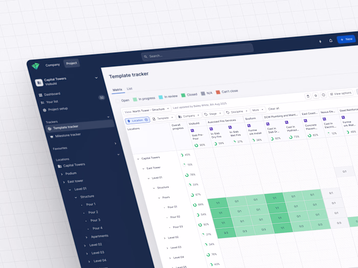
At Visibuild, we inherited a legacy approach to managing interactive states like hover and pressed — both in code and design. This approach used extra overlay layers: in code, multiple
<div> wrappers with state tokens, and in Figma, absolute-position overlays mirroring the same structure.Technically, it worked and scaled well without adding new colours, but as our team grew, this system created confusion, slowed onboarding, and added friction for both designers and developers.
The problem
The core challenge was maintainability and ease of use. The overlay method introduced a lot of unnecessary complexity:
Developers had to manage and debug extra layers, which slowed implementation and increased errors.
Designers faced repetitive manual steps in Figma, which led to missed states and inconsistent UI.
New team members struggled to understand the overlay system, making onboarding harder.
Overall, the system increased cognitive load for everyone and risked UI inconsistencies if overlays were forgotten.
This real friction across design and engineering was a clear signal that we needed a better solution.
The solution
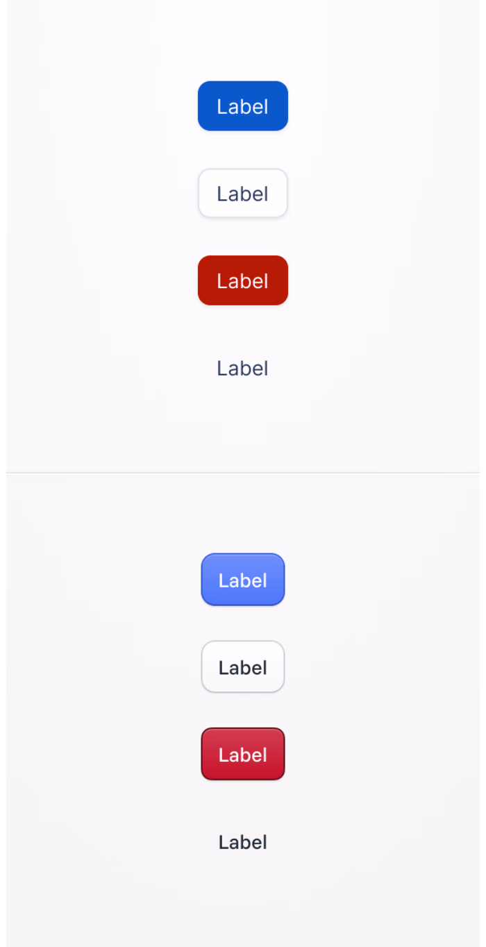
We introduced a new generation of state tokens built with modern CSS
color-mix() — a simple way to combine colours with opacity into one token.Each token mixes:
The original enabled colour token (like
base.color.selectable.primary.primary-enabled)A light or dark base colour (like
core.color.neutral.n-100 or core.color.neutral.n-1300)An opacity value for the state (like
base.opacity.hover)This meant no more overlay divs or extra layers, just one token that handled all interactive states.
To make it easier for everyone, we split selectable tokens into clear variants,
primary, on-surface (default), and destructive, each with its own namespace (base.color.selectable.{variantType}). This removed guesswork and streamlined token use across the team.We also introduced a clear ‘deprecated’ prefix for old tokens to avoid breaking existing components while teams transitioned at their own pace.
The impact
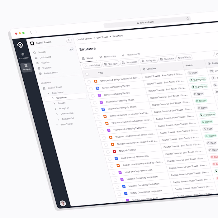
This update simplified over 300 interactive components:
Removed an average of 3 DOM layers per component
Replaced complex multi-token overlays with a single, reusable token
Improved code clarity and reduced DOM weight, speeding up rendering
Tightened design-to-code parity by aligning teams on shared token logic, not overlay structure
Simplified maintenance and documentation, making it easier to onboard new team members
Importantly, we kept our colour system lean, no new colours or hard-coded values, just smarter tokens built from what we already had.
Documentation & Accessibility
Updated design system docs with before-and-after examples and clear token usage guidelines
Created a Figma reference file where designers can inspect and test all interactive states in context
Ensured all tokens meet WCAG AA contrast requirements for accessibility, tested with Figma plugins and browser audits
All state tokens were tested to meet WCAG AA contrast requirements using Figma plugins and browser audits.
Collaboration & learnings
Worked closely with engineers to validate browser support for
color-mix() and build fallback logicRan design workshops to re-onboard the team and reduce reliance on manual overrides
Biggest takeaway: design and code don’t have to match structure perfectly, they just need to share the same intent. Our new system achieves that by focusing on shared token logic rather than duplicated overlays.
We keep reviewing token usage regularly with the design team to maintain best practices, gather feedback, and build ongoing buy-in.
Key takeaways
Simplified state handling, no more overlays or guesswork
Strengthened design-to-code alignment by focusing on shared outcomes, not exact structure
Scaled token logic across multiple variants, including destructive and surface-level states
Proved that design tokens can abstract complex interaction states, not just static colours
This work transformed how design and engineering collaborate at Visibuild and set a new standard for scalable, accessible interactive states in our system.
Like this project
Posted Oct 3, 2025
Transformed interactive state management at Visibuild using modern CSS tokens.