
Augusta Ugwuagbo
Graphic designer building engaging designs and purpose


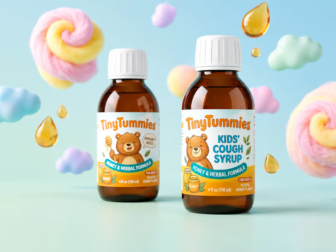
Tiny Tummies — Children's Cough Syrup Brand Identity
A concept brand identity project for Tiny Tummies, a playful children's cough syrup brand designed to make medicine time feel a little less scary for kids and parents alike.
The Challenge
Kids' cough syrup packaging usually falls into one of two traps: sterile and clinical, or so cartoonish it undermines the trust parents need when giving a child medicine. The goal was to land in between, warm and comforting, but still clean and credible on a pharmacy shelf.
The Concept
Tiny Tummies is built around a soft, rounded mascot character with a bubbly, friendly logotype. Instead of leaning on literal fruit or clinical iconography, the visual world uses abstract floating shapes, soothing swirls, syrup droplets, cloud-like blobs all to evoke comfort and relief without feeling like "medicine." A gentle pastel palette (mint, soft coral, warm cream) keeps the tone calm and reassuring while staying visually distinct on shelf.
What I Delivered
•Logo and mascot character design
•Color palette and typography system
•Bottle label design
•Product photography direction/mockup styling
Why It Works
The soft character and color work speak directly to kids, while the clean layout, clear dosage information, and thoughtful typography keep the brand credible for the parents making the purchase decision.
1
91
COCA-COLA × FIFA World Cup — CONCEPT CAMPAIGN VISUAL
A Personal Concept Development Project
•OVERVIEW
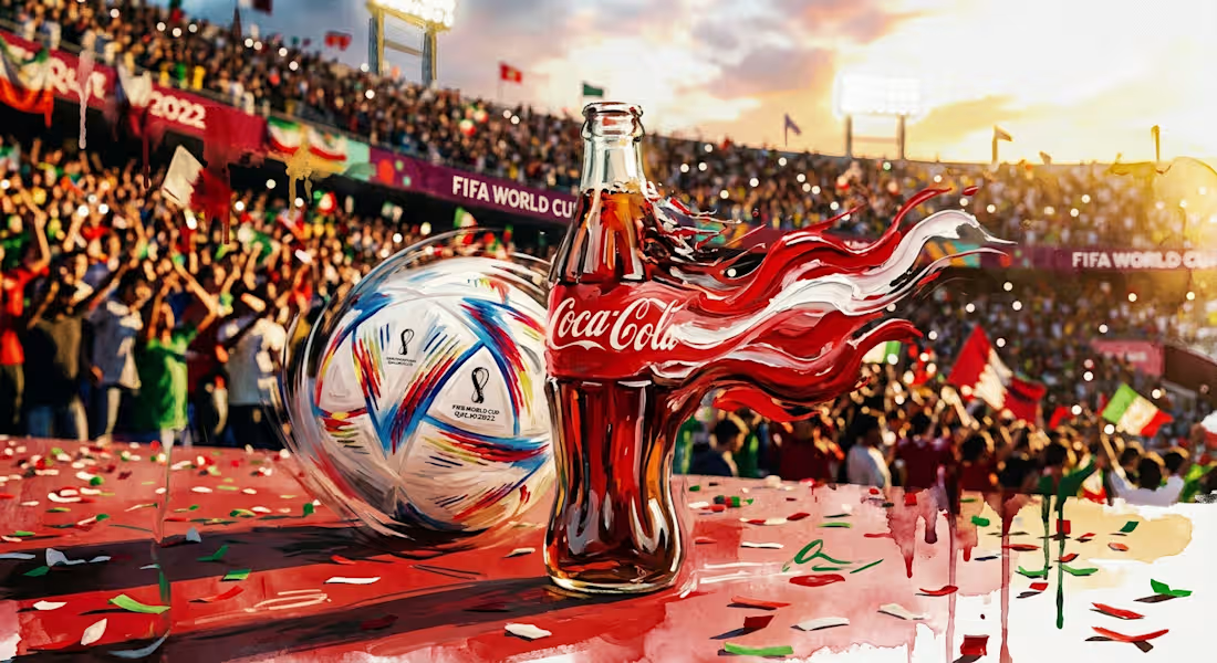
A speculative ad concept imagining a Coca-Cola × FIFA World Cup activation visual with a hero image for out-of-home and social placement built around match-day energy.
•CONCEPT & DIRECTION
The Coca-Cola contour bottle and official match ball are staged at equal visual weight against a sunlit, packed stadium. A red-and-white ribbon motif, echoing the Coca-Cola wordmark as it sweeps across the frame to suggest motion and celebration, tying the brand to the excitement of the game rather than presenting it as a static product shot.
•DESIGN RATIONALE
Color: Red/white doubles as brand identity and natural "celebration" color, letting Coca-Cola feel native to the scene.
Composition: Ball and bottle share equal focus, positioning the product as part of the moment, not the sole subject.
Mood: Warm lighting and crowd depth create an aspirational feel suited to social ads or OOH.
•PROCESS
Concept ideation, mood direction, and compositional prompting developed independently, refined iteratively using AI image generation tools.
•APPLICATION
Hero visual for a World Cup activation campaign, social ads, stadium OOH, or landing page banner.
0
54
Mock & Proper — Full Brand Identity for a Fine Mocktail Label
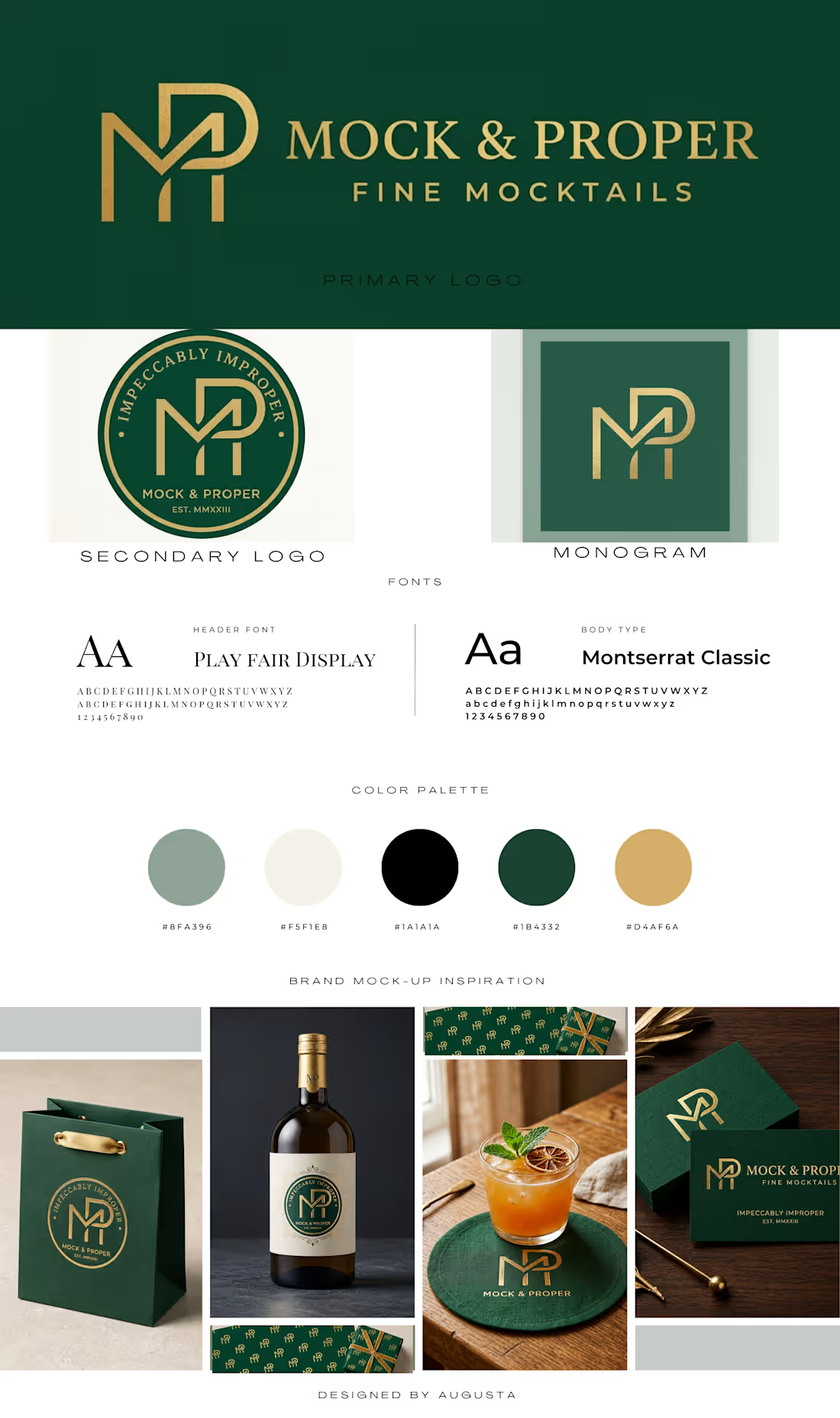
Designed a complete brand identity system for Mock & Proper, a fictional fine non-alcoholic spirits brand built around the tagline "Impeccably Improper." The concept called for a look that felt indulgent and premium, playing with the tension between "mock" and refinement.
The identity centers on a custom interlocking MP monogram, paired with a deep forest green and antique gold palette that reads luxury without needing alcohol to sell the experience. From there, I developed a circular badge lockup, a horizontal wordmark, and extended it across a full suite of brand touchpoints; business cards, gift bags, wrapping paper patterns, wall art, and bottle packaging mockups across a 4-SKU product line.
This project was as much about restraint as it was about detail, keeping the typography clean and letting the gold foil, monogram construction, and packaging materials carry the premium feel.
Scope of work:
Logo & monogram design · Brand color palette & typography · Packaging design (bottle labels) · Business card design · Gift bag & wrap pattern design · Brand mockups
#BrandIdentity #LogoDesign #PackagingDesign #GraphicDesign #BrandingDesign #LuxuryBranding #MonogramDesign #ProductPackaging #VisualIdentity #BeverageBranding #DesignPortfolio #FreelanceDesigner #ContraDesigner
1
73
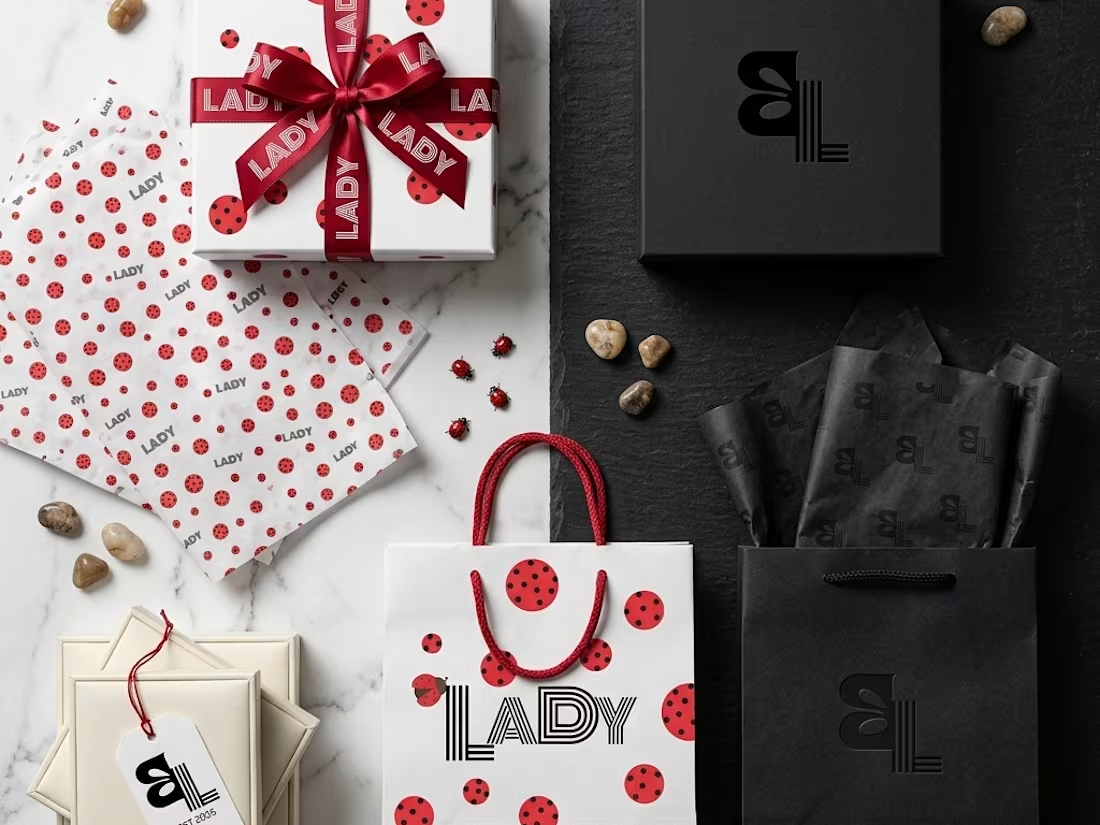
CONCEPT:
Lady Boutique needed more than a logo, it needed a personality. The concept draws from the ladybug: nature's most fashionable creature. Bold red, precise black dots, clean white space. The result is a brand that feels confident, playful, and unmistakably feminine without being soft or generic.
CREATIVE APPROACH:
The rebrand was built around one central idea: energy with elegance. Every design decision was intentional. The ladybug isn't illustrated literally, it's abstracted into pattern, color, and attitude. The brand strategy was defined first (what Lady makes women feel), then the visuals were built to express that feeling rather than just describe the business.
Three pillars guided the work:
1. Red for energy and boldness
2. Dots for personality and movement
3. Black lines for precision and structure
VISUAL DIRECTION:
The identity system includes two logo marks, a wordmark with a typographic ladybug detail, and a stacked monogram (BL) for compact use. Typography pairs Briesta Script (warmth, femininity) with Kabel Regular and Black (structure, confidence). The color palette deep black, warm grey, crimson red, blush, and white keeps the brand from reading as juvenile despite the playful motif. Packaging mockups (bags, boxes, wrapping paper) show the system in full life, proving the identity works at scale and across touchpoints.
1
81