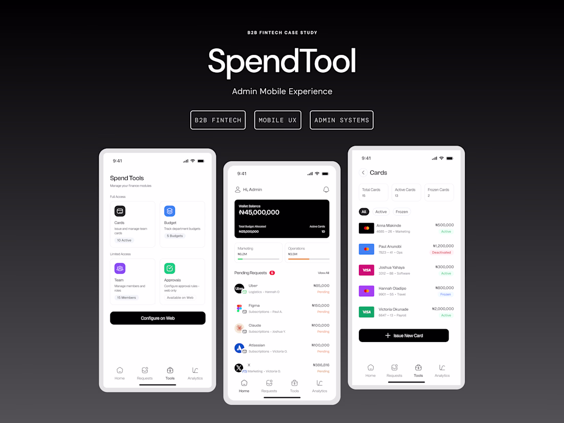
Designed the mobile admin experience for a spend management tool — cards, budgets, approvals, team management. Built around how finance admins actually work.
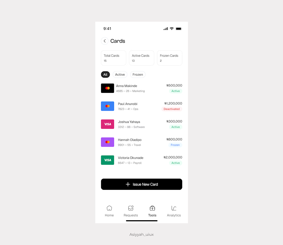
Card management screen for quick oversight—active cards, spending limits, department tags, and easy issuing. No clutter.
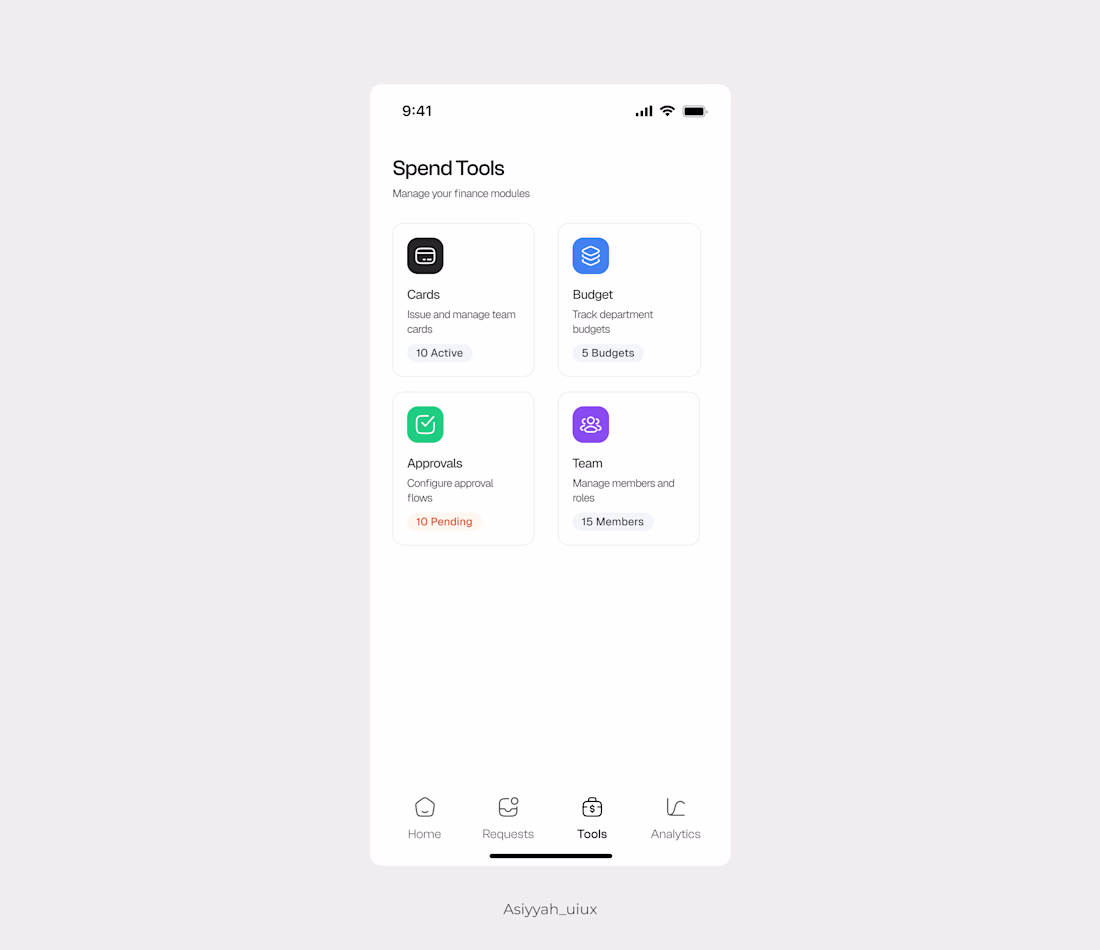
Designed this tools hub for a spend management platform—centralized access to card management, budgets, approvals, and team settings in one clean view.
The goal: eliminate menu-hunting and give admins quick access to everything they need. Simple structure, real-time status, no clutter.
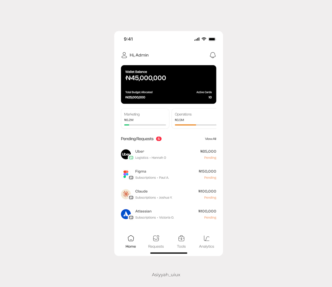
Admin dashboards are often overcomplicated. This is the mobile admin view for a spend management platform designed to handle approvals, budget tracking, and quick oversight without requiring desktop access.
The goal was simple: give managers the control they need without the...
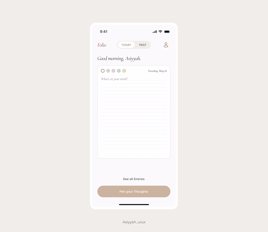
Stepped out of my usual client work to explore something different. I've been feeling creatively restless lately, so I let myself experiment without constraints. Made several iterations before landing on this final version.
A simple journal app. No complicated steps, just you and...