
pro
Muhammad Abdullah
Branding | Brand Identity | Website
- 5.0
- Rating
- 210
- Followers


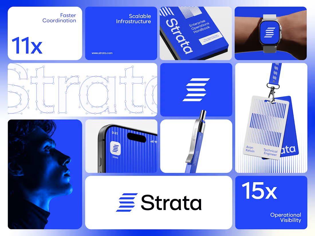
Strata’s brand runs on one colour, one shape and one rule. Restraint was the strategy.
I designed the brand identity for Strata, an enterprise SaaS platform that connects fragmented systems, data, workflows and teams. A product that removes chaos can’t have a chaotic brand, so every element earns its place: “Every layer, working as one.”
One shape: Five horizontal layers forming a subtle S. It works as the logo, a pattern and a rhythm for layouts.
One colour: Strata Blue #2447F9, carried by near-black and white. Solid only, never a gradient.
One rule: Complexity, organized into movement. If a layout feels busy, it’s wrong.
Structure: Modular grids, strong alignment and architectural spacing across every surface.
Imagery: Single-colour portraits in Strata Blue, so even the photography follows the system.
Fewer elements, used with discipline, scale further than more elements used loosely.
If your enterprise SaaS company needs a brand that stays consistent as it grows, let’s talk.
#VisualIdentity #SaaSBranding #B2BBranding #BrandDesign
1
33
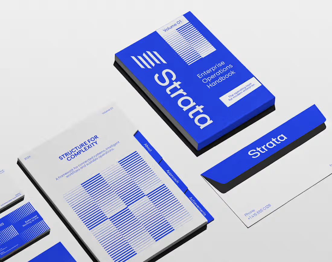
In geology, strata are layers laid down over time, each one holding the rest. That’s exactly what an enterprise platform should feel like.
I designed the brand identity for Strata, a SaaS platform that connects fragmented systems, data, workflows and teams. The name already carried the idea, so the identity makes it visible: “Every layer, working as one.”
Logo: Five stacked layers forming a subtle S, solid like rock and arranged for motion.
Principle: “Complexity, organized into movement” turns a dense product story into something calm.
Palette: Strata Blue #2447F9, near-black #02040C and white. Flat colour only, so every layer stays distinct.
Layout: Modular grids and architectural spacing that build pages the way strata build ground, in order.
Imagery: Portraits washed in Strata Blue, with light streaming through, putting people at the centre of the system.
A good name sets up the brand. The identity has to prove it.
If your SaaS or B2B platform needs a brand as solid as its infrastructure, let’s talk.
#BrandIdentity #SaaSBranding #TechBranding #LogoDesign
3
36
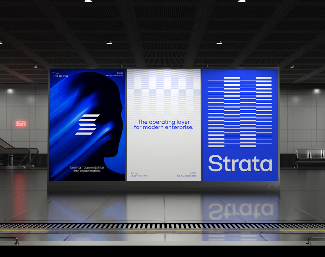
Every integration platform draws its brand from nodes and connecting lines. Strata is built from layers instead.
I designed the brand identity for Strata, an enterprise SaaS platform that unifies fragmented systems, data, workflows and teams. Its products sit on top of each other and work together, so the brand does the same: “Every layer, working as one.”
Mark: Five horizontal bars that read as a subtle S. Each one is a system, and the stack is the platform.
Wordmark: Clean and open beside the mark, letting the layers do the talking.
Strata Blue #2447F9: One confident colour with near-black and white. No gradients, no noise.
Grid: Modular, strongly aligned and spaced like architecture, because enterprise buyers trust structure.
Campaign imagery: Blue-washed portraits with light moving through, showing complexity becoming movement.
Structure is the feature enterprise buyers can see first.
If your B2B tech company needs an identity that makes its platform feel organized at a glance, let’s talk.
#SaaSBranding #VisualIdentity #EnterpriseBranding #LogoDesign
1
28

Enterprise software is rarely complex because of one system. It’s complex because nothing talks to anything else.
I designed the brand identity for Strata, an enterprise SaaS platform that connects fragmented systems, data, workflows and teams. The idea: “Every layer, working as one.”
Logo: Five horizontal layers stacked into a subtle S, separate parts moving as one structure.
Principle: “Complexity, organized into movement” shapes every layout decision.
Colour: Strata Blue #2447F9 with near-black and white. Solid colour only, no gradients, so it reads as clarity.
System: Modular grids, strong alignment and architectural spacing, so every surface feels engineered.
Imagery: Human portraits in Strata Blue, a reminder that behind every workflow there are people.
The best enterprise brands make complexity feel quiet.
If your SaaS company needs a brand that makes a complex product feel simple, let’s talk.
#BrandIdentity #SaaSBranding #LogoDesign #B2BBranding
2
44