
pro
Khairul Islam
Logo Design with Clarity & Simplicity
Ready for work
Khairul is ready for their next project!
This Premium Letter M logo mark is ready for their next owner.
1
1
4
A distinctive letter A, geometric logo designed for modern startups and growing brands.
Professionally crafted to help your business look credible, memorable, and launch-ready from day one.
Exclusive design rights: sold once, never resold, with copyright transferred upon purchase.
Dm or comment if you're interested.
1
16
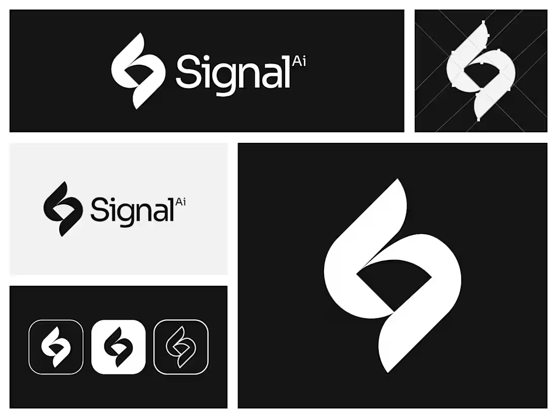
Distinctive letter S + spark logo designed for modern startups and growing brands.
Logo is sold only once. Copyright transfer to the buyer
1
13
Designed for founders ready to move fast. A collection of premium, ready-made logos created to help your brand launch with confidence from day one.
Exclusive ownership — every logo is sold only once. Copyright transfer to the buyer
0
6
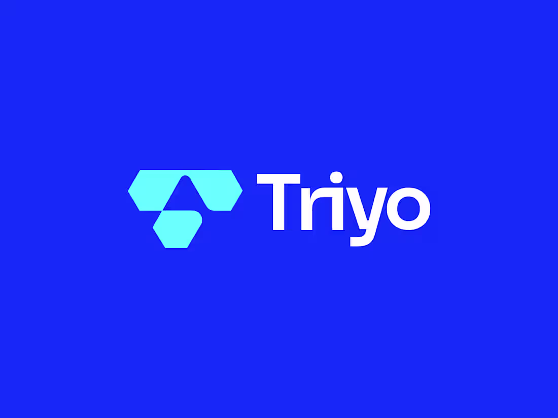
Triyo Logo | Letter T Logo
Unused concept
Designed & Developed by Khairul Islam
Brandwave Studio © 2026
#logodesign #branding #identity
0
11
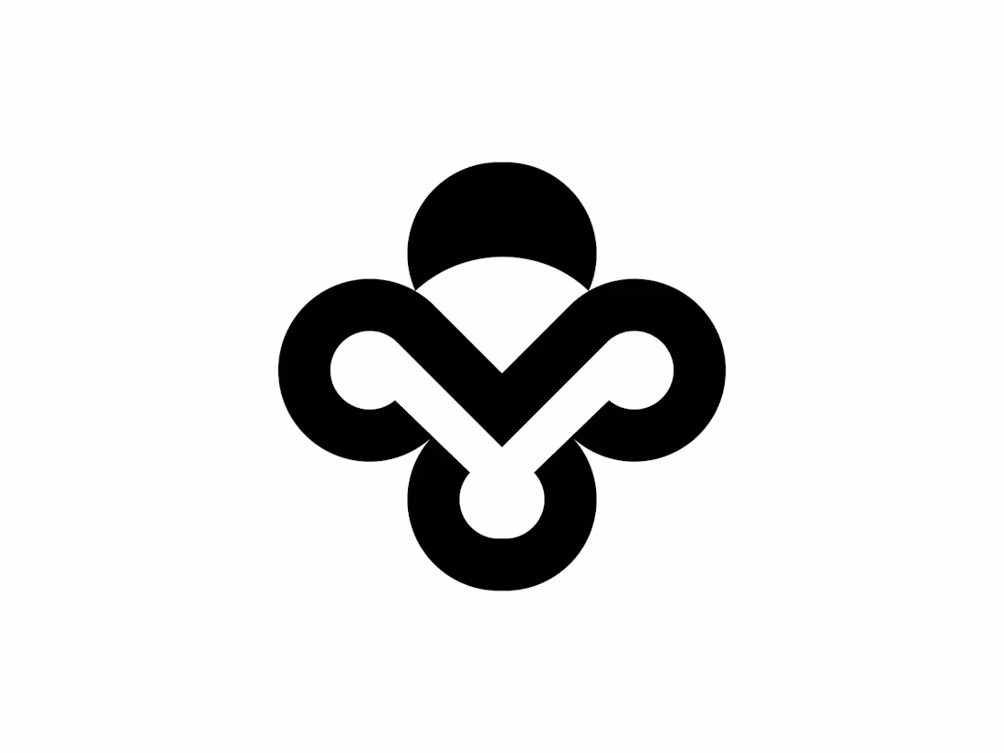
Designed this logo based on Unity, Connection and Trust.
0
9
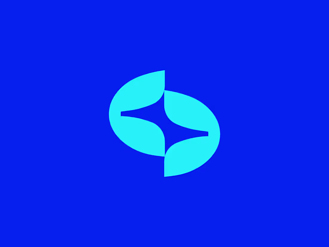
Unused S Logo for sale.
Logo Features:
A bold geometric letter “S” built through continuous flowing forms. The balance of sharp cuts and smooth curves creates a sense of motion and precision, while the central negative space strengthens clarity and rhythm. Minimal yet distinctive, the mark carries a strong modern presence.
What’s Included:
Premium high-resolution logo files (AI, PNG, SVG, PDF, JPEG)
100% full ownership and commercial usage rights
Instant access and download after purchase
Free Revisions If needed customisations
1
25
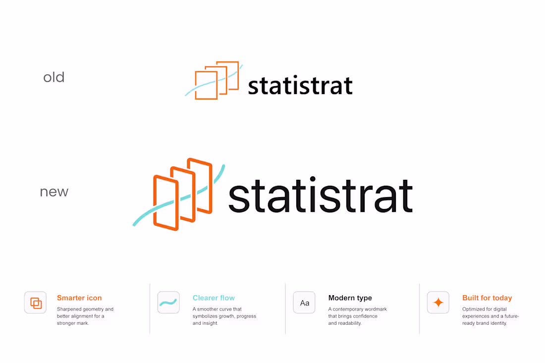
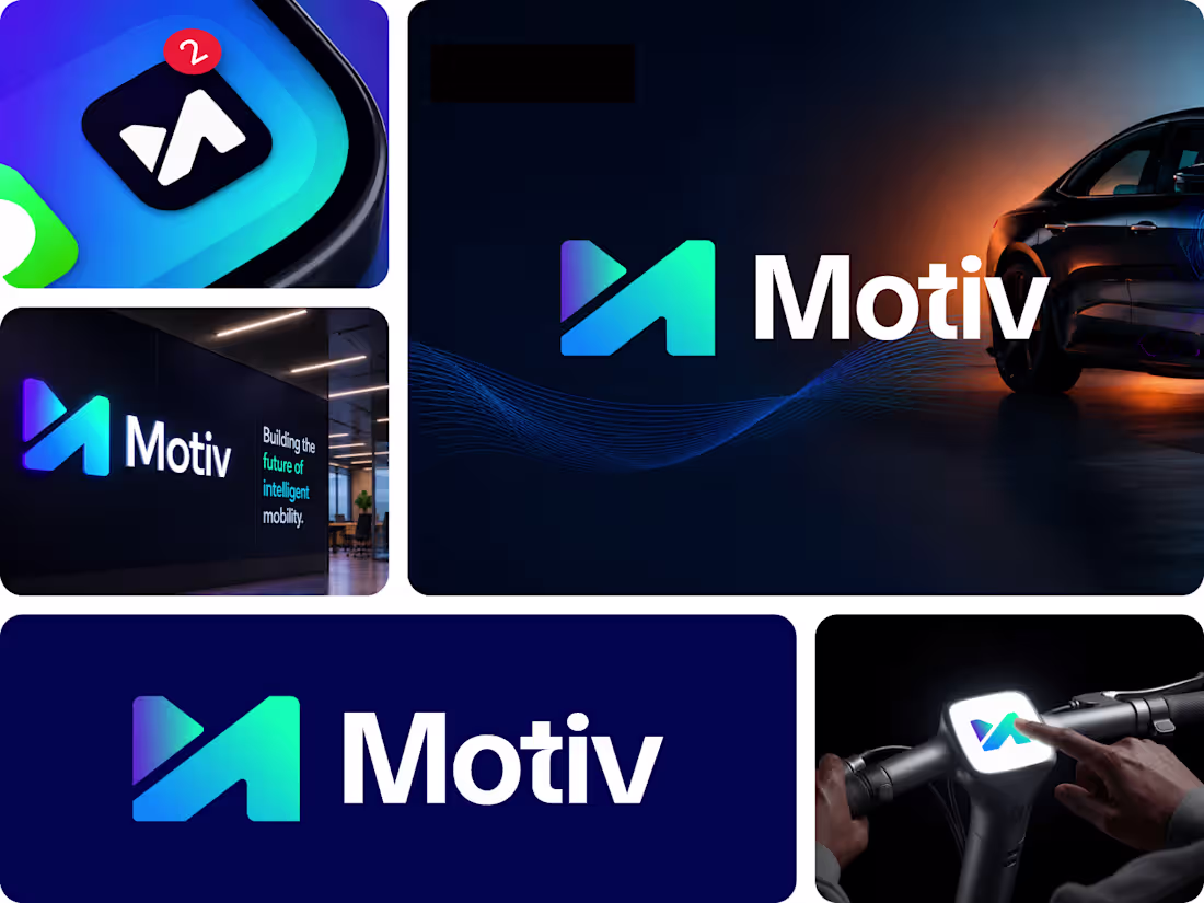
The redesign keeps the core visual concept intact while refining the geometry, improving flow, and introducing a more confident contemporary wordmark. The goal was simple: preserve recognition while creating a stronger, future-ready identity.
Old → New
• Smarter icon system
• Clearer visual flow
• Modern typography
• Better digital adaptability
0
18
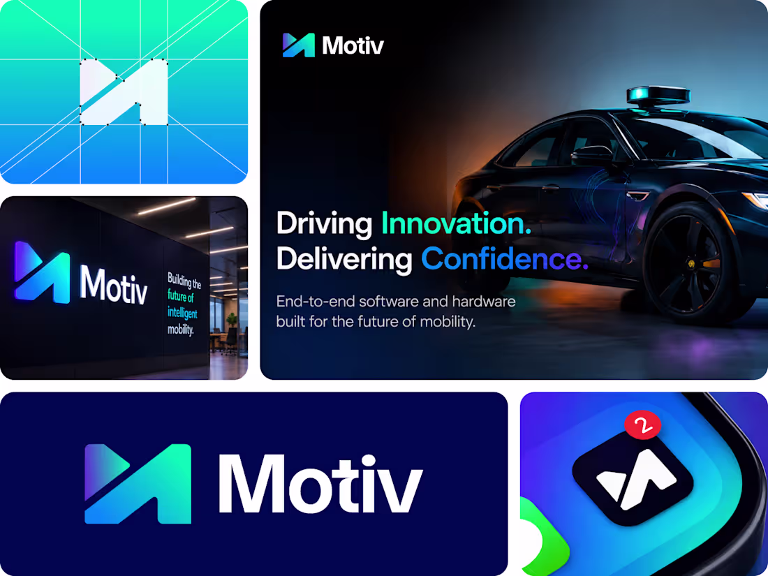
Motiv is focused on building intelligent mobility solutions that make transportation safer, smarter, and more connected.
The symbol is built from a sharp, forward-moving geometric form that represents direction, progress, and constant motion.
1
36
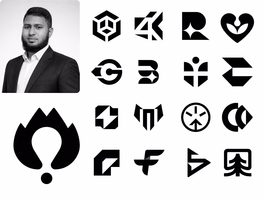
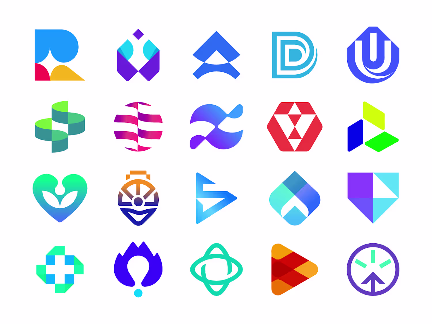
Some of my favorite logo work done over the years for wonderful clients worldwide.
1
26