The network for creativity
Join 1.25M professional creatives like you
Connect with clients, get discovered, and run your business 100% commission-free
Creatives on Contra have earned over $150M and we are just getting started
Back to feedPost

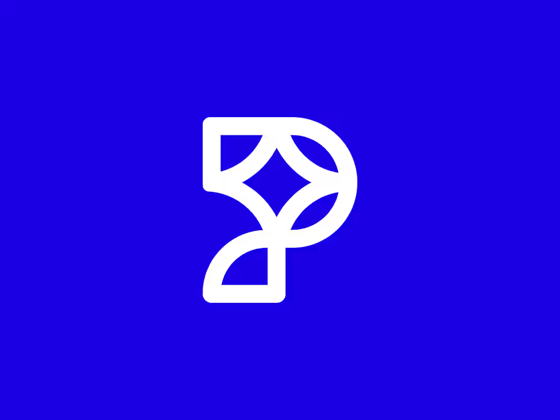
Designed this symbol a few days ago, just for fun.
After exploring many variations, this one feels clean, balanced, and just right. I’m keeping it as one of my designs available for sale.
What do you think?



Looks cool and not overcomplicated in my opinion!
The network for creativity
Join 1.25M professional creatives like you
Connect with clients, get discovered, and run your business 100% commission-free
Creatives on Contra have earned over $150M and we are just getting started





Related posts

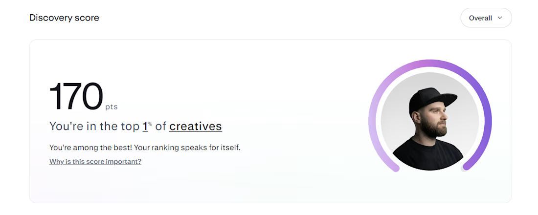
Top 1% on Contra. 🎉
A little milestone, but a reminder that showing up and doing good work consistently actually pays off.
If you're just starting out and wondering if it's worth it: it is. Keep going.
Thanks to all my clients and everyone here who's been so supportive.

That's Legendary bro congrats 🔥🔥🔥🔥

A personal identity experiment for Super Intelligence.
The symbol combines a star and the letters SI into one compact mark.
Logo design + motion.


Excellent use of geometry in the logomark!


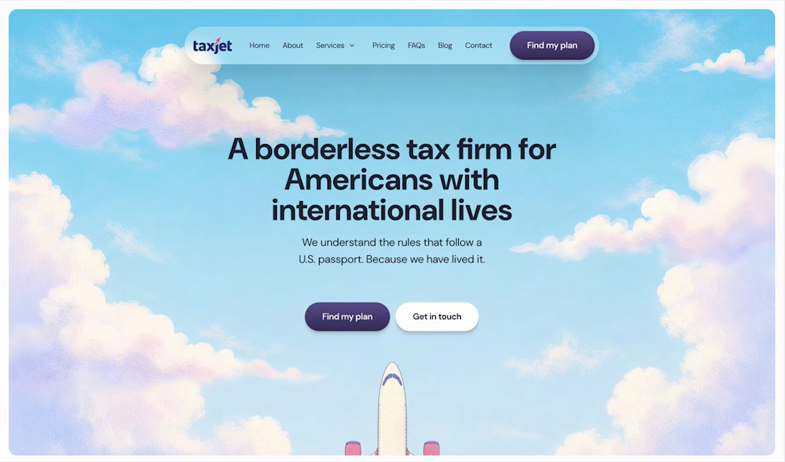
Your homepage should answer one question: what do you do? If a visitor can't answer that in five seconds, everything below the fold doesn't matter.

I just saw Bright Studios’ new website. You guys nailed it! Really like it.