pro
Khairul Islam
Logo Design with Clarity & Simplicity
Ready for work
Khairul is ready for their next project!
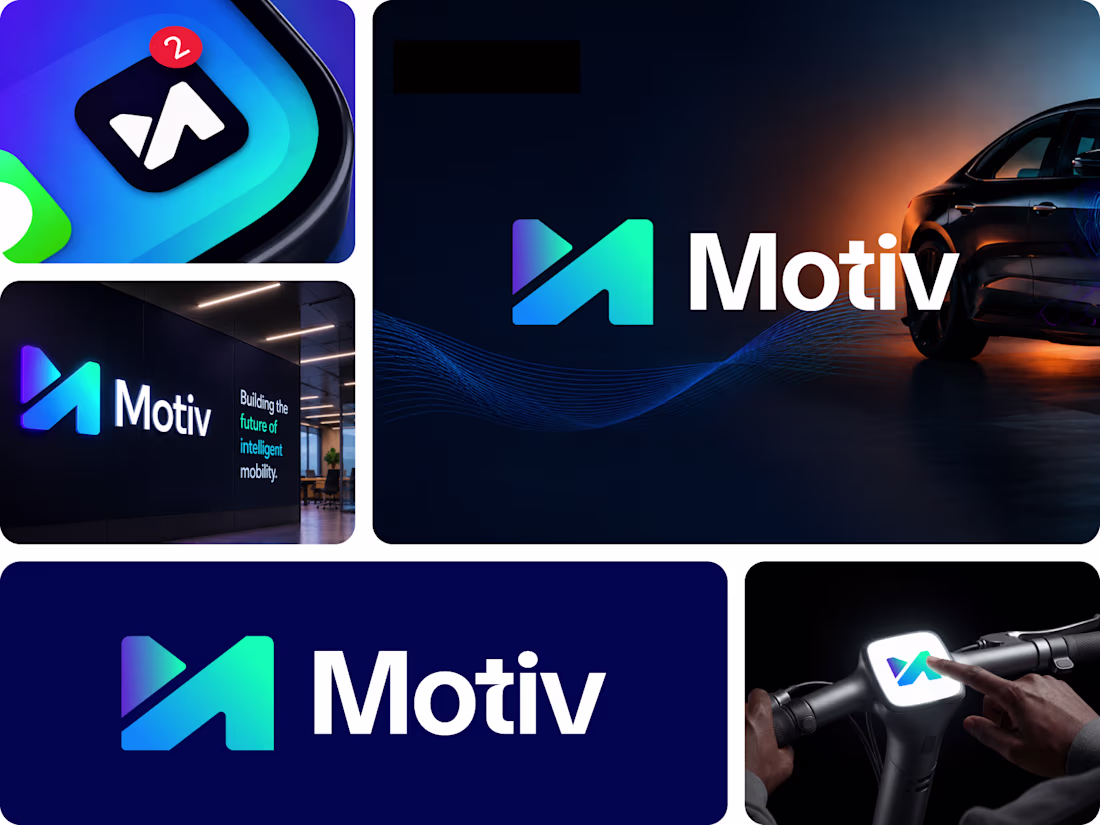
This Premium Letter M logo mark is ready for their next owner.
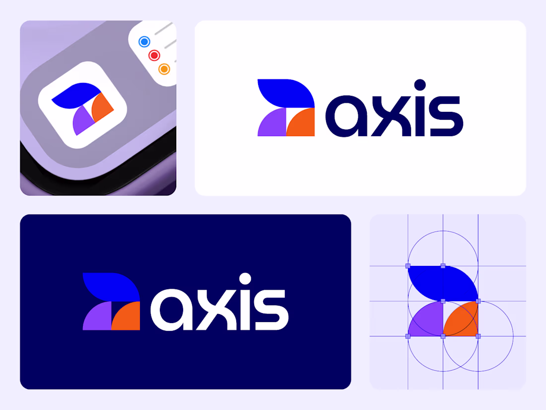
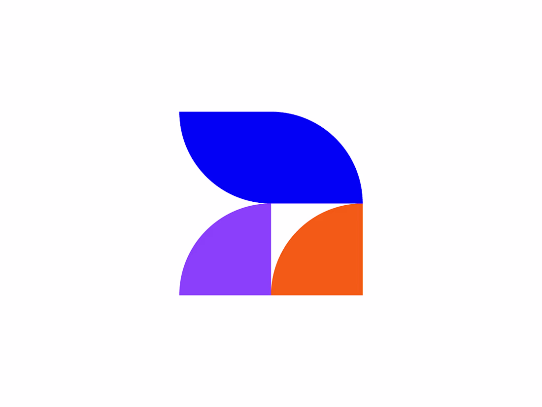
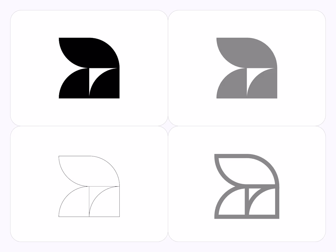
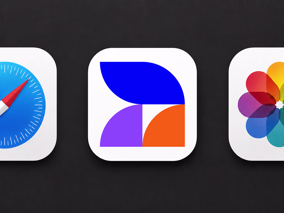
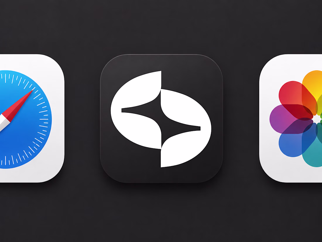
A distinctive letter A, geometric logo designed for modern startups and growing brands.
Professionally crafted to help your business look credible, memorable, and launch-ready from day one.
Exclusive design rights: sold once, never resold, with copyright transferred upon purchase.
...
Distinctive letter S + spark logo designed for modern startups and growing brands.
Logo is sold only once. Copyright transfer to the buyer
Designed for founders ready to move fast. A collection of premium, ready-made logos created to help your brand launch with confidence from day one.
Exclusive ownership — every logo is sold only once. Copyright transfer to the buyer
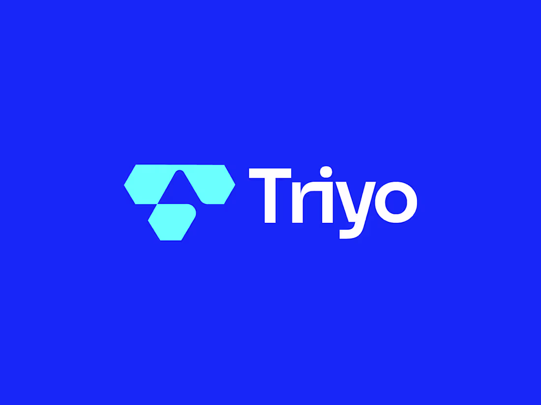
Triyo Logo | Letter T Logo
Unused concept
Designed & Developed by Khairul Islam
Brandwave Studio © 2026
#logodesign #branding #identity