
Anta Petrenco
Brand identities and packaging made to be remembered
New to Contra
Anta is ready for their next project!


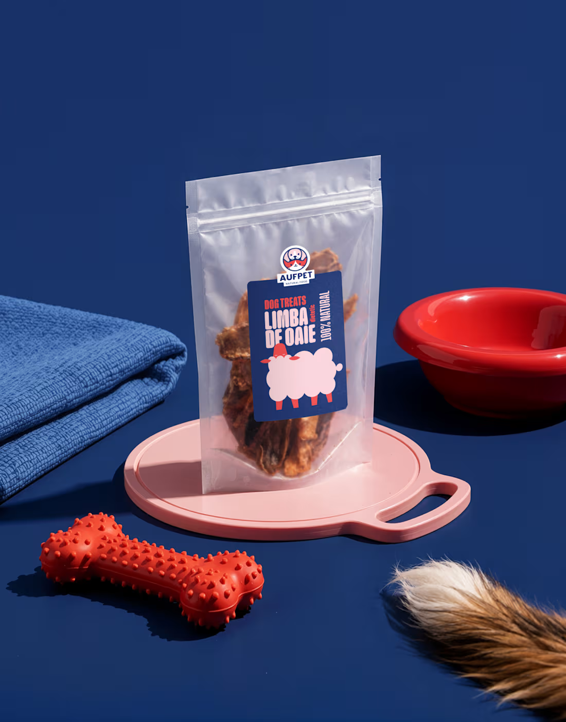
Packaging and illustration for single-ingredient dog treats, made in Moldova. Aufpet air-dries one cut per pack — no additives, no fillers, nothing else.
Nothing gets hidden. The pouch stays transparent, so through the film you see exactly what you bought, while the card shows what your dog sees. Both points of view sit on the same pack and neither apologises for the other.
Colour sorts the shelf: sky for poultry, sea green for fish, navy for sheep, red for beef, mint for rabbit. Eight cuts, 50+ labels across all flavours, five special editions. Photographed with the dog it was actually made for.
🐾
5
141
Journo Birds
Brand identity, visual system,
and editorial experience
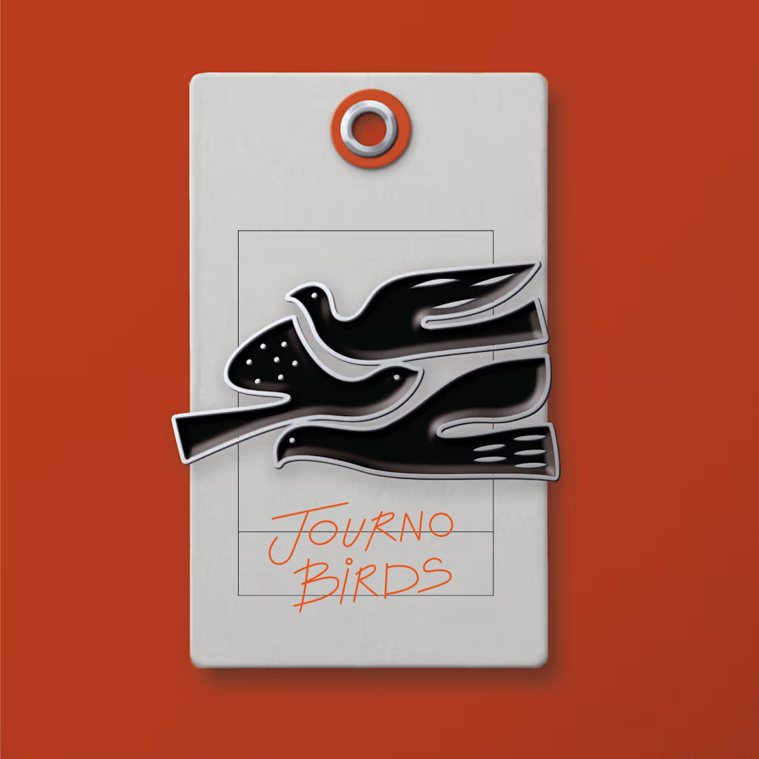
Journo Birds is an independent journalism project founded by a team from Estonia, dedicated to documenting and sharing the traditions, customs, and stories of Moldova. The project required the development of a comprehensive visual identity system that reflects the voice and spirit of independent female journalists.
Conceived as more than a simple logo, Journo Birds integrates a distinctive brand identity with a cohesive graphic language that speaks to freedom, independence, and journalistic integrity. The visual system serves as a vehicle for storytelling across multiple platforms — from editorial content to social media presence.
The identity features a minimalist geometric bird silhouette as its central symbol, representing freedom of speech and the ability to navigate complex narratives from multiple perspectives. The accompanying hand-drawn typography adds a personal, authentic touch that humanizes the journalistic voice while maintaining professional credibility.
A key aspect of the project is its visual consistency across all touchpoints, creating a unified brand experience that resonates with audiences interested in authentic, independent reporting. The carefully crafted design language reinforces the editorial mission while building recognition and trust within the community of readers and followers.
The collaboration between the Estonian Journo Birds team and True Agency resulted in a distinctive visual identity that effectively communicates the project's commitment to independent journalism and cultural storytelling.
2
9
189
❤︎
Mamico
Spatial concept, zoning,
graphic system
and customer experience
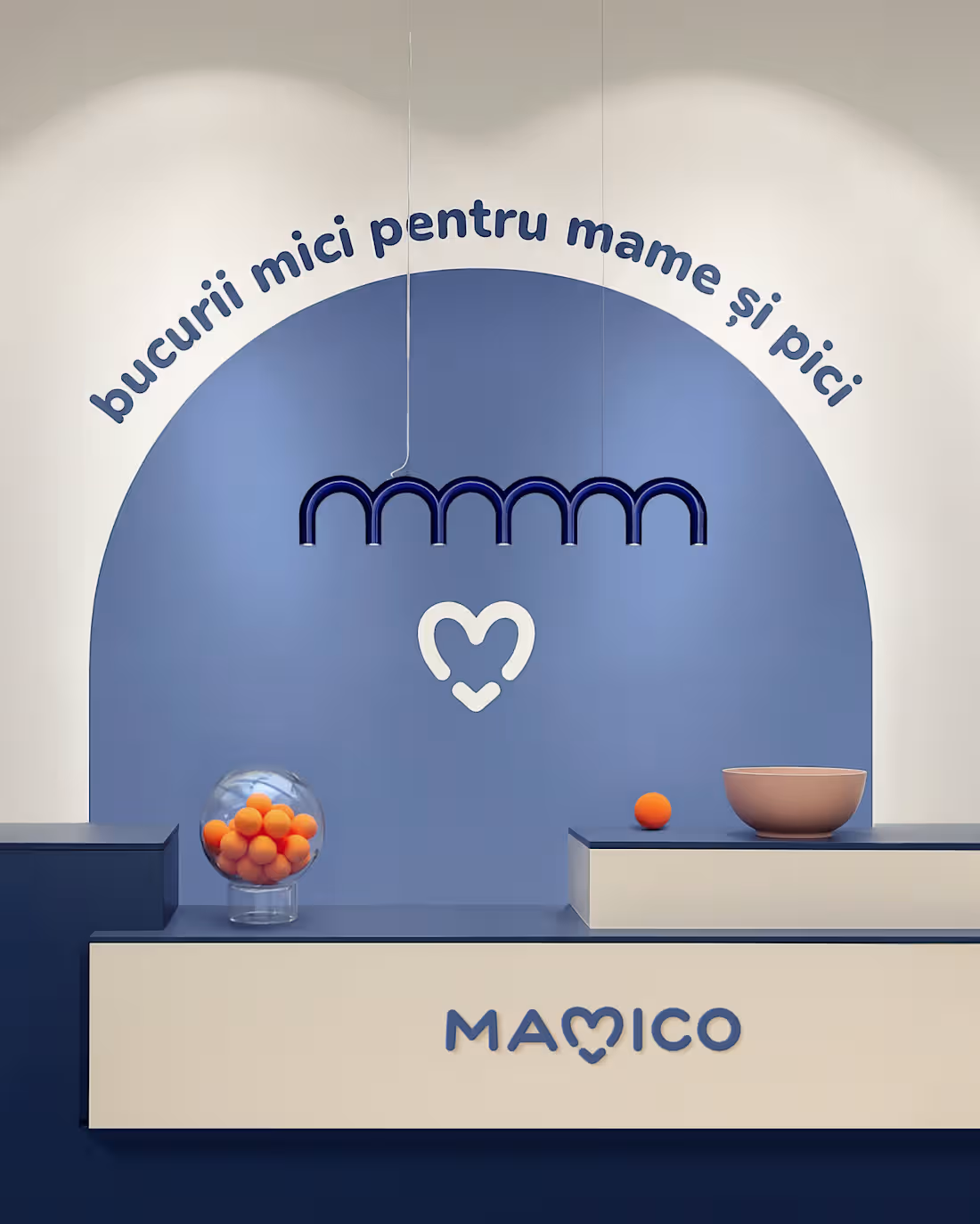
Mamico is a large-scale children’s retail space spanning 1,700 m², designed as a comprehensive environment for future and young parents. The project encompassed the full development of the store — from spatial zoning and customer flow to wall graphics, immersive areas and experiential elements.
Conceived as more than a traditional retail space, Mamico integrates product, service and emotion into a unified experience. The layout includes dedicated zones for different stages of early childhood, as well as carefully designed room-like settings that recreate real-life nursery and home environments. These allow visitors to better imagine, test and select products in context.
1
3
161
Radacini – Long charmat
Packaging | Label Design | Visual Identity
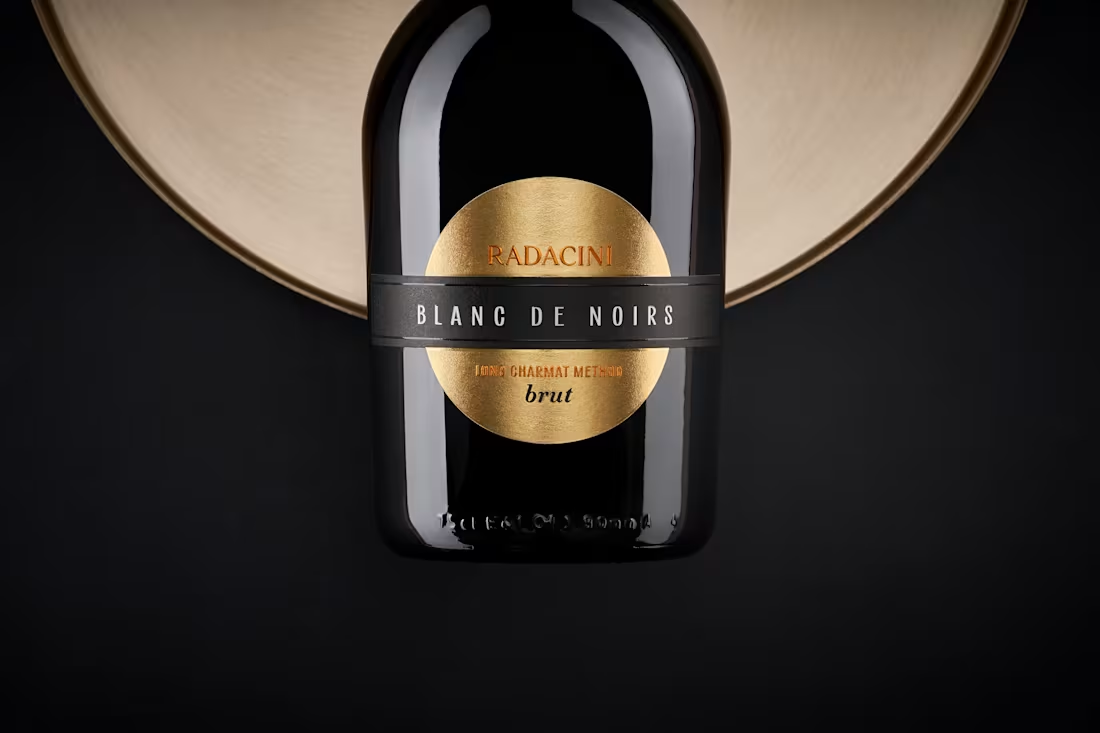
The design builds around the bottle’s shape — rounded, grounded, with a low center of gravity. It sets the tone for a visual language that’s minimal, structured, and quietly confident. Nothing here distracts from the form — instead, the elements work with it, highlighting proportions and keeping the overall composition clean and balanced.
The key visual accent is the gold foil — used both on the neck and echoed in the circular label. Set against a dark background, the metallic finish brings a sense of warmth and understated luxury without overwhelming the design.
1
3
139