
pro
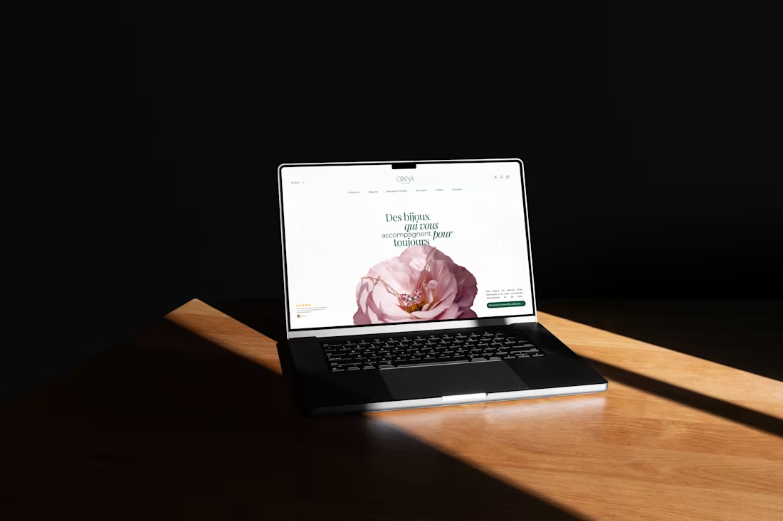
A refined website design concept for OJANĀ, a jewelry brand focused on timeless elegance and emotional connection. The interface blends soft floral imagery, delicate typography, and spacious layouts to reflect the beauty and intimacy of fine jewelry.
2
3
206
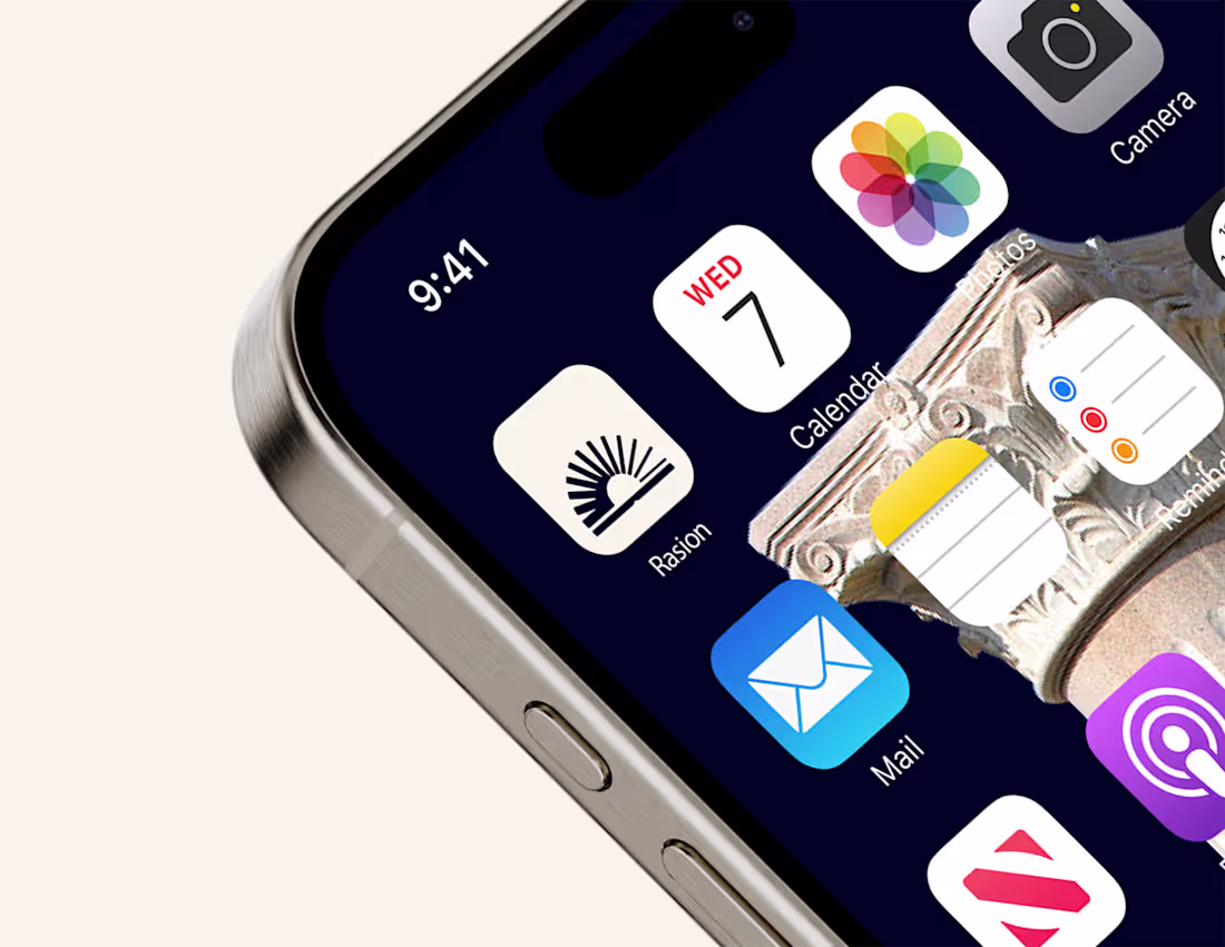
A clean and minimal app icon designed for Raison, an AI-powered education platform. The rising form symbolises knowledge, clarity, and intellectual growth, reflecting the platform’s mission to guide students with trusted AI assistance. The design ensures strong visibility and recognisability across digital interfaces and mobile environments.😊
0
162
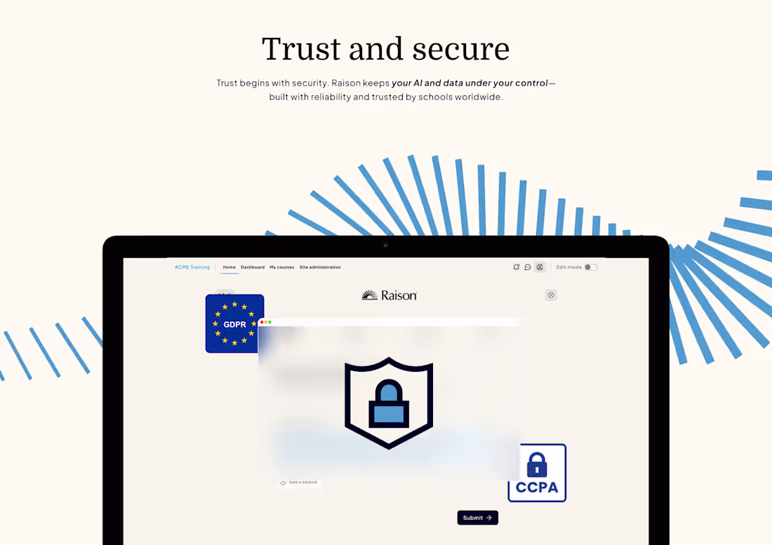
Trust and security, a key screen from Raison, designed to communicate data transparency and reliability.
The focus was to build visual trust while highlighting GDPR and CCPA compliance in a calm, confident tone.
0
257
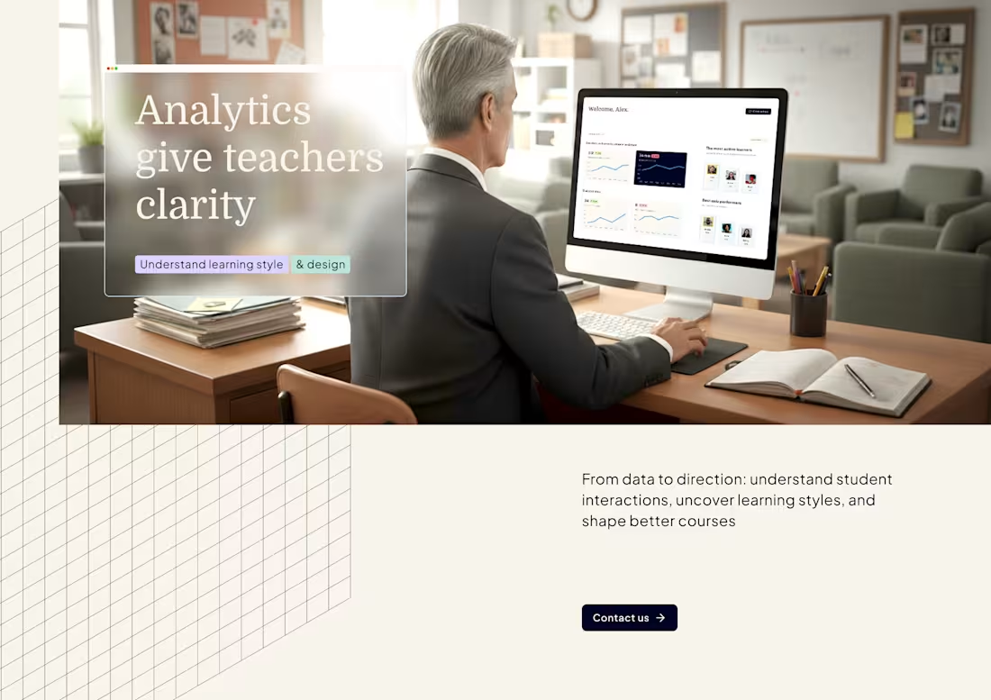
Recent layout design direction for Raison (https://raison.is/), a modern learning platform empowering educators with clarity through analytics.
Make learning insights accessible and actionable.
0
250
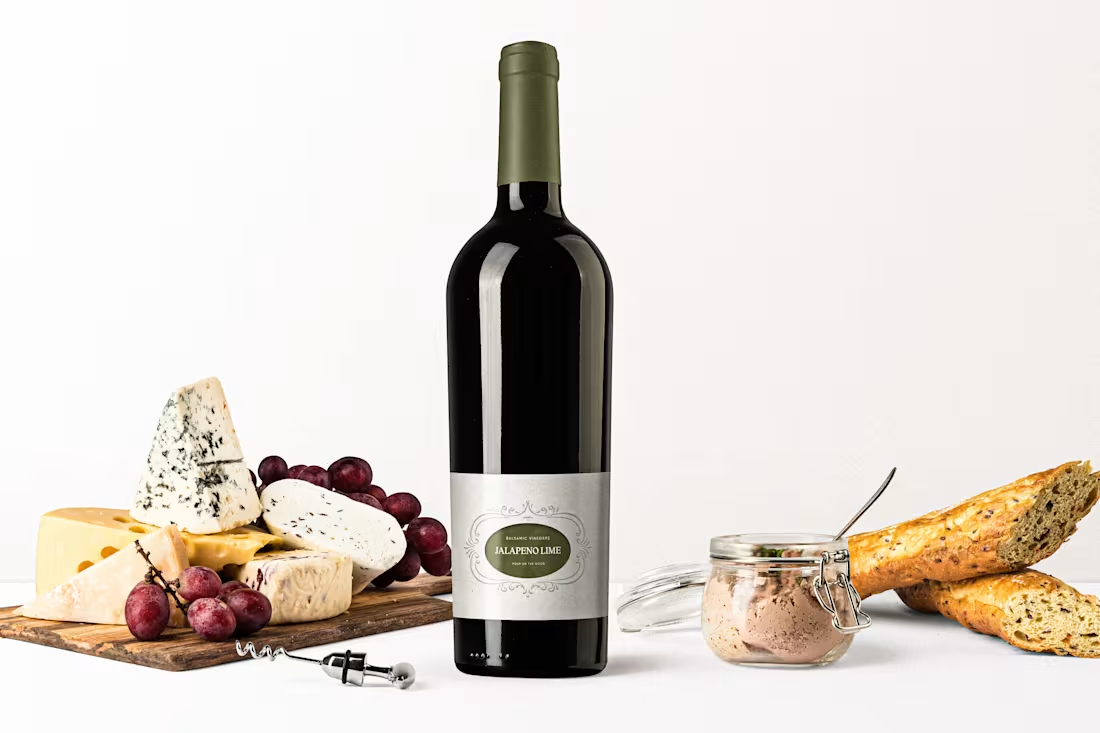
Brand Identity for Heritage Olive Oil brand Carmine & Lucia’s
1
8
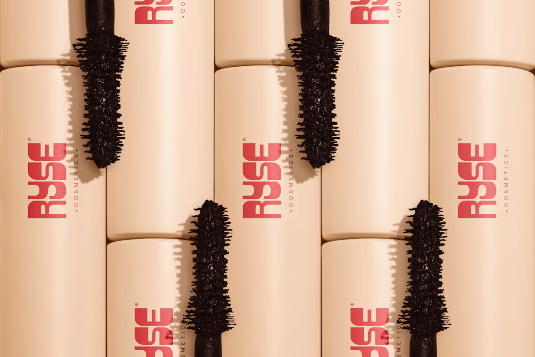
Brand Identity project for Beauty, Cosmetics brand RYSE
1
12
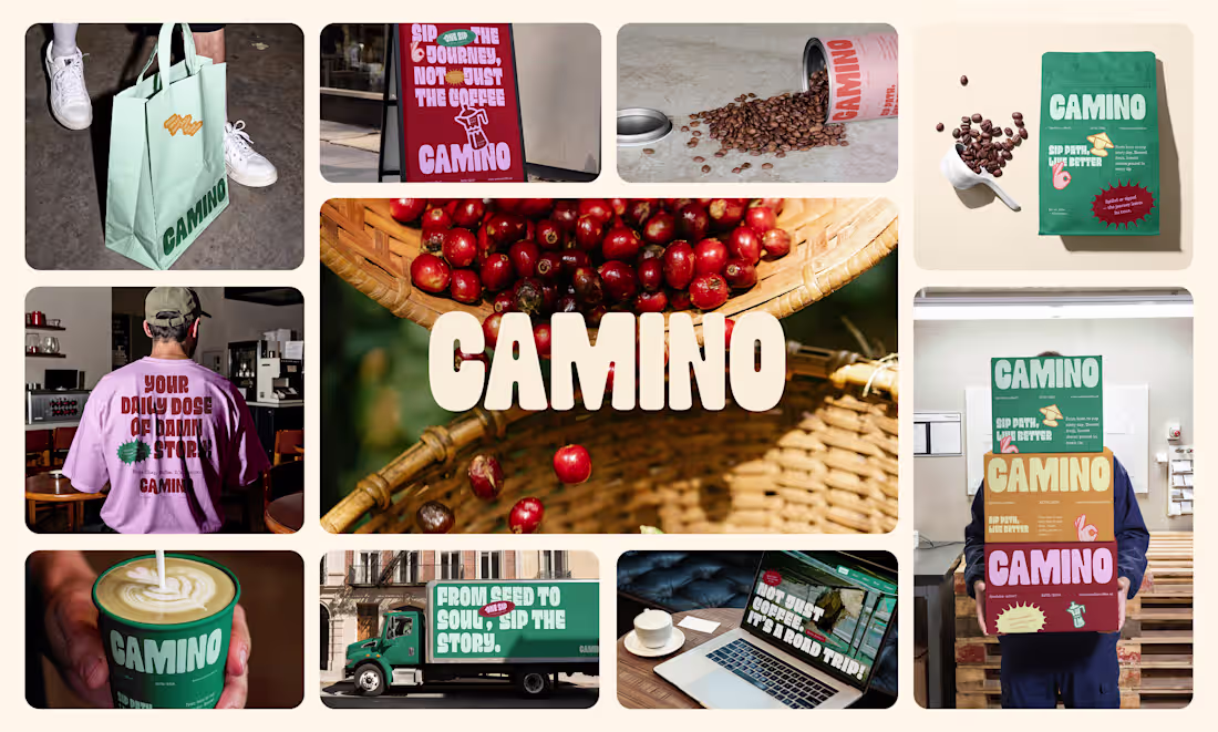
Here’s the recent project I’ve done, a specialty coffee D2C brand from the Netherlands.
Really loved how this project went. They wanted an approachable yet bold brand for the snobby specialty coffee industry — not the usual.
That bold approach helped them stand out and connect their audience to the true origin of the coffee.
2
3
178
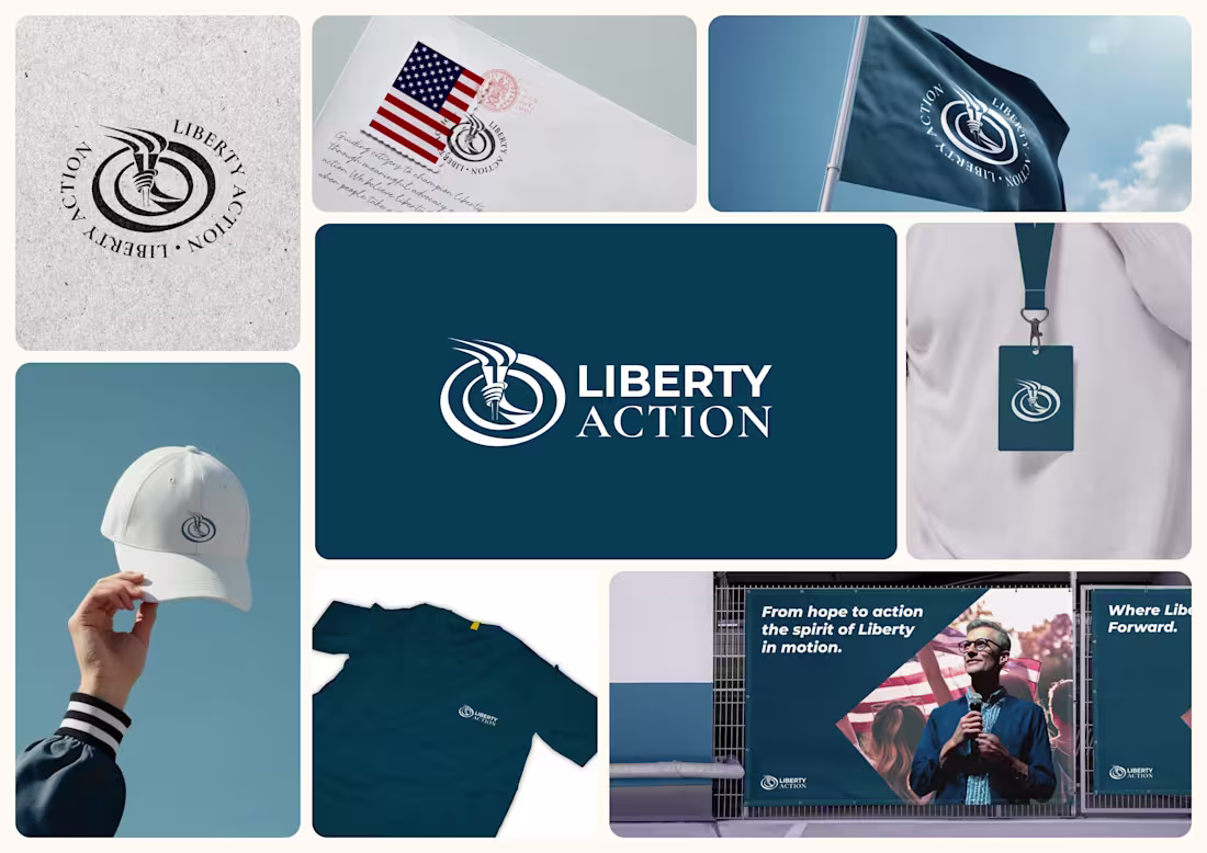
Liberty Action Logo Design
1
11
Forma® | Architectual Studio Brand Visual Identity
2
30
Sundel | Eatery Brand Identity
2
29
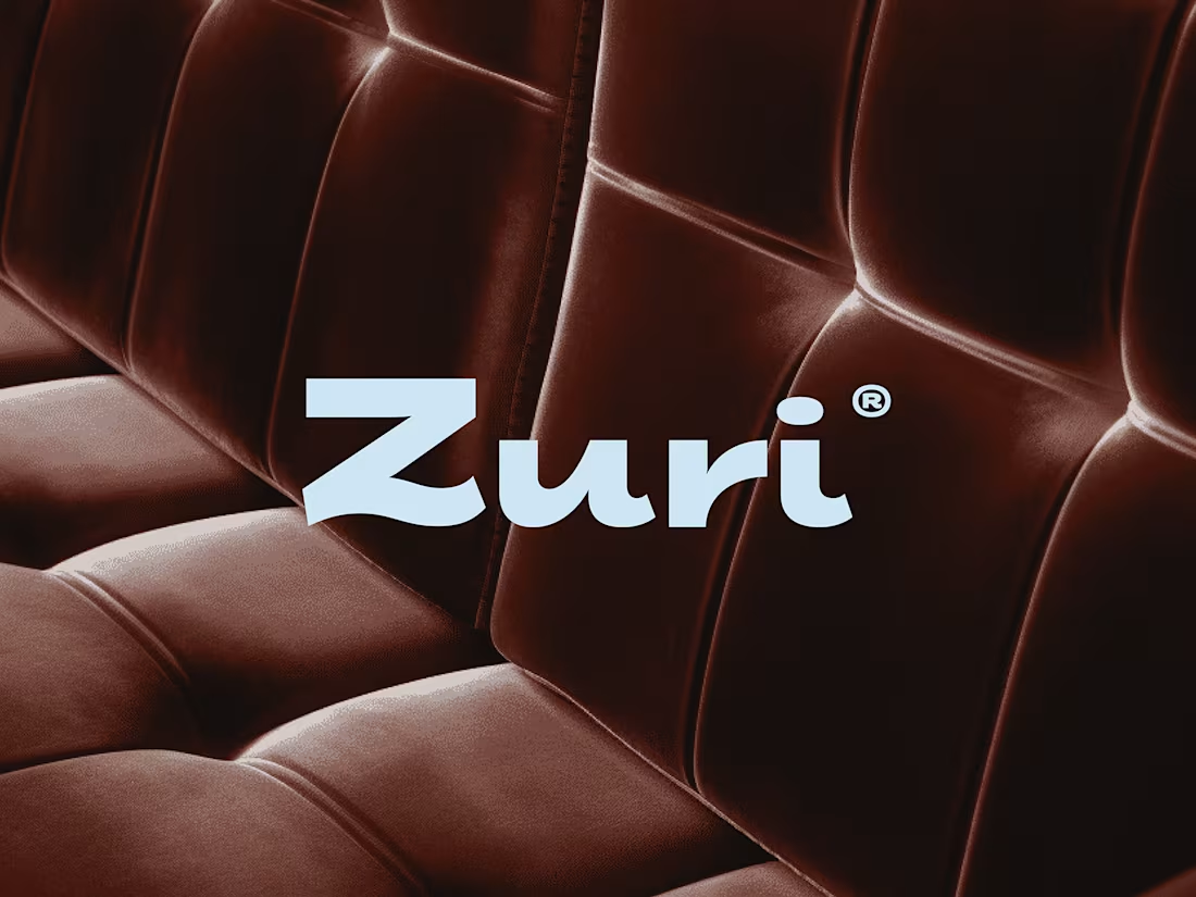
Zuri® | Furniture Studio Brand Visual Identity
2
50
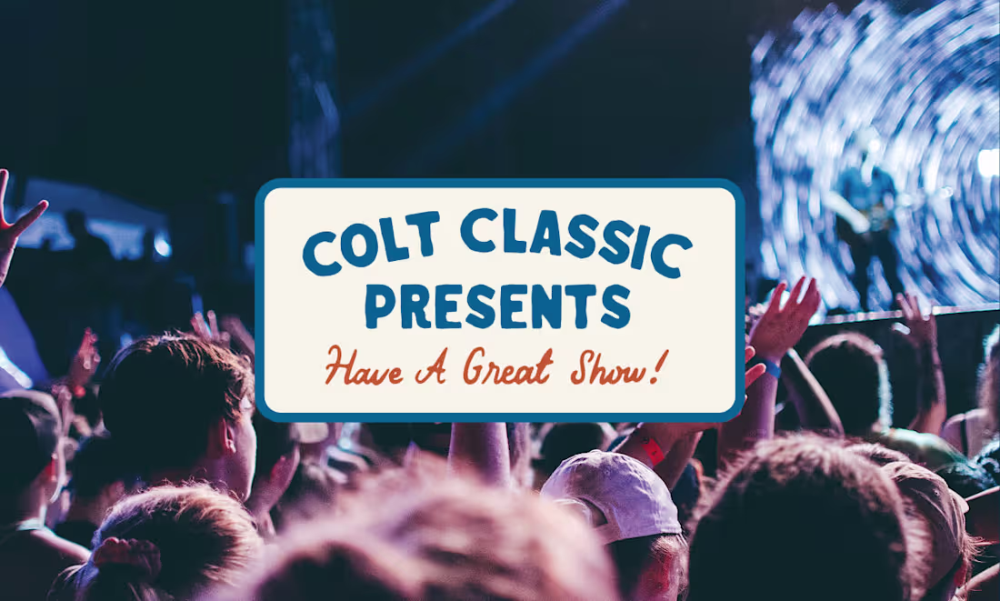
Colt Classic Presents | Artist Management Company Brand Identity
2
6
Pack2go | Last Minute Travel Booking Platform Brand Identity
2
15