
Al Helal Hadi
UI/UX Designer | Framer Developer | Landing Page Specialist
- 6
- Followers


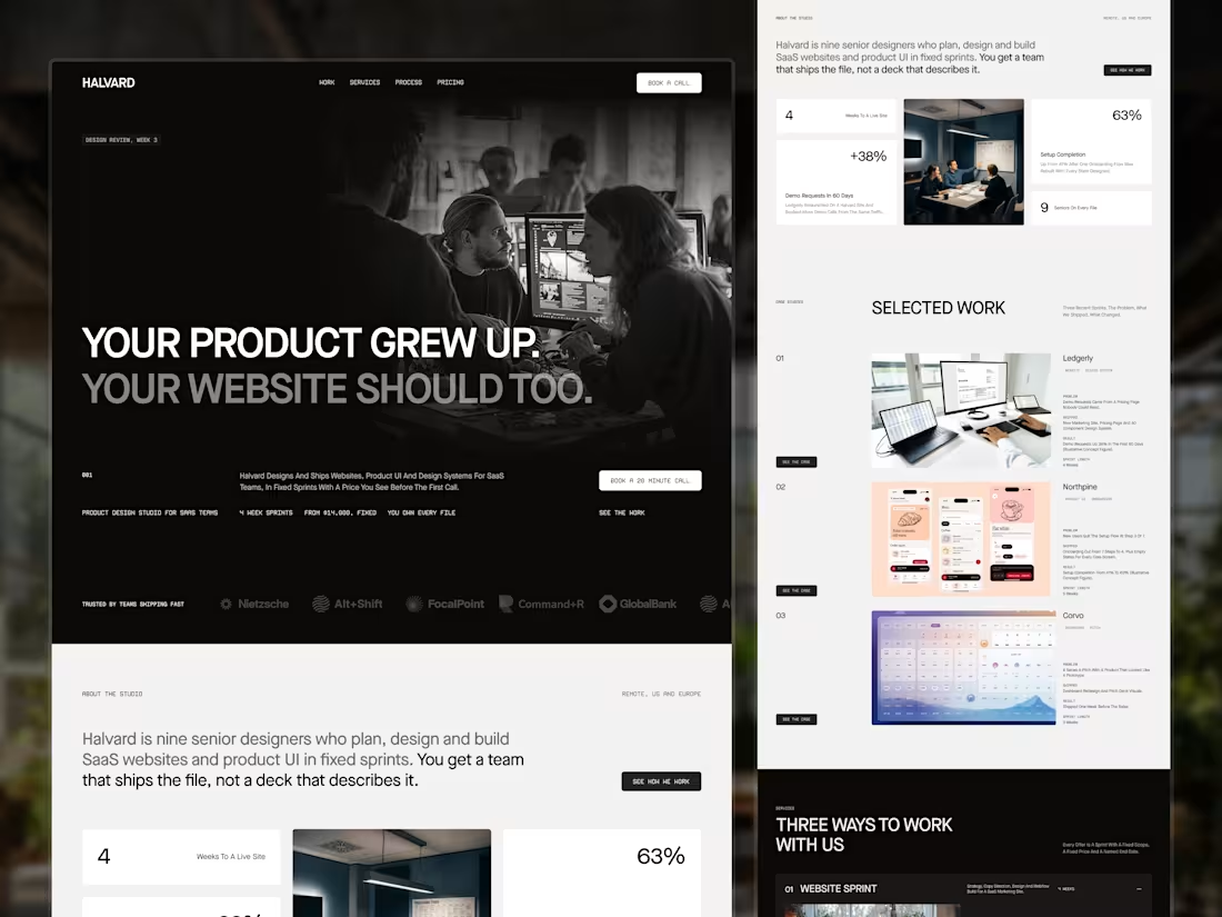
From $14,000, 4 weeks, every file yours. That row sits under the headline on Halvard, my concept digital agency website. A founder shouldn't need a sales call to learn the price, and the call gets better once they know it. What does your homepage answer first?
2
2
28
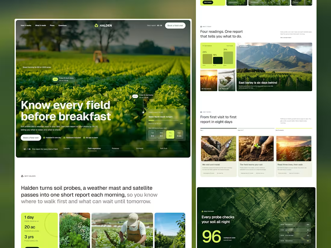
Halden is a concept I designed for a farm sensor service. The people it's for run 80 to 1,500 acres and have already tried a farm app that asked too much of them.
So the page asks very little back. One report line in the hero, probe readings pinned to the field photo, and a three-step path from first visit to first report in eight days.
No drones, no glowing dashboards. I took those out after seeing how often agriculture templates lean on them.
Selling to people who would rather be outside than on software? Let's talk in DMs.
0
8
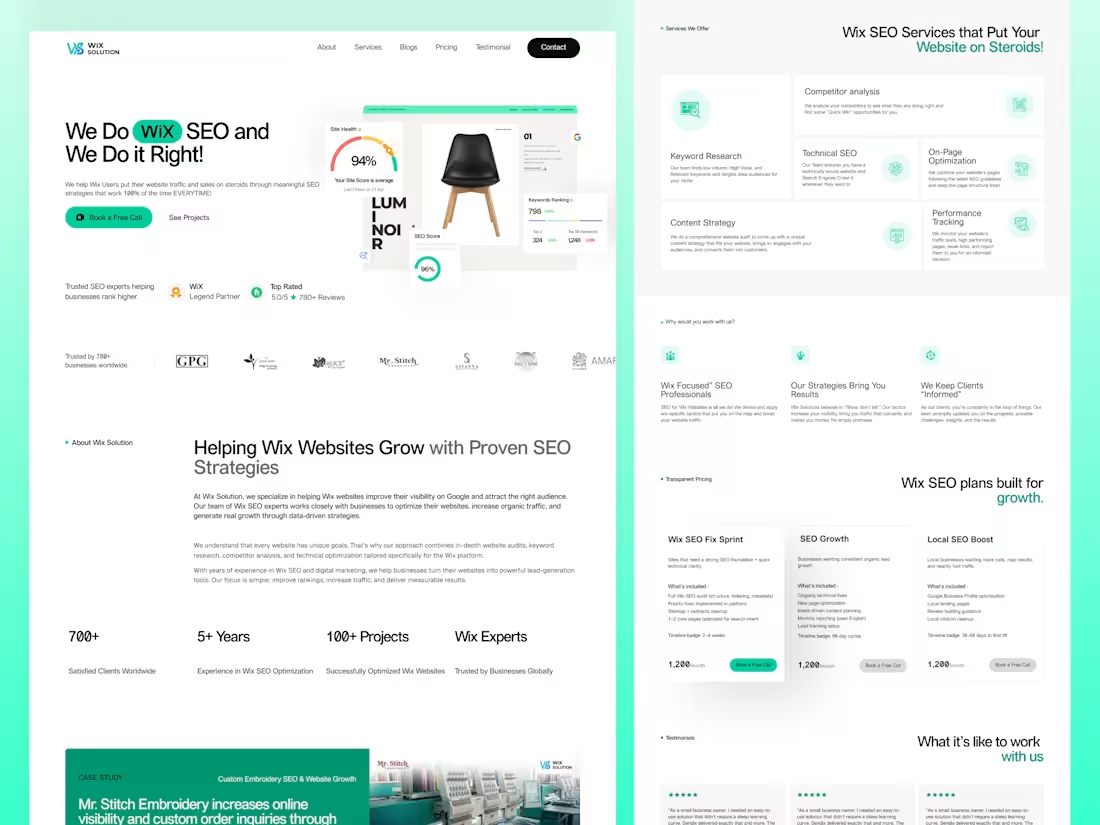
Wix Solution is an SEO agency with a single-platform focus — they only work with Wix-built websites. The redesign brief was to stop treating that focus as a footnote and put it at the center of the page.
I rebuilt the landing page around a sequence of proof. Every section answers a specific question a Wix site owner is already asking — about fit, credibility, scope, price, and process — before the visitor has to ask it.
The hero leads with the niche, treating "Wix" as a brand mark inside a green pill so the specialization is unmissable on first scan. Trust signals — Wix Legend Partner status and a 5.0 / 780+ review badge — sit under the primary CTA, in the same eye-stop as the click. A real client case study (Mr. Stitch Embroidery, 200% organic traffic, 2.5x more inquiries) lands before the services grid, showing the work before describing it.
Pricing is fully exposed. Three plans, one price, with timeline badges. Agency-skeptical founders don't want to book a call to learn what something costs, and the page respects that.
The visual system stays restrained. A single mint green carries the growth narrative through accents and surfaces. Cards share one radius, one shadow, and one icon treatment so the services, pricing, and process sections all scan at the same speed.
The result is a landing page that pre-qualifies leads. Wix site owners self-identify as the right fit. General SEO shoppers self-select out. The form fills with the right people.
0
52
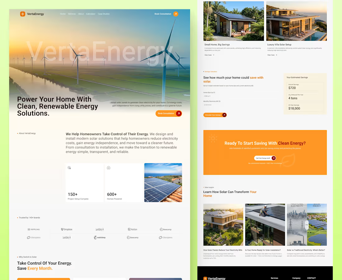
Designing for solar is really about reducing confusion.
This renewable energy website design focuses on clear structure, simple content, and guiding users naturally from awareness to action.
The calculator and case studies are placed based on user intent, not just layout.
1
38